


Description
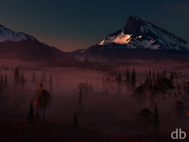
This is an update to my “Arboreal” from
2003. I put this together on my “Asfaloth” laptop while “Year of
the Dragon” was rendering on Bucephalus. The planet is my first
attempt at using the “Lunar Cell” plugin for Photoshop and I
cannot say that I am completely pleased with how it looks right
now. I thought the scene looked nice enough to share as is
however while I work out the kinks.
Let me know what you think!!
weesam [basicmember]
Had this one on my desktop today. Looks so much better than I expected.
Mason
Would almost prefer a bright moon to cap this off. Maybe even a sister view inside the forest with some lightning bugs.
PMvanova
Not going to rehash what everyone else has said about the mountains. I have the original Arboreal on my desktop and it sparked an idea for a story. If this render was a bit closer so you could see the man on the pinnacle, it would be even more awesome! I love seeing an alternate view of an original, gives more depth to the images.
aka Eric
I would also like to see a multiscreen of this, please tackle it soon?
Eric
Multi-screen????
Ryan
I would still like to do one more single-screen render before I attack the multiscreen. Thanks for being patient!
Nick
Dual screen?
Heather
I absolutely love this image, would love to see it available for dual screen 🙂
Ryuzaki
I like this a great deal, it’s like an imaginary planet (albeit smaller) circling Earth.
Alisha
I found you quite a few years ago, and I’m still loving it all. I’m a huge fan of the planetscapes. Will these eventually be fitted for Google+? Wanted to use of the DB pics on Google+ like Facebook, but the DB logo gets hidden by the avatar. I would love to see these for Google+. 🙂
CE
I love all your planetscapes, and I like where you’re going with this one (vs the original); I love the ethereal feel of the clouds you’ve been using alot lately. I do agree with Tyler that the planet is overexposed, particularly in the lower hemisphere over the ocean. The large white continent in the upper hemisphere appears to be experiencing an ice age, not sure if that was the intent or not! I think the original planet has more texture to it, though I suppose that could be due to the difference in the altitude of the light source relative to the planet.
I have to agree that the mountains on the left are overlit. I’m assuming the planet is meant to be the main light source, and it would have to be behind the mountains, even though it appears to be to the side of them (a LONG ways behind them, really!) so I would expect them to be backlit (especially since they seem to be more shadowy on the planet side and more reflective on the far side – I’m guessing that’s snow, but I think it accentuates the feeling that something is not quite right with the lighting) I’d love to see a few shafts of light/shadow in the clouds from the rocky edge of the right mountain or at least a difference in lighting between the clouds on the right and on the left.
I like the milky way, nice touch!
Shazee
The Milky Way cluster of stars is a really nice touch, but it’s not bright enough to complement the planet. Totally looking forward to the finished version of this!
Tyler
However based off what I’m seeing so far this one should surpass it in time. The plant is overexposed and the cliffs to the left are out of place but I trust your touch to get this into classic status.
Simon
The original is still in my personal favorite of your wallpaper. I’ve never wrote a comment on your work ’till today and I speak french has first language. I loved the original version of this wallpaper for it’s cold feeling with the pine trees, the clouds, the sky, the colors. It was feeling like a Boréal forest. Right now it looks more like a jungle and the smoke/cloud, makes it feel like it’s hot and humide. That wallpaper had that unique touch of Boréal and it lost it.
Dan
Really like this, but the mountains on the left just seem out of place. They look too tall and the lighting is weird, its hard to explain
Verjigorm
I really like it… though the mountains on the left look a bit strange, guess these are the ones, Dave T meant to be looking washed out.
JoeB
Looking forward to the finished version of this as well.
Dave T
But the mountains look washed out.
cmmnoble
Hi Ryan! This is a cool one. I agree, though, that something about the planet feels a little off. Maybe it’s a little too sharp? Or maybe it’s that the big shield of clouds in the upper left of the planet is so solid–that’s a lot of white right up against the limb of the planet and the black, starry sky. LOVE the starry sky, by the way. Hope that stays! Can’t wait to see how this one comes together as the “kinks” are smoothed out. 🙂
Jeff
I love where this is right now, and I already have it on my desktop.
Speaking of reduxes, have you thought of revisiting ‘Lotus’? It’s great on a standard monitor, and I’d love to see it in a widescreen format.
Friar
Good stuff! Dual screen!
Matt
This is a beautiful wallpaper as I have always liked the night ones, my only complaint would be that it is a bit dark in the trees in the bottom third of the screen. Other then that I love it!
Deanna
Wow, I love this. It went straight to my desktop. The starry sky is my favorite part of all. It’s mysterious and beautiful and I really love the contrasts, so I hope you don’t change much! If you do, I guess I will have to keep using this one. 😉
Josh
I must say, the distant planet in the old wallpaper looks better, I think.
Maureen
I like the starry sky. I am not sure that the mountains look quite right; the ones on the left are barely there while the ones on the right are very solid. Something didn’t feel right there. The silhouettes of the trees are too solid. There should be some light in there, somewhere. But I do love the scene. I really appreciate your landscapes, especially the other-worldly ones.
Travis
Love this render a lot. Only things that stick out for improvement are perhaps toning down the visible atmosphere on the nearby planet and darkening the mountains on the left to match those on the right.
Brian
Love the updated rendering of one of my all-time favorite wallpapers!
Bobc
This is absolutely the type of thing I love. I (as usual) like the darkness in the foreground. Perhaps one of the things that bothers you is what Shay says, i.e. not enough washout in the sky from the bright planet? Anyhow, I instantly made it my desktop…
Kirk
Upon rereading it, my comment sounds harsher than I meant it to!
On a side note, I’ve been a member for several years (and used the free gallery before that) and before the last few years you rarely updated your work based off of feedback, usually posting the final version first. Out of curiosity, why the change?
Kirk
Looks pretty good, Ryan, but needs some tweaks. The mountains on the left looks a bit too much like a painting, while the planet looks very cartoonish. By themselves each element works, but together it seems disjointed.
Shay
Looks good so far! The planet seems awfully bright to be able to see that many stars in the background though.
Wraith
If this is a work in progress I can’t wait for the final version 😀
Dan
I think the definition within the upper and lower areas could do with a little more definition but gorgeous otherwise. This might also make for a great cross with “Tears from Heaven” as a picklejar in tribute to the Perseids this weekend …
David
Maybe a bit too dark but I like where this is going. Very atmospheric; love the detail in the planet and the amount of stars in the sky. I really like the direction your art has gone. Much more than just a wallpaper but a distinct and masterful style.
Duncan
Very Nice!