Description
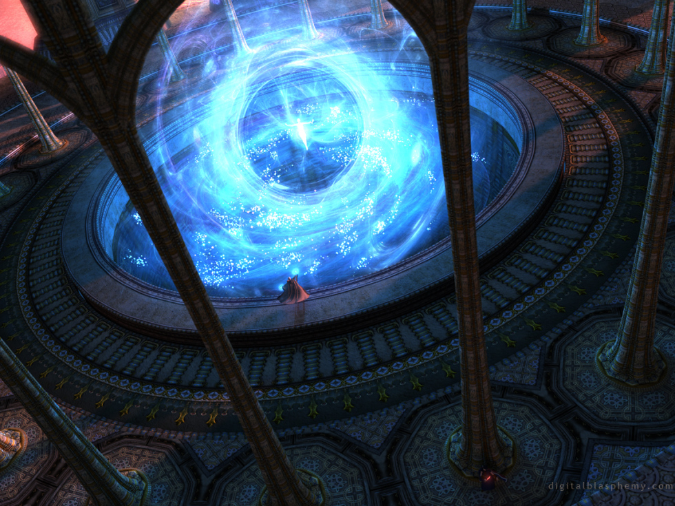
I’ve always been a sucker for magic and fantasy. Some of my earliest renders attempt to capture this. For whatever reason it had been a quite a long time since I’ve tried anything “magical”. After reading “The Chronicles of Narnia” to my 7-year old son Ian, doing a little CRPG gaming, and purchasing a new version of Lightwave the time seemed right to dust off my spellbook in Winter 2011.
For the record: The figure in the center of the “magic” was Ian’s idea.

 Arcana: arcana11920
 Arcana: arcana3
 Arcana: arcana31920
 Arcana: arcana1


Davin [nonmonthly]
I love the pattern work on the columns. You don’t seem to leave out any of the details.
Keith
Hi Ryan,
Love your work. The Triple split files of this work “Arcana” seem to be corrupted, I cannot extract.
Take Care,
Keith
Michiel
Hi Ryan,
This is a fantastic wallpaper. I just got dual 2560×1600 monitors, and with this wallpaper they really shine. 😉
But I can see a strange line running down from the top, around pixel 1592 from the left. It’s also on some other sizes. Perhaps something you could fix?
Cheers!
Galvanized
This is my first post Ryan and I love your work. I’m actually a musician/DJ so I may use your work for a cover in the future, but for now, I’m just personally enjoying and inspired by the worlds you create in these images. They are stunning and just fantastic. I’ve actually followed your work for years but just now decided to get membership.
I just purchased your lifetime membership offer and am glad I did. Some of your pickle jar images are just amazing, along with your gallery renders.
The 2nd image (“frontal” view) in the pickle jar did it for me (versus the “isometric” view in gallery render). It kind of reminds me of Half Life 2 – Episode 1. There’s a reactor that is presumably powered by anti-matter and it just looks like it’s ready to blow (and it does in the game). Great image. One of my favorites, among many.
Keep it up and best wishes to you and your family.
Yours truly,
DJ Galvanization
Ryan
Well, I’m kinda sorta working on something else right now. That’s a sweet idea but it sounds more like a sequel.
Nephelyn
I have no intention to jostle … But are you going to implement it, then ? Another idea : A small lightning strike that emanates from the plasma ball below the center figure, hitting the staff of the wizard, reflects on it and hits the guy behind the column – indicating thankfulness from the center figure to the wizard for freeing it from the abyss … 😉
Regards,
Nephelyn.
Ryan
Great idea!
Nephelyn
Hello Ryan,
In my opinion, glowing, magenta coloured runes on the top around the abyss could make the image look even more complete, don’t you think ?
Regards,
Nephelyn.
Ettawen
I really like this one! It kinda reminds me of Uru online.
Owen Clark
Superb, the magician is back!
Gandalfwiz
Ryan you are a gifted Wizard yourself. RYAN THE WHITE Love the image.
Ryan
I render one “single-screen” image at 2560 x 1600 and then scale/crop the smaller resolutions from that. Then I do the same with the 7680 x 1600 multiscreen.
Travis
I’ve been wondering for weeks now what the red “light” was against the column.
I finally realized this is an assassin getting ready to kick some warlock @$$. Great work fitting this figure in!
Karl
I was wondering how you render all the resolutions for these wallpapers? I have been making my own wallpapers but i render each resolution individually which is a pain.
Ryan
True, this one probably looks a lot better on one side or the other. However, I gave up choosing a side for the dual screens a long time ago. My policy now it to provide a centered file (so people cannot say that I lean left or right) and then provide the triple-screen file which has enough extra space so you can center it how you like on your system.Hope this helps. Let me know if there’s anything else I can do!
Firestar
Again, we find a dual screen image with a massive main focal point in the direct center of the screen. That yields a 1/2 and 1/2 piece on each of two monitors. While this is somewhat alleviated by using the triple screen image, I often find that something on that right edge is missing when I do that.
Slightly annoying, but just a small gripe. This is still a truly breath-taking image.
Steve
Nice to see that there isn’t the extreme angle differential that your previous close-up triscreens had.
(all the pillars pretty much go stright up and down)
Joshua
Ryan,
Holy Cow! I love this one. You really outdid yourself this time. I cannot even tell you. It is going to be a while before I change this background… it takes me to a totally different world just by viewing my desktop! Love your stuff as always!
scott wray
thats what im talkin about!
D
Was there a reason you decided not to use additive shading for the particles? (Where during rendering the image’s color is added to the color behind it instead of replacing it; equivalent to Photoshop’s “screen” filter.) In the multi-screen perspective there are parts where the particles seem to darken their surroundings. Especially on the right middle where there are many piled on top of each other.
Alberich
That’s the sky. There’s a triangular gap where the two archways meet.
Mirage_X15
(if my comment posts twice, my apologies)
I love the new angle of the multi-screen, my only issue is that there’s a white arrow at the top of the magic sphere, (to me) it’s very noticeable and feels very out of place in the context of the piece. I don’t know if it was intentional or if it’s the result of a glitch during rendering – but I thought I’d point it out (it should be easy enough to remove in photo-shop).
Otherwise, I love this piece, including the assassin 🙂
Trifid
Wow… simply a masterpiece – I love the new Dual Screen renders!!!
Any chance on getting this side angle in a single screen version???
Ryan
I hoped you come around to it 😉
Mike
OK…with the little figure in the center I can dig this being daylit.
suab
The triple screen image is one of the best ever imo!
Foz
Nuff said.
Patrick
Wow! I love this! More like it please. 🙂
Mirage_X15
Hmm… I guess it is… it still seems out of place to me, but if that’s what it’s meant to be, than that’s what it’s meant to be. Maybe it’s bothering me because we can’t see that ‘gap’ between any of the other arches (though they may be obscured by the more foreground columns.
Wilf
love this one but the 5120 x 1600 (dual screen 16:10) render seems to be missing. I have a bit of an odd desktop (4960×1600) so the aforementioned render is the best fit. Any chance of running that one off? Thanks.
Chris B
firefox locked up & I got click happy trying to get my comment.
Chris B
firefox locked up & I got click happy trying to get my comment.
Chris B
It really has improved over the years lol. I Like all of the versions, and thanks for the 3rd one. It looks great, the assassin looks either grainy or out of focus but he’s obviously magical and able to blend in with the shadows or go out of phase so that’s probably what’s happening hehe. I don’t think you have to re-render it unless you want to.
Joe
Love this Ryan. I’m really enjoying how creative you’re being with your multi-screen versions lately. 🙂
Kristin
I definitely like the different angle for the multiscreens, but don’t think that it works for the single screen so well. But that’s just my opinion. All around it looks magnificent!
Travis
Crop looks amazing, love this angle and feel it really helps accentuate the magical element you were going for. In the sake of time, I’d say you don’t need a new render. With the chance that you could make it a view that is slightly pulled back, I would hope to see a little more of the orange “sunset” background, mostly for the gorgeous contrast. However, it’s great as is since I know you’re itching to move on with new renders! Bravo!
Brandi
Your question on cropping…the crop looks fine so far on my machine. Will check a different size on my other computer, but I don’t think you need to re-render.
I really like 2 and 3. The change of the magic and the camera angle really improve this image into one of your best.
JBumgarner
Anyone else see this? Or am I trying to add something that isn’t really there?
Brian
Even though I cannot utilize the triple screen version, I love just seeing it!
It sounds like moving the camera around is not a big deal, at least compared to rendering. I would love to see different camera angles in the pickle jar going forward (or back?). It’s one step closer to being in the picture and being able to look around.
Kirk
I love the picture, but I find that in the multi screen the pillars and the assassin look rather grainy. It’s distracting… Otherwise though, it’s absolutely beautiful.
Ryan
Thanks guys. I’ve added a crop of the single-screen in the Pickle Jar. Do I need to do a separate render?
Travis
Uh, can you make a single screen version of this? The triple screen is beyond spectacular!!!
Lisa B
I was about to post “No Fair!” when I decided to download the smallest dual screen and see if I could fit is some how. Looks fantastic centered on my 1280 x 1024 🙂
Lucas
The triple screen version is phenomenal, and yes a pickle jar version of the single screen from that angle would be grand!
Ryan
I love the new angle on the multiscreen renderings. I second Mark’s notion that a pickle jar version from that angle would be welcomed.
Mark
I love the new angle on the multiscreens. Wouldn’t mind a pickle jar version of the single screen with that camera 🙂
Matt
defiently like the “magic” in this version more then the old one :S.
Now if only the surrounding looked more dark/EVIL D:
Will
Please please please do more fantasy and magic stuff! Pretty please with lots of sugar on top 🙂
Michael
I loved the first and love this one even more. The assassin/guard adds a dash of intrigue to an awesome revisit.
Steve
The previous version looked a little more amorphous. This one looks like a glass ball whose edges are hidden behind the pillars that frame it.
Overall, I like it better than the previous version, but I would make the edges of the sphere be visible and not co-incident with the pillars.
Karana
Reminds me of the “power source” in Disney’s Atlantis: The Lost Empire
Jeremy
Love this one…I hope you do more like it. It reminds me of Pyre and White Magic which have always been a couple of my favorites.
celmendo
He def. got some of daddy’s talent! 2.0 is way better and Ian’s idea was a good one. Thank you so much. Love it.
JohnHodges
I like this one better than the earlier version; it looks more like science than magic. Sort of a “superheroine origin” kind of story; the lady is getting charged up with Tachyon Energy or something.
Mengistuh
What’s with the assassin in the lower right? Ooo. Dark. lol. Neat picture. I like it.
David
I’m loving the new magic, It looks even cooler than the particles! Was there a person in the fetal position in the first one? O.o
I think you may have lost some of the noticeable sunlight with the new camera angle.
P.S. This is my first comment! 🙂
Eric
Cool!!! If you consider the original as the 1st frame, and 2.0 as the next, you see the magic happening. Are you considering a 3rd, or even a 4th, to “complete” a magic storyboard? Just wishful thinking. 🙂
Cheers!
Another fantastic render!!!
anna_writr
It was one of your most awesome pics ever and you just made it better! The big particles were the only setback of the whole image and now it looks so much more gorgeous.
And the figure in the middle gives the magic a “point” so we kinda know why it’s happening.
Nelson
Woow, that is how magic should be!
It’s a pity the second person is so far on the bottom that you have to cut the upper magic part away in the FullHD resolution. I think I will cut my own frame out of the 2560×1600 🙂
Walo
This looks better than the last one. I’m using both versions in my iPhone and iPad. I use the older one for the lock screen and the new one on the home screen.
P.S. it would be nice if there were idevice resolutions for the pickle jar versions.
Roger
Love Arcana 2.0. I did not even see the person in the middle of the magic in the first one. Another great one.
Michael
*jaw drop*
My first ever comment…
Been following your work since 1996… awesome reinvisioning. I ment to comment on Inner workings because I just loved the grren version, but this one got me to comment. Thank you!
scott wray
I really like whats going on here.. its an amazing scene. I would like to see the camera moved, the prospective is kind of throwing my eyes off
Andy
Love the redesign! 🙂
Jeff
Yes, I agree, MUCH better rendering. The particles in the original looked a little, well, cartoon-ish. I’ll be proud to display the updated version on my desktop.
BTW, any thought given to an update of Lotus?
RC Davison
Much better! Great job!!
Miguell026
cool mod Ryan! nicely done!
say… now we have 3 entities on the scenario! 😛
PS: you definitely should draw scenarios for games like Prince of Persia (arcana fits 100% in prince of persia) and unreal tournament (MAPS)!
or at least let them take some of your ideas!
these scenarios are amazing and beautiful and should be turned in 3d maps for great games!
Lidia
So much better! Thank you for updating it! It looks great!
Ryan
less is definitely more here.
Pete
I like the second one better. I think you can see the detail of the central figure a bit more clearly. Both are outstanding, though!
Foz
The first image, I think was overkill on the sparkles, it looked… messy.
However, this new image – yes, this is awesome!
Terry
I think less is more most of the time so I’d say the second is better.
littlemom
All I can say is “LOVE IT!”
Ryan
That one failed to upload for some reason. I’d reuploaded the file and it should be available now. Thanks for the heads up!
Trifid
Any chance on getting the 1920 * 1200 resolution?
Anthony
Removing the sparkles makes this a much cleaner image and a fantastic addition to the gallery. Well done, sir.
Ryan
I’ve removed a lot of the sparkles and changed up the effects a bit. Rendered in under 12 hours this time!
Paul
I think this amazing work, worth the wait. Though I do have a question, in this render at pillar at the bottom of the render there is a red glow that I can not make out. I would like to know what this is exactly. Can you please answer my question. It looks like someone or something that is hiding from the person at the center of the picture.
Jenanne
I’ve always loved the magical renders you’ve done and very happy to see you return to them. I do agree about the magic blue swirl, though — needs something but not sure what. Perhaps additional colors?
Charles
I second Michael’s request.
Michael
If it only takes 10 minutes to render without the volumetric effect, I am curious to see the difference is (for no other reason that I am a geek and want to know). Can you put up a sample split image with half being without the effect?
Sean
Nice work Ryan
BenC
I’ve read more books than I can remember and if I had to pick my all time favourite it would be the Chronicles of Narnia everytime. I must have read the Voyage of the Dawn Treader over ten times now. So I hope Ian is enjoying them!
I’ve often wondered if you’d read the books because I’d love to see some Narnia inspired work – although i suspected that ‘At World’s Edge’ could be taken from the beginning of the Silver Chair and ‘Once Upon a Time’ could be inspired by Cair Paravel.. or maybe thats just my imagination?
Ryan
I’m working today to produce a quicker rendering variant of this so I can go forward the the multi-screen. I think I’ve made some significant upgrades to the “magic” so stay tuned for that.This winter I’ve been reading C.S. Lewis’s Naria Chronicles every night to my son Ian before bedtime. In the first book some serious magic went down at the first touch of the sunrise. Likewise the sunlight is an integral part of the spell this magician is working on. For this reason I would rather not do a midnight version for this piece.That said, I may yet play around with different color variants ;)I would rather not comment on the figure beyond the column except to say that she is holding a magical dagger…
Miguell026
great job !
tho i personally prefer huge majestic landscapes/ scenarios!
but a different wallpaper is good! very creative!
keep it up Master Ryan!
PS: who is that fella on the image hidden behind the pillar?? 😛
Kristin
Looking closely it looks like the fellow behind the pillar is sitting down holding a red glowing helmet? Don’t know what’s going to do though, but it’s interesting to speculate!
Very nicely done, I love love all of the intricate details on the pillars and ground. The bottom of the magic swirl does seem a bit disjointed and I’m not sure if that’s supposed to be the “base” of the spell or if it is another intricate layer.
All round I live it very much!
Joleen
I agree that the blue swirls could use some work. They look a bit flat, and that makes me lose the sense of the grand scale that the rest of the image evokes.
I love the exquisite detail in the floor and columns!
kellzilla
http://www.google.com/search?q=volumetric+effect
When in doubt, Google!
Basically, it’s the “blue magic stuff” and the sunset lighting. (But I bet the worse offender is the magic stuff, cos it looks to be almost entirely light-effect.)
BobC
Reminds me of Quest for Glory 2 final game scene, just much more detailed, I like it
DaveShaw
Is than an Assassin lower right??
jmpond
Very cool render! Is that a bad guy hiding behind the pillar? (Lower right)
G
I really like the piece, but I do not like that the top of the blue swirl is cut off in 16:9. Can this be addressed?
Tom Thomas
Love this one and echo the sentiments for fantasy based themes.
But what the heck is a volumetric effect? What part of the picture has it? Why does it alter the rendering speed.
🙂
Randall
Thanks, Ryan, for returning to a fantasy theme! You can be assured that you have fans of your fantasy and sci-fi themes. I love all of your work, and the variety of scenes, but don’t forget to throw in a fantastic one like this one from time to time. Awesome!
Nelson
I also love your decision to enter the magic world once again! There were plenty early magic works which I find amazing.
Though, this one is a little bit different. Like already mentioned, a night setting surely would be great, and the star-like dots in the blue whirl just don’t look like a 155h render with newest software… :-/
Still a nice work. And I’m interested in seeing the non-volumetric render version, too 😉
Matt
Like others have said the attention to detail is amazing…but the blue swirls just kills it for me.
sigmaman
Amazing detail mate! Love the little character watching from behind the pillar.
Deatherage
Ryan
If you love fantasy so much, why not write small stories for your pictures…or a book?
7.5/10
Deatherage
Ryan
If you love fantasy so much, why not write small stories for your pictures…or a book?
Terry
Do you use Photoshop much in your workflow?
Frank
Ryan, Brilliant image looks great on my 1920×1080 screen. Can you tell me as I look closer who is the figure in the back on the right hand side wielding what looks like an illuminted dagger/sword.
Scarr
After taking a closer look the actual magic of this picture seems a little underdone. The magic in previous magical works look much more real… er… as real as magic can be.
Sly V.
I like it. I would agree with Will though. If doing another night version tickles your fancy it would be interesting to see a darker (bad magician) night version of it. The figures really make this image though. Good job Ryan.
Will
Great to see you revisiting some of your older art styles.
If you were to make a time/colour variant can I suggest the following: Night has fallen and the red sorcerer has overpowered the one in white and the ominous glow of red magic now burns in the center of the well.
Andrew
Could you post a side-by-side comparison of this image with and without the volumetrics? It would be nice to get a sense of what took 154h50m hours to render!
Kana
This one is cool, just like your previous version of this. However, I think this might look a bit more unique if you had it with not just one, but maybe 6 or 7 or so others helping this loner – a combined spell of some sort.
Another idea for possible future reference is maybe a spell cast in the forest – a druidic theme, maybe? Just a thought.
Keep up the awesome work!
Lidia
The concept is good, but the magic swirl in the middle is disappointing. I’d love to see an updated version with a better swirl. I was really looking forward to a magic themed wallpaper… especially since it’s been so long since you’ve created one like this. I’m a fan of magic, fantasy and RPGs as well.
Mike
The magic grew on me…but I can’t get over it being daylight. Detail is fantastic and I love the red counterpoint. Pleeeease do one at night!
Jeremy
Love it! What would also be cool is taking the center magical ball and doing that as a render on its own. Love it!
Geep
This is really fantastic! I love the detail and the colors you used. Definitely going to be staying on my background for a long while! 🙂
betsey
I may not understand how you do it–can’t wrap my brain around the technical stuff–but I always love the results!!!
celmendo
Always loved this piece and the update is great…except for the central magic swirl. That’s just plain not great. Maybe that’s the part that locked up the machine? Like the addition of the figure with the knife/sword.
Scarr
More magic soon?
Seth
I haven’t been a huge fan of this kind of digital art (in general, not just yours), but this is terrific! I agree on the praise for the details, and the tilted camera adds a nice touch. More!
Sanalith
I’ve always loved your early magic-based wallpapers, and it’s such a treat to see you trying that style again! Lovely as always, especially your exceptional attention to detail.
Joel
Interesting styling of the “temple”. Looks cathedralic, egyptian and romanesque rolled up in one. The other magician there behind the pillar with the red “energy” sword is very cool. Creates the idea of a climatic clash between two powerful wizards. Perhaps you should write a mini-series online book with your renders.
On a side note Ryan, if your looking through your past digital blasphemy would you ever make a redux of “Fuego”?
JD
The pillars look kinda skinny.
The ‘blue swirl’ looks a little cheesy.
I love the tile work and how the light hits it.
Cybinary
Is that really a woman? I have a hard time making out what that figure is down next to the pole. Looks like a masked figure holding a red blade or something.
Like others have said, I also love seeing the figures and how it shows off the over the top scale of the setting. This one will diffenatly go into heavy rotation on my workstation once the multiscreen renders come out!
Ben
Awesome work, well worth the wait! Can’t wait to see the multi-monitor version 🙂
Littlemom
Wow this is so beautiful. Love it Ryan it was worth the wait. 🙂
Littlemom
Wow this is so beautiful. Love it Ryan it was worth the wait. 🙂
DaveShaw
Ryan, the 1080p crop is missing the top of the “blue stuff”. Would you mind re-cropping please?
Thanks
Ben
Ryan’s use of obscene scale put to good use. This is classic DB in action. 😀
kellzilla
I just saw the woman in red, awesome! I wonder if this is the badguy to the blue’s goodguy. Or if I’m reading too much into simple colors. 🙂
FlareHeart
The enormity of the spell is amazing, and the pillars around the central area remind me a lot of the final battle in God of War III. Great work!
kellzilla
I love it! I very much miss your old magical works. Sometimes you just need to revisit the past (with updated tools!)
And “LOL” at varied colors…there’s enough colored light-splash in this image that Photoshop probably wouldn’t work…he most likely would have to do the whole thing over again, all 155 hours!
Nick
The figures in this one really make it good!
Karl Shaw
Will you post versions with varied colors in the pickle jar? This is great!
Daniel
Greetings from Chicago.
Amazing work again Ryan. Made me think of Disney’s Fantasia immediately 🙂
Nick
I’m glad to see you diving back into your old school ways a little bit. I’ve wanted to see some of your old wallpapers updated for quite a while.
The piece itself is awesome. Amazing detail as always. I kind of wish the magic itself wasn’t quite so white is some parts, but that’s my only real criticism.
ojonasar
Reminds me of some of the on-line games I play. Good thing it wasn’t rendered on my old Commodore Amiga; if you could have found enough RAM (which would probably cost as much as a small house at the time) and had set it running in the mid-eighties, it would likely still be rendering now.
Joel
“El Dios Del Fuego”-“The God of Fire”
Brandi
Your attention to detail always impresses me. Love the woman behind the pillar with the red blade. It’s that kind of thing that makes looking at your work so rewarding.
Tyler
Enhance the spell effects and offer a night version of some sort. I would love to see moonbeams myself, but I’m sure whatever you decide will be amazing. I tip my hat to you Mr. Bliss for revisiting the fantasy theme. Between you and me it’s a style that you excel at and should continue to maintain.
David
Two is definitely better than the first. What is that thing at the bottom of the screen? It sort of looks like a person bent over but its hard to tell.
I’d really like to see more of the surrounding scene in the multiscreen version, as is the center is cool but the surround is a little underwhelming.
Greg in CA
???
Greg in CA
That’s what I get for not reading and jumping the gun, lol…
GMaster7
Ryan – Loving the new angle on this, and the new style of the magic/figure! This is great! It combines the look of your abstracts, which I absolutely love the most, with fantasy!
Grayce
This reminds me of how I picture the Fount of Power at the Keep of the Four Worlds in the Chronicles of Amber series by Roger Zelazny… If you love reading fantasy, it’s a great story…