


Description
I wanted to do something for the Valentine’s day holiday (it had been requested for years) but I didn’t want anything too syrupy. My rule is always that I won’t post something that I wouldn’t put proudly on my own desktop, and this fits the bill (for me) for a Valentine’s day wallpaper. I need to make a version with one gold (love), one lead (hate) arrow because that’s how Cupid was traditionally armed.
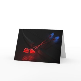
 Take Two - Valentine's Day 2010: cupid1
 Take Two - Valentine's Day 2010: cupidarrows1
 Take Two - Valentine's Day 2010: cupid2
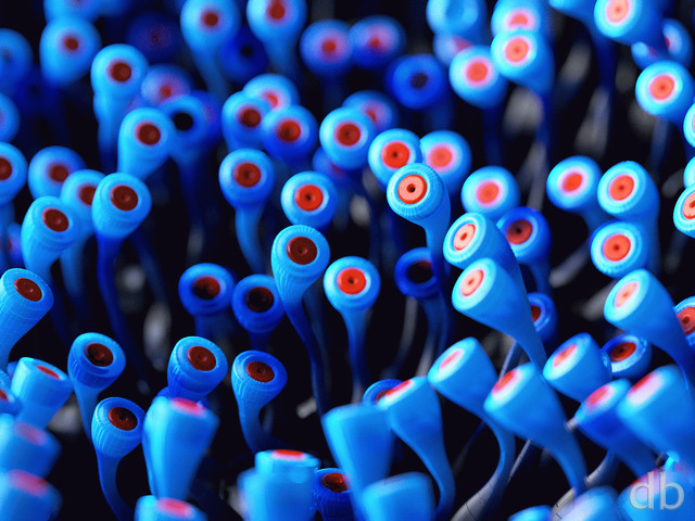

Ryan
Not anymore 🙂
Unclegumby [lifer]
Are you still contemplating the gold and lead arrow rendition of Cupid?
Jenanne
How about a “Hunger Games” version of this wallpaper?
Lidia
I like this pickle jar thumbnails idea!
Dave
You used to have the Da Vinci quote “Art is never finished, only abandoned” on your page, and now I realize it’s missing. What happened to it?
dogchops
Love this wallpaper!
Just too talented Ryan!
S. Scavere
Can anybody tell me what resolution is best for the Verizon Razzle, cause they all look pixelated on it.
S. Scavere
Can anybody tell me what resolution is best for the Verizon Razzle, cause they all look pixelated on it.
ochoco999
I just loved it.
Richard H.
In the Pickle Jar, the 1920×1200 version of ‘cupid1’ is not listed. However, if one edits the browser URL directly, it’s actually present on the site! So for anyone who would like that resolution of that version, here’s a quick link until Ryan fixes the missing entry:
http://www.digitalblasphemy.com/content/picklejar/cupid3/cupid11920.jpg
RSA
Can we expect to see a 5760 x 1200 version?
Walo
I agree with Lidia but at least this render is better than the 1rst version. I’m using a desktop theme with this version and the 2nd version in slideshow mode.
Chris
I wasn’t expecting a Valentines day theme picture. The render looks really sweet though. I am sure a hand full of people might think it’s a tad dull. However cupid’s bow is quite legendary and think there has never been a better recreation of cupids tools.
Chris B
the hearts seem a lot rougher in the 3rd version while the 2nd version, they seem a lot sharper & more glass like, like the shafts of the arrows. other than that it’s awesome. 🙂
Ryan
Lidia: That is one of the pitfalls of posting images before I am completely happy with them. If I make more than one change per render there is a good chance people will like some changes but not others. That’s why I have the Pickle Jar though, so everyone can use the version they prefer. Thanks for the feedback!
Michelle
This final render is really great. I don’t think I’ll be using it as a wallpaper, but it’s really pretty and perfect for those who would like a Valentine theme on their desktop.
Ryan
Had a little mixup with the comment database but it seems to be working now. Still interested in your feedback!!
Lidia
I like the bow in the third version better, but I like the hearts in the second version much better than the ones in the third version. I’m keeping the second version on my desktop…
Jeremy
Dual split files are broken. I can’t show off at work!
Jeremy
Dual split files are broken. I can’t show off at work!
Jeremy
Dual split files are broken. I can’t show off at work!
Jimmaresa
I just love this image. I may be wrong in my view but I see the contrast of the passion of he hearts and the ice feathers at the end. It is so on target!
Jimmaresa
I just love this image. I may be wrong in my view but I see the contrast of the passion of he hearts and the ice feathers at the end. It is so on target!
Reuben
Well the hearts look a lot better than they did in the first version. Well done on the re-render. As other people have said, it would be cool for you to start making wallpapers with other weapons in them, even though it is something different from planet, land and seascapes and abstracts, it is something you seem to be skilled at. And it seems a lot of fans would enjoy that type of work from you.
Dave
Ryan, will you be doing a multi monitor version of this? Also, will you be doing a multi monitor version of Muspelheim? Please don’t neglect us multi monitor users 🙁
Ryan
The dual splitscreen link is available now. Fat-fingered that one. Sorry!
Lidia
The hearts look much better on the second version. I know a Valentine’s Day wallpaper may not have universal appeal, but I’m glad you did one anyway. I like it.
Chris B
The hearts look amazing but it’s a shame to take away the details on the bow. I like them both, I have it set to switch between them every 5-10 min.
Miguell026
hey Ryan no sweat!!
im sure LOTS of lovers out there will adore this valentine work of yours!
not that i dont like it.. its just not my thing really…
i know your work since 1999 and i was sure as soon i saw this valentine wallpaper that this was just a “try out”!
no sweat! art is art!
and valentine’s day deserves a bit of tribute too!
im awaiting your next masterpiece! keep it up!
Ryan
I had no illusions that a Valentine’s Day wallpaper would have universal appeal. Just trying to have some fun ;)I would render another version with the old shiny bow but it probably wouldn’t be ready until after V Day. The changes I made to make the arrows more “crystalline” jacked up the render times on this one considerably. I’m ready to move on…
Miguell026
well..
i think is better tho this is not really my thing.. =P
loool
tastes differ a lot when it comes to art!
anyway i’m looking forward to see your new renders Ryan!
keep up the good work!
Cheers!
Tyler
Dear Ryan,
As others have stated the revision improves the arrows at the cost of the bow. I’m not sure why the bow wasn’t left alone but you have your reasons. Personally I will leave the original up because it’s overall more cohesive to me. You do amazing work Ryan and I think sometimes the masses interfere with your creative vision… just a thought.
God bless,
Tyler
Stargazer
The new version is GREAT. It’s really great that you listen to your ‘peeps’ and take their thoughts into consideration. Although some arrows with super sharp arrowheads w/scroll work on them would be totally radical… Great Valentine wallpaper… THANKS!!!
Laurent
I prefer the bow in the first version but the arrow tips and their glow in the new version. Great Work!
Aeolwind
The original is better. You can’t see the bow well enough in the new version. Original got an 8, this one a 6 =/.
sleeper
And I’m looking forward to the multi-monitor version. 🙂
Ben
The new version is amazing! Keep up the great work
BADWOLFBAY
Bravo on the addition of the mentioned discounts ! I qualify for neither, but think it’s a great move for you.
Lover your stuff, keep on keepin’ on….
macmage
I had not realized you had done the update at first. What I did notice is that I could see the bow better this morning. I love it THANKS again Ryan.
Robert
macmage
digging out again – first 30” now another 20″
why did I leave AZ and move back to Maryland :=)
Ryan
I’ve posted an updated version of “Take Two” this morning. A lot of the feedback on the original focused on the heart tips but I thought it equally important to update the arrow shafts as well. I gave them their own glow (and yes they are transparent) which should keep the hearts from “sticking out” too much. This will be the final update for this one, as the holiday is fast approaching and I have another scenery wallpaper in the works that I’m itching to work on. I’m going to try to put together a multi-screen render today and have it up ASAP.Thanks everyone for the great feedback!
asterismW
Agreed, the hearts are much better.
Nick
The hearts look much better in this second render. I think they fit much better with the rest of the picture now. Great work, as always.
Chris
jbhodges7
“It’s the thought that counts” Wed February 10, 2010 at 2:31 am
This one happens not to be my cup of tea. But I appreciate the thought anyway.
Couldn’t have said it better myself =)
Happy V-Day.
John
I love this one for its simplicity.
jbhodges7
This one happens not to be my cup of tea. But I appreciate the thought anyway.
sigmaman
Love it mate. really nice. My wife thought is was grreat too.
Mark
Am I the only one who actually likes the hearts?? While I won’t be using it for my wallpaper, I don’t think it’s nearly as bad as some people here are making it out to be. As Ryan said, it was meant to be ‘fun’. And I think that goal was achieved.
CK
the tentacle feathers i think look awesome.
if in a future project you could incorporate that design in to something it would be awesome.
ill wait for the re-render on this one though. everything looks good in the original except for the hearts. the only way i can describe them is that they look almost 2D, flat.
Chris B
I put it on & she ooh & awwwed over it so that’s good. I do like everything but the hearts seem to be lacking something, like some other people have said. They definitely scream Valentine’s day! lol.
I love the ‘feathers’, bow, and how the shafts are transparent. It would be cool if the hearts were more transparent maybe with some red light or something glowing from inside rather than the solid red or maybe just get rid of the white outline. The shadows threw me off a little bit, but I like them now, the glowing from the hearts & then the shadow from some overhead light. The reflection is awesome.
Can’t wait to see what the update looks like.
Pete
Ryan, I love this. Colors are so vibrant. Cute design.
James
I’m a lifetime member, and this is the first image that hasn’t instantly gone to my desktop in years. I don’t know exactly what it is, but this image doesn’t begin to stand next to your work for the past two years; it reminds me of your early renders of spaceships actually. I’m confident you’ll make improvement, as you always do when initial feedback is negative, and hopefully it’ll do the trick.
Kenny J
Beautiful Ryan. No further comment needed.
Dan
Ryan, obviously something like this would look better created in Maya and rendered in Mental Ray. But given the tools you use to create you other works I can absolutely respect what you have accomplished here! I think a lot of the complaints are based on people coming to expect photorealism from you instead of any variety of digital art. You got a similar reaction with the first render of “In Full Bloom” because of the “cartooney” backdrop. I actually liked that first render much better! I know how much fun experiments like this can be and changing the expectations of your members is extremely difficult. But a few more pieces like this and people will start to come around. Excellent job keeping it interesting with this one and as always, keep up the good work!
Ryan
Thanks for the feedback guys. I have an update rendering and it should be up sometime this evening. I think even Scott may like it!
Clark
I think the transparent shafts of the arrows could represent two things. First, if they’re transparent they’re likely made of glass. Glass, symbolizing something that is beautiful but fragile, is a good analogy for love. Second, the fact that they’re transparent also speaks to the ideal that when in love you can see through the walls and defenses put up by your partner. These, of course, are just my views of this rendering. That being said I do have to agree that the hearts are a bit cartoon-like and while that may have been the goal, does bring the quality of the image down.
Michael
A bit harsh there Scott… Grumpy much?
Caleb Hall
The arrowheads look a little too flat to me.
Scott
This is the worst render I think I’ve seen since I’ve started following your work 12 years ago. The hearts are awful, the arrow shafts are transparent, the tentacle feathers (although cool) are out of context for the theme, and it doesn’t have much depth combined with the darkness. The heart reflection is about the only thing going for Take Two.
Scarr
haha… I Love the DB touch on the feathers of the arrows. Well done.
Scarr
haha… I Love the DB touch on the feathers of the arrows. Well done.
Scarr
haha… I Love the DB touch on the feathers of the arrows. Well done.
Scarr
haha… I Love the DB touch on the feathers of the arrows. Well done.
Wraith
Fitting, but a bit dark. Maybe some particle effects in the empty space?
S. Scavere
I like this one, especially the depth of the bow and the illuminated texture of the floor beneath the arrowheads, but i have to agree that the arrowheads themselves are a bit too 2D.
susan fran
well valentine is not my thing, i love your work but prefer nature, old ancient paintings etc. thank-you
Aras
Pretty cool… But will we get a dual screen render?
asterismW
I love archery, and I think this wallpaper rocks. I agree with others about the “2D-ness” of the hearts, but I still like them. I disagree with extending the blue (it IS Valentine’s Day after all), but think it might be cool to make the fletching more like fire instead of like tentacles (don’t get me wrong, I think they’re cool, but I’m not sure they exactly fit with this composition). The Guru is right about the arrow lengths, but I probably wouldn’t have picked up on that if s/he hadn’t pointed it out. I think if they were long enough, it wouldn’t look right.
Stargazer
I hope you take everybody’s advice and make changes to this one concerning the ‘heart tips’ on the arrow…. not 3d enough. Love the reflection though, and everything else is perfect. I’m with Simon… I’d like to see real arrowhead tips that are ‘very’ sharp w/a little scroll design on them. That would be awesome… maybe dripping a little blood… if you can do that on here. lol. Love your stuff.
PHiL
I like it, but I agree with others that the hearts seem a little to cartoonish to me (no surface texture). The reflection and arrow feathers are awesome.
Also where the arrow shafts cross the bow, they seem totally transparent?
Keep up the good work!
Loren
Hearts are not really my thing. If you could do another one, perhaps for the pickle jar, with regular arrow heads, that would be sweet!
Jason B
WOW I love this image. This is a great Valentines piece, especially for your first attempt
simon
First – I really like the Bow, feathers and texture under the hearts. However it’s very dark and the hearts lack texture and depth. I think the reflection is actually better than the hearts themselves.
Maybe real arrow heads with heart reflections?
DAB
I’m not sure where Seth gets the idea that people *don’t* like Valentine’s Day . . . but I agree with his suggestion to bring the feathery blue down to the arrow tips. Perhaps replace the white around the hearts with it? Other than that, I love it — as I do just about everything you’ve ever done, 🙂 You ROCK!
John
Personally, I think it’s great. Imaginative and certainly fitting for the season. But if I put this on my monitor at work (which I’ve done with all your works), I’m not sure what all the other men at the office would think.
Seth
Good stuff, glad to see you trying some new things. Given how much people *don’t* like Valentine’s Day, you might have more success carrying that icy blue down to the tips of the arrows… more of a sarcastic take on the holiday. 🙂 Keep up the good work!
Miguell026
well.. not my kind of thing…
was not expecting this..
but its a nice wallpaper for those lovers out there!
nice job none the less!!
Peace!!
Walo
I like this picture, it never crossed my mind seeing a Valentine’s Day wallpaper from db. I love the arrow tails, these look very unique. The only thing that feels out of place is the hearts, these look kinda fake and low quality.
Nessie
its a nice alternative to slushy hearts and flowers
Harry King
Good work certaily as always however I would agree with others when I say the heart arrow heads look fake and out of place, to put it bluntly not in keeping with you quality of work. They look flat and 2D in the strictest sense of the word, I think its this lack of form and the white border that affect there quality.
On a more poitive note I love the arrow tails and would love something based on those.
Reuben
I really like the bow and the feathers of the arrows but, in my opinion the hearts look a little too fake and/or tacky. I would like a similar thing but with realistic or intricate arrowheads. Then it wouldn’t really be a valentine’s day wallpaper. Anyway that’s just my 2 cents
The Guru
I really like the picture, don’t get me wrong. It’s very unique and I quite like the look. It’s just that as a former archery instructor, I have to say that the arrows are not nearly long enough for any sort of draw on this bow. No one’s gonna get shot with these arrows.
Sam
Possibly make the red colour of the hearts a bit darker. i found it too bright/intense on the eyes and didnt fit with the rest of the image
sleeper
I like this. Look forward to the next render of it.
Michael
Aren’t arrowheads supposed to be relatively flat? *shrug*
Michael
Maybe you could make a version with broken hearts, for those of us without a valentine. :*(
😀
Jon H
This one will never go on my desktop, but it’s pretty good none the less. The arrow feathers and the bow itself look cool. If you replace the hearts with something more deadly at the tip, this would look cool hanging on a wall in an armory of futuristic weapons. There’s a wallpaper idea for you 🙂
P.S. I also agree with the others that the arrow heads should be more 3D.
Sanalith
I love this simply by virtue of it being a bit different! As many have said, the feathers are especially lovely, but I think the image as a whole is really great! As always, thank you for sharing your talents with us!
Melissa
Simple and classy! Love the red/blue arrow tails. Great work Ryan!!
Josh
This looks like some kind of extraterrestrial, space bow and arrows with weird tentacle things on the ends. How incredibly odd and unique. I like it!
ordith
But Valentines isn’t really my thing. Looks like this would also work if you replaced the hearts with normal arrow heads (“normal” in this instance being up for debate). I wouldn’t mind seeing some weapons rendered like this. I think it would be very impressive.
Littlemom
I think this is just adorable. I love the blue and red ends on the arrows. Great Job!
Pinion
My wife will love it. Personally, Valentine’s Day is far too commercial for me…
Getwired
…to get an abstract of a macro close-up of a few of those red/blue tentacled arrow tails. Those are COOL man!
LauraS
To be honest, I’m not a fan of Valentine’s Day. That said, I think this is a pretty darn cool wallpaper. 🙂
Greg in CA
‘Nuff said.
Ben
Sittin here looking at it with my other heart. How fitting. 🙂 Thanks Ryan!
Jonathan L
I love it.
That’s… wow. Really unique!
Fantastic job, Ryan!
kody
love it ryan, just in time for the upcomming miracle day where couples come together to be shot once again, by the arrows. makes a wonderful background, cant wait to see your next piece!
dejerdejer
Hey this is sweet. I love this. I bet the hardest thing to decide on was the color of the feathers for the arrows. I like this. I would like to see some different pickle jar versions where you change the color of the tail feathers. I almost would like to see the whole arrow in a gradual blend from red to pink. That would be so sweet. But overall I give this a 9, its different then your usual works, and it makes a great background! Thanks
Ceej64
Needs more color! Too much black IMO
msfphoto
very interesting. it has your signature looks. i really like the reflection of the hearts.
Jay
I believe that this is a magnificent valentines day wallpaper. Good Job Ryan
Brian J
S. Scavere, the Verizon Razzle is a 220×176-pixel resolution according to the review from reviews.cnet.com.
Thanks Ryan for the V-Day wallpaper 🙂