Description
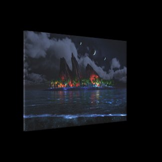
I started work on a night-time adaptation of “Endless Blue”
almost immediately after I posted the last day version. It took
me a few tried before I arrived at something worthy to post
though. My first attempts were far too dark.
I hope I didn’t go overboard with the lights in this one. As
with the day version wanted to take what I had done before and turn it up to
11.
Let me know what you think. I hope to have multiscreens
soon!!


geomercenary [lifer]
I can hear the music being played…
LisaB [basicmember]
I love this pic. My co-worker calls it “Space Luau” 🙂
Dagfari [nonmonthly]
This is a great desktop background, there is just enough interesting stuff around the edges that it still looks nice when it’s obscured by a bunch of windows. But when you’re done working and minimize things, there’s the island – time to party…
Hoverwolf1
The original was and remains one of my favorites, especially the night version. I loved the solitude of the image, undercut slightly by the sight one other soul, close but not too close. It seemed like a great metaphor for life: we are each islands unto ourselves – close enough for comfort, not so close that we resent eachother. Very powerful.
The extra lighting on the beach in the new version just makes it seem more like there’s a yet another party to which I’m not invited, kinda ruining the whole feel of the original. It comes across more like loneliness than solitude. As in, we are all islands unto ourselves, but some islands are more equal than others. The extra moons and the lighting in the water are fine; it’s just that the mood of the original is lost.
James
Wow! I want to paddle out to that island and enjoy that jungle disco right now!
Beautiful image. The water looks stunning. Love the coloured lights.
Karen
the natives are having a BBQ … a very big BBQ
Kerry
Love the final render of this one. Great work!
Billy D
I have to say this is going to be one of my favorite works of yours. The vibrant yet understated use of colors and lighting really make this version impressive. It’s hard to describe why it’s so striking to me, but the coloring is a big part of it. I also generally prefer night time and dark images, especially for my phone and tablet.
Zach
Wow, this one makes me wish that I had a third monitor. I love the dual-screen, but the triple is just awesome!
Excellent work, as usual.
Melchior
I like night time ones because its not overally bright and I can see my desktop icon layout(games, System maintenance, tools, etc) and not a bright strain on my eyes ^_^
thx Ryan ^_^
Ryan
That’s what happens when I do Photoshop before coffee. New triple-screens are up now.
Tatiana
On the left side of the triple screen, there’s a big section where the stars are in front of the clouds instead of behind them. There’s a smaller section that does the same thing with the left part of the big cloud that’s behind the island rocks, but that one’s not as noticeable.
Ryan
Multiscreens now available. Sorry about the wait! Next up, the day version…
Bob
Dual screen perhaps?
Stargazer
One of my faves!
Greg
I absolutely love this render. Honestly it’s my favorite one you’ve done Ryan. The colors are so bright and it just makes me happy.
It’s currently my Windows lock screen at work, and I’ll make it my wallpaper at home as soon as you have a multi-screen render.
Bryan L
Images like this are why I am a lifetime member. This is one that I need to order for my wall. This one makes me want to drop my clothes jump in the water and head for the bangin party.
Bill
I’m actually in the process of watching Lost .. and this makes me think of the show! =D
Ben Bailey
Truly amazing. Dual screen ASAP!
keeblerUT
It is one of those scenes that just make you want to take a deep breath and take it all in to remember it. I am looking forward to the multiscreen versions of this soon!
Russ
Ryan, I have always been fascinated by your work. I have zero ability or understanding and would like to see a behind the scenes of how your images progress. Any chance on a future project you might have a link that shows 5 to 10 shots of how your pictures evolve and come to life? I am sure many of your members would love to see something along these lines. Thanks!!
D
Thank you sir! Can’t wait to start using this on my dual screen workstation.
Ryan
Ha! Actually I am rendering a 7680 x 1600 version right now on Asfaloth. It will probably take a few more days though.
D
Please God, make Ryan render the multi-screens!
violet
this is gorgeous. I love dark scenes, and would like to see the darker versions of this.
Hawk
So beautiful!
Travis
Absolutely stunning image. Makes me happy because I’m about to visit Southeast Asia and a lot of these type islands. All I know is, with the lights around the island, the entire structure and island suddenly seem much smaller than they did previously…cool!
RC Davison
The moons are great! (I love how art is so subjective!!) For me, there is a bit too much light on the island. if they are from campfires, I would expect the spread of the light to be much smaller, or at least less intense. Keep up the great work!
CHSpera
Looking for the dual screen version(s)… this is awesome!
clayton
love it private party island waiting on the dual screen
cmmnoble
Spectacular.
Tyler
I never tire of fantastical, multiple moons/suns. I can hear the water lapping up to the beach, and I find myself wondering what is happening around the sources of light. 10.
Ben
Love it. To me it looks like a wild party night in the tropics!! 😀
Jenanne
Love it, pretty much. I love the three moons, and the clouds. And the blue-tinted water, and the luminous foam on the beach. I love almost everything about this render, in fact. The only thing that bothers me is the source of the lights on the island. I like the colors, particularly the red on the outcroppings, but they seem — hmmm. Artificial? Like the foliage is being lit by an artificial source, I guess. I’d like the colors better if they seemed to be coming from some sort of bioluminescence. Still, it’s a 9 all night long. 🙂
Old Sailor
I like it. It seems to represent the nicer times in the tropics.
Bryan
I want to be there in the party right now. Love the glowing phytoplankton in the water. Not quite sure what to think about the ominous dark cloud though. Something looks like its about to rain on the party. But perhaps it is warm enough that the showers would be welcome relief or a little beach lovin in the rain.
Elaine
I love that you are doing a nighttime version! As other commenters have mentioned, the island looks like there is a massive party going on at the base of the mountains. I like the sky and the bioluminescence in the waves, but there’s something odd about the sand and water on the near shore. The speckling is distracting – the impression is that I’m looking through a pane of glass with raindrops on it.
Victoria
I’m with Rob – looks like an island party! The lights are gorgeous, and the shoreline phosphorescence makes it perfect.
Rob
I like this better than the daytime version. Very cool! I can imagine the party taking place.
Schaff
Just awesome. Color combinations are fantastic.
Deanna
I love the surreal feel to this and all the intense color!! It’s beautiful. There’s a giant island party going on there and I want to be there.
Brandi U.
Love the water, love the sky. But, yeah, too much light on the island. Tone down the lights, especially the red on the rocks.
6
The sky colour is nice but yeah, too many moons and a bit too much bittiness on the shore in the foreground. The lighting on the rock for me is the real issue though. I glanced at it and the first thing I thought of was that someone had strung some lights below the rocks setting up a rock concert with that as a backdrop. Very artificial, which would be fine if you were going for that but I suspect you were going for something more naturally subtle.
Graham
Too many moons, the rock feature has been done to death and the water on the shore looks like it’s floating rather than sweeping over the sand. It’s a nice image but the rock feature needs to be changed to give it a new feel.
Littlemom
Very nice
Maddie
I just love it! All the colors… The sky… The water… Just wow. Well done sir.
Colin
Agree with Graham; too many moons, unless you were going for some kind of celestial alignment feel. Too subtle at night for that though. The light reflections make the rocks look very synthetic. I’m neutral on the water on the shore though, was refreshing for me.
Romarch
The original was quiet, contemplative…and then I noticed the hint of a campfire and it became tantalising…absolutely tantalising, the thought that it might be inhabited, most likely by someone who liked the peace and the solitude just as much as I would. For all these years, every time I’ve looked at it I’ve wanted to swim over and find out who, if anyone, was there, or what was making the glow…
The contrast between that image and this one is the visual equivalent of (a) the soft, faint sound of Gregorian chant slipping out of a partially-open window on a perfect night versus (b) someone driving by my house at 1am blasting rap music from his car stereo. Your other commenters are right; this looks like a huge island party. I wouldn’t go anywhere near it; and I’d probably always wonder what happened to the lone camper and whether s/he felt s/he’d been exiled too.
Romarch
I know I said a lot in my earlier comment about whether I thought this was a suitable remake of the 2005 image. What I ought to have added was that, considered completely apart from that, this piece is drop-dead gorgeous all on its own! I really ought to stick to evaluating each work on its own merits; this is one of the most beautiful I’ve seen all year from you or anybody else.
(Okay, maybe it’s not a party over there but some biological or geological phenomenon… That’s what I love about your work – it gets my imagination going!) :-]
user [nonmonthly]
Usually when you make these gorgeous wallpapers I can’t help but to look for that ‘being’. Not sure if its a man or woman but I enjoy looking for him/her. It’s like find waldo. Please keep putting, I’ll call that being “the keeper’.