


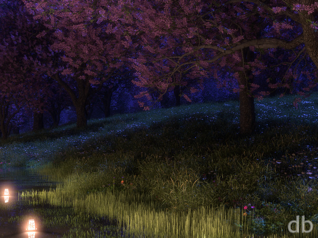
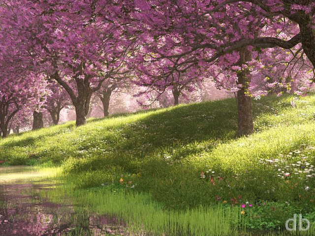
Description
My original “Gotham” was created in 1998 using a single greyscale heightmap. I did an update in 1999. using some simple geometry for the buildings. I did another updated version in 2001 and a second render viewed from an elevated garden.
This latest is my first rendered in Vue d’Esprit.

M. Ryan
Might it be time for a Gotham Garden as seen in winter? Hopefully, you could have the scene taken in both day and night.
colleen
Gotham Garden was one of the two renders that originally got me hooked, after years of nibbling at the free gallery I finally signed up as a memeber so I could get the gotham updates and see the rest of the work I have been missing out on. Love it! Keep up the great work. (I have a different DB wallpaper on each of the computers at work and every one of them gets compliments)
Mieg30
I love this..
Can you make a large, mega Future Metropol/City?? JETSON style!! but not cartoonish ofcourse??
Nice colors, perhaps on another planet, facing other planets
Something incredibly large, you would make when your in Manic Mode !!
Eric
I have the dual screen at work and every time someone new sees it they comment on how they “Really” like it. So I think you should know this must be one of your better one’s. 🙂 Cheers!
S.S
The buildings texture just doesn’t seem right to me :
Pyratooth
Kind of reminds me of a futuristic version of Tokyo this one. Like the soft glow around the blossoms too.
Amadeus
Now posted under the right image!
Very well done, I’ve always enjoyed your updates to older images and this one doesn’t disappoint! Keep it up! Do you find that going back to older work helps you reset your mind for new projects? I have that happen a lot, but then I’m no artist…
nitrium
When I saw this work, I screamed a whoa! I was waiting for such a work for a long time. Yes, I kindly request from all the artists here to create works including human and city. Yes, they are more touchy and beautiful.
nitrium
Such works are my favorites, since they include future, nature and human. Not just like the ones which only include planets, natural events, etc. Former ones not only include a dreamed future but also human peace including not crowded environments. Thank you
llminthorn
I wanted to thank you for the spring version of one of my favorites-Gotham Garden (1999,I think). I have had it on my screensaver for several years after being introduced to your website by my then supervisor, life time member Helen Goudreault-Knapp. She is a terrific lady and that particular wallpaper reminds me of her.
Again thank you for a beautiful rendition of a favorite.
Canskate
I reallllly like this. I just spent 6 days in NYC on vacation and this is a great reminder of what a great time I had.
AltF4
Reminds me of Halo: ODST
Mangoman
If only………IF ONLY!!!!!! all of our cities looked this beautiful, what a joy it would be to live in them. I’ve read so few of what any have shared on the beauty of the work of your art; can you imagine walking along that pathway going home to a very nice apartment somewhere in that crowded menagerie of towers? A comforting thought. A beautiful piece of work, Ryan. Thank You.
Ryan
Right you are. Thanks!!
Benson
Your 1999 update links to the ’98 original; seems this was the intended target: http://digitalblasphemy.com/preview.shtml?i=gotham1999
Ben
Ryan, I love you, man. Lifetime member and all. And I want to love this one *so* much. It’s about as Randian as it can get, and I loved the earlier edition, so it ought to speak directly to me. I just can’t see the perspective you see here, though. No matter how I try to bend my mind, the guy just looks far too big to me. Clearly, it’s how it got stuck in my mind the first time, since others are seeing what you do here, but this one just didn’t work for me at the end of the day. Looking forward to Gotham Garden 2014! 2010 has been a great year already, so not seeing eye to eye with you on one will hardly turn me off. Keep up the amazing work. You’re an inspiration to a lot of creative folks who are still working day jobs!
Walo
I see the multiscreen renders and I get jealous of the guys that can have that setup
Ryan
I have played Ninja Gaiden 2 but I’m pretty sure I wasn’t actively thinking about it when I designed this piece. It’s all in there with the rest though so I guess it’s possible I was subconsciously channeling Ryu Hayabusa.
Michelle
You’ve been hard at work. This looks great. Thanks for everything you do to add a little awesome to our days! 🙂
Chris
Have you ever played Ninja Gaiden 2? I don’t know why but this really reminds me of it.
Badbrainsg
This image is wonderful! While I really like (almost) all of your wallpapers, this one–a departure from your earlier approach–made me gasp when it opened.
NautilusNT
The original is still my favorite on this site, but you can’t knock higher-res renders with multiple screens (even though I don’t have multiple screens) Can’t wait to see a render with green leaves though. And oh, no Christmas in Gotham please, unless it’s hideously dark….
Phillip D
Wow this is excellent image! What a huge upgrade from your previous image! On your multi-screen wallpapers, the buildings still distorted along the sides…I have never done panoramic images but once, but I thought Vue solved this issue on the sides on this new version 8?
I have been studying Carrara, the rendering engine is great but the learning and the software is way different than Vue or Worldbuilder and I dont know if I like it.I was kinda dissappointed that I bought it…but it was on sale 50 per cent off at the time I purchased it so I thought I give it a try. Maybe I am not patient enough…
As you have excelled in making landscapes, I thought I have a suggestion you ought to try Terragon 2 with Xfrog plants for your wallpapers (I have never tried Terragen but have seen some good results) Xfrog plants are great to me and can be modified by their software.
Anyways, back to the feedback on this image…. I really like the lighting on this image,the lighting has a very soft glare and feel to it… and the building lights look so realistic, that I doubt any other Vue users can come up with this!
MB
The center screen on a three screen is absolutely awesome. The side screens are distorted with building leaning at crazy angles. Maybe they need to be designed leaning the other way to compensate for what happens in rendering?
JK
Rears it’s ugly head again! Bummer.
Patrick
been waiting for a new Gotham, and I love it! Ryan, you never cease to amaze me 🙂
Richard
Hmm, I’m only pointing out the most obvious here, but the multiscreen versions are suffering from some pretty severe stretching…
But I’ve managed to piece together a workable dual-screen image from the triple screen image, so I’m not too fussed.
Great job though Ryan!
Lidia
A city scene! Yay! It’s been forever since you’ve done city scenes! Many of your city scenes were some of my favorites back in the day. You should do city scenes more often. For this one in particular, I’m not crazy about the bright lights on the water and on the trees, but everything else is great.
Ryan
I’m definitely not going to sweat one sample left on a screen “Johnny Appleseed” style. Thanks Greg.My “See All” page isn’t strictly chronological. It looks at year first, then categories within the year. The day scenes are listed first.
Greg
@Bill – Don’w worry about it, it doesn’t matter. If Ryan has a problem, he’ll tell you, he’s cool and diplomatic (referring to the whole Haiku thing) Great idea for advertising!
@Alberich – I emailed Ryan just to tell him (even though he will probably read these comments) of the messed layout, so it should be sorted soon (like the other 2 things I told him about… I feel bad for pointing out mistakes 🙁 )
JS
I enjoyed your first Gotham renders and I’m liking this updated version even more. Great work!
Bill
I’m not sure what difference it would make whether it was high res or not since if they want more then just the sample I gave them they still have to go to the site and pay for it. And I don’t think Ryan is worried to much about the free advertisment. Ryan’s art is everywhere. Besides, this is how I became aware of Digital Blasphemy all those years ago. I saw one of his renderings on a public screen at work.
Miguell026
Awesome Ryan…. Just Awesome!!!
Batman will sure love the new city’s garden to fly around ^^
Alberich
It is on the See All page, to the right of Highland Spring. I’m not sure why it’s not on the far left where the newest one usually is, but I’ve noticed that images get out of order occasionally before this.
Thomas
Ryan,
I love every wallpaper you got. But I love love love the city scenes. It seems as if you have been sticking with nature themes in recent years. I would love it if you could do some updates on the old city pics or even some new ones.
Keep up the phenomenal work!
Tadzmatrix
How about a Daytime Version of Gotham Garden
Bill
The Gotham series has never been a favorite of mine but this is a nice update. I have it on my laptop now and have gotten several compliments. Hope you are still healing nicely Ryan. I’m holding you to your lifetime membership responsibilities. And expect many many more renderings. As always I leave one of your wallpapers on every computor I get my hands on. I hope all your other members do the same. I’ve been doing this for years and have yet to get a single complaint. Because You’RE THE MAN.
Greg
@Bill: I hope they’re not the full res ones that aren’t in the free gallery… lol
anyway… Ryan, I’m still wondering why this one isn’t on the page with all the wallpapers (http://digitalblasphemy.com/seeall.shtml)
oh and I really cant wait for some multiscreens!!
Scott
except bruce wayne. I’ve never really liked the people in any of the images for some reason.
Ken
Gotham Garden was alway my favorite. Glad it’s gotten a re-boot. Can’t wait for the dualscreen versions!
Tim
Love this one Ryan. Your original Gotham Garden has always been on my desktop. I think the scale is perfect. Would enjoy seeing seasonal versions.
Greg
you know what? i just looked at it a third time now and the buildings are just fine! so ignore my last comment
Rick
I love it! Gotham Gardens has been my favorite work of yours, and although I would never have imagined it could be improved, you have. I WANT THIS ON PRINT! As big as possible. In Zazzle terms, collossal is not too large.
I mean it. I was looking for something to fill 4-6′ of my wall in my living room, and this has to be it.
Silvaria
I’m a huge fan of the purple/green combination, so I absolutely love this. 8D
Morgan
That’s a nice one. However I notice the “classic” Vue-issue with the trees. The branches/leaves are very flat.
Anyway, good work! 🙂
Brian
The Gotham series was always a favorite. You always remember your “frist”. City at Night II was my introduction to Digtial Blasphemy. I think this is a very good, very modern update on another of the series.
Please allow me to vote (again) for a Dome of Blue Seeress update. At least a resolution update.
Chris
It almost feels like a totally new piece that you just came up with from scratch. Excellent job on the city, it looks like a truly massive city. Very detailed and the park gives a bit of tranquility to tough looking city in the background.
Samuel
The buildings aren’t too close, there’s obviously some kind of gap (perhaps the river in the other Gotham renders) that separates where the man stands and the base of the buildings.
Keep up the good work.
Greg
I love it, but I have to agree with some posts. I must have been one of the first to see it (i have the second comment) so i wasnt sure if it’s just me… so i kept my mouth shut…
but now I have to agree, the close buildings are too close. You can see that it’s out of proportion because of the tiny lights in the windows of the buildings. just make the buildings vary far away.
or what would be much easier: scale the man and the trees down. then if you want, maybe add more foliage to the trees so that it still looks epic.
awesome lighting though wow!
a.a.
This wallpaper looks incredible on my desktop – no surprise there. I really can’t thank you enough for your marvelous work. “A thing of beauty is a joy forever.” â Am also hoping that your most recent surgery is the last of them, and am glad to hear things look good so far.
Max
I keep trying to find something out of place. Every light is perfect, the textures are insane, the scale is flawless, and even the foliage (which I normally find to be the part that stands out as unrealistic) stands out beautifully.
DUAL SCREEN PLEASE!
David
This is awesome, please crank out the multi display versions!!
The Guru
Although you can see the similarities between this and the older version, you can also see how much technology has leapt forward/you’ve become more practiced. This picture is amazing. I was a little concerned about the man looking too big but once I saw a larger version of the picture he looked more in place. Excellent work.
Mithun
I am speechless looking the art. I have been following your art from 2003 and during early 2009 i decided that i have to get a life time membership “No matter what the cost was”; your work is priceless!!. Ryan, Thank you for making each day a better day…. your work makes me happy!!
SheaRae
I have been waiting for this wall. I find this so pleasing to look at on my new laptop. Love it!! Any ideas for a daytime scene?
TM
I really enjoy the Gotham Wallpapers and they are the reason I signed up 8 years ago. I would like to see a lot more of them. Something I do miss from the older ones are the various colored neon lights on the buildings. Still worth a 10 as is!
Mark J.
I like it. Good mix of colors.
And I join you in your hope that your long nightmare of surgeries is finally over.
GMaster7
This is great, Ryan! I too would love to see a version with green trees… though I do like it as-is. I’m first and foremost a huge fan of your abstracts, and I do also enjoy your space themes, but I have to say that this latest wallpaper looks great and makes me want to see more cityscape work in the future! The nature wallpapers are always beautiful, but I’m personally a bigger fan of the edgy, more futuristic stuff. Keep up the good work!
Kenneth
You could probably make a Christmas/Winter version of this later in the year….
Andrew
The original Gotham Garden was one of my all time favorite wallpapers from your collection. I’m SO glad you revisited it and are considering more seasonal renders. Keep up the good work.
Samuel
Gotham Garden has been my favorite for a while and this is SO SICK.
BTW, it reminds me a bit of the game BIOSHOCK.
You should totally do some underwater city renders!
Mark
Guys, this doesn’t have to be realistic, it’s a piece of art⦠Ryan is meant to be doing just that with artistic vision, not making an exact replica of what a city might and should look like.
I like it, by the way. I think a few other versions of this would be great.
Mark
Guys, this doesn’t have to be realistic, it’s a piece of art⦠Ryan is meant to be doing just that with artistic vision, not making an exact replica of what a city might and should look like.
I like it, by the way. I think a few other versions of this would be great.
Psyclone
Well, I’m assuming you’re going to be revising this one, so I’m going to toss in my 2 cents…. I love it, but the buildings all look like they’re the same material. I’m assuming these are just image maps? Couldn’t you make them different materials? With real cities, most buildings are constructed out of different stuff, ya know?
Overall, though good work. I love the remake, and I’ll throw in my vote for more cityscapes!
hstar
Thanks so much for this! I wish you would do more cityscapes. (Hint hint. 🙂 Maybe even a daytime or sunset version of this one?
Natalie
The 2001 version of Gotham Garden was on a co-worker’s desktop and was the piece that originally drew me to your website. Love the update.
Nicola
This is amazing, it really draws you in. Great work Ryan.
I hope this will have a nice dual-screen so I can show it off at work!
Michael
Your city renditions just get better and better; each new one brings a deeper depth of dimension and realism.
BIBLEfreak
I love it! Any chance on dual screens.
sigmaman
Sweeeeeeeeeeeeeeeeeet!!!!
Zach Voss
It looks great but it seems a little pixelated. Did you render it at Ultra quality?
Overdrive
I’m a little puzzled by this one.
The perspective of the buildings directly on the right of the central figure seems to indicate he’s standing much higher than ground floor. That would require a fence. Maybe that would also strengthen the impression the building he’s looking at is further away than it now appears to be.
Second, the skyscraper right above the figure has much larger (black) windows (or it looks that way) than the scraper directly on the left. I.m.h.o. this causes a distorted perspective, because both buildings seem to have been build almost against each other (but maybe the black squares are not windows?).
Overall the buildings in front have almost equal small windows than buildings in the back. Some of these higher buildings in the distance even have much brighter lighting. Of course that may be just the case in gotham city, but the result is a less realistic sense of depth.
But considering the enormous difficulty creating these kind of cityscenes I still consider gotham garden (spring) a succesful work of art.
8*
Brian
I’ve always loved the original wallpaper. Having a fresh look makes it just that much better. Great job!
Mike
If you look very closely, you can see that the guy is much more in the foreground than it appears at first. At first glance, it looks like the shortest building to his right is smaller than he is! But it’s not – he’s actually much closer to the camera than it seems. Not sure it needs fixing, but it is a bit odd looking at first…
Great overall though! Now to remake Galleon. 😀
Andy
I nice change from the landscape wallpapers. Nice Job!
Dan
I always loved the original from 2001, and I’m glad to see an update! This one is surely a slam dunk Ryan! Love the buildings and foreground walkways with lights and water are awesome!
Alan
That is an excellent update! And glad to hear the surgery went well.
Ice
I have been waiting for some new “City” scenes. I like this one….now just do a remake of Estuary with wide screens 🙂
Randy
Figure does look like a statue, compared to windows on building to the right.
Ryan
Actually the guy is in proper scale with the trees and all of the buildings. Perhaps the nearest buildings do not look far enough away.
RCD
Great job! Hope you’re back on your feet very soon.
Lawrence
The last two backgrounds have been superb. Keep up the good work. I a partial to pictures that have meaning and speak to me.
Marco Viti
Really Fantastic, wallpaper…Get well Rayan!
Ben
I love this one, but absolutely agree that the dude should be a lot smaller. Looking at the little tan building nearest him on his right with the big glass block windows, it looks like it’s the size of a garbage dumpster in comparison to him, not a building.
JEB
This is by far one of the best you’ve ever done. I hope you make this a poster, I’d love to hang this one in my office as well. Thanks so much for your amazing work!
Dave
I’m waiting for a revamp of Singularity! Planetscapes/Space are some of my favorite wallpapers of yours, and what better than a Black Hole?
David W
I personlly think the shadow of the guy should be either not there at all or half the size that he is here. it makes the surrounding structures much smaller than they should be. just a personal suggestion.
other than that, its a master piece
theres one other thing Id change if I were you… Id take out the blue fog at the top of the picture. either that or not as much as there is. just a personal opinion. I dont feel as stronly about the fog as I do the shadow of the guy.
Walo
Now this took me as a surprise(in a good way). I never thought you were doing a building scenery again. Looks impresive.
Dana
My new favorite!
Geep
I just discovered the original Gotham Garden a few days ago and now to see an update this awesome is great! This is going on my screen right now. 🙂
Dan
That’s a stunner of a remake. I remember this being one of the first one’s my Dad used for his new computer back in 2001.
James
Looks great. I can’t wait to see the dual screen version.
becky
nice remake! this one is finally gonna replace cloverscape 🙂
Greg
Awesome cityscape… must have taken a while to render!
ray
love the revised version, and the Bruce Wayne touch (if that’s what you intended)!
Wraith
It’s so pretty and 2010-ized!
Dennis
I’ve been a member for a while and i’ve always loved your original Gotham Garden. I’ve been quietly hoping that you’d revisit it again and now you have! I think it’s awesome, an instant favorite. I think it’s great you’re exploring the season aspect with it, and can’t wait to see how the other seasons turn out!!
Manhawke
I’ve always been a fan of night scenes. This city is very well done and I wish such a place existed. If we can dream it, maybe one day such things can come to pass. I feel like Starfleet Academy should be on the other side of this town.