


Description
Getting more comfortable with Vue 9.5’s new cloud controls. They really do allow you to place clouds wherever you like. Very powerful! The previous versions had one character standing on the rocks overlooking the valley, but a number of folks seemed to see two. In the end I thought it would be a good idea to actually have two people together. In this case they are the sorcerer and “assassin” that I used for my “Arcana” scene. So does this scene happen before or after the events in “Arcana”? You tell me…
 Heliocentric: heliocentric1
 Heliocentric: heliocentric2
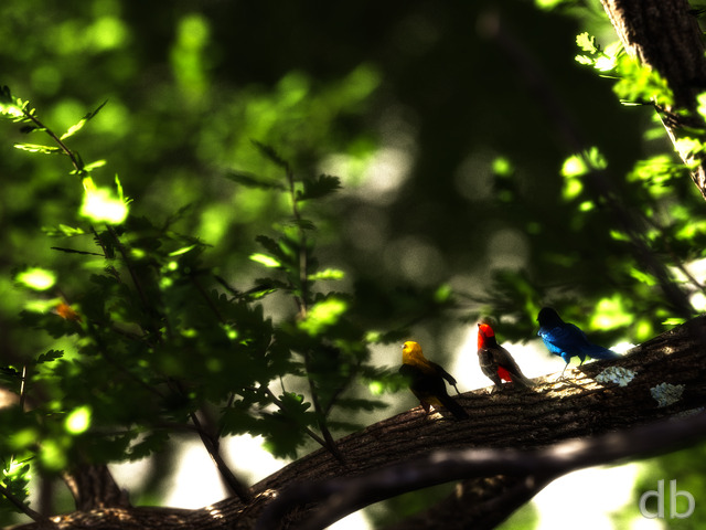
Eirik
I just realized that the (single-screen) version 3 of Heliocentric is absolutely stunning. Wow.
Love that contrast with the night sky in the corner that gets cropped out when it spans 2 monitors. Simply breathtaking!
Gilvan
wonderfull work!
Shay
To see how much Ryans talent, and how far along software and technology have come compared to a decade ago.
http://digitalblasphemy.com/preview.shtml?i=harbor
Wanderer
I dont know why exactly, but this rendering reminds me of Game of Thrones more so than LOTR,Return of the King…
Karl
the 640 x 480 image is missing, the size for my phone. Could you add a link to it?
Agni451
I realize the files would probably be 15MB each, but I would really like to have the lossless PNG versions for multiscreen (3).
Sebastian
Are you planning on adding a humanless version? I have a tendency of liking those without human life more than those with…
Cole
Thx for adding the storm rez!
Anna
Nearly every post takes my breath away and this is no exception! You do such amazing work. I would also like to see it in a night version too.
Ryan
The 2560 x 1440 (16:9) PNG collection is going up today. Most of 2011 should be available as I post this. I’ve marked the links as “Lossless” in the download table.
Ryan
I started a night version of “Heliocentric” rendering last evening. The clouds in this version are quite a bit less opaque and that will most likely increase the render time a bit.@Logan: Quite a lot of people are using 16:9 so I hope to have the 1440p PNGs up shortly!
Daniel B
Thanks. The other thing that might work well is to add a voting system of some sort where people could request specific images and/or resolutions for PNG copies. That way maybe you can see what images people want to get the higher quality and it’d also allow you phase those changes in over time to dampen the sudden increase of storage and bandwidth some.
For example, right now I have about 20 images of yours on rotation for my wallpaper, pretty much all 5760×1200. I’d rather get PNG’s of those 20 than the entire single monitor galley in PNG.
The same idea could also apply to higher res renders of your older work or maybe even ones that might be “due” for a re-make (Children of the Night on either count for me).
horcruxhp
Thank you! Thank You! You have no idea how long I have been waiting for the dual screen version. It’s going straight to my desktop!
Ryan
Good idea. I’ve added a comments field to the renewal form where you can let me know what you would like to see more of. The only downside is that it only works when you use a credit card. I already use all of the pass-through variables available with PayPal and Amazon.I would love to add more PNGs but, as you know, they are very large!
Daniel B
Ryan,
Please consider adding an option to the renew/pay it forward order pages to specify why people are doing so.
Since you mentioned there may be a relationship between the PNG, bandwidth usage, and memberships’s, letting people specify why they are renewing or gifting a membership may give you insight into what those people are looking/hoping for. The amount of donations that went into your new workstation obviously shows that people are willing to put down extra money to help your art. So giving those people who want to push more money your way a voice (or at least a better data point) may help encourage that.
I’m paid up for another 18 months, and would definitely tack on another couple years right now and/or do a couple of pay-it-forward memberships if I knew I could get triple widescreen (5760×1200) PNG’s of your work going forward and over time the existing gallery.
Luke
I miss the stars (and godzilla), but nonetheless, this is cool enough to be promoted to my wallpaper for a while. I like the full-on sunshine as well – makes quite a change from your usual style of landscape, plus, its not so bright that my monitors blind me.
Ian
I concur with bruceam, and would like to add that a daytime version would probably look pretty great, too, or any other type of alternate version, really. It would be hard to go wrong with this image as the starting point, and I look forward to whatever you cook up.
bruceam
Ryan,
I have no idea how a night version of Heliocentric would look, but I would love to see it. I believe Heliocentric would be a very good candidate for a Four Seasons version as well. The clouds shifting in type, density, and altitude as the seasons would be gorgeous. And the color combinations associated with each of the four seasons could be done with this vista, as it covers so much area. In this way, the summer and and the spring could look entirely different, and completely avoid the problem you encountered with Highland Mountain scene in the autumn.
This is a great image, and has become one of my favorites, Especially the widescreen multiple monitor shots.
Keep up the great work!
Matt
This, with the dual screen, is absolutely unbelievable! I love the tilt of the — haha, I was about to say “photo” because it’s so realistic! — image, and it’s truly awe-inspiring. Thanks for the amazing artwork! 🙂
jlpilkin
I’m liking this wallpaper more and more every day. Great job! Especially with the triple screen.
Robert_R
Beautiful! It look like “The Lord of the Rings” with the 2 little Hobbits, Frodon Sacquet and his friend going to Sauron’s contry 😉
Yes I’ve a lot of imagination 😉
Andrew
This looks fantastic! Small nitpick: the Digital Blasphemy watermark is out of place on the 5120 x 1600 version.
rdefores
Looking at the 7680×1600 render on my single 1920×1200 monitor makes me want to buy three 2560×1600 monitors and another video card. *sigh*
Cole
no 360×480 anymore?
Ryan
Just uploaded. Why do I always forget that one?
john
Forgot the dual screen 3360×1050 again, lol.
Ryan
Let’s try it with a new line for now.
Brandi U.
I do think a separate line for the PNG files would be good. It’s a little confusing that the “(PNG)” is actually a separate link. Or, at least make the PNG underlined.
Jason
Oh man, I never noticed the assassin in Arcana before! lol
chris hoga
Any chance you could make a moble version at 768×1024?
Ryan
Which device are you using Chris?
GMaster7
Ryan, I love this newest version. The two figures and the scope of the shot that they help provide (from the cliff and the trees up to the starry sky!) are wonderful.
Greg
Ah I see now 🙂 thanks
I new line would help I think 🙂
Thunderbol
oh I am a hardcore visualphile 😉
Ryan
As much as I appreciate that lossless quality of the PNGs, I have to admit that my JPGs are all compressed at a very high quality setting (over 97% in most cases). You are not likely to see any JPG artifacts in the hi-res files. The PNGs are provided for the hardcore visualphiles.
Thunderbol
I guess N°3 looks best so far 😉
Thunderbol
would be nice to have ALL your pics as .pngs
(I know, a hell lot of work, but in the end its about quality, isnt it?)
Ryan
Click where it says “PNG” to load the PNG file Greg, otherwise you will get a JPG. Perhaps I should add another distinct line for the PNG files…
Miguell026
THANKS Ryan!
i was awaiting these PNG files for ages! thank you!
now the quality of my 2560×1600 files will increase!
Awesome work!
Keep it up! this is Quality!
can’t wait for your next scenario!
Peace to all
Nelson
I like your idea of offering the highest resolution also as PNG. Sometimes I have taken the 2560×1600 and cut an area out of it for my desktop use (1080p), when I want to see an area more detailed or when I don’t like a certain element in the picture. A PNG is perfect for such things.
And btw, Heliocentric really rocks 😉
Paul M.
I can imagine myself on that precipice, looking out onto that vista. Absolutely beautiful! I can hardly wait for the next image.
Phillip D
Amazing atmosphere…I bet those clouds took a long time to render, lately on my artwork when I have godrays, or dense grasses, etc…I render only in size of 1024 pixels by 768 due to rendering times takes a long time, lol….and this image you have here is quite amazing..excellent atmosphere!!! Guess what is on my desktop now 🙂 your new post of this image.
Cougz
Totally orgasmic Ryan…
Greg
your ‘PNG’ image isn’t even a png at all 😛 it’s a jpg.
PNG is just an extension like .exe or .dll – its simply a method of data storage and compression. a completely unnecessary change to the site, just upload 100% jpgs (no compression)
Ryan
Thanks guys! I’ve got the multiscreen all cued up and ready to render. Once I hit F9 I imagine it will take at least 20 hours (and hopefully look acceptable when it’s complete).
Shay
Lets get some bigger renders going! Can’t wait!
Zach
This piece is beautiful, Ryan! I can’t wait for the duals of it. 🙂
OMeyers
I liked the first render. Man I LOVE the third. Keep on keepin’ on
Tony
I got to say Ryan this one is an impressive feat of work, feels like I’m seeing the visual with my own two eyes.
byteful
ABSOLUTLY BEAUTIFUL!!!!!!!!!!
Can’t say anything more that would do it justice!
erielack
V3 is great. Each one just kept getting better. Cannot wait to see other new landscapes.
Fumigator
I get it now… different link for the PNG. (Sometimes I really miss old-school underlined links because you can tell it’s a link without hovering)
Fumigator
The PNG version appears to be a JPG.
dmackoy
I love the changes to the cliff and the valley additions. It really makes the whole thing feel much more open and a feeling of greater depth.
I did however like the softer lighting that you had in the prior version, felt a little calmer… like an easy morning.
Either way the new one has made my background. Thanks for putting all the effort you do into each one of these.
Alex H
Constructive criticism: some of the mountains look a little plastic. But otherwise the new rock, the lighting, the clouds, the new character, the everything else is perfect. Would rate it 9 if I could vote again (10 being reserved for personal favourites such as the grid and overseer.)
Logan
I’ve been holding out but I think v3 is going on my desktop now. Can’t wait for the PNG files in a 16×9 resolution.
@Braden, I think Ryan has the selling prints thing covered pretty well with Zazzle.
Richard
Version 3 is so good it has replaced “Dispersion” as my phone wallpaper! 🙂 Good job!
Steve
All 3 images are fantastic, but it is nice to see what you mean when you say art is never truly finished, only abandoned 🙂
Brandi U.
I’ve liked all 3 a lot. V3 seems the perfect blend of the strong points in V1 & 2.
Braden
Have you considered moving your hosting to a different site, at least for the images? For example, Smugmug has a flat yearly fee with unlimited bandwidth and storage. I would think this would suit you very well and could possibly save you money. They also allow you to sell prints of the files, and with a “pro” account you can even sell stuff at a markup for profit.
Lidia
Definitely the better version of the three. I really like that you shed some more light on the big rock in the foreground. I like the caped people on the rock, too.
Chris B
Still missing one character aren’t we? 😉
The way the light is hitting things is awesome, especially the rocks and clouds, and Godzilla is missing lol, but it is fun to see clouds look like different things even in the digital world. The only non-consequential nitpicky thing I can come up with is you can’t really see the crystal on the magi’s staff anymore… Still love it & it’s the best version so far. 🙂
PNG, I don’t know, it’s really only in the 2560×1600 resolution, I don’t know if it would be worth your time for the small number of people that would pay extra for it compared to a non-PNG. I mean we will always go for the best resolution for our monitors but I don’t know if people would pay more for it. If it makes more people sign up that’s awesome :). Would it make that much of a bandwidth difference? I’m not sure what the average difference between .jpg & .png is with your images.
bruceam
Outstanding!!! I really like this image! Version three is the best of the group. I am anxiously awaiting the dual and triple screen versions of this image.
Keep up the Fantastic Work.
David
Honestly I think it would be silly to charge extra for PNG, these images are only downloaded periodically by subscribers (I wouldn’t give non-subscribers PNGs), and the price of bandwidth is always decreasing (S3/EC2 is currently charging $0.12/GB, or less if you send >10TB). It seems to me this should be a nice value-added feature for being a subscriber.
Benson
V3 is great — I like the new rock. Were there two people all along, just closer together, or is the shortie a new arrival?
Benson
I have a lifetime membership already; I would be happy to pay extra for PNG access.
@Daniel B
Lossless compression is always much bigger than a suitable lossy algorithm, while the differences in efficiency between (modern) lossless algorithms are small by comparison. There are several lossless JPEG standards (Lossless JPEG, JPEG2000, and JPEG-LS — I’m not sure exactly how they compare vs. PNG for coding efficiency), but none of them are nearly as widely supported as PNG, so I think the compatibility benefit of PNG is worth whatever small size penalty there might be.
rdeforest
The changes to the foreground addressed my previous concern perfectly. I agree with +Benke about the cape, but much less distracting than the apparent pitch difference was. Here’s hoping the barrel distortion is mild in the multi-screen…
Daniel B
Just a thought, but perhaps having a second pricing tier for people who want access to the lossless formats? Cost-wise the only difference for you would be storage and bandwidth costs so a few bucks more / year should cover it. As long as the content itself is the same (same images, resolution, etc.) is the same I don’t think people would have much of a problem with a seperate tier.
Also, I was under the impression that jpeg was better at photos and photo-realistic stuff. Isn’t there a lossless jpg format that would be more efficient than png?
Gregor
I have to agree with FlareHeart and Ryan, this third render is the best so far! Do I smell a night version coming up? 😀
FlareHeart
Definitely the best render of the 3, I love the shadows on the clouds in this one.
PNG files are something I’d definitely prefer. They end up looking sharper overall. I have a Lifetime membership, but if I was on a subscription model, I would definitely renew again with those as an option.
Labanimal
don’t see much of a difference in quality between the PNG and the JPG, perhaps a bit in the shading of the mountain… but not that much different… but other than that, V3 is the best as a Final! Very good! 😉 Looking forward to the Triple!. Love the Angle just the way it is! I think that’s one of the aspects I love of this design!
Looking forward on your updates on Enshrouded & Moonlit Citadel especially! They are LONG overdue for Triple monitor!!!!!!
Ryan
Version 3 is definitely the best. Love the new foreground rocks, the multiple characters, and how the light seems more uniformly spread. Beautiful!
Please start the multiscreen ASAP!
Benke
Very nice colors and a good step back to the first version’s lock but improved! 🙂 I like the stars occupy a greater deal of the sky. Earlier it was too small creating a little disturbance to the image. The only thing I feel could be improved is the large cape. It looks a little bit unrealistic to the rest of the world.
JoeC
I think that the new version is really beautiful, but it physically makes me dizzy. Can we please have a flat one in the pickle jar? Please?
Scot
is there a way to make the clouds more wispy? like a longer exposure look?
Ryan
I’ve posted a new (final?) version of “Heliocentric” in the Members Gallery today. I’ve changed up the foreground quite a bit, added some more trees in the valley, and brought back the sunlight on the near mountain peak.You may also notice that the 2560 x 1600 file now has a PNG version. This is a lossless file that looks exactly like my original uncompressed render. Basically it is the “purest” image possible.I’ve added PNG versions for my newer images and will be adding more (and more resolutions) over time. You can download them all here.The main deciding factor in adding more will be how they impact my bandwidth budget per month vs how many more people sign-up/renew with them as an option.Let me know your thoughts on new render. I am eager to get started with the multiscreen version…
Skrit
I’m so excited for the tri-screen of this!
MJPollard
Night version title: “Lunacentric”? Just a thought…
Firefly
I love the angle on this. Makes me feel like i’m looking through a birds eye.
Can’t wait for your dual screen.
Tyson
night version maybe?
Kromak
I really liked the first post of Heliocentric but this one is even better. Everything seems a little clearer to see in the new rendering. Really stunning piece, this will probably be up on my desktop for a long while.
Ryan
I can see doing a night version, though the title wouldn’t make a lot of sense.
Ryan
The final version will have more sunlight on the mountain and improved rocks in the foreground. Hope to have it up before the weekend! I’m also rendering a new abstract on the side…
Garry
Personally, I like the less smoothed out clouds of the original version. I also like the greater visibility of the background mountains of the original version vs. hiding them in the clouds. I do like the simplification of the large foreground rock (removing the vegetation) and the brightening of the stars in the updated version. Both versions are stunning, but that’s my feedback.
Dan
I don’t feel this is Cheerful, but its certainly not gloomy either. It makes me think of a grand adventure. With all that landscape below, basked in golden sunlight just waiting to be explored.
Dark logic
Ryan; why is the sun and cloud base tilted. Giving its me vertigo; can you please please please make the world flat.
David M
This is great Ryan. Kinda reminds me of LOTR: The Two Towers when the beacons are lit from the mountaintops signaling solidarity with Rohan. Just my opinion! Anyhow – great job.
FlareHeart
Maybe it’s all of the X-Men that I have been watching infiltrating my perceptions, but the dude on the cliff looks like Magneto.
Thanks for the wonderful update!
Ryan
Thanks for the kind words! Funny you should mention Codex Alera because I’ve had a copy of “Furies of Calderon” mocking me from “unread” pile (sitting next to “Curse of Chalion” by Bujold, “The Judging Eye” by Bakker, and “The Other Lands” by Durham. I will be sorely needing something new to read after I finish reading “Dance with Dragons”. I’ve heard so many good things about Jim Butcher I may finally dive in.
Seeker
Cheerful isn’t the word that comes my mind when I see this. Majestic is, I’m sure who the guy standing on the bluff overlooking the land is, but I imagine a great lord of the land surveying the place that he has pledged to protect. Reminds of soemthing out of the Codex Alera series. Awesome scene regardless.
Tyler
I would say cheerful by comparison to Dødenfel. Everything is relative. I actually feel peaceful looking at this.
Ryan
Maybe cheerful isn’t the right word. “Brighter”?
David V
I’ve been reading the comments about the perception with mixed thoughts. At first look, it gave me a weird sense of vertigo but it seemed in an odd way correct. Sitting bored at work, I leaned my head on my hand with my head cocked to the left and the perception instantly changed. The angle becomes more natural and a certain depth seems to pop out. I say a “flattened” angle would ruin the entire feel of the picture.
jens
this is really good, but it is not cheerful IMHO.
Looks more like dooms day… 😉
markm
yeah, i have to agree too. better clouds but worse mountains/lighting.
It seems to me like mountains in the distance have gotten larger and are blocking out the sky more. Also, perhaps the clouds are lower.
i think i’ll stick with the first one for now
bruceam
Wow, Very, Very Nice. This one would be wonderful spread over several screens. Once again, Great Job.
RoninStorm
Now this feels like the closing scene to a truly epic film where those two on the rock saved the world from destruction. Love it. 🙂
Case
I’ve gotta agree with Kana. Mountain lighting was better on the first render, And I’d still like to see a little bit more stars. So far I’m diggin the other little changes on the new render, good work yo!
Kana
Ok – clouds, definitely better in the second one. Mountain lighting, though? DEFINITELY the first one is better for that. Combine the two and you’ve got a massive winner for me, although I still really like the scene you’ve created.
I also would like to see the person taken out, too, but that’s just me.
Jamison
I thought that too.
Aelver
Is that the volcano from Dødenfell (side view) I spy off to the left?
Ryan
I almost called it “Elevado 2011”.
Mjodvitnir
This is awesome, it’s already on my background and surely has the potential to become one of my favorites.
Wraith
Elevado from 2002. Love the lighting and how the sky contrasts with itself. Love it. 🙂
JD
I love the mix of yellow / orange / white sunlight
horcruxhp
This is another great wallpaper from DB. I can hardly wait for the dual monitor version!
Chris
Looks like the cloud cover has increased and the overall height of the land to the left of the sun has moved up. I like it so far.
Losing the detail on the background mountains on the left is a bit of a shame. I would think splitting the difference on that would be a nice touch.
Dan
This picture is just great, I love the view.
(Off topic) I know you’ve touched on the desert landscape in some of your renders, but it would be really cool to see a real desert scene. You know, with the cactus and cracked land, tumbleweeds and dust, maybe something cool going on in the sky.
Patrick
A ten from me. I like the feel of this. Bright, adventurous and imaginative.
Now how can I wake up to a view like this?
Travis
Ryan,
I prefer the original lighting, too. While things are more “calm” now, the image almost feels too subdued. However, still amazing colors and I love the perspective. Art is so tough!
Ryan
I prefer the original lighting on the mountains too. I haven’t figured out what changed in the newer version (except for clouds in different places). Such is the danger of posting first drafts I guess…
Thunderbol
hm I prefer the first version a bit more, because I dont like that theres now more shadow on the mountains in the left and middle of the background and also that the right and right bottom corner is now darker because of that
Jeff K
WOW. Amazing what a few little tweaks can do. Im one of those that loves this perspective. Great work!
Ryan
I’ve posted a new version of Heliocentric this morning. The clouds are smoothed out a bit as are the rocks in the foreground. There are a few other little tweaks that I will leave for you to discover. Getting closer!
Benke
Wow! This is definately the best one you’ve made this year since Dolmen! 😀 I love the view, the cloads and the colors! My membership went out yesterday and it is definately worth renewing it! 😉
Amaryllis
Lightbulb…I get what people mean by ‘flat’ persepctive: the horizon line parallel to the bottom of the frame. I like it the way it is, however, because lifting your eyes up and to the right gives a a sense of hope and positivity.
Scott
Them: “oh wow, where was that picture taken?!”
Me: “umm, actually it’s this artist on the internet…”
Them: /boggle
+1 to ya Ryan.
Kana
I didn’t even notice the guy, he blends in with the rock. He looked like a piece of outcropping or a really dark tree lol. Either lighten him up a little to make him more visible, or take him out?
Besides that, I love the angle of this one. Great work, as always!
Rusty
what is that dark area on the right side? is that something sticking up through the clouds?
Ryan
I haven’t started the multiscreen yet (still finalizing scene) but I’m pretty sure it will be less canted than the single-screen. Not flat though…
Jack
I actually like the tilting. I’m not sure how that will work for a duel screen tho which I am very much hoping for!
Ryan
Glad you noticed! He is a recurring character 😉
Matty
Ryan, this character seems to be alot like the one from Arcana, especially with the tiny red glowing crystal. Is this a recurring character, or simply unintentional?
Littlemom
This is exactly why I am a DB member. I always love your landscape type wallpapers they are always my favorites. Can’t wait to see the finished product. As always great job Ryan!!!
anna_writr
Okay, there are TWO posers, and definitely a little more definition needed in them. 😀
anna_writr
I’d love to see the poser with a little more definition on his cloak so he doesn’t just fade into the rock.
Also maybe a level version? It’s artsy but I find my head tilting.
Love the clouds!
Matt
I personally love this render, and you use the third’s rule very well here, no matter the perspective. It’s like a flyover of a scene, and we are heading toward the sun. Can’t wait for a dual-screen version for at work!! 🙂
Paul
Awesome image but I keep tilting my head to the left… I would prefer it to be flat rather than at an angle. 🙂
Brian
i went to the link now and got the correct size. The size I got initially on 3 occasions, was a the length of a multiscreen but the height was like 600 pixels. Weird. Anyway, all is good and downloaded.
Ryan
Thanks for the feedback! I checked the 1920 x 1080 file and it seemed to be correct on my end. What size are you seeing?
Brian
It is breathtaking and the colours are awesome. Just one thing, though. I think the link for the HD 1920 x 1080 is wrong as the pic does not look the right size….
Amaryllis
It’s breath-taking. Will become another favorite when final version posted I think. Don’t really understand the calls for a ‘flat’ perspective, however. I don’t know what that means. But for me, by the time my eye reaches the right top corner of the image my imagination is already in freefall – it’s what I love about DB.
I see two figures in this image, actually, and not just a ‘sorcerer’ type. There seems to be a light-haired woman, too.
Alex H
Replace the sorcerer dude with two people (Parent(s) and child(ren) or even a simple couple) embracing and watching the sunrise. You could give them roughed up/ragged clothes to hint at some dangerous journey they’re undertaking together.
The human touch is simple, but is such a good way to inject meaning into beauty with little effort. What’s the point of amazing scenery if there’s no one around to appreciate it! 😛
Do a picklejar version with no people in it for members who can’t handle the intimacy 😛
Great pic imo, don’t lose the stars or the perspective. With a little polish, this one could be your best so far.
Greg Zaal
And I see you’re trying to make it cheerful… it’s not working 😉
The contrast and overall darkness and orange of it make it look evil. I thought that dude was some sort of evil sorcerer!
Perhaps some grass on the foreground mountain will make it better, and that will fix the previous problem I mentioned
Also the ominous clouds in the sky – I’m sure they would be lit from the bottom if you can see the sky from the ground. Lighting them from the bottom will also cheer it up a lot 🙂
(Lets hope I don’t think of anything more 😉 I have three separate comments already 😛 )
Greg Zaal
And the rock in the foreground could be better… not sure what’s with that…
But you’ve inspired me to try my first landscape!!
Greg Zaal
Ah Ryan it’s awesome!! BUT the clouds again look pretty terrible… I’m sure this cant be a limitation in the software, I’ve seen so many good clouds in your works!
Apart from that, it’s seriously epic 🙂
Walo
I love this render! It has a very unique atmosphere(literally and metaphorically). I say tweak it if you feel you can make it better, but I love it the way it is.
Andy
One of my favourites this year, very nice job!
Phil
I love the picture but also would like to see it more level. It looks like the mountain in the foreground and the character is level, but then the rest of the world is all tilting. It seems a bit distracting.
Kristin
Oh I’m in love with this! Even though it is still a “little rough around the edges” as you may say it is still fantastic. Leaves me with a “wow” feeling 🙂
Logan
Reminds me of the planet Crematoria, from Chronicles of Riddick. You know, with the big difference between night and the scorching sun.
Brandi
I agree about the area to the middle right looking odd (like a dinosaur), but I’m sure you’ll clean that up.
You’ve put out so many great new and semi-new wallpapers lately, I’m having a hard time keeping them on my desktop (and laptop) for long!
RoninStorm
… probably means the bloke on the hill is watching what Godzilla will do next. 😉
(Sorry, Ryan, just see what I see. 🙂 Hopefully not broken the image for anyone!)
celmendo
🙂
RoninStorm
Agree with phil on the black patch on the low-middle right, but to me it almost looks like Godzilla wading through the mist. Surely it’s not… right?!
Would really like to see this in dual screen, with the sun way over to the right.
celmendo
the shadow/cloud/mountain area in the middle right looks like a dinosaur facing to his left with a penis tail. Am I the only one seeing this?
phil
I really like this one. Especially the contrast of the intense color on the right with the nearly grayscale in the top left.
But, my eyes keep getting drawn to the mountain on the middle right as something doesn’t seem quite right. Either the intense black shading or the way the clouds break around it on the right edge?
Paul M.
Ryan,
Nice Picture…Is this supposesd to be on a different planet? Always a fan!
Benson
This planet must have low gravity to support such sheer topography.
I really like this one, and can’t wait to see the multiscreen renders.
And Ted S already took most of my thoughts and put them better, so I’ll be brief: if the definition of Digital Blasphemy is to become the Creator of your own worlds, what a waste it would be if they all looked just like Earth!
Lidia
I don’t like it much. It’s too bright and too dark at the same time.
Eneelia
I love the tilted angle and the color and contrast to the night sky.
Jenanne
Ted, I agree with you 1000 percent. I want to see Ryan’s imagination in his work, not photojournalism. That said, I love most of Ryan’s work. 🙂
Brief
Well at first, perspective was a concern of mine. Not anymore though. But I would like to see a little bit more sky. All in all, another one of my favorites.
Ted S
I like that Ryan is willing to take creative liberties with his artwork regarding things like stars when the sun is shining and planets in strange orbits. The pieces may have some photo-realistic qualities, but they aren’t photographs.
When his work has similarities to the beautiful environments here on Earth, that is fine since it makes them more recognizable. But the generally subtle “unrealistic” differences are often what make me really wish I could escape into the scenes; I can’t just Google a picture of the place or buy a plane ticket to get there.
I personally don’t come to Digital Blasphemy to see photos. I come to see the immensely imaginative fantasy worlds that Ryan is able to dream up and translate into works that he shares with us so that we can all enjoy them.
Brett
Ok looks like I have yet another favorite!
Once the dual screens are up this is my new wallpaper ;)… not sure what I am going to do soon.. upgrading to 4 monitors 😀
Pete
The clouds in the valley look a bit off to me, but otherwise, this is really outstanding. Love your work, as always, Ryan!
Kromak
I think this is my new favorite, nuff said…
betsey
is this the one you were talking about re-doing “Enshrouded”??? My brain just clicked on this when I read the comment about “red Sky…..”
Skrit
Keep the moon/stars, I love the contrast between them and the blazing sun! Realism be darned!
I also agree with rdefores. Getting to see drafts and the process as they progress with your recent works has been fantastic.
Thunderbol
I like the perspective. I also like the stars in in (although they are rather small).
I like it in general when the picture looks real world like for most of the time (or not too much out of this world), but then has this one (or really few) elements which create this out of this world feeling. it’s a good combination, imho much better than pure out of this world stuff or abstracts (aside from the db mushrooms).
Ryan
Thanks for the feedback so far. I know the stars are unrealistic but I like them here.
Tyler
Was this inspired by Red Sky at Night? The angle is fantastic and I guarantee once you touch it up it will become an instant classic!
Ryan
I love the perspective – feels exciting, adventurous – which I’m sure is how some people feel about inner ear infections.
Not real keen on the dude on the cliff – but he’s not that important.
Ryan
I had a feeling that opinions on the perspective would be mixed. I personally prefer it for this scene. What does everyone else think?
JoeC
the perspective makes me feel like I have an inner ear infection. Can we get one that’s flat, please?
Yanthor
This is incredible! I hope when you finish polishing it that you provide several variants in the Pickle Jar. This feels like there could be other variants with other lighting angles and lighting colors that could be equally breathtaking in their own ways.
Your work just keeps getting better and better!
JBumgarner
Feels like I’m gonna teeter over the edge of the cliff.
The Guru
I love the mood and the setting, and the general layout, but as far as how you pulled it off, the whole thing seems a little like a draft. The clouds seem a little too choppy and the texture of the rocks seems a little off. Still a good wallpaper. I just think it needs a little work.
rdefores
I like that you publish these drafts and solicit comments. It shows confidence in yourself and respect for us. It is one of the many reasons I promote your work to friends and co-workers.
Chris
I personally enjoy the perspective. Has the feeling of flying over the cliff edge in something like a hang glider or wing suit.
I would also agree that the stars and moon seem to be a little out of place considering the proximity and intensity of the sun. While they might be partially visible in that amount of light, they seem too well defined. Might be worth experimenting along those lines.
Overall I like it. Looking forward to the final tweaks.
rdefores
I like the idea of a tilted/banked viewpoint, like from a turning airplane, but the rock and person (or is it people?) in the foreground don’t seem to have the same tilt, so it looks like they’re from a different scene. I think if there were things on the foreground rock which made it clear that ‘up’ is pointing at about 11 o’clock, the cognitive dissonance would give way to the feeling of motion implied by the rest of the scene. I think barren pine tree skeletons would suit the mood nicely for gravity compasses. 🙂
dmackoy
Off to a great start. I like the color and feel but have to agree on the perspective, needs to be flat. Other than that I am looking forward to the completed render.
jlpilkin
Overall, an excellent wallpaper. It goes well with my ‘early morning’ collection. I would loose the stars against the black sky near the top-left, as it goes against what could actually happen in a real atmosphere, especially given the presence of clouds and the proximity of the sun. Of course, this could also take place in a purely fantastical world, which is fine – I just can’t convince my brain to believe it.
FlareHeart
I love the color and the angle! I think it’s something new that is a great twist. Maybe a flattened perspective in the pickle jar for those that prefer it, but I really like the angle in this one.
Thanks for the great wallpaper again Ryan!
Kirk
I like the perspective quite a bit… I’m just wondering how you’re going to do the multi screens. It seems to me you’d have to adjust the perspective, but maybe I’m wrong.
Max
I agree with what some others have said. The layout is badass, but the actual level of realism and detail is lacking.
Labanimal
Love this new design! There are two main problems with the design, Godzilla and the surface clouds to the middle right, and the mountain mid left. The surface clouds seems to become very choppy, not flowing too nicely… Godzilla is in the way I think, its very distracting!…
The way the sun comes up and shines over everything… You would think that the mountain to the mid left would be a lot brighter!…
Matt
Version 3 is amazing. This piece just got better and better with each iteration. The foreground in version 3 is killer. Great job. Love it!
Logan
I think this would be an interesting night concept. Like I mentioned before this reminds me of the planet Crematoria from Chronicles of Riddick with the sudden boundary from night to day. I wonder what it would look like when reversed, with the boundary going from day to night.
Regarding PNGs, I realize you are posting the original 16:10 file that you render. I know you can’t make one of every size and resolution but perhaps a large 16×9, perhaps the 2560×1440 so those of us with 16x9s don’t have to crop. Do you have access to the statistics on how many people log on with 16×9 sizes to determine if that would be worthwhile? Honestly though great work, we are thankful for the awesome pics you create for us.