


= Add to your a la carte shopping cart.
= No watermark version, for Plus members only. NOTE: On this page, this icon is a link by itself.

= Add to your a la carte shopping cart.
= No watermark version, for Plus members only. NOTE: On this page, this icon is a link by itself.
This feature is disabled temporarily. You can still add a la carte items via the "Downloads" tab on any wallpaper, including this page.


Jon Wayne
Epic, newer similar versions of this would be nice.
Rick
The dual-screen version of this is presently on my backdrop and the strong leaning effect of the buildings at the periphery reminded me of the Wikipedia entry on tilt-shift photography. A useful effect of lens shift is to take photos with this type of perspective without the buildings looking like they’re leaning. Since your rendering tools are presumably ray-traced, is simulating this available to you?
Tazz
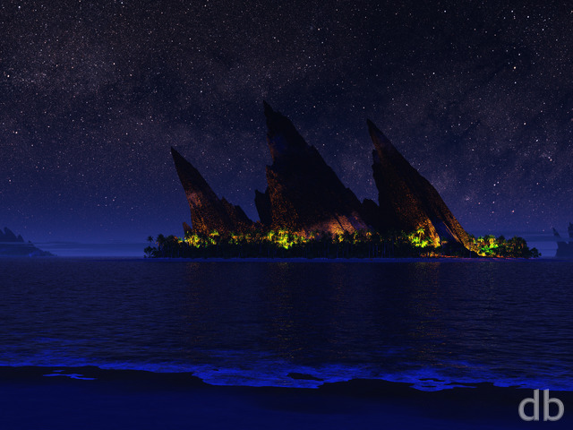
I was dwelling the catalog of multiscreens and found this. It’s a great peace combining a cyberpunkish metro landscape with the traditional nature realm with the boat and water…maybe it’s time to refresh this image or try the combo again?
Tyler
Dear Ryan,
How many times have I told you son? Futuristic sci-fi images are where it’s at. You are obscenely good at them, but I understand you have to “mix it up” a bit for your members. There are few images that you create that I literally want to live in, but this is one of them. Please sir do us a great service and put out more like this in the near future. I mean this sucka was made back in 06 for crying out loud!
Xandra
I’m with Aaron – I’d love to see you do more futuristic cityscapes!
Robin
I really love this one. I come back to it over and over again. There is something so wonderfully peaceful about it.
Aaron
It would be great if you could do city scapes and sci-fi stuff. This is one of my favourite images.
Atlantis10
Reminds me of everything that was beautiful about Ghost in the Shell.
Tim
Love it! Reminds me of what Gotham would look like from a different perspective.
I love the Gotham series.
charlottesometimes
i love sky lines and close-up city scapes- twas a city scape that drew me to your work in the first place.
🙂 this one pleases me, and makes me wish i had a super-wide screen… 🙂
L. Murphy
Quite a beautiful image, and one that I find reminiscent of a scene from the original “Ghost in the Shell.” Nicely done.
Ted
I’m typically stuck more on the planetscapes but this one grabbed my attention.
It hints at a modern future where everything has perhaps ‘worked out’
John
I love what the small touch of color does for this over the previous version. I love all of the cityscapes, but I tend to prefer the ones that have some color, but not an overbearing amount. The highlights in this one make it really stand out.
Thanks for all of the great work!
Rick
I’m a sucker for cityscapes.
I really liked the stark, original Gotham. I loved Gotham2001 since it captured a very similar feeling, but more visually interesting and far more dramatic. Gotham Garden is sitting on my desktop right now!
I have always been crushed that neither of the Gothams made it to Zazzle. Bring Metropolis, please! Neopolis is good, but doesn’t have the feel, or the atmospherics.
Zazzle! Zazzle! Zazzle!
Simon
I don’t remember the last time you did a city based render, so I find this a very refreshing change. I think it’s brilliant and one that I will keep coming back to.
Bruce Blanton
it reminds me of one of my favorite movies “Blade Runner”…….Ill keep this one for quite a while :))
Bruce
Cindy
I’ve never been a fan of the city scapes, however, I think this is probably the best I’ve seen. I think it a bit busy & crowded. On the otherhand, I think is it dynamic and I dig the moon. Huge fan Ryan, will be forever.
Mike
I really like this one 🙂 One thing I also wanted to comment on is that I always appreciate those little extra details you add to your artwork such as the boat in this photo.
betty
I think the sailboat in the forefront brings out the full huge size of the buildings!!! Very cool, dude!
Ryan
Yes, the problem with creating a multi-screen version of this image is the skewing at the edges. I tried to minimize it by moving the camera in and restricting the field of view, but the skewing is still evident. It was much worse when I tried to widen the frame (so you can see the tops of all the buildings).
Basically, some images are better suited to “multi-screen conversion” than others. Sorry!
Labanimal
Hi Ryan – Thanks for trying your best – despite the problem, the wide-screen version will be one of my favorites for a very long time!.
Just keep your designes as amazingly blasphemous like this gem!.
Terry
Shay
This is a wonderful image great work, lookinf foward to seeing your next masterpiece
Dean Harding
I gotta say that while the single/widescreen versions look great, the dual version looks pretty horrible, due mainly to the distortions – especially on the left-hand screen…
I guess the problem is that it’s pretty hard to fix without creating all new buildings to fill in the second screen 🙂
Chris
Its good, but I’m not really a fan of the perspective. To me it looks like you missed the effect you were aiming for and instead all the buildings seem to be leaning waaay too far to the center.
Labanimal
I really like the Widescreen Version of Metropolis as it shows you a little more of the buildings, especially the blue/green/red ribons of colour around the top of each tower. However the Dual & Tripple version cuts off the top of the buildings and you can’t really see the moon anymore as it also contributed to the affectiveness of picture.
The buildings from the left seems awefully skew!. The whole angle of the render has been changed which kinda affected the mood of the original two.
I was really looking foward to the Dual especially the Tripple, but have to say, the Wide is definately the Best one of the bunch.
Please Fix them!.
George Cypher
I dont think I like the contrast between the sophisticated buildings and the older style of the boat.
Also the buildings dont seem to have any real shading, they are just dark at the top and light at the bottom.
Sean B.
I like the city but it needs to at least look lived in. Right now, there aren’t any cars and no foot traffic. Maybe some aircars would be cool, just something to let us know that there are people to go with all the lit windows.
Phillip Deck
I cant believe this image. I hardly ever post comments on your site, but when I saw this, I gotta comment…..The buildings altogether looks so real in art as I have seen so many 3d images of cities from other artists don’tlook as nearly as good as yours……the lightings in the windows and all windows look different….so much better than your original render a while back…I really like it
Tril
I agree with Danny, the boat is key. To me it’s the best part of the picture!
mike
First, I really think this is a nice piece. In drawing from the previous Metropolis works, we get to see a nice, new, modernized perspective on the city. Yay! 🙂
Second, constructive criticism.
– I agree with the previous commenter about the reflections in the water. 1) The buildings in the reflection are mostly dark, without really hinting well at the light from the windows (remember also the color of those lights if you intend to correct this). In particular, note that the water is completely dark just below the semi-short cylindrical-building, that is quite well lit, just to the right of the boat. 2) Also, on the lower left of the scene, there is a short, domed building that is not reflected in the water at all (the reflection is merely of a tall, square building).
– On a personal note, I think perhaps the moon is too big. It makes the scene seem less real in my opinion, and more like a dramatic shot in a movie, althought I suppose some people might like this. Also, like the building lights, it doesn’t seem to be making its presense felt in the reflections on the water (viewpoint angle not withstanding, I realise the buildings are tall, and the angle to shallow. It feels like there should still be a smidge of peripherial ‘glow’ right near the bottom edge of the scene. Maybe.) Anyway, I would suggest experimenting with a smaller moon, or even none at all if you want to try seeing what the “glow of the city itself” does to the scene lighting.
– On another personal note, I’d like to see a bit of variety on the shoreline. There are lots of tall buildings, one short domed building… and streetlights. While this is a perfectly valid scene, I wonder if perhaps devoting a small portion along the waterfront to a public park, with a few trees and a statue of some kind might work in the scene? or maybe just a noticable statue that might reside at a street corner, or even in front of the small domed building on the left. I’d almost like to see people or some other “activity” along the waterfront as well, but at the distance in this perspective I suppose such would be too small to see well, except maybe in the large resolution versions (1600×1200 and greater). Perhaps a few cars (modern or futuristic?) on a waterfront road would do well? Or maybe not. It’s hard to say without experimentation I suppose.
– A curiosity: I wonder at the street lights, and why there doesn’t seem to be any traffic lights among them. I’m not saying they’re necessary mind you, I’m just pondering the absense of them. Are there no streets intended for vehicles in this area perhaps?
– Lastly, I would like, if nothing else, to see a version of this without the boat. It does make one think of an Asian harbor, as another commenter mentioned, but I would like to think of it as “any city” as well, which is hard to do with the orange-sailed boat there. Alternately, if you felt up to it, I would also suggest a version with multiple craft on the water of varied modern types, to give the river a bit of modern “life”. Although I realise that would add to the difficulty in rendering the water with both light reflections as well as the wakes left by any boats moving at any speed. (I guess they could be stationary.)
Anyway, to sum up my long-windedness, I think this is a very good scene. And while quite nice as is, I believe it to be worthy of further improvements and experimentation (read: picklejar versions).
Michael James
I love this scene, and the fact it feels artificial for me maakes it better.
Jennifer
What an amazing update! This is absolutely incredible.
Mike Barber
This looks Awesome – Will there be a Dual Screen render?
Francesco
As I really liked the original Metropolis, I was exicted to see the new one. Actually I really like the scene, but for some reason Metropolis 2006 has not the same atmosphere as the original ones. Perhaps is too futuristic… It’s like hmm a beautiful women, who like looking at, but for some reason, I feel not really confortable with her. So it is with this picture… there is a lack of atmosphere… amnd I have the impression, that you reworked not really perfect or made it in a rush.
James
This is amazing!
Jules Kain
WOW JUST WOW
this is the best out of all your cityscapes
now im happy i joined i just might have to become a life time member
Jules Kain
sorry to comment twice but i was reading some of your comments and id just like to say there is nothing wrong with this its perfect
my favorite part is the moon its blasphemy !
Danny
I must say I totally and categorically disagree with some of the commenters before me.
The reflaction in the water is nice – I would not expect to see the windows reflecting one by one in the water.
The atmosphere is – in my opinion – more dramatic than previous versions, thanks to the clouds and moon.
The metropolis series is one of my personal favorites and this one tops them all.
I like the endless number of dark buildings – totally dark business empirish.
Danny
Sorry for commenting twice, but I must comment about the boat.
In my opinion, it is very much necessary in this scene, for a few reasons:
1. To give a graceful touch of color
2. To give a sense of proportion – this makes the city look big
3. To give you something to focus on – something small, recognized and near.
4. To combine simple and sophisticated – the small sail boat, with the huge advanced buildings.
In my opinion, the boat holds the scene together.
Sean W
The blend of the atmospheric effects and the urban sprawl is more interesting than the original, although I think I prefer the buildings from the original better. These seem a little too gray and less glassy; however,I like the variety of the building shapes. I love the moon peeking out, as well as the clouds drifting amongst the tops of the skyscrapers.
Overdrive
I really do like city pictures a lot. Metropolis 2006 is a tremendous improvement compared to the original, but I have some remarks:
-There’s almost no reflection of the lighted windows in the water
-Some buildings seem to have a little too many windows enlightened (the tall one on the right therefore looks more realistic)
-Depth seems not optimal yet
Still a very appealing piece of work; I like it very much. Especially the fog and the highly detailed streetlights. I certainly would like to live in this city.
Rated 8 (could be 9 if little improved)
Labanimal
9/10 – Keep em coming Ryan!!!!!!!
Tril
I love this picture (liked the original Metropolis too!), particularly the sky, and above all, the vivid gold color of the sail standing out amidst the blues and grays. I gave it a 9. I’m not completely satisfied with it but it’s hard to pinpoint why, other than to say it’s something about the skyscrapers themselves. They don’t seem realistic or interesting enough, somehow. I actually found the skyscrapers in the original Metropolis more evocative though the rendering was much more primitive.
Hopefully other commenters will have more ideas.
glowlimn
This picture immediately makes me think of Hong Kong harbour- the utlra-modern buildings reaching into the clouds, the lights, and the amazing craft on the harbour. I was there in January this year, and this feels just the same- all that is missing is the laser show reflecting off the buildings. Magic!