


Description
This is my first project rendered and developed on “Asfaloth“. It is a continuation of the work I
started with “The Unveiling” and
thus
I
have left the word “veil” in the title. I’m still exploring
Vue
d’Esprit’s new “height conforming” clouds.
I thought it would be fun to add my family to the scene.
Can you spot the four of us?
 Mistveil Mountain: mistveilmountain1
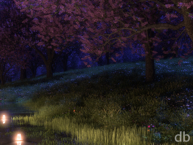

Theo
The original Mistveil Mountain is really good. It just popped up on my desktop and I didn’t recognize it in comparison to it’s more colorful counterpart. It really reminds me of Elder Scrolls V: Skyrim. All it needs is a dragon perched atop the mountain 🙂
Theo
The original Mistveil Mountain is really good. It just popped up on my desktop and I didn’t recognize it in comparison to it’s more colorful counterpart. It really reminds me of Elder Scrolls V: Skyrim. All it needs is a dragon perched atop the mountain 🙂
Jean Aspen
I so value your inspiring visions. I keep them before me as I write. They remind me to stay awake to mystery, joy, compassion, possibility, play
.
Jean Aspen
I so value your inspiring visions. I keep them before me as I write. They remind me to stay awake to mystery, joy, compassion, possibility, play
.
Jean Aspen
I so value your inspiring visions. I keep them before me as I write. They remind me to stay awake to mystery, joy, compassion, possibility, play. Thank you!
.
Gene
Sorry everyone — I have no idea how or why my last comment tripled itself…
Gene
I like this one. I’d have given it a 10, but the texture of the rock face on the upper left of the image doesn’t look right to me — distractingly so. It looks like glare ice instead of raw rock. But hey, I still love it. Thanks again Ryan.
Gene
I like this one. I’d have given it a 10, but the texture of the rock face on the upper left of the image doesn’t look right to me — distractingly so. It looks like glare ice instead of raw rock. But hey, I still love it. Thanks again Ryan.
Gene
I like this one. I’d have given it a 10, but the texture of the rock face on the upper left of the image doesn’t look right to me — distractingly so. It looks like glare ice instead of raw rock. But hey, I still love it. Thanks again Ryan.
HolyGrail
Love this version much more…..really would like a tri-screen of this.
Please! Please! Please!
keeblerUT
the more I see this blue one the more I want to have it. 3840×1200 would work fabulous.
wfrazee
really like this variation. Would it be possible to beg our way into a dual screen version?
David
Growing up in the mountains the shads in this version make me feel those crisp clear nights. I am sure we will see more resolutions of this one!
courtney
I actually like this one better than the ‘official’ red one and would love to see it in dual screen, until then it’s hanging out as my laptop background
sixpach71
Ryan – I love this piece and would really love having a version for dual monitors.
Ryan
Can I ask what browser you are using? You should only have to enter your login info once per visit.
shirty
i continue to love these wallpapers on all my devices year after year, but ive had enough of this web layout. can’t i just sign in once per visit? isn’t is lax security to have user/ pass sent across the net over and over again. i think it’s meant to be ssl also
Ryan
Thanks for renewing. Here’s the 3360 x 1050 file.
revolut10n
Love this and renewed my membership on account of it. Unfortunately, there are no dual-screen renderings of this. I have 3360×1050.
Jim
I’d actually like to see the blue version combined with the red version’s aurora, since it’s more colorful and would add the touch of contrast the blue version lacks.
John N.
I really like both versions. They both stand out in their own way. Two 10 ratings here!
Tony
Dear Mr. Ryan, it’s simply superb for my new desktop picture! Trully hope some day you’ll make some more Aurora Borealis on the night sky. Stay well! Greetings from Slovenia. 🙂
rupietupe
Both the red and blue are gorgeous, but the red is my favorite because of the pod and the aurora stand out more. I still have both downloaded, of course! Thanks so much; your art takes me to wonderful places!
Brian
Both versions are excellent on their own merits. Could you please render the blue version for multiscreen as well?
Chris J
I like the blues and greens from the early version. The triple monitor render turned out pretty well in red. I noticed a lot of trees and water this past year. Time to mix it up with some fantasy stuff? Can I come over for table tennis?
Ryan
Weird things happen at the sides when I get into extreme camera angles. I would rather crop the top and bottom a little bit than add anything negative.
JK
Shame it’s so zoomed you can hardly see the sky or big mountain to the left.
Rob E.
Loved the blue untill the red took my heart. The updated scene (Skyrim!) has greater depth. Really comes to life. Much more atmospheric.
Coleman
While both are great I prefer the blue over the red. Please render the dual and triple screen versions of the blue.
Nelson
After playing a bit in GIMP, I decided to stick with a blended mixture of both scenes. So now I got a general blue landscape, but with a more colorful sky. 😛
Rob
Could we get a 1600×900 version of this?
It’s lovely 🙂
Markus
I might be alone in this, but I personally think the mountain on the right hand side in the first image looks correct. It forces you to look closely to see the contours, but it looks much more realistic once you focus on it. The red image, in contrast, makes the mountain look pastel-like in my opinion..makes the image look more fantastical.
Jenanne
At one time you posted info about several mosaics you’d done, but I can’t seem to find the post about them anymore. One was for Portals; I can’t remember the others. Could you please repost the info? Thank you!
cmmnoble
Both versions are quite nice. In the pink, the colors of the aurora really pop, and the mountain to the right has more contrast. But I think I like the blue version of this scene best because it is a little more subtle, and I definitely prefer the white flowers among the rocks in the foreground.
David M.
Ryan, I like this one better than the first because I think the Aurora adds a critical element of color here. The addition of the whales is a nice touch. All-in-all it has a much warmer feeling than the first one. Great job!
Billy
Once again you have created beautiful images that seem so real people ask me where they were taken when they see them on my phone.
Don
I like the original better, but I’m partial to blues
Fandeboris
You have outdone yourself with this one!! 5 stars, A++ “10” even
Momcat
Were the mountains in both upper corners fixed in the red version? Could they be fixed in the blue, as well? I think that’s one of the reasons I do prefer the red version because the mountains in the blue were always “wrong.”
And I do prefer the white flowers; the red look like coals thrown up by some unseen volcano.
Joe
I much prefer the pink version to the blue one.
Jenanne
I voted high on the blue version, then wished I’d left the highest vating for the second version. I voted the same for both but prefer the second. The blue version just isn’t colorful enough for me, perhaps because it’s summer.
And oh! Are we ever going to get a summer version of “At World’s Edge”? We have Autumn, Winter, and Spring — how about summer?
Jason
I really loved and appreciated the original, but the second version really spoke to me. Definitely hard to choose a favorite, but kudos either way.
Ryan
People are saying the second version but voting for the first. Mmmm…
celmendo
I love the blue because I just find that to be a more pleasing color but the mountain on the right was off. The red version fixes that and is overall improved but I really don’t like the fins. They don’t seem to fit into the body of water the picture evokes in my mind at all and I also liked the flowers more white. Also the whole thing is hazy red to the point of almost being monochrome.
For my personal use, I reduced the red a bit, increased the contrast a bit, added a touch of blue (all which made the aurora pop a bit more and still left it very red) and took out the fins. But those are my personal nitpicky issues and overall the red version is superior. They are both beautiful, thanks!
Timmo
Ryan, this new version is awesome. I loved the first one but the new one just draws my eyes into it even deeper. Thank you.
Ryan
I usually do groups of three animals in my scenes but I chose four this time. Two adults and two little ones.
Todd
Oh, to answer the family question, yes center of frame, lower third bar in the water. Almost looks like a pod of dolphin dorsal fins, until you zoom in.
armadillo
New version is best, imho.
Ryan
They both have the same aurora but the colors seem to pop more in the second version.
Tatiana
I honestly can’t pick which one I like better. I like the first one for its coldness and feeling of isolation. I like the second one for the awesome aurora. Both are 10s for me.
Todd
I have to agree with the blue fans, I liked the blue better than the purple.
Being a Coloradoan, any chance for a fire tribute version? The firefighters out here are working their tails off trying to keep us safe!
PaulXX
I really like the blue version. Mainly I am not a fan of the new color in general, but the other changes with texture are wonderful. I love your landscapes! Keep up the good work!
Dale
I loved the first version because of the starkness and subject matter. I love being in the woods after a snowfall at night when it’s all quiet and pristine. And seeing this type of image for the mountains is just beautiful. I’d really, really, really like to see it in a multiscreen.
The second image is intriguing in its own right. The colors are fantastic, and the aurora really sets things off. This one definitely deserves miltiscreen treatment too.
As a matter of fact, I think I’d like to get a wide poster made of the first image once the multiscreen is done.
gumboot
Go with the new one. Love the improvements – all of them 😉
Travis
Love the aurora borealis effects you added to the sky–this image really does it for me now. Even more haunting, yet majestic feel.
Myles77
This wallpaper is great! I’d personally like to see a little bit more.. I don’t know… color? around the bottom coast, but this one will adorn my screen for quite awhile!
Amaryllis
I love this image, and the monochrome is haunting. So many ways to lose yourself in this one; exceptional, magnificent escapism for a moment during a work day.
Markus
All the weird sci-fi readers will know what I’m referring to by my title – the sheer height of the mountains and the mostly bleak / cold setting reminds me of HP Lovecraft’s “The Dream quest of unknown kadath” where the outer gods rule over earth. This image is exactly how I pictured Kadath to look like in my imagination. Excellent render!
Gary
This looks fantastic on my Droid Razr Maxx… I did have to use a larger image and crop it myself, but it’s something I have to do on a regular basis… it’s too much to ask you to make wallpaper for every mobile device.
Trav
We should vote this as one of his top ten!
Russ
That is the beauty with art. It can lend itself to inspiration and the creation of many splendid things. If you liked Skyrim then pick up “The Witcher 2”. Just don’t play it while the kids are around 😉
Candy
I am really liking this image. I do agree with a couple of the other comments made. The clouds in the sky reminded me of the northern lights and I though how cool it would be if they were enhaced with a little more color. Also, the flowers in the foreground could use a little more color as well so they are more visible. One final thing, the mountain in the back on the right seems like it could use a little more detail. All in all it still is a very cool image!
Skyweir
The image of the mountain on the right also recalls your earlier work, “Monolith”. The two larger mountains help to frame the more detailed, closer central mountain while keeping the eyes moving over the entire image. Good composition!
Chris B
I love everything about this image except for the Left Mountain, I think you are going for snow covered, but I think it needs a little more detail or contrast to make it not seem so washed out. otherwise awesome!
Khyren
Kind of reminds me of Devil’s Tower in Wyoming. But that could also be because I was recently there. Should be spectacular in Tri-screen.
Dan
Could be something on my end since no one has mentioned it yet, but the mountain on the right seems to have some shading errors. Looks like maybe snow not rendering right?
Great scene though!
Ryan
I was playing Skyrim back in January and this piece is definitely inspired by that game. I never finished the game though after my Dad’s accident.
Afya
Have you been playing Skyrim? 😉
Beautiful.
Anton
I love it 😀 nice render to showcase your new rig.
Wraith
I love serene nature scenes like this. Your mountain scenes have quite literally been AWEsome. I’d love to see a sunrise/set version of this.
Trav
I cant wait for the multi-screens! It will be my new wallpaper the moment you post those. VERY good job! I am in awe of this incredible piece of art.
Hunter
…And that’s a good thing!
Chris
I hate to always be the critic of things, but I usually try to provide helpful feedback, and not just say “looks nice dude” and leave it at that. I felt it didn’t make much sense to have the mountain in the middle be the focus of the picture, while both the mountains on the side of it were actually taller than the middle peak. It kinda takes away from the majesty of the main mountain. Also, I thought the ice on the other two peaks could be trimmed a bit. Other than that I like the idea. 2012 has produced some significantly improved images from the past two years, and I really like the variety you provide. Keep it up Ryan.
rupietupe
I really like the feel of the cold with the flowers giving the promise of spring (maybe add a little color to the flowers to help them stand out a bit?). You mentioned the clouds; I thought they might be aurora, which would be awesome if they were colored just a little more. I agree with the right mountain having great placement but needing something. However, it is gorgeous even in the first rendering! It makes my day to see a new image of yours! 🙂
dujeon
This is another beautiful image, i love this one, it has a touch of an ethereal feel to it which is awesome
Betsey
if I could give it a higher number I would!!!!
anna_writr
This is a spiffy image except for the far mountain on the right, which looks oddly undetailed, as if it were a bleached out photo. I dunno if the lighting will do it, but it could use a bit of contrast in the texture of the ice/snow.
Kana
I like!
DCarver
That looks awesome!
Chris H
I love the idea of this new piece. Nothing more majestic than a mountain range. Especially in winter. I reside in Oregon and as I head in to Portland I can often see Mt. Hood off in the distance. Even in the summer its snow capped and gorgeous.
One small thing that could very well be just my eyes. The foreground detail looks almost out of place due to its crispness compared to the mountains that have an almost photo grain look due to the mist.
Don’t get me wrong I think that its placement is perfect for the overall image. Just something about its detail seems odd. Can’t really explain it better than that.
Overall its still beautiful and already added to my rotating landscape background.
Psyclone
Is there an iPad HD render forthcoming for the new version?
keeblerUT
I would really love this image in that size, the colors in this version are much more enjoyable late at night then the hues of the original. Thank you very much!!