


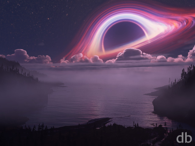
Description
Last week I had the good fortune of a clear night to observe the Perseid meteor shower. It was Ian and Jason’s first and they had a great time (we had my green laser pointer to play with between meteors). When I was a kid my mom used to wake me and my brother to watch shooting stars. I’ve been fascinated by the night sky ever since.
This wallpaper is dedicated to that night in 2010 with my boys, the nights to come, and those nights many years ago. I hope you enjoy it!
 Tears From Heaven: tears2
 Tears From Heaven: tears1
klikevil [nonmonthly]
Love this one looked it up again right now pickle versions and all rock keep up the awesome art man.
Enoctis
I really love this one. I love the name, and I love hearing the inspiration or tribute behind the pictures.
Lynda
This fits how I feel when Steve Jobs died yesterday. I’ve been looking and looking for something to reflect how I feel. Tears from Heaven. Couldn’t be better for me.
Phoitack
Dear Ryan,
I first want to let you know that I enjoy your wallpapers. I like Tears from Heaven BUT I would prefer if you could reduce the shooting stars or remove it completely. The backdrop is fantastic. If you want a shooting star, just put one. Thanks.
Lew
Jeff R.E.
This one brings back such amazing memories. Thanks for this one. Excellent idea featuring the Perseid shower.
mph66
This is what keeps me coming back to this site- the thoughtful, inspired art you provide. Nice story. May you and your boys enjoy many years together looking at the stars.
Spike
Not quite sure what it is, but I really love the dualscreen of this one – a good bit more than the single-screen, which I like really well as is. Awesome!
Ryan
Not sure why that one goes missing from time to time. Sorry. The link should be working now!
Ryan
The dual and triple-screens are now available. Enjoy!
Taylor
You seem to have missed 3840×1200 on this render. I only bug you about it because I like this piece a lot.
David
Tears from Heaven is spectacular! May be my favorite work by you to date.
Ryan
The version multiple monitors is rendering now.
Spike
I really like the new version with a fuller sky! Thanks for taking the time to remake it!
Luke
I preferred the previous version – the dark foreground produced a better contrast with the sky, which made the meteors seem more abrupt, or violent.
Ryan
No, this one will have a dual-screen. “Quartet” too!
Nick
Will this be another example of a wallpaper that your loyal paying customers never get as a dual-screen?
Harry King
I really do prefer this version its brilliant
I can see why you might be favouring strong foreground images in front of infinite focus backgrounds/skies as the long range images could become same-y so don’t give up but it is nice when we get the chance to choose our favourites. Thanks as always.
Mars
i wonder how it would look like if the water was reflecting the rays of the meteor, its too dark for my liking
byteful
I, too, like this alot better. Please say that you are not gonna forget us that have multi-screens, on this one. I really hope that this one is added to the multi screen versions.
Thanks Ryan, as always, your artwork amazes….
Hunter
What’s that doing on the front page?! Quick, get rid of it before Summer notices! We still have a few weeks of warm weather at least!
Paul C
I think the one with more sky is better – great job!
Luc J
I love the new version. It has a more minimal and pure feeling and looks a bit more realistic without compromising the magic. The path of the meteors and the emphasis on the sky makes this version feel more majestic to me.
Sometime less is more.
Brett
I have to add my voice to the others V3 has just been put on my desktop!
Tibfib
I love the new version!
Xyverz
This is FANTASTIC work! Keep it up, Ryan!
JKNorth
This works perfectly. The desert foreground was somewhat forced and inelegant compared to the sky. Version 3 is a Ryan-worthy effort!
MJ
I agree with LauraS and others who’ve requested this change. More sky and less foreground is definitely the way to go!
LauraS
Oh yes, this is perfection. Thanks for keeping the green in it!
Walo
This one looks great, has a similar feeling to “Harbinger”. Love it.
Tyler
Good call on giving ‘tears3’ gallery status. You have incorporated all of the best feedback and created an image I can proudly display. In fact, the sky on this version is so amazing I actually love it. Good work dude!
Ryan
I’ve put the new stripped down version in my gallery and will leave the desert versions in the Pickle Jar. Thanks for the feedback!
Lidia
This new version with more sky is definitely the better one.
Becca
I like the more-sky version, for sure. If you do a dual-screen of the more sky, I have no doubt it’ll end up as my wallpaper for a long time.
littlemom
I agree with the others that the pickles are better. Thank you Ryan for all the beautiful renders that you do.
junyoure
It appears that most want more sky, myself included. Can’t wait to see the multi-monitor pickles. Awesome work fine sir. Please rock on!!
celmendo
The version with the more sky and the water is the one I’ll stick with. very nice
Reuben
I would like to see a multiscreen of tears of heaven 3 I like both of the versions, but having a multiscreen of one with more sky will look awesome.
Thanks
Metal
Hey Ryan,
I thought I should leave you some feedback regarding your art work, and art direction. It would seem that your “darkest” work is naturally based on your perception of the world. What I mean by that is, you don’t seem to be someone plagued by depression or anything like that.
Having said that, I believe you need to perhaps “immerse” your self in other mental modes to give your work more emotion. Of course, please feel free to ignore this comment as not only am I slightly intoxicated, I’m also pretending to tell you how to do your work, LOL.
Anyway, I would like to challenge you to truly tackle these emotions when you envision your next “dark” themed piece: Hate, Malice, Discomfort, Depression, and Rage.
I may sound like a drunk idiot, but I do believe if you can truly put these emotions into your work, you will become an artist within his own league. (Heh, especially since your pretty much the only who supports 5760×1200).
And when I mean “truly”, I mean sincerely feel these emotions are you create your work.
If you actually read this, thank you so much for your time.
Dale
I like all of these, but this one I think I like best because there is more sky to enjoy. Great! Are you planning a dual-screen version of this?
Scarr
Love the new version Ryan! I loved the first one, but the newest is my favorite. Well done.
Wraith
Each seems to be good in their own respect. I’ll keep both. 🙂
Brandi
I think the new version is perfect. Plenty of sky, but the ground is still interesting. Great job with this one.
Ryan
I have a new version of this rendering on my alternate machine.
littlemom
although the gallery version of this render isn’t my favorite, I absolutely love the pickle jar version, I love how the mountains are just sillouttes in that version. Much better.
Chris B
shoals is one of my favorites, I can only imagine what you could do with it now!
Aljo
yo man cosmic shoals … I dare you
Chuck
I live in Tucson AZ, in the desert and this is a beautiful representation of it. I’ve lived here in the desert for most of my life and for all you desert haters out there you don’t actually know how beautiful it can be to be in the middle of the desert in the middle of the night when its pitch dark and all you have is the moonlight to show the way. This piece is really cool to me because I recently lost my dog, he was 14. He was a shepherd/wolf mix and looked very similar to the wolf or coyote in your picture. Its like my dog in your scene. Thanks man.
Keep on doin what you do….
Silvaria
I am a fan of astronomy, I love night wallpapers, and I adore the color combination of green and gold…I understand here why some may not like it, but frankly, this easily goes into my Top 10 List. Bravo yet again!!
Jonathan L
We just want to see more of the beautiful sky and less of the foreground. 🙂
The sky is so beautiful, but 60% of the image feels like a dark, enjoyment absorbing place.
Had there been no shooting stars and this was in fact just a desert piece with sky, etc. it would be thoroughly enjoyed for what it is, I’m sure.
As a couple of examples of desert pieces that were well received: Oasis and Shrouded Desert.
Anyway… Can’t wait for the new render, Ryan! 🙂
Jen
I have lived most of my life in the desert and quite like the foreground. For those of you who haven’t spent much time in the desert it would probably look fake if you were standing in it. I am also more fond of the original double rainbow picture with the desert. I know the desert isn’t for everyone but for those of us who grew up in it and love we appreciate the occasional foray into that style. Don’t stop doing desert scenes Ryan.
nick
but doesn’t really look as realistic as some of your other work. still, im a big fan!
Jonathan L
…for a piece with more sky and less foreground!!
I’m really excited to see it, Ryan!
Keep up the fantastic work. 🙂
Dank
hey just wanted to chime in.. love your work, and been a fan for years..
current direction? well i will admit this piece is not one of my favs from you, although i cannot pinpoint why.. i think that “mikes” comment was very insightful, but that doesnt mean that he is ‘right’. i can agree with him on a couple of points however.. in this particular piece, i think that there may be too many stars, and combined with the clouds, make this picture seem a bit cluttered..
also, i am not a fan of added wildlife, in most cases. in a few of your pieces you have made it ‘work’ for me..
not sure if any of this is helpful. so, keep up the good work, and remember, this is about what you want and like, even though most of us want and like them too. thanks a million!!!
Mike
Ryan,
I enjoy most of your artwork and am a huge fan of your abstracts, planetscapes, and many of your day/night scenes. However, I am fairly disappointed by your attempts at more earthly realism.
That’s not to say I think you’re not working hard enough. The effort you put in to each wallpaper is apparent; no matter how hard you work, however, it is nearly impossible to avoid the “fake” appearance even the most ambitiously realistic CG artwork. I believe this is akin to the “uncanny valley” phenomenon that occurs, for example, with CG humans. There is a range of realism that exists just before the point where a CG human becomes indistinguishable from an actual human, and in this range the CG representation looks very “creepy.” A similar effect seems to be happening with your artwork, because as you strive for realism, it begins to look rather “off.”
To that end, I submit that your artwork would be more pleasing to the eye if you strove for a more stylized look. You don’t need to make your wallpapers look like photographs. Your top-rated wallpapers exemplify what I mean. Though they depict physical scenes, there is an element of fantasy to them that stems from a tasteful use of blur, stylized or distant organic shapes, and plenty of color and contrast.
“Tears from Heaven” does not have these qualities, and that is why I find it troubling. Not only is the image very dark and green, but it appears that your intent was to take an ancient photograph, rather than to capture the beauty of the event. If your modeling and rendering software were more capable, I’m sure this image could have been a fairly accurate view of an ancient meteor shower. However, not only are there inherent imperfections in any CG artwork, but the detail in this piece is too fine-grained to catch the eye. The details you have added to your impressive reproduction of the night sky do not redeem the image.
My suggestions, then, for this specific piece, would be to capture the beauty of the “tears” by making them bigger, brighter, blurrier, and perhaps fewer. Why are there oddly-shaded clouds obstructing this sky? The horizon, too, is jagged and unnatural looking, and the shapes of the trees are awkward. Diminishing the prominence of the dark green in this image by increasing the variety of color and contrast could truly add to the composition.
I’m no expert, but in my opinion, employing the same techniques you have in your top images in every image you create will greatly improve the overall quality of your work.
Cheers, good luck, and thank you for continuing to produce spectacular artwork!
dmackoy
I recently returned from a trip to the desert and saw that this was up, what a spectacular image. Its hard not to stare and just get lost some where else.
Sometimes I do feel the single screen is a little to busy as the triple screen seems to spread out the action a little to feel less dramatic and more serene.
Also I personally like the added lighting in the first render. When its not there i find myself getting distracted by it since im trying to figure out what it is. Great work Ryan.
Koona
I love your night scenery. Truly amazing work Ryan.
John Bates
Seems like the largest resolution version was left off the list.
kellzilla
Have you ever been to a desert that is less “sand dunes” and more “nearly-dead dry earth”? The ground is craggly, jagged, and somewhat “out of this world” looking. These trees are pretty accurate representations of the twisted things that grow there; there’s not enough water out there for something full and beautiful and straight-lined.
Deserts are WEIRD, yo. Full of crazy crap you’d never expect out of our Earth.
kellzilla
It’s not often that I disagree with an entire comment/critique, but I don’t think anything you’ve said applies to my opinion of the pieces he’s been placing up lately.
This piece in particular, I like that the image is dark (it’s night time in the desert, for crissakes), is green (it’s a weird astronomical event, which creates weird skies), doesn’t have a lot of contrasting colors, etc. I think Ryan captured perfectly what he was going for.
Genj
Ryan,
The darker version is now my new background. Thanks for posting that one. I hope you find the time to render a multi-monitor version of the one without the terrain light source.
Thank you, yet again!
Chad
I like both of them, but think the one that actually shows the landscape (tears1) adds a little more depth. I think what I mean is, it draws you deeper into the image because the focal point is different. If that makes any sense…
John
The dark foreground IS better. I think it adds to seeing the sky at night.
Foz
Hmm… the darker foreground *is* better, but you have darkened the entire night sky with it as well… which I find is unrealistic.
I personally think it would be better if the stars were more prominent as is it with the case of a real night sky.
celmendo
I love the green color and I do like the pickle jar version more. A bit more sky and less landscape would be better to me as well but I like it as is too.
Chris B
And green is my favorite color… It looks great with the green I don’t think I would have thought to use it. I will agree that more sky would be better, but I just cropped a larger resolution to get it. The galactic ring looks totally amazing!
Harry King
There are a lot of time I agree with you ryan but this time I agree that the foreground landscape detracts from the beauty of the star-scape. I also however agree that the pickle-jar version (as of Aug 29) would look better with more sky and a lowered mountain range (as if looking upwards more). Still nice work as always and thank you.
Koolio
Might I add that a sky only version would be fantastic, given the point of view as if we were looking up at the sky.
Koolio
The Sky is beautiful. But the foreground is a bit distracting, maybe remove the trees and the dog/wolf. The hills are okay probably better to shorten them and show more of that wonderful sky
HolyGrail
Please give Tears From Heaven a triple screen option. Its my favorite wallpaper by far. Thank you, thank you, thank you. 🙂
Mars
If this one was done similar to your “Beginning of the End (2009)” It would come out amazing!!
Andy
The brightness of Ryan’s wallpapers the seems to be a constant debate. He has to make it look as good as possible, but it usually always our monitors that are not set up correctly. Would I be right that you use a hardware calibration tool such as a Spyder, Ryan?
nickaix
I do have to say that I like the pitch-dark foreground better–except that there is so much of it. The wallpaper becomes more like a demonstration of how bad the black levels on my monitor are! How about sliding the foreground down a bit and letting us see more sky?
Geoffrey H
I’d really like to see it without the foreground at all. just post the space scene in the background and it’ll be my desktop for a good while, but im not a fan of the foreground at all
JK
Every conversation here always has “too dark” or “too bright” somewhere in it. Fact of the matter is there are thousands of makes & models of monitors and video cards out there and all Ryan can do is use his setup to make it to *his* liking.
The rest of us really should teach ourselves to adjust gamma and contrast and brightness to suit our own hardware. It would be great if there was a DB utility to do just this. All it needs to be is a utility that keeps it simple and suits anyone here who has issues with light levels no matter how savvy they are with computers.
Personally I use FastStone Image Viewer. Perhaps there is something simpler out there already? Griping about it here really does zero good.
Lidia
I think I like the darker pickle jar version better.
Dave T
… which is better. The sky looks fantastic either way.
The Sane
I agree with Spike that the darker version looks more real, which is a really cool desktop at night when I’m working and feeling introspective, but I like the lighted foreground better as an artistic piece. I get more visual bang that way. Perhaps a compromise would reducing the amount of land or making the hills more like a border framing the sky?
Thanks for all the wonderful art Ryan.
Mars
If this one was done similar to your “Beginning of the End (2009)” It would come out amazing!!
Spike
I like the original, darker version better… I think it lends more realism to the overall scene. The nebula really adds something nice to it, too.
Tim H
I love it, well done ryan. One of my new favorites !
Dogclaws
I love it the way it is. More sky would be great but not essential.
Brimmer
The Guru, your right about the Zune HD having what we can call a portrait dimension of 272×480 as opposed to the landscape dimension of the PSP.
Either way Ryan, I really like this one but a bit more of the sky would be nice.
Duncan
I like the original version but would consider removing some of the shotting stars. As someone else mentioned, it looks more like Armageddon raining down on us, not shooting stars across the sky. Maybe change the angle of the meteors to a more horizontal plane as well.
Tyler
Original’s better, PJ’s better, there is no perfect render obviously. The concept is brilliant, but the execution proved perhaps too difficult. I understand completely as a musician when you envision something that exceeds even your own ability; or certainly the technology and resources available at the time. The foreground will never compare with the sky, and until they harmonize this piece will always leave you wanting…
Brandi
I prefer the original far more than the PJ. The PJ is too dark and essentially, takes away part of the wallpaper. While the sky is the main focus, it doesn’t look right without some ground to also admire. There’s not enough sky in the image to hide the ground in the PJ version. Ruins the effect for me.
Jonathan L
The pickle jar version is much nicer than the first, though both are great.
However, I can’t help but feel, when I look at it, that I would like to see more of the sky. Just a little bit more! The sky is soooo beautiful!
Ryan
It doesn’t look like barrel distortion will be a problem on the multi-screen render. It becomes an issue with “vertical” objects (trees, statues, buildings) in the far right and left of the frame, but the multi-screen I’ve worked out doesn’t really have any of that. I didn’t add any more trees on the side so everything is pretty much horizontally oriented.The meteorites in the multiscreen will look more like they are radiating from a focal point in the sky. Hope to have it rendered and posted before the weekend!
kellzilla
I like the pickle jar version better. It seems more like you’re actually there in the deep, desert night watching the meteor shower. I would love to see another version that is tilted up, with less foreground and more sky.
Jenanne
I love this one a lot, THANK YOU for the desert scene! I like the original better than the PJ. The Perseid meteor shower has always been a favorite of mine, and this is a lovely tribute to it. I don’t care a wit that the streaks in your render don’t look exactly like the shower itself. These are more lovely and interesting, and reality is way overrated (in digital renders, anyway). Please don’t make the sky blue unless you’re going to do a day version, which in this case wouldn’t make much sense. I love the IDEA of the wolf, but had to enlarge the image to see that’s what it was. Perhaps the wolf could be sitting, howling at the meteors? It might be clearer. But overall, I LOVE THIS! Gave it a 10.
Simon
I think the original version looks more like what you’d get if you did a long exposure photograph to capture an image like that. In any case, I think I like it better. Makes the image more surreal by painting an incredible backdrop over familiar surroundings.
John Moore
Waiting on the Member’s files!!!
LauraS
I love, love, love the green in the sky!
JEFF
Personally, I prefer the original post to the pickle jar. To me, the PJ version looks half finished. I get the impression you have the same concerns about it from your comments. those who like it would probably prefer just a sky full of shooting stars.
The Guru
Thanks for putting Zune resolution back in. Also, about the PSP/ZUNE HD res, PSP is made for a long image while I believe the HD (don’t actually own one) is made for an upright one. Shouldn’t it be 272×480?
Oh, I got the pickle jar version. I think I like that one better. Cheers man.
anna_writr
I like the new version better. It looks more like what you’d see in the night if you stood there.
Love to see an angle where the sky shows more, too.
asterismW
I definitely prefer the original over the picklejar. I like that there’s more color. The sky is awesome as always, and the foreground reminds me of the deserts in the southwestern US.
Duane
Wow, the PJ version is much better IMHO as it takes the viewers focus immediately to the sky; whee it should be.
I would love to see the angle tilted towards the sky a few more degrees so we could get more of it.
Duane
Wow, the PJ version is much better IMHO as it takes the viewers focus immediately to the sky; whee it should be.
I would love to see the angle tilted towards the sky a few more degrees so we could get more of it.
BenC
Much prefer the pickle jar version! The foreground in the original caught my eye too much, and it’s lack of realism jarred with the amazing sky. I think having the foreground shadowed catches my eye more as I want to explore what’s hidden.
Also, while I’m posting, I’d just like to say that I think it would be cool if you could make an interior at some point. The likes of Grotto, Obsidia, Hall of Kings and Of all Places are among my favourites!
Silver
I think needs more sky and less ‘ground’ .. the sky imo should be the focal point.
Silver
I think needs more sky and less ‘ground’ .. the sky imo should be the focal point.
Walo
I originally thought about a reflective body of water as well but I went to the conclusion that it may create too much “clutter” in the scene to see meteors both in the sky and in the water. I also kinda agree that the coyote looks fake(the posture itself not the animal). It’s hard to convey into words how I picture this image in my head.
Max
It certainly seems more natural to me. It also really helps to focus one the most beautiful part of this piece, which would be the sky imo
Scott
I actually like the green sky. It’s just something different. Not wild about the foreground; I don’t want it gone but maybe a bit of tweaking somehow. Don’t mind the wolf or coyote. I really like the idea of this but I think I will wait to see if it gets a bit more work before I save it.
Kevin
This is an amazing wallpaper. However, I think it would look better with less meteors in the sky. Also, the desert foreground seems a little fake. I’m not too sure why.
Gina
I love watching the showers each year. I grew up in Alaska and with us kids, my mom woke up to see the Auroras (Northern Lights). Been facinated with the sky since. Good job my friend. You are a wonderful artist. Thank you.
Firestar
I could see this one without that tree on the right, but that’s just my 2 cents (or 1 cent, cause its hardly worth much).
Either way, my Droid now has a new background.
Randy
Did a great job capturing the Milky Way. The number of meteors reminds me of Armageddon. Maybe thin the number of shooting stars just a bit. Maybe.
Flora from the American Southwest?
Z
Can’t wait to see a dual-screen version of this.
Tyler
I agree with your recommendations. The sky is phenomenal despite the foreground which seems out of place and outdated for that matter. Honestly I would replace the whole foreground with a body of water and the reflective surface would be astounding. I think where Ryan goes astray is in trying to create photorealistic images when he is clearly a creative artist. Am I wrong people?
Duncan
Ryan….This is great but I feel there are too many shooting stars. Maybe take a few out, and some blue to the night sky. Again, great concept, just my two cents.
Jonathan B
I love the concept of this picture, but it needs a few revisions/additions to it before I use it as my desktop wallpaper. 1 – Remove the coyote. It looks too fake and really distracts from the true beauty of the picture. 2 – The sky needs more of a blue-purple tone to brighten it up. 3 – I would love to see more lush foliage. I’m not a fan of those desert trees.
dujeon
This is awesome Ryan Thank you man
Michelle
It was too overcast here to see them on the three nights when they would have been the most readily seen by the naked eye! Thank you so much for capturing a moment I wasn’t able to see!
Abby
I can’t wait to put this on my dual screens!!!!! This is breath taking!!!!
virus
Just me but I think it would look better to get rid of the trees and the mountain and just have a flat horizon. maybe the sky top with ocean underneath.
Walo
I’ve never seen a meteor shower before(mostly because I work at night) but this looks awesome. I agree that the foreground is a little bit too bright or maybe is too colorful for a night scenery I think a more monochromatic palette is better. The sky looks awesome and the milky way too.
Genj
I also stayed up and watched the shower this year!
A few thoughts, because I really do want to see this one tweaked and made my background!
1: the meteors should be a straight line emanating from a general point in the sky.
2: The ambient glow is a suggestion of city lights I suppose?
3: I think the clouds should be removed.
4: Love the milky way!
5: kill all the lighting on the terrain, it seems unnatural. Give it a silhouette effect.
Ryan
The Zune res (240 x 320) is showing up now. Sorry for the omission.
The Guru
I know that I’m running a little behind the technology curve, but why did you take out the old Zune res? I don’t feel like calculating it, but is there another resolution in the mix that has the same proportions?
Anyway, about the picture. I don’t like this one as much as most of the others you’ve done recently. The trees look a little fake. There’s a little too much light for night time. I’d prefer a moonlit look. It still looks nice, don’t get me wrong. I just think it could use some improvement.
littlemom
I think for the most part this is a pretty wallpaper. Love the sky, but I agree with others who want the sky in done in blue for a more realistic feel, I love the wolf in the forground, but the hill and trees are to dark for my liking, I also feel the trees look like a computer animated movie and doesn’t have a realistic feel so over all I’d say it’s good, but not your best, but I do consider this a good enough render that I will add it to my always growing collection of wallpapers. Keep up the good work. I always look forward to your wallpapers and am a big fan.
Ryan
I went back and forth about the foreground. I tried it in silhouette but the scene looked a little too basic. In the end I tried lighting it just enough so you could make out a few details but not enough to fully expose everything.The problem with this approach (and I’ve been down this road many times before) is that some of your monitors will show the foreground brighter than I would like and some will show it darker. For example it looks too bright on Jessie’s computer. Sorry!
Momcat
True, a touch more blue in the sky, a different foreground and no animals — really enjoyed D’s reference to “Reverie” — and it would be practically perfect in every way. Makes me happy just looking at it.
Glad you had the boys with you and glad your mother was so cool.
Gary
Not sure what the animals are in the foreground, but they are a little destructing. I love the sky and desert trees and hills.
Gary
Not sure what the animals are in the foreground, but they are a little destructing. I love the sky and desert trees and hills.
J.Mattner
I personally think the sky is a bit too green. Maybe you could render a blue-sky-version?
Wraith
It’s almost magical. Could we perhaps have another version with a different tint (perhaps blue instead of green), and the land a tad lighter, perhaps?
thangobrin
I love the sky but would like the whole thing a bit lighter.
Also I appreciate I am asking for the moon a stick, could there be say a campfire in the foreground bouncing light onto the cliff wall? Mad probably impossible idea, but there it is.
Thanks Ryan
Andy
Yay! Something out of the ordinary for a change. Love the new wallpaper Ryan! Looks like its straight for the Cretaceous period! 🙂
Dan
Awesome! I love the mixture of real scenery mixed with imaginative skies! The blasphemy factor in this image is high and great!
Aaron
As with some others, I LOVE the sky/clouds/mountains, but the foreground trees and wolf leaves a lot to be desired. I almost made this my main background, but after getting the full sized image and looking at it again I decided against it. As Geoffrey H said, they just don’t seem to mesh quite right.
Geoffrey H
The sky looks phenomenal. it has a great deal of depth and realistic clarity. The landscape in the foreground however leaves a much to be desired. The contrast between the stark realism of the sky and the almost cartoonish animation of the foreground is a little too distracting for my taste. it apparent the two halves of the whole were created separately, and they just don’t seem to mesh together quite right.
JK
…the barrel distortion is gonna ruin the multi-monitor version of this fine piece of art.
cappydawg
Could you lighten it up a little to see the ground covering and the animal. I love though..
Ben
… I can finally replace ‘extrasolar’ – been hanging on to that one for a while now. This one is just phenomenal. As time goes on Ryan, your site becomes a bigger & better value for wallpapers I actually want to have on my systems.
Chris
I wasn’t expecting shooting stars. I think that’s a new one for you actually….maybe I’ll have to look back through my collection lol. I’m in love with this one. Great job Ryan
JD
I didn’t stay up to watch the meteor showers the other week, so this is a good substitute.
pyro4fun
Did I miss something or did you not post a 1280×1024?
Other than that, I love this one, very cool idea!!!
Rob
I love this but I think it would be a lot better if the tree was on the left. Mainly because I myself, and I think most people, have icons on the left side of their screen. Therefore I love the sky so I want to see more of the sky and space that the tree sort of covers up. Love your work tho bro!
KRingg
First of all, you really have a talent for atmospheric, particle, & fractal effects. Truly… that’s what sets you apart as an artist. That said… the trees on the left and the horse/dog thing in the middle seem far too reflective & smooth to look natural.
I will be taking my own download of this and darkening the aforementioned regions to help make the sky really pop. Just thought I’d share some constructive criticism.
PS: Seriously… the sky is beautiful!
John
Truly beautiful!
betsey
CANNOT be improved–12+++!!!!!!
Darlene
This is so beautiful, literally brought tears to my eyes! Love it, love it, love it!!!
kellzilla
Frikken gorgeous. This one goes to eleven.
Michael
Ryan.
Please tell me there is a multi screen of this in the works….. Please!
Steve
Thanks for reminding me why I joined this site. You are the best Ryan, really. This is awesome.
Phathead
I haven’t seen you use green like this in a very very long time.
I agree about the less foreground if only because the sky is one of the most spectacular things you have created on this site.
Geep
This took my breath away… It is absolutely gorgeous. The name is hauntingly lovely as well. Please leave this just as it is. Its perfect. 🙂
DoctorJJ
I like the idea of a meteor shower and it does look very nice. A little less foreground may put more focus on the sky (which I assume is your intent).
Overall, you’re doing fantastic work and keep it up!
Did you have a chance recently to witness one of these and so received the inspiration?
D
This one might look better with the foreground as silhouettes like in Reverie. It’d also make more sense, considering how bright the milky way is.
Is this a good time to remind you of Cosmic Shoals? I’ve always wanted to see you do a remake of that.
Patrick
I cant wait for a dual version of this 😀 it looks so awesome!
Micro78
I like the pickle jar version with no foreground alot more!
David W
oh how i love your art. when I first see a masterpiece of yours for the first time, it always takes my breath away. absolutely astonishing beyond belief.
TXLogic
Dual monitor version needed! 🙂