Description
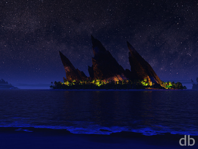
I was curious as to how my “Fluorescence” mushrooms would look with
only back lighting. Not sure if this one deserves its own place
in my gallery or not, but I think it makes a nice wallpaper
nonetheless.
Rendered using Asfaloth.


Ryan
Sorry that one slipped through. I’ve updated the file.
Shannon [liferplus]
Any chance we can get the master without the text in the bottom right?
Josh [lifer]
The original rendition of this image is how I found out about your artwork … truly amazing work — paid for a lifetime membership years ago and I have never regretted it. This more recent version of the fungi is excellent as well, much more lifelike and beautiful. Keep up the good work!
docster [basicmember]
…of the ones I’ve seen so far. Very nicely done, Ryan. The dual-screen…?
Marisa
Ryan,
This is the best looking shrooms i have seen since the red and green ones. Keep up the good work, I was really hoping that I would see them in orange 🙂 one canomlyhope 🙂 keep up the great work 🙂
Thomas
It only got a 9 because the multi screen is missing!
I got hooked when you made this and exactly this image(old one) was my companion for many years on every PC i had!
Please do a multi screen of this!
James
When can we expect a 5760×1080 version of this wallpaper?
Cindy
It happens to be one of my favorites in it’s old incarnation and I find that I like this one better. A request tho. How about a similar redo of Holiday Fluorescence — Christmas 2001 (the red/orange and green version of my favorite mushrooms.)
Deidre
Oh! I love this version too! I don’t know why, but these mushrooms always make for an awesome picture. My only reason for giving it a 9 rather than a 10 is because I want me a multi screen version.
Root)User
Excellent update to one of my favorite creations
Scott
It opens up the world to shrooms!!!!!!
CE
I love backlit translucence in general so this is an immediate favorite. Have you played with the degree of translucence any? Maybe a pickle version or two?
AJD
Could we get a iPad HD version?
Robert
Visually stunning! One of my favorites of your works. What a gift! Merry! Merry!!
R
With the technology ever changing and the ability to doing things that were not possible before, I like how you explore different way to change older pieces you have created. Maybe finally getting the desired effect you had originally envisioned, or just adding to your library of work. Either way I think, if you have the room, all pieces deserve a place for your members to view them.
On another note (sorry if this was stated before, I didnt read all the comments) might I suggest underglow? from the grass or ground beneath the mushrooms. Its always interesting to see what the direction of light on an object does to the picture as a whole. -R
Stargazer
It looks like you’ve changed the ground that these mushrooms are on slightly. It would be very cool if you would put them on a mirror floor, so that it shows their reflection. Maybe with a starry night sky background. I would def like to see it anyway. 🙂
Unclegumby
I really like this version. As a side note, would really like to have the preview version where you see the grid morph into the current rendition. Thought that would make a very kewl wallpaper as well.
WillowMoon
My favorite version of Fluorescence you’ve done so far! While I can appreciate all the different versions, they’ve never really struck a cord with me. This one changes my mind!
Rankin
One of the first pieces that brought me to DB with a nice twist. I will say this though that I still prefer the 2000 edition of this one though. I prefer them to glow rather than my imagination wondering what’s glowing behind them?
halletl
I love the simplicity of this render…not to mention that these are my favorite colors!
Brad
This same image is what made me a lifelong fan, love them damn shrooms, no matter what colors you bless them with. Excellent.
kellzilla
Love these. Love the fact that we can download a different image than our actual resolution so that we can crop it how we like it. I’ve got dense icons in the left third of my screen and a small strip of data on the right side, so I have to move the focus a bit off center. I can also zoom in or out if I want something to be bigger/smaller. Thanks for all your beautiful images, Ryan!
BobC
If I’d never seen the 2009 Fluorescence I think I’d rate this one pretty high, but for me, this version lacks the mysterious glow and visual “pop” of the original.
betsey
thanks for fixing the 1280–both the .zip and the direct download!!!
Ryan
I was going for less depth with this version (more of a silhouette) so I guess that’s a feature rather than a bug. I created the design because I was looking for something that might look good on a t-shirt. Not sure if that will happen with this version though.
Mjodvitnir
I loved this one from the very beginning, but it’s getting better and better. 🙂
Utoxin
LOVE this version. When’s the multimonitor going to be available?
robk64
Opinion from someone who’s been a fan/member for many years, so take it for what it’s worth.
Cartoonish. First thing that came to mind.
Great color, and the backlight idea is nifty, but something got lost. As a different look, it works, but it seems to be a departure from your usual work. That might have been what you were looking for, in which case, brave effort.
Personal preference is the classic look of the mushrooms of yesteryear. I still have the DB ceramic coffee mug coaster with the ‘shrooms on it, and that image still gets compliments from coworkers. This? Might look good on a kid’s spiral-bound notebook.
For something called Translucence, I think the tinkering has made it rather opaque.
Stargazer
No matter what you do to these mushrooms they are always awesome. I’ll never tire of them.
Jenanne
I like the idea in general, but the mushrooms look rather plain and lacking in depth. Some elaboration or perhaps color variation might improve this render, IMHO.
tmcd
Revised rating. Looks like 1280 x 1024 is indeed fixed, but I’ll re-check at home.
I love the translucent effect.
JP
Very good atmosphere! Gives a real nightlife impression.
seamus
really like the shrooms, in all their various forms and finishes… would like to see other colours as well!
keep up the excellent work, d00d!
Zach
Very cool! Even though it lacks the photorealism of many of your pieces, I think it is stylistically solid. I’d love to see a multiscreen render of this one!
TieDyeGuy
I set my computer up to run through each of the variations on shrooms on a fast cycle and I easily like this one the best. I always prefer your work in blues and especially the glowing blues, but the radiance in the atmosphere of the glowing background really draws me into this one. I find the glow less distracting than the spores and less stark than the clean one. I notice that the stem edges now being dark instead of light makes them seem a little less ethereal and a little more cartoonish, though. That may be what looks flat to teddeler. The gleam to the edges of the 2k9s give more depth and roundness to the curves in my eyes.
dpallari
I’ve always loved every version of these. I would love to see the multicolor 2 and 3 screen versions of this as well!
teddeler
ummm… I have loved all the flourescent pictures up to this one. On this one the mushrooms look kind of flat to me and at odds with the 3d look of the ground. Maybe it would look better without the ground. Sorry.
Jason
I love all the Fluorescence wallpapers, and this one is a great addition to the set. Definitely should be added to the gallery.
Ryan
It must have been corrupted during FTP. I’ve uploaded a new file and it seems to be working.
Schaff
Ryan, Love this render as much if not more than the previous renders. There’s just something about blues, blacks and fluorescence together. Awesome.
Schaff
Ryan, Love this render as much if not more than the previous renders. There’s just something about blues, blacks and fluorescence together. Awesome.
Peter
Looks really good. However, I’m also getting the 1280 x 1024 issue. I’ll upgrade this if the issue can be resolved.
Ali
1440 and 1600 png are missing
Ryan
I was curious as to how my “Fluorescence” mushrooms would look with only back lighting. Not sure if this one deserves its own place in my gallery or not, but I think it makes a nice wallpaper nonetheless. Rendered using Asfaloth.
tmcd
Is 1280 x 1024 garbled? I’ve tried in two browsers (Linux, Ubuntu, Firefox and Opera), and there’s a horizontal divide and the image jumps at that point. Or is it just something with my system?