Description
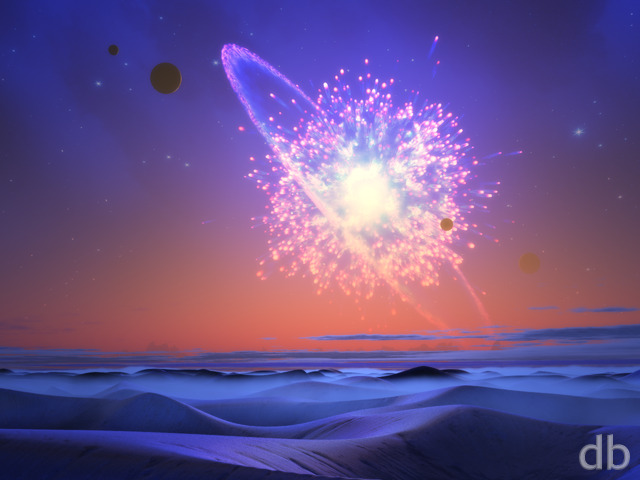
All the recent news about Comet ISON
inspired me to create my own comet, something I haven’t attempted
since 2009’s Harbinger. Whereas
that comet was completely created using Apophysis, I used a
combination of Apophysis and Lightwave’s particle effects this
time. The planet is an adapted version of “Roche Limit” (recall I did say I was going to
explore the moons of that system…)
Here’s the original “Traveller” from 1998 if you are curious…


 Traveller: travellercomet1
 Traveller: traveller2k131
 Traveller: traveller2k132


Michael Flohr
[Basic]
It seems that the MBP version (3456×2234) has an error with the watermark. It appears doubled.
Alton
I really like all of these different pictures, they make me feel inspired like a little kid.
Ryan
Sorry about that! Could you use the triple-screen and shift it to your liking?
Jason
I really love this one. I’m setting up a new workstation and I always seem to go for the blue/black night sky scenes with the planet in the background. Gotta say though, the planet been split right down the middle on dual-screen bothers me. Not sure how long I can keep it if its still that way once I get my other two monitors added 🙁
Fumigator
This is a nice piece. Love the snow on the mtn.
Jenanne
If you want to get technical, the North American spelling is “traveler”; “Traveller” is the British spelling. But no one has complained so far (about that) and DB has many British fans. As Mark Twain once said (attributed), “I donât give a damn for a man that can only spell a word one way.” 😉
Ryan
The file was there but I had misspelled “Traveller” in the file name so it was not linked correctly. It should work now. Sorry about that!
scottg
TRI-SCREEN split files still NOT up. Dead links
Victor
AWESOME!
Speedy J
Really amazing wallpaper especially for this time of the year…Keep up the good work Rayan 🙂
Speedy J
Really amazing wallpaper especially for this time of the year…Keep up the good work Rayan 🙂
ZUL
The guys face to the far right hand of the screen looks really cool. He’s catching some sleep as the comet passes by. It almost looks like there’s an open wormhole with the comet going into it. Nice work.
ScottG
Triple screen split files = DEAD LINK
Kyle
The 3200×1200 for the comet only is a dead link…
nithilher
Now perfect. I also like the background plate render, but it appears that the triple screen render 7680×1600 is broken. The bottom part of the image is corrupt. And, if I’m not mistaken, the comet is split between two screens. Is that deliberately so?
Matt
The effect on the comet is pretty cool. The link to the 1998 version prompted me to go back and look at the gallery, and I found a couple of old “goodies” that I used to use as wallpaper. Ever given any thought to redoing ‘fisheye’ or ‘red sky’?
DougB.
Perfect timing, to coordinate with Comet ISON’s fly-by of the sun tomorrow….
Peter
Nice! The way I see it, without the man, the mountain now is part of the background, and the comet is now flying over the middleground. Much cooler!
Michael T
Would love to see the background plate made into the dual screen …
Pete
Smaller planet – check, glow – cool, no goofy little video game character standing on the hill – awesome!
sally
the planet themes are the reason I’m a member, again, and again.. this is so beautiful! I love the image and the color…
sethr
I like the revised version much better; thanks Ryan!
Ryan
My latest (final) render is available this morning. I’ve removed the little astronaut, added some glow to the comet’s “coma” and changed the lighting angle on the background planet to better match the comet’s flight.Multiscreen coming soon!
DougB.
I have to agree with Peter, while the person on the hill is a small part of this scene, when you do take notice it does throw off the scale.
Caleb
I really like the concept here. I’d love to see a version of this without the planet in the background, just the night sky and the Traveller.
Peter
Normally I like the characters in your art, but this time, the man completely sets the proportion of the landscape off in my mind. Originally, I thought that the terrain he’s standing on was a huge mountain in the distance (which makes more sense)… But with him on it, it looks like a little hill.
Ann
LOVE it!
what if you changed the planet’s colors a bit? more of a purple than an aqua?
Brian
The comet’s appearance reminds me a lot of the Patronus seen in the Deathly Hallows Part 1.
Wish I could be the guy on the mountain watching this…
Laurie
I love your work. I am hope you are planning something new for Christmas. I am no expert on digital art I just know what I like. Your work is amazing. Thank You
Nick
Love this one. The planet almost seems like a distraction though. Might be more interesting without it.
RC Davison
Great image. I really like the composition and colors, but the comet’s nucleus is a distraction. It appears too crystalline. A more nebulous structure with jets of material flowing off it would be more realistic. Keep up the great work!
PerfectCr
Love it! I’d love to see a mostly RED version of this in the Pixel Jar, but the blue is very pleasing too.
Ryan
I’ve added a new version of “Traveller” this morning. I’ve made the planet a bit smaller in this version so it doesn’t compete for attention with the comet.
Mike Barbe
2560 x 1600 (16:10) didn’t render correctly
Mike Barbe
2560 x 1600 (16:10) didn’t render correctly
Ryan
Awesome, but like Shelly mentioned the 2560×1600 is corrupted…
Shelly K.
This is awesome. However, bug report: the regular 2560×1600 looks like it is cut up an put back together out of order.
Ryan
I like the smaller planet idea. Stay tuned…
Pat
Amazing. Really awesome. You might want to play around with the size of the planet in the background. It’s competing for my focus with the comet, which should be the main subject. This is just my first impression though.
Grant
Star of wonder, star of night
Star with royal beauty bright!
Jeffrey
I am a SCI FI buff and I love your scenes that are alien and includes space shots and planets. etc. 😀
Mike
Saw this, said “ooh!,” and immediately added it to my random background rotation folder, even though I’ve mostly been holding off on expanding my collection until I could take the time to do a more systematic download from the DB archives. Guess I liked this one.
Wazalord
Comet or Nexus? Reminded me of the Nexus from star trek… like he is standing there ready to be picked up..
Melissa
Really like and like the title. Facebook image coming soon?
Jeremy
Yet another homerun planetscape! I’d love to see a little green in there somewhere (maybe the ringed planet?) Love this one!
Pete
I wish there was a version without the tiny 80’s video game character in the picture. It is an unfortunate little blemish on an otherwise beautiful image… I do feel that way about most of the characters though in DB images – the feel of those characters never closely matches the beauty of the rest of the artwork and they feel like afterthoughts. JMHO…
Scott
Another classic planetscape from Mr. Bliss! 🙂
Jenanne
Terrific start — I love the colors and the composition. Now it just needs some polishing. I’m not very fond of the tiny person in this one, however.
Theo
The planet looks a little…fake? I don’t know if it’s my head misinterpreting the milky way style galaxy colors as clouds, but it looks like the planet was just copy/pasted right over the top, making it pop out, but in a less realistic way. The camera vantage point make me question if I should turn my head at an angle to view the piece too.
Drew
Love it except the body of comet doesn’t look realistic to me, I think it would look better if the rings we’re removed.
Slackweed
Good start, comet needs to be cleaned up I think- a little too chaotic.
hurtzDonut
Great
Maddie
Beautiful, but I agree, the planet is kind of off.
sethr
I agree with Chris. The planet almost seems to have a lower resolution than the rest of the scene
Nightwynd
Ok, now THIS is very nice!
Chris
I love the colors and the sky and the landscape … and that comet is beautiful! the planet seems a little out of place though, like it’s not quite a part of the scene …
Littlemom
Love it the blue tones are awesome!!!
Thom
Love the blue, this one’s great!