Description
“Red sky at night, sailors delight. Red sky at morning, sailors
take warning.” The reason has something to do with dust kicked up
into the atmosphere by approaching bad weather (which usually moves
from west to east at the latitudes most familiar to whomever coined
the original rhyme).
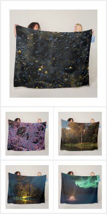
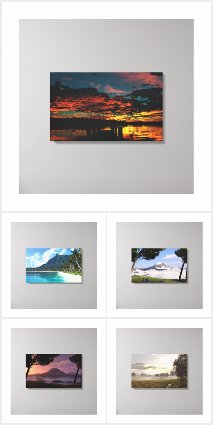
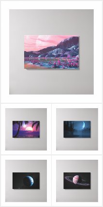
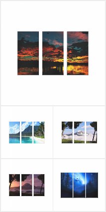
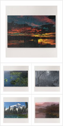


 Red Sky at Morning: redskymorning1


Davin [nonmonthly] –
Love the reds. I stopped by to pick out a new desktop and was surprised by this wonderful render that I seemed to have missed all these times.
Kelsi –
I have my wallpaper set to change every half hour(90% of the wallpapers are Ryan’s) and I always love it when this one comes around. It’s so pretty, can’t help but stare at it. The lighting is awesome, I especially love that the clouds are lit up from behind with the bright white light of the sun, but very subtly.
Sebastiaan –
… must you make such a beautiful image! I can’t stop looking at it, all the time, forever and ever! It’s like you cursed me or something…
CE –
A beautiful, peaceful looking morning skyline this image makes me want to say “ahhhhh”… and roll over and go back to sleep! (yeah, I’m a night owl)
Being familiar with the “Red sky at morning, sailors take warning” this title conjures images of galleons and frigates and ominous seas, so the peaceful woodland skyline seems a bit… unexpected. You did a galleon some time ago in the same color scheme, but I don’t think the marine theme has made a reappearance since… have you considered doing another?
Lee –
I’ve been a long time fan and member of Digital Blasphemy and have graced my main PC’s dual monitors with many, many wallpapers made by Ryan, but this image has a special meaning for me. I bought a new laptop a couple of months ago and for some reason didn’t bother to change the stock wallpaper it came with. At first I thought that the wallpaper was not very good, and then as time went by I began to hate it more and more. Until finally I said I’ve got to replace this thing with one of Ryan’s creations. I chose this one, “Red Sky at Morning” and as soon as I changed the wallpaper I had such an emotional reaction. First I thought how absolutely beautiful the image was, then I realized how absolutely ugly the wallpaper was that came with the laptop was. It was beyond ugly, it was Fugly! And I couldn’t believe how long I just put up with it. Anyway, now whenever I open up my laptop, I’m greeted with this wonderful image, and say “ahhhhh! Thank you Ryan!
Jenanne –
Thanks, Ryan! The 5120 x 1600 is indeed now the correct size.
Ryan –
Sorry about that. I need to recheck my Photoshop script!The 5120 x 1600 should be the right size now.
Jenanne –
And so did I, today. This error seems to happen often, and we can’t tell what we have until we’ve downloaded the files. Why does this keep happening, particularly on 5120×1600?
@genie, Wed March 14, 2012 at 12:00 am
Very good works, but when I try to download the 5120×1600, I get the 5120×1440…
genie –
Very good works, but when I try to download the 5120×1600, I get the 5120×1440…
Logan –
Scenes like this are what keep me coming back. This one finally replaced Grand Design which has been on the desktop for months.
However, as jlpilkin said, the 1920×1080 (and 1366×768) has the planet cut off. Instead of cropping the top/bottom off the single screen, could you create it by either cropping the sides off the multiscreen or else do whatever you did on the 2560×1440?
Terry –
Simply beautiful Ryan, well done.
Ryan –
You might be seeing the ground itself (which is green). It’s hard to keep the shadows black across all the different monitor settings.
Nephelyn –
The shadows right in front of the trees look green-ish and grainy … or is it my monitor ?
Jarrod –
This just strikes memories of camping and morning glory back into my soul. Thanks Ryan incredible.
jlpilkin –
Definite improvement with the new version. Works perfectly for the morning sunrise.
The only minor issue is that the planet is partially cut off in the 1080p version – easily fixable by cropping the 1920×1200 version though.
Kyle –
This came out a lot better than your earlier versions, though the sky has always been great-looking.
Fumigator –
Where are the 2nd and 3rd moons? Or the rings around the single moon which was partially destroyed 1.6 million years ago in the great war of (insert SciFi saga here)? This can’t be contemporary Earth, surely!
Littlemom –
Omgosh Ryan this is so beautiful. It’s perfect the way it is. Great job. I love the Sun rays and the sky, and the colors. You are such an amazing artist. I look forward to seeing more renders.
donut –
Your wallpapers for the iPad 3rd Gen will be great. Looking forward to it!
Nico –
Not the monitor! Nice and looks much better! Thanks!
Ryan –
I noticed this happen when I ran the new “HTTPS Anywhere” extension. If you’ve installed any browser extensions lately (between now and the last time you were able to download my work successfully) then perhaps try disabling them.@Pete: Thank you!!
Pete –
This is one of my all-time favorites. It reminds me a lot of the sunset that I proposed during. 🙂 Amazing work. If I could vote higher than a 10, this would be a 15.
Dave T –
When I click the link for the size I want, I get a screen full of garbage characters. Tried with several 16:9s.
dan –
Im not sure if its my set up but it sees like the last few of your wallpapers, which i think were great!, seemed a little washed out. I think it sometimes makes the images feel fuzzy and not quite as brilliant as they could be. May just be me though lol…. keep up the great work, im always excited for the next image!
Ryan –
Thanks! Yes, there will definitely be a zip file available.
Adi –
will look SWEET.. can’t wait to see them come next Friday! Will you have a zip file with all iPad wallpapers that I can download in one shot?
Oh.. and red sky is very cool.
Thanks
Ryan –
I primarily use Vue d’Esprit and Lightwave for my rendering. I use Zbrush, Onyx Tree Pro, and Xfrog for modeling. Happy rendering!!
Red Sky –
What technology do you use mostly these days Ryan I’ve been following your work since the days of Bryce – I’m thinking of trying my hand at 3D again and wondered what tools you typically use or would suggest.
Terry –
Like it ryan, looking forward to the multi-screen 🙂
0beron –
While this is most certainly a beautiful image, I much prefer your works that contain more modelling (not sure if that’s the right way to explain it). This scene seems flat since all the objects of interest are far from the viewpoint.
Your abstracts often exhibit lots of modelled objects, but your best natural scenes also do this – the floating garden and the highland seasons ones in particular.
The sky, clouds and light rays look wonderful, but it needs something in the foreground?
Tyson –
I’m just used to the blue in ur pics! Would be cool maybe for a pickle jar variation. Blue, purple, magenta! Sweet pic though!
Tyson –
I’m just used to the blue in ur pics! Would be cool maybe for a pickle jar variation. Blue, purple, magenta! Sweet pic though!
Ryan –
It isn’t your monitor, I have some “camera glow” added to the render. Looking at the image (now that I’ve posted it of course) I see that I have one last tweak that should be done. My final version will be up either later this evening or tomorrow morning.
Nico –
Looks maybe a little hazy? or it’s my monitor? but I like this. Like to see a full day pick of the lake if possiable.
Ryan –
I’ve added a second render this afternoon with new rocks in the foreground. They are a bit bumpier than the original rocks, but they may be hard to make out because I’ve removed the light source near the camera.
Sean –
… but the fore ground rocks not so much …
Ryan –
I really just wanted something in the immediate foreground to break up the reflections a little. The new rocks won’t be that much different than the first once, but they will (hopefully) blend into the scene a little better.
Jason –
When I saw the rocks, I thought of granite after millenia of polishing from the water… nice and smooth. I see I’m too late to influence the new render, but I hope you don’t add *too* much jaggedness to them.
anna_writr –
I really like the dawn light here. I’d love to see a version with a little more light and just natural light on the foreground rocks.
Ryan –
I have a new version rendering right now with an improved foreground. Thanks for the feedback everyone!
Terry –
I like it, I’d replace the rocks with some kind of silouette of a jetty or something like that…
Looking good thought 🙂
ChrisSpera –
Sunrise…yeah! Rocks…not so much. They detract from the rest of the composition.
Joël –
The image is really good, the sky, light and clouds are beautiful. The rocks instead are really low quality rendered.
James –
A beautiful image. Over here in England I grew up hearing, “Red sky at morning, shepherd’s warning. Red sky at night, shepherd’s delight.”
I like the rocks, they look like they’re in slightly soft focus. Adds to the dept of field for me. Awesome.
Karl –
I agree with Mars, this image resembles your work from the 90s. I really like it, even though the textures do not look all that realistic, it has a surrealism to it that I find very gripping. I love the lighting also, great work!
Mars –
nuff said
Henry V. –
As “D” stated, the texture of the rocks leaves something to be desired. Perhaps add some depth/definition into the trees. The clouds seem to have a lot more. I do love the style and artistic perspective of the image though!
D –
Very nice render but the “rocks” (shape and texture) are not up to par with the rest of the image. Seems similar to the issue you had with the trees in redfern forest.
Chris –
I like this one alot. The lighting is just early enough to where we can’t see the sun yet, and that’s the best time of the morning. One thing I might change about it is the detail of the rocks in the foreground. They look too smooth and the texture pattern doesn’t quite seem to fit.
Sniper_x5 –
I told this quote to my 5 year old son and he locked on to it. then a few months later we were up at the lake and the sun was setting with all the best reds and oranges. A friend turned to my son and said “know what that means???” he said yep and told him. I couldn’t help laughing at the stuned look on his face. He was like “yes… yes that is what it means.”
It’s great when a picture can take you back to good memories.
Great work as always
JDD –
I have a fisherman friend who often quotes the “red sky at night…” rhyme. I’d rather just stay on land and check out the sky and not get on a boat.
looks good Ryan