


Description
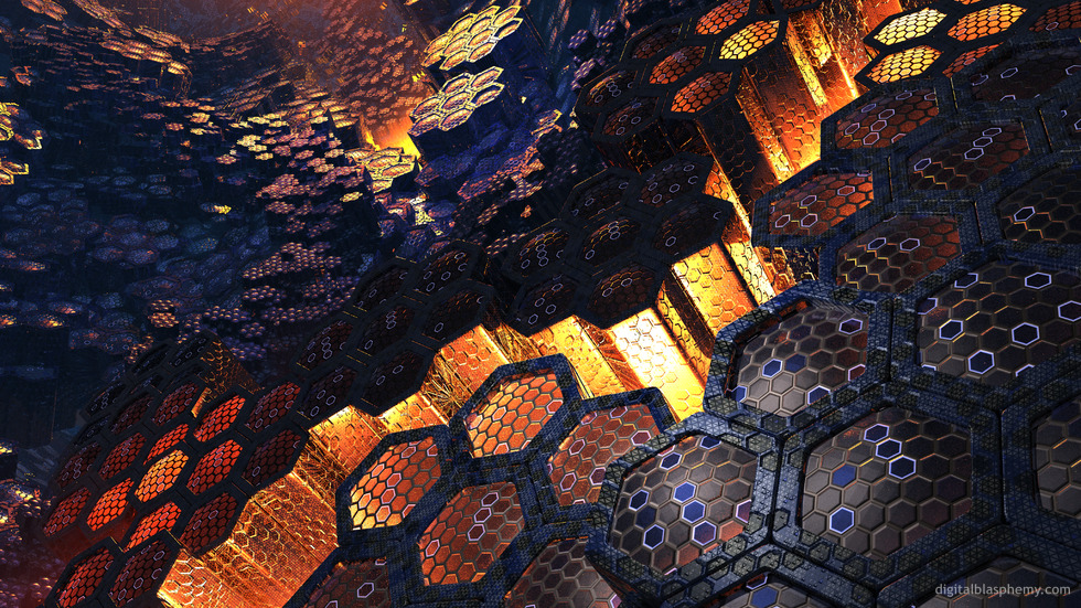
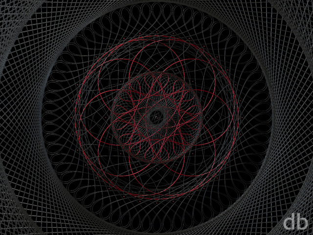
Continuing here with the “techno-abstract” theme of “Automata” and “Waveform” here. Lightwave
11’s new instancing system opens up a lot of possibilities!
See also Latticework and
The Comb.
Continuing here with the “techno-abstract” theme of “Automata” and “Waveform” here. Lightwave
11’s new instancing system opens up a lot of possibilities!
See also Latticework and
The Comb.
= Add to your a la carte shopping cart.
This feature is disabled temporarily. You can still add a la carte items via the "Downloads" tab on any wallpaper, including this page.
Other Versions:
 Hivemind: hivemind1
 Hivemind: hivemind3
David Mancini
Excellence. The Lossless Master is watermarked though.
Ben [plusmember]
I was looking for a wallpaper for my work laptop as I was tired of the default ones, and I chose this. The biggest “issue” I have now is that I also want to use it on my home laptop, but don’t want to have the two the same… I am tearing myself apart as to which one to use this on…
Love all your work, however for some reason this one really draws me in (I think it’s the Orange)
Trevor [lifer]
Ryan,
Anyway to get you to go back to these older images and blow ’em up for 5760 x 1080? I’d love to have this for my 3 monitor setup.
Jenanne [liferplus]
I just noticed that your renders now need only a minimum of 10 votes instead of 50 for inclusion in the Top 10 Rated Images of All Time (and top 25, 50, and 100, too). Hivemind is now #10!
Ryan
Sorry about that! It should be showing up now!
Duane [lifer]
I wish Hivemind3 was available to download.
Alex
I like the creativity and mixture of texture and colors. This is my first visit as a member. I am downloading this one.
Ryan
Any chance you could do a Facebook Timeline version of this one?
Sparky
1024 x 768 (4:3) is damaged. The bottom quarter of the image is messed up.
Slackweed
Could you please make dual screen of the original darker version? It’s the best one!
Brandon
The link for the 2560 x 1024 dual screen isn’t working.
Eric
There seems to be a problem with the 7680×1440 version. Love the multiscreen versions.
Chris
My most preferred version is the v3, it feels the most alive!
Brandon
I think it’s pretty well agreed that a lot of people like version two the best. Dual and triple screens of that would be great!
Ryan
I just started the multiscreens rendering this morning. Sorry I got a bit sidetracked with my new version of “Moonlit Oasis”!
Nithilher
I very much like, if the scene looks mysterious and outworldish. I would very much like to have a triple screen version of this. Are you planning to provide one?
Jeff
Will you offer multi-screen versions?
Jenanne
I like the lightning in Version 3; it reminds me of the “power plant” in the Matrix. I also like the idea that the hive mind is using energy bolts to communicate. However, the lightning does make V3 a little too busy. I do like it, but just not as much as V2.
Rachel
The lightning detracts from the image. It draws your eyes to focus on the electricity which doesn’t seem to fit the imagery.
V2 added depth to the original image and the lighting/coloring was beautiful. It had better harmony than V3.
Kyle
Echoing the sentiment earlier: my personal preference is sans lightning – please do multiscreens with and without! 🙂
Daver
I really like this one. I can agree with some regarding the darkness in V1 adding to the mystery of the scene, but the sparks in V3 really set this version off for me. Slightly distracting to me is the detail that the hexagonal texture on the grey borders of the larger hexagons are not aligned to the larger shapes. The mis-alignment seems to increase further to the right side. It’s just a distraction, I still love the over-all image.
Joe
Barring any more additions to the Hivemind family, the first one got a 9/10, second a 6/10, and the last, a perfect 10.
I didn’t honestly think that the image could get better from the first one, and was quite disappointed with the second. However, the third just blew me away, and I am super-duper looking forward to the multiscreen renders.
Irene
For some reason, v1 is still my favorite, the darkness in the background just amplifies a sense of mystery and stillness for me. I like that it’s less ‘perfect’ than v2 and v3 brings more action to the scene but … I like the stillness of v1. Thanks Ryan for all 3 choices.
SimonRev
V2 is my favorite. I think the lightning detracts overall from the scene. That said, I can see why some people like V3. Any chance, when you get the multiscreens complete that you can do multiscreens of V2 as well?
Jonathan
I really like the electricity. IT is like it has come alive. ITS ALIVE!!!
Peter
I really liked v1. Then v2 came out and it was even better. But then v3 came out, and I am still using v2. Don’t get me wrong, I like v3, I just prefer v2. Still really need the Twitter header version.
Doug B.
I have to give this one a lower rating than the original….sometimes less is more, and I think this is one of those times.
Simon
I think I like it better without lightening. It kinda feels a bit gratuitous or out of place somehow. Perhaps if it were toned down a bit, though? Or if the electrical arcs followed the geometry a bit more?
Jenanne
…and that’s saying a lot. I didn’t see how you could possibly improve on the first version. Boy, did you ever prove me wrong. This is GREAT!
JD
I really like this type of wallpaper.
The geometric shapes appeal to me.
Will keep this for a while…..
Stargazer
I meant to tell you that I’d love to see the Queen Bee of this colony.
Stargazer
I’m one who usually loves the distant planets and suns and moons of all your art but I LOVE this “abstract” one. When I keep it up as my wallpaper on my ‘puter constantly, I know it’s one that I love… and I’ve done that with Hivemind.
Doug B.
To me the updated lighting seems to have added an overall “haze”, I think it would look better with a lighting level somewhere between the initial version and this one, just my $0.02
Peter
I liked the original, especially because it is so thematically similar to my favourite computer game.
I thought the original was about a 7. Then this one came out and…
Ryan
You read my mind 😉
Matt Reed
This one with the new lighting reminds me a lot of another of my favorites, hexalite.
Ryan
I really like both the old and the new versions – could you do multi-screens of both?
Slackweed
The added lighting makes the image look noisier. I prefer the darker.
Hunter
This is a really awesome piece, and I really like the new version. This is one of the best pieces I have seen from you recently – keep up the good work!
Hunter
This is a really awesome piece, and I really like the new version. This is one of the best pieces I have seen from you recently – keep up the good work!
0beron
Wow… I was going to comment that v1 needed the background lightening up to see the hex columns in the distance, but you’re one step ahead, the new v2 is stunning.
I love the rapid fire series of abstracts that have been appearing recently!
Jonathan
I like it. Think it would be cool to have some electric sparks in there too. I like the lighting better in V.2.
Alexander
Lovely colors! Very honey-ish…
Ryan
Added an update to “Hivemind” in the Members Gallery this morning. I’ve done quite a bit of tweaking on this one over the past few days but this is my first render which I felt was an improvement over the first version (which will remain in the Pickle Jar).
Bruno
I’ve installed this on every device because it’s one of your. Best pieces. But unfortunately I can’t find the renders for Twitter header and for the BlackBerry 10 (720 x something). Will you upload the missing resolutions too?
Tim H
Absolutely love it. Digital grand canyon. Fantastic !
Jay
This is an AMAZING piece! I love it, it would look beautiful across my tri-screen at 5770×1080, let us know if it’s possible.
James
It’s awesomeness should be larger!
Logan
This reminds me of a Tron version of Giant’s Causeway, a rock formation in Northern Ireland that has a hexagonal lattice structure to it.
Littlemom
Love it. Great job!!!
Ryan
I have hexaline on every device including a custom theme on my chrome browser – replacing them all with this beauty as soon as the dual-screen versions are up
🙂
Erik675
Can’t wait to see this in triple wide resolutions! Keep up the good work, as always!
Paul
Brilliant, keep up the outstanding work Ryan. THIS is why I am a lifetime member!
Slackweed
BACK TO THE BASICS ! FUCKIN AWESOME.
BobC
Fantastic! I also love these mysterious, disorienting “techno-abstract” pieces (“Where are we?” “What is this?”) This one is super evocative and, as I look at it, keeps shifting scale.
Mike W
Love it!
Nelson
Like some others have said, I too am reminded of some former works. I always found Latticework and The Comb beautiful, and this one combines these two and adds even more. I also feel a little bit of Hexaline in it. And this is only in-progress yet…? Well, I am really excited for the final version then, but this one deserves a 10 already.
Justin B
I’m not normally an abstract guy, but this one instantly became my new background. I can’t tell you exactly why I like it so well… it just works. Awesome.
Joe
Love these new Lightwave 11 pieces Ryan. This reminds me of something awesome I saw/read/played that I can’t put my finger on.
cmmnoble
The blue and gold colors, the lighting, the way it draws my eyes in deeper and deeper–everything about this one is great! This and Waveform (in all its variations) are instant favorites for me. Is it too much to hope that you’ve got even more techno-themed abstracts in the works?
Miguell026
nothing like a glowish wallpaper!
very good one Ryan! perfect Hive!
i miss the night glowish wallpapaers 😀
David
Fantastic. 😀
Stargazer
Love this. Gorgeous. I would love to see it with more of a light inner glow towards the back. This is really beautiful.
Doug B.
Reminds me of somewhat of ‘V GER’ from ‘Star Trek The Motion Picture’, but with more detail.
Malcolm
Reminds me of both Hexaline and Azula, two of my favourites.
DClark
Would really go well with Deus Ex: Human Evolution fans..
Ryan
Try it now!
Magnus
I like this 9/10 but whats wrong with the 1080×1920 res? half of it is discolored PLEASE FIX !!
Randy
I like the blue light in the background, opposite the gold. Also like the charcoal color in the foreground. Nice touch there. My only suggestion would be to brighten the background just a bit, not so much blackness. Excellent work, Ryan.
Nico
Turn the blue to a green? Maybe a pickle jar version? Very nicely done. Like the geometry configurations. Can hardly go wrong with that.
JonE
I’m not too much into this kind of imagery, but I tend to like this one, not sure why. I gave it a nine only because you seem to always go back and make things better.
Intech
Stunning, I love the way my eyes search out the detail and follow the fissures through the hive. I especially like the promise of what may be located even deeper in the “Hive”. Good work !!
Jenanne
An instant classic and favorite. Love the title, too. I agree with Doug B.; you’re really on a roll with these techno-abstracts. This is right up there with Automata and Waveform.
OMeyers
I like the recent abstract bend you’ve been on lately. This is a wonderful piece of art. Can’t wait for the multi screen version.
Miles
Absolutely stunning! Really loving all these new abstract ones.
Brian
This looks amazing. Has a slight cyberpunk feel to it. Can’t wait to see the final version!
Chris
this one resonates with me strongly. love it. seriously love it.
RDL
Enough said. Some color variations would be fun. An ominous red would be sweet.
Doug B.
Talk about being on a roll…..from Waveform to Hivemind…two immediate favorites.
Ali
1440p png doesn’t load all the way
Jeff
Reasoning ? Because I could not click 11. This is an instant classic DB wallpaper, if I ever saw one.