Description
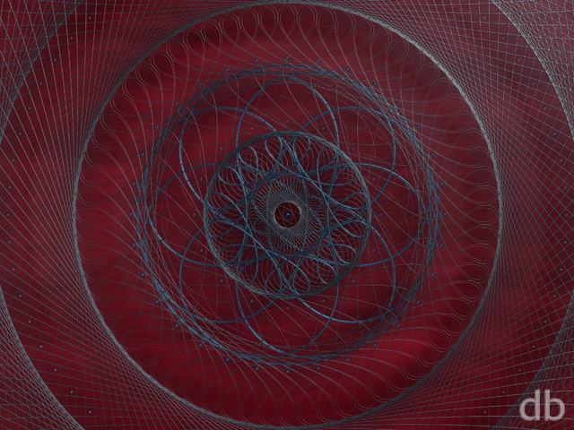
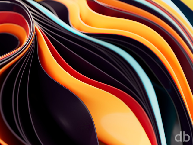
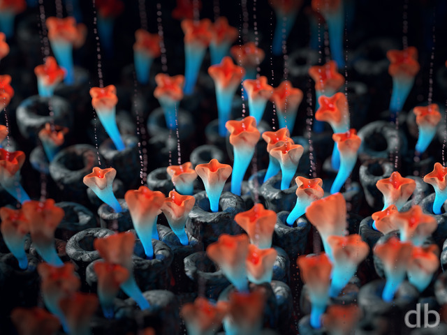
Here’s an alternate version of “Passel” that I designed, furthering my study of how to texture cloned objects using Redshift in Cinema4D. Oddly enough, I discovered that the colors shook out differently in the multiscreen version than the single-screen version I initially rendered. I decided to go with the different versions rather than cropping the multiscreen because I liked the colors in the single-screen more.
A lot of folks suggested I do a “blue version” or some other monochromatic look but I thought it would be interesting to do a multicolored version. I’ve also given the objects a bit of more of a glassy look.
Hope you like it!


 Passel (Red)
Sarah Paland
[Lifetime]
So cool!
Susan Tucker
[Basic]
Great abstract and lovely colours.
Larry Odom
[Basic]
I especially love the color as well as the texture and contrast. I also prefer the darker backgrounds, they accent my smaller desktop icons. Thank you for all the hard work you put into each scene !
Larry Odom
[Basic]
I love the color, texture and contrast ! also prefer the darker backgrounds as they work well with my smaller desktop icons.
Thank you for all the hard work you put into each scene !
Robert Nesterowich
[Lifetime]
I’m a big fan of the darker images. I like this one because it is dark, but colorful.
Larry Koman
[Plus, Lifetime]
Love it, but the lossless seems to break Windows. My background just turns black and background selector in settings is disabled. Running the original lossless, no problem.
Sarah Paland
[Lifetime]
Love it!! Miss these types. Glad you have done a few abstract ones ☺️
Robert Caldwell
[Lifetime]
Outstanding!
Stephen Hedge
[Basic]
I’m revising my review! The colours are perfect after a day of using it!
Eric Liscinsky
[Donor, Lifetime]
This makes an awesome desktop for my dual monitor systems. The colors really POP!
Ronald Fisher
[Lifetime Plus]
This is a kaleidoscope of colors that is beautiful. The trill of waves brought a sense of calm and reassurance. I like this conception just the way it is.
Stephen Hedge
[Basic]
Like this one a lot. I tend to favour abstracts and so new work is always great. Also, as a triple monitor user, I love that there is a lot of interest for the left and right monitors (the centre one is mostly covered with work stuff :-)). Only one criticism, it’s a bit bright and saturated so I needed to adjust this in a photo editor. Or was too bright in my peripheral vision.
Eric G.
[Lifetime Supporter, Lifetime]
Looks great on my phone!! Oh, AND the desktop! Beautiful work Ryan thank you!
Littlemom
[Lifetime]