


Description
Imagining what the sky might look like on a world near the galactic center, without all the interstellar dust that darkens our own view of the galaxy.
I rendered the background using Lightwave and the foreground is Vue. Rendered first at triple-5K.
 Core World: coreworld0
 Core World: coreworld1crop

Ginger [nonmonthly]
The bottom portion of the screen is the same as another render. Not other worldly at all.
jjlem01 [nonmonthly]
This is a nice render but I have two vertical Portrait monitors on each side of my horizontal Landscape monitor.
It would be nice to have all renders with a Portrait resolution 1200×1920.
My setup looks something like this:
http://ubuntuforums.org/showthread.php?t=1543300
Here are some portrait desktop backgrounds:
https://www.flickr.com/search/?tags=1200×1920
Zach [lifer]
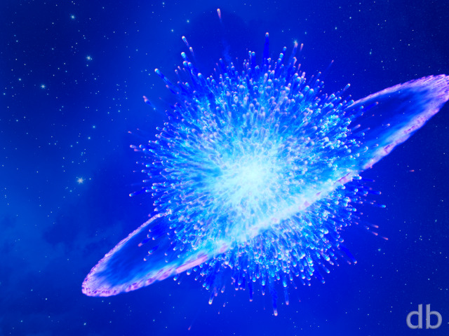
I like both versions, but for different reasons. The blue version is appealing to me because of the colour palette, but it seems strangely less focused than the “daytime” version. It almost seems like the DoF is wrong or something like that, but I have a feeling that’s just an illusion. For now, it’s the yellow version on my screen. 🙂
Kes [lifer]
This looks pretty nifty on the Galaxy S6 Edge with the Wallpaper Motion Effect. I have one quibble, though. The resolution is 1440×2560, not 2560×2560. I’m currently using the 1080×1920 and it looks pretty good, but I would like to see it in the native resolution.
Mario Carini [nonmonthly]
Like the primitive nature of this work. It looks like a world in the formation stage, getting itself ready to sustain life.
Ed [lifer]
Both of these wallpapers are really good! Like others are saying, it’s hard to choose which one is better, but I like the yellow one the best; it just look more natural, and it’s easier on the eyes.
drow [nonmonthly]
maybe a primeval trantor, which in the foundation era is an ecumenopolis, a world-spanning city.
i prefer the golden coreworld0 variation, i can’t quite put my finger on what bugs me about coreworld1. maybe its the dominance of blue light, since the dual- and tri-screen versions don’t do it as much.
Dustin Snyder [nonmonthly]
In Issac Asimov’s “Foundation” books, the capital of the Galactic Empire is the planet Trantor, which is located near the galactic core. This is what I first thought of. It looks amazing.
Ammon [nonmonthly]
This is one of my new favorites!
Ty Lambert [nonmonthly]
Amazing work! Love it 🙂
I’m am always grateful for artists who can take us to places we could never hope to visit in, as what Dr Carl Sagan used to call, “The TSarship of the Imagaination”.
Wonderful.
Jen [nonmonthly]
The larger spectrum of color makes me very happy. I agree with the earlier comment, the yellow is perfect for Coruscant.
Christine [lifer]
They’re both wonderful but I like the variation of color in the blue one.
Josh [lifer]
I can see why this is a difficult decision — the change in star color completely changes the image to me (beyond just the slight right/left difference in viewing angle relative to the viewer). The blue makes it seem like a colder alien world, where the yellow makes it seem a bit more like Earth-like …while found myself looking at the yellow one more I can very easily see either being used as a background on my screen/wall.
Max Kaehn [nonmonthly]
This is what the night sky on Coruscant would look like.
The gold one looks more like the afterglow of sunset; the blue one looks more like a night sky. I put both of them into rotation on my desktop background.
BeccaM [lifer]
However, I can see the point of those who seem to like the other as well.
But honestly? The blue one is the version going into my desktop background rotation. Personally, I’ve always loved imagining what it might be like to see a galactic core from closer in, unobstructed by the dust clouds we see here from Earth.
If nothing else though, Ryan, I’d love to see more ‘Cosmos-inspired’ creations. 🙂
betsey [lifer]
perfection!!!
betsey [lifer]
I love this in yellow…
betsey [lifer]
I love this in yellow…
Doug [lifer]
I like them both. The blue is better for having work and seeing it around the edges of the work. It also draws the eye more to the foreground and clouds. The gallery (golden) really draws the eye strongly to the rising core. If I have to choose, I’ll go with the golden gallery version.
DaveC [lifer]
I like the blue, personally. I’m a nighttime type of guy and the blue goes towards that feeling.
Lynette [lifer]
The short answer is: the “blue” one in the gallery.
The slightly longer answer: The pickle jar version reminds me of sunrise and the gallery version reminds me of sunset. I prefer the more colorful version in the gallery, but I do like the back highlights of the clouds in the jar.
Either way, I’m sure someone at work will ask “where’s that?”.
Mark [sponsormemberlifer]
I love this, absolutely stunning. I personally prefer the second render, the first is much too yellow for my personal tastes.
Doug [lifer]
To me the edges of the dark bands look a little too well-defined, I would think the edges would have more of a thinning-out effect.
Jenanne [lifer]
Both are awesome, Ryan, but I think I prefer the new version. I like the “sunset” look of the PJ render, but I this one is more otherworldly, and I like the blue tones over the yellow. Both are terrific, however — I love your space images.
Cherie Blu [lifer]
I am loving the new inspirations lately, but this series takes the cake!
Richard H. [lifer]
Lovely! Which do I prefer of the two? Hard to say, to be honest. The new version seems to have more ‘natural’ colour, in that it isn’t overall yellow, but it feels a bit colder, and I think of it more as a night shot. The golden original is maybe a bit overall yellow from a distance, but viewed up close I really like it. It has a warmth to it with a sunset feeling. Also, I have to say that the water looks better in the original golden version, and there also seems to be more detail in the dark areas, which I prefer. Certainly, I think the multi-screen versions of the original scene (and particularly the triple-screen versions) work a lot better than the newer render, because they’re just a lot more interesting; there’s more to see in them, especially at the outer edges. But overall, particularly in terms of the regular single-screen view, I like both versions very much and don’t especially favour one over the other. I’m really glad you’ve provided everything (including multi-screen Pickle Jar versions) in full 5K resolution, though. That’s much appreciated. Thanks!
Ryan
The first version (with the golden sky) took nearly 180 hours to render on Bucephalus which the gallery version (with a sky which brings out more the colors in my stars) took only 48 hours on the same machine. The difference? I increased the “world diameter” (moving the horizon further away) and used a flat plane rather than a displaced surface for the water. Which do you prefer?