Digital Blasphemy | 3D Wallpaper

Posted on July 26, 2002

  • I did a little more color tweaking on my roses and came up with something I liked better. I hope you agree. You’ll find the new version up on the new images page, and the original I posted yesterday can be found in Pickle Jar.

Posted on July 25, 2002

  • Rather than tweak “Fissure” I decided to work on something new. As a result, this afternoon I’ve added another new wallpaper to the gallery. It’s called “Hybrid” and hopefully it is an improvement on the rose making techniques used in “September Rose“. Jessie had a lot of input on the colors so I have to give credit where credit is due. I’m still working on this one so stop back tomorrow if you are interested in the revision.
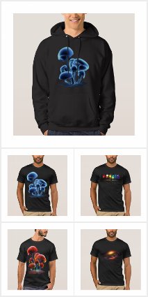
  • I’ve put up a t-shirt design in my Cafepress store if anyone is interested.

Posted on July 23, 2002

  • I took some time off last week to entertain my father and four brothers who had driven out from Illinois. It was my Dad’s first real visit to California and I think everyone had a pretty good time. I know I did.

    On Sunday, before they were set to drive off, my Dad asked to see how I worked. We gathered around my workstation and I fired up Lightwave. I whipped up some simple rock formations and he seemed fairly impressed. After they left I sat down, refined things somewhat, and ended up this morning with an image I actually liked. The result, entitled “Fissure”, is now up on the new images page. It’s still in the early stages, but I hope you like it.

    Thanks everyone for your comments regarding image brightness. The majority of you confirmed what I think to be the best course of action: to keep making images like I always have. There’s little hope of me perfectly matching brightness on everyone’s monitor. Some people wisely suggested that one could download a graphics editor (I recommend the freeware Ifranview for the PC) and adjust the brightness, contrast, and/or gamma to fit one’s particular screen. This is probably the only way to please everyone.

Posted on July 15, 2002

  • I’ve added a newer version of “Macrocosm” (def.) to the gallery. Quite a few of you mentioned to me that the image seemed too dark. This new render isn’t a whole lot brighter, but it is a little. Essentially, the asteroids in the foreground are supposed to be silhouetted by the galaxy in the background. I didn’t want them to be brightly lit, but I did want some detail to be visible. The previous version, plus a “Galaxy-Only” version, are available in the Pickle Jar.

    Dimly lit objects have been a problem ever since I started using this Trinitron. I had noticed right away that some of my older works looked horribly washed out on this monitor and there were details visible where I had intended there to only be shadow. Now the problem is reversed. I’m not sure how to solve this, given that I love to use darkness and shadows in my work.

    What do you think? Should I “over-brighten” (to my eye) to compensate for darker monitors? Drop me a line if you have thoughts one way or another.

    Anyway, I hope this one works better for you. I’ll try to do something bright and cheery next time, OK?

Posted on July 14, 2002

  • I spent all afternoon working on Plan B (see this morning’s post) and I think it worked out nicely. I actually think this version turned out much nicer than the failed render. The new piece, entitled “Macrocosm”, is now up on the new images page. Comments appreciated (is it too dark?).
  • I was about ready to cry this morning. The Lightwave render that I started on Thursday night was supposed to be done this morning, but instead I woke up to find that it had crashed. Such frustration comes with the territory I guess, but it’s still heart-breaking.

    Moving onto Plan B now, which will hopefully result in a new render on your desktop by either tonight or tomorrow morning.