


Description
I thought it would be fun to update my “Endless Blue render from 2005, since it keeps
showing up in various “Viral Photo” lists.

I thought it would be fun to update my “Endless Blue render from 2005, since it keeps
showing up in various “Viral Photo” lists.
= Add to your a la carte shopping cart.
This feature is disabled temporarily. You can still add a la carte items via the "Downloads" tab on any wallpaper, including this page.
Other Versions:
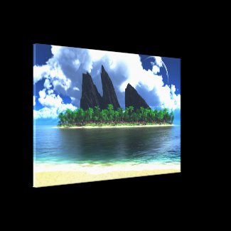
 Endless Blue: endlessblue2k142
 Endless Blue: endlessblue2k141
John C [nonmonthly]
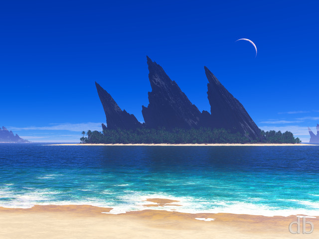
As someone who grew up near the ocean, what’s conspicuous to me by their absence are seabirds. You would never see a scene like this without plenty of birds visible, and to me it looks almost eerie without them. A dolphin or two and maybe a few fish in the shallows would make this a 10! I think I also preferred the original, bluer Endless Blue water and skies, personally.
Bob
Dual Screen??
Tyler
Will we see it this year??
DaveSp
Your comment made me LOL:
At times I’ve wanted to retitle it “Endless Rendering”…
Frustration encapsulated. 🙂
Bob
Dual screen perhaps?
Elaine
This gets better and better. The rocks, water, and sand look much nicer in this version.
Jenanne
Oh, THAT shore. I assumed you meant on the island, and you know what they say about assuming. 😉
Tyler
Wow I see it. However I meant in the foreground. As if to say hop aboard and travel to the island =)
Jenanne
There’s already an unmanned boat on the shore. I believe it’s a canoe. But it is small and a bit hard to see. It was REALLY hard to see in V2. 🙂
Tyler
Can’t wait for the multi. A night version sounds even better. Personally I would love to see an unmanned boat on the shore but that’s just my imagination going.
Rene
New version looks great! Can we please get a 1280 x 800 (1280w) version, please? Thanks!
Shane
Looking at some other people’s comments I agree with the trend of something looks out of place. But I’d say it’s the clouds that look too real. They look like they’re out of a photograph, but I knew that couldn’t be true. It was some weird cognitive dissonance.
Melvin
Looks great, sharper! The water is clearer for sure.
Jonathan
I think this is a great improvement. Sand, water and trees look much better.
Brian
I did like version 2 and have had it as my background since you put it up. This is still good though it might be a little sharp for me, if that makes sense. Like that I have a choice with pickle jar versions so thanks for that.
Joel
I really like the improvements to the water and sand in this version. The water is much clearer and the sand is less harsh and grainy. The picture as a whole makes me wish I was outside on a summer day rather than this rainy nonsense I have now. 🙁
Jenanne
I liked V2 just fine and didn’t have a problem with the greenness of the trees, and I liked the color of the water better in V2, but this version does, I think, address the overly green flora that bothered some members. Regardless, it’s still a 10. And I’d still love to see a night version of the final.
Bob
This and Rite of Spring have dual monitor coming by chance?
Slack
This is awesome, but the trees are TOO GREEN and cartoonish. Props for not making it so noisy!
Overdrive
Beautiful indeed, but not as magical as the original. I’m impressed by the water (surface and reflections), but plants & trees still don’t seem quite right (not enough shadows, I think). Nevertheless another fine piece of artwork!
Jen
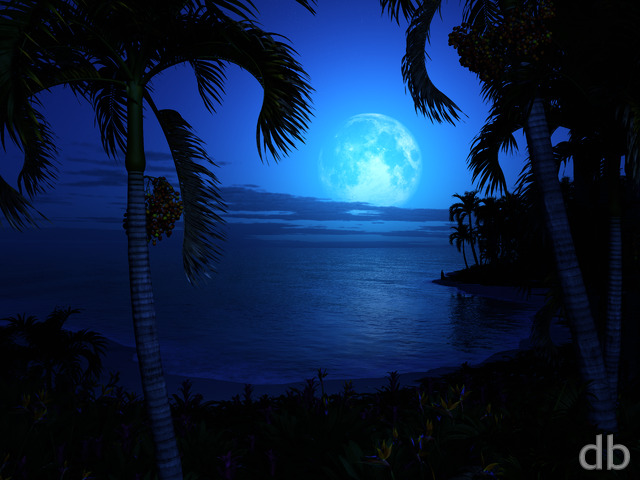
Beautiful and calming and the moon is excellent.
Peter
Something looked a little sterile to me about this picture. A little too perfect. I think it is the lack of any sort of movement in the water. It’s like I’m looking at a smooth lake on a breezeless day, except I think this is supposed to be an ocean. Still much better than I could ever do. 😉
Jeuce
Just from the title, I’d have loved this scene without the central island and mountains… just the shore, beach, clouds and crazy moon.
Ruth
Yes, Ryan, definitely worth the time! I love the moon; just right! I liked the moss on the cliff tops before, but I like this version at least as much. I agree with the sand being a bit grainy, but it’s not a big deal to me. I have loved the different aspects of all the renders on this one; thanks so much! In direct contradiction to the art critic below, I think your work is fantastic, and if I want something that looks like it was painted, I will go to an art gallery. I have always loved your work, and I think you are the tops in this field! 🙂
Harry
Brilliant, so much better than the more recent one and a near perfect descendant of the 2005 version. Not being rude but as recently commented, I havent been a fan of the water any scene involving water for the last year or so but this one I think can be considered to have nailed it right on.
One of my comments wouldn’t be complete however without a little nitpicking however so:
The taller palms look a little bright and over exposed meaning that they seem to have lost some detailing that the smaller ones benefit from.
The “green glow/moss” on the under side of the cliffs is well a little out of place as it is nearly brighter than the sun illuminated top side and is rather monotone hiding the details of the rock when again compared to the top.
All round, absolutely worth the effort and time, and if all the tropical/sea water can be made to look like this then all for the better, it has so much depth but true transparency.
BobC
This is clearly a more direct descendent of the original and here the photorealism does work quite well. The return of the planet or moon is very nice. As such, it is certainly worth the effort. (I am, though, partial to the utterly alien strangeness of the 2005 original…)
Nico
Definitely an improvement on the January 2014 render. The overall composition is brighter and cleaner. The colorful green of the trees contrast nicely with the bare rocks. The moon is a nice touch. I think it was worth the time.
WillowMoon
I think the new update is better overall. The water & clouds look much more realistic, and really give you that “dream getaway” kind of feel.
However I do miss the mossy look on the rocks, it gave them lots of texture and depth, now they are just kind of flat. I think you would see a lot more detail on them if the sun really was as bright as the rest of the scene shows.
The new plants are easier to see and not just a cluttered mass of green, but the color looks a little too bright, not much but just slightly.
I think if you found the middle ground on those two things out it would make the scene look much better. That said even if you don’t change a thing it’s still one of your best!
Jenanne
Gee, doxpixl, don’t sugarcoat it that way; tell Ryan how you really feel.
Seriously, you’re entitled to your opinions but I couldn’t disagree more to your comments about the recent updates. The technology certainly has improved, but Ryan is still the creative genius behind these renders. I don’t see anything formulaic about them; I’m delighted to see some of my old favorites refreshed, and sometimes completely transformed (re: “Amazed”).
drow
i like this version much better, thanks!
drow
i like this version much better, thanks!
Tatiana
Absolutely gorgeous. You can FEEL the sun from the way it makes the sand and the top parts of the clouds so blinding. The water is beautiful, and the gradient is nicely subtle. The moon is nicely minimalistic so it doesn’t distract from the focal point of the island. And the island itself is wonderful with the stark rocks in the background and the detailed plants in the foreground. This is perfect.
Drew
Wow, stunning, one of the best ever
doxpixl
I’ve gone back and forth between the old and new versions. From my perspective the old version is better. The only thing I like about the new one is the addition of the palm trees. Everything is too hard and stark, the colors iin the new version are hard, metallic and fake looking; there is no gradual change in the clouds from a bright white to softer shades. The foam on the shore has no detail, it’s just a stark white. The sand color also looks fake. The older version has a more hand made quality, as if it was actually work done by a person and not a machine. I’m beginning to not like what I used to think were really good renderings; they had a more dream-like artistic human drawn quality. As if you were sitting at an easel and drawing and then painting them. They are beginning to look like formulaic artwork: put in this combination of elements and poof! There it is. This is true for many of the pieces and not just this one. “archipelago” also looks very plastic and fake. It seems to me the ‘artisan’ is being lost to technology. I know, they are all made on a computer, but something has changed and they are losing a human touch and quality.
Jenanne
All the changes are terrific; I particularly like the moon/planet and the clouds. And the changes to the flora. Great, Ryan! Perhaps a night version?
JMK in CT
All it needs is a little beach hut and me in a hammock.
Jonathan
I’d give it a 10, but there is something about the sand at the bottom & and the Palm trees. The sand is better than the previous, however I feel it is still to washed out. And the Palm tree don’t look lively to me. I like the color in the original a bit more.
Note: barely have left central Illinois and the largest body of water I have seen is Lake Michigan.
Ben
Awesome, really love the changes.
JacobKlein
Wow. This version is so much better than the original attempt. It has the right stuff in focus, and has the contrast at a perfect saturation level. And it’s very crisp, without being grainy. Kudos on a very nice render.
Doc
I like this version. I liked the original but thought it was a bit too ‘clean’, although I think that suited the night version nicely.
I like the water, it looks good (and enticing !) but does seem to make the island ‘float’, as someone previously said. I like the foliage too as it seems to make it a bit more real to me, but not sure about the clouds though. I agree with a previous post, I think the clear sky suited it better.
The impression of size the original had seems to have been muted a bit with the palms I think. But I like it, and like others look forward to a multi-screen version
horcruxhp
I love it, Ryan. Do you think you will do a multi-monitor render of this one?
Deanna
Ryan, could you please check the 960 x 854 (Droid) version? It is unfinished and split into 3 images. Thanks!
Jenanne
Thanks, BobC. Agreed. I do hope you plan to revisit this one, Ryan. It wouldn’t take much, IMHO, for this render to be a 10.
BobC
Yes, I’d also like to see more develop from this. IMO, any problems that might exist with it were technical and NOT in the artistic conception.
Genj
I’d like you to revisit this one. The most bothersome feature for me is the water color change. It seems very unnatural for the water depth to go from 2-3 feet to a water color of what is around 50 feet. It’s too extreme.
Laura
I do like it, but love the photorealism of the original.
Elaine
Reworking Endless Blue is a great idea. I love how lush and green the island looks in the new version. I only gave it a 7 because the clouds, foreground sand, and foreground water are not subtle and look out of place. I actually like it a lot better if I scroll down and hide the almost-white sand. I hope you will do a night version.
Hoverwolf1
I like it, but the vegetation on the rocks needs to be toned down as well. I’d still like to see a night version.
mike5
I’m not sure why but the colors just seem fake to me.
That having been said, I wanted to say that I like the level of plant life on the island. I think I’d like the original more if it had this level of plant cover.
CE
The one sad thing for me about some of your beautiful art is that there is no hope of actually going there in person! I love this one! I would have given it a 9 but for the dark-to-light transition bands in the clouds, which don’t seem quite right yet. I’m sure that’s just because of the learning curve with new software, though.
Bryan
Very good. One of my favorite works is the Ocean of the 2002 Atoll. I would like to see that ocean put on this island.
Sharon
The island looks like it’s floating. 🙂
eliott
Great re-make of one of my favourites.
I love the colour of the water in this, and the clouds look like an approaching storm (not sure if that’s what you were going for or not).
Even if you change and re-render this, I eagerly await a multiscreen version
Alex H
That’s gorgeous. Great rework of the original. As already said it doesn’t dethrone the original because it’s too different, however it makes a great companion piece
BobC
I like the direction this “version” is going and understand that there are problems with the current rendering and I feel that this a very different piece from the 2005 version. What I’ve always liked about that piece was the slightly eerie fantasy art or planetscape aspect of it. I like this more “earthlike” one too, with the foliage on the rocks, the darkening skies, and the building storm clouds…
Ryan
Thanks for all the feedback! As you can tell, I am still learning the new “photometric” atmosphere in Vue 2014. Most of the issues that I am hearing with this one can be attributed to the new setup. I think I get salvage this one with another render if I am patient enough to let it finish.
Rankin
Sir I can tell that you put a lot of detail and effort into this piece and I feel as if that’s also what gives this a low score. It’s not like your other piece which had a pleasantly simplistic nature, which was its original lure in my opinion. In this piece, I just feel as if you used to much green and made the clouds too imposing. If you had the clouds from perhaps, Sunspire, it would be a less overbearing detail. Perhaps also a little less foliage or less contrast. Hard to say what needs to be done but the greens are to hard on the eyes (like the water) and the clouds don’t do it for me.
Shell
Rough man really rough. Definitely needs some work, good start can’t wait to see it finished
CDO
IMO the clouds completely ruin it; the main attraction of the original (for me of course) was the complimentary blue sky and blue ocean while this revision has weirdly colour-banded clouds making the sky look strangely busy…
The only other constructive criticism is that the the foliage is a bit too dark, making the whole island instantly look unreal. The palm trees are possibly OK as they are, but the shrubs and grass/moss on the rocks need to be paler/lighter or at least different in some way to the palm trees to differentiate them somewhat.
The green of the foreground water is more true-to-life than just blue, but slightly on the side of neon green in this version (I have a colour-calibrated IPS monitor)
Other than that, I love all of your “revisited” images and seeing the progression of ideas and new capabilities and in this case the additional foliage on the rocks is actually a great reflection of the passage of time!
Tyler
Very rough draft Ryan. Brilliant idea to revisit it. My qualm is that it offers nothing new beyond the original. It’s merely a pickle jar at present. Hoping you do your Bliss thing and add a little magic to make it stand out. A revision should always surpass the original or be left alone IMHO.
Angelique
The water was better in the 2005 version but the island is better in this updated version.
SaltNPeppr
I think in this case, its because the green of the rocks matches the green of the palms… too much of the same shade, which btw seems very close to the range used in the sea. Nothing wrong with that — its a green take on the endless blue theme — but maybe a little more variance?
My brain says the ocean need to shade a touch more towards blue, the palms need to lean more towards emerald, and the rock-green perhaps as is? I don’t know.
I like it, I really do. (Hence the rating.) I just think the colors are maybe too close, or perhaps needs a little…variation in the scene. Otherwise its too glaring and in-your-face kinda thing.
Stargazer
This isn’t all THAT bad. I think if the rocks were less green they would stand out more. And I happen to really like the water. A little too much contrast in the clouds. A few starfish in the foreground water would be cool. But overall I kinda like it. All your water pics are good.
Katie
I do love this, but the clouds are a bit over saturated, and there’s something about the way the water meets the beach that feels kinda funky to the eye. I think maybe having something out in that dark spot in the ocean (like a shark fin or something) would help give this a little more depth too.
Jenanne
I agree with the other comments, except I do like the amount of clouds even though they need reworking like most of the render. However, I love that you’ve chosen this image for the first one of the new year — it’s one of my many favorites!
Greg
I like it, a bit. The idea is good.
But, honestly, I see the original as being more ‘real’ looking then this one.
Even if those greens are accurate to real life, I think they look strange with that sky.
But mostly, I think the shoreline just looks more rendered than real.. which is a weird side-step of Ryan’s normal water..
anna_writr
As others have said, it’s very odd. The greens are much too green. The rocks shouldn’t match the foliage. Other versions did very much look real. This one doesn’t, and not because it is too pretty. Keep trying!
Matt
It has potential, but the clouds look funky, and it is over saturated.
Craig
I have been a member for years, and this is the first one that I won’t D/L. Just being honest, like the other say it’s over saturated, and just plain ugly. I absolutely LOVE your work, but in this case, not so much…
Marius
The clouds look like “16 colors”. the water is oversaturated and to green.
And I dont like all the plants. I would like to see a version without clouds (or way less), reworked water (more blue less green, less grainy if possible) and black lavarocks
10/10 if the intention was to show the people ists computer made an no photo.
Bez
I like it – love the water, but I think I liked the original better.
Pete
I can see where a few people are getting the grainy or oversaturated parts, but on the whole, I love it. We’re locked in the same deep freeze up here in WI, and that makes me feel just a little bit happier. 10/10 for timing, if for nothing else.
Pete
I can see where a few people are getting the grainy or oversaturated parts, but on the whole, I love it. We’re locked in the same deep freeze up here in WI, and that makes me feel just a little bit happier. 10/10 for timing, if for nothing else.
Hoverwolf1
Love the concept of a redo for this piece, just needs a little work on the clouds/graininess issues.
Chris
Needs some work on the water and the clouds, but the island looks amazing. I think overall the textures could be trimmed a bit, but I can’t wait to see the finished product.
Littlemom
I agree with others that say the render is over saturated in color and the island peaks look fake somehow. but I still give it an 8.
Tor
It may just be my monitor but the plants and algae? on the rocks look very saturated. The water near the shore looks more green than it should.
Overdrive
New version of one of my all-time DB favorites. Agree with Christina, seems over-saturated on my 2560×1600 screen too, particularly visible as strange coloured lines in the transitions between the darker and lighter clouds. But i like the general idea, maybe just a little finetuning could make it a 9 or even a 10.
kellzilla
And here I was searching your backlog for a nice, warm picture just yesterday! I settled on the “Avatar” Pandora-looking version of “Satori”, but this has a lot of potential if you can get those clouds under control!
Christina
it seems a bit over-saturated, but it may just be my home laptop being weird.
Drew
Gorgeous. Only criticism I have is of the graininess in the foreground, where the ocean meets the beach.
Alec
Amazing rework of one of my favorites. The clouds could use a bit of reworking but aside from that its perfect. Can’t wait to see the night version (always loved that you could see the hint of a fire between the rocks at night).
Deanna
I rated this a 10 because I just plain love it. Endless Blue has been one of my favorites for a long time and I love the rich color in this update.
I just want to ask.. Ryan, could you please take a look at the 960×854 (Moto Droid) mobile version? It’s looking slightly unfinished. 😉 Thank you!
SaltNPeppr
I think what bothers me is the juxtaposition between a sea with obvious wind on the surface to create those little ripples/waves, and then palms that seem to be standing still/upright.
Personally I think the scene would be better served by either more of a millpond sea, or more obvious wind in the palms.
But that’s just my thoughts.
SaltNPeppr
But, that said, I quite like the improvements. The bare rock, the clouds, the moon, yeah, the scene is much better. Just thought I’d add that. (Its only that the artist in me is a little *too* uncomfortable at the wind differences.)
SaltNPeppr
But, that said, I quite like the improvements. The bare rock, the clouds, the moon, yeah, the scene is much better. Just thought I’d add that. (Its only that the artist in me is a little *too* uncomfortable at the wind differences.)
Bill S. [lifer]
From a physics standpoint, any water ocean on a planet with an orbiting body that big or something that big in your sky will have huge tidal forces acting upon that ocean. It will not be at all peaceful as you see it there.