


Description
Given that “The Plant Factory” specializes in branching structures, I thought it would be interesting to see how it would handle creating a new version of “The Grid” from 2005(!).
I’ve gone with texture mapped models here (since the procedural shader I used before doesn’t work with the 64-bit version of Lightwave) and I’ve added some little extra “nodes” here and there to break up all the right-angles.
Let me know what you think!!
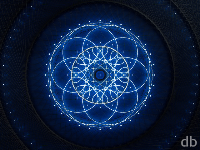
 The Grid: grid2k162
 The Grid: grid2k161
 The Grid: grid2k16orange
 The Grid: grid2k163
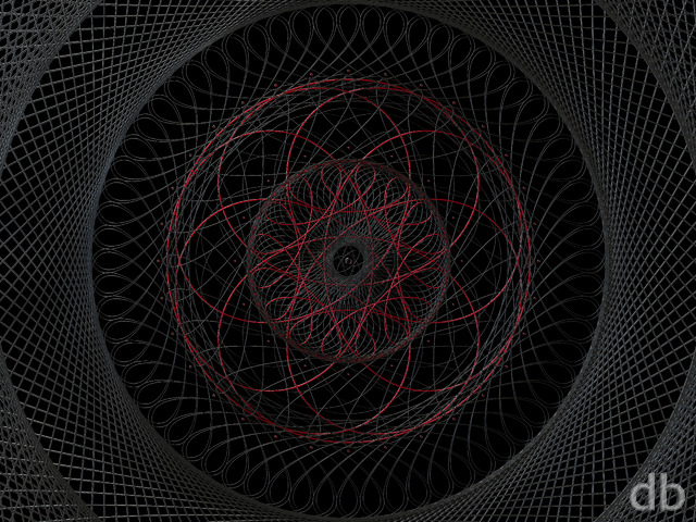
Jon [plusmember]
Of an already remarkable classic! Way to go! 🙂
mollycule [nonmonthly]
I really liked The Grid, and this new version of it is awesome!
Brent [liferplus]
The original grid was always a favorite of mine and I like the updates, however this newest version really knocks it out of the park. It’s much cleaner and balanced. The rings and nodes add a cool new touch and the overall colors are better on the screen. Awesome work.
Kataan [lifer]
I love this! Would it be possable to make a green version. So it sorta looks like a Borg cube?
Dr ZUL [lifer]
I’ve always loved the originl grid, it was one of my favourite abstracts, but this update is awesome. I love it.
MIke [basicmember]
Glad to see some fresh abstracts. Freaking sick man!
SethR [lifer]
I agree that this version is a big improvement, and I will use it as my wallpaper in the near future. I essentially agree with cmmnoble.
Hoverwolf1 [lifer]
This version looks pretty cool; the larger circles seem to fit better into the grid than the nodes did.
Randy [lifer]
Scanned through the comments, didn’t see an answer to why there’s a letter A in the grid.
cmmnoble [nonmonthly]
I am a big fan of your abstracts. I thought the first few versions of The Grid 2016 were interesting, but the details kind of got lost in the noise of so much going on. This one (#4) is great! The colors are wonderful. The the grid elements really pop out against the light background. I like the circles and spiny elements. And the depth is amazing. This is going to stay on the desktop for a while. 🙂
Ryan
The poster and canvas are still available!
Romarch [lifer]
Is the print of Grid 3 still available?
Romarch [lifer]
My basic problem with Grid 4 is that it looks like something a prisoner might see after regaining consciousness amidst the rubble of an earthquake…just to have a spool of concertina wire fall on his face. Seriously, the nodes look like barbed wire. But that’s just me, I reckon; as with any artform, other viewers’ mileage may vary.
Thank you for keeping Grid 3 where I can get to it! It’s on my phone now, among other places. 🙂
Ted [nonmonthly]
Very Nice! This reminds me of old fashioned (50’s and 60’s) magnetic core memory.
Chris C [lifer]
This latest update (grid #4?) is leaps and bounds better than the first few revisions in my opinion. Much more visually appealing. I’m not usually into the abstracts, but this is now one that I would consider adding to my wallpaper rotation.
Ryan
There’s no wrong answer. I obviously liked them both or I wouldn’t have put them in my gallery 😉
Danielle [lifer]
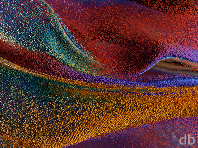
This is one of the few where I actually like the pickle jars better than the main one. I think I like the pure straight lines. Also, it reminds me of those “Cube” movies. All great work, tho!!
Ryan
Sorry you don’t like the update. I just felt that the earlier revisions were trying too much to look like the original and were falling short. They were too “murky” and all the details I had added were being lost. I did like the addition of the light source but it didn’t save it.Fortunately I have the Pickle Jar and your favorite will remain available there. If, after a time, Members rate that one higher than this one (with the scribbles and circles) I will certainly consider swapping them. Your rating was not wasted!
Jonathan A [liferplus]
Liked the update before. Love it even more so now. This is one of those pieces that really burns questions I know can’t be answered, such as what it is a part of or what built it. You are always provoking and that is good. Never change Mr. Bliss. You have a wonderful mind.
Romarch [lifer]
My previous comment was about Grid #3. The new one, #4 with all the circles anad scribbles, flies in the face of everything I said and the “10” rating I gave it. This is why I don’t usually jump right on and rate/comment on new posts… Bloody heck.
Romarch [lifer]
Now *that* works! I thought it was only ho-hum until you added the light on the back end…a move which I’m going to call “the Transfiguration”, because the image with it is on a whole ‘nother plane of existence than the image without it. I’ve been waiting to see what you were going to do with this; I was hoping you’d find a way to restore the sense of structure, which you’ve done in a way I’d never anticipated. I can’t stop staring at this, gazing into its incredible depths…
I thank you, sir; my faith in you is affirmed.
Hoverwolf1 [lifer]
I like it… but I don’t like the “nodes”. Sorry, but I liked the original because of all the right angles going on ad infinitum. The original was one of the reasons I started coming back to this site. Don’t get me wrong, I do like this one, especially the green added to it, but I like the vision captured by the 2005 version better.
Robert [lifer]
I’m with Travis here. There is just too much going on which distracts from the great part, the center, where the clear blue rectangle grid shapes contrast with a pure white background. Great contrast, technical/sci-fi mood. But the rest of the picture is just too much of a an uninspired and distracting mess. If the whole picture was like the center and perfectly sharp, without blurring, it would be a great technical-themed wallpaper.
This is a symptom of a problem I observed with many of your recent wallpapers. I often wished them too be much more simplistic and not to be overloaded with details and colors. This has ruined a lot of otherwise promising wallpapers for me.
Rodney [lifer]
The Grid(2005) remains as my single favorite graphic you’ve ever created. Seeing this new version is just amazing!! I LOVE IT!!!
Would you consider doing a “Tron”-esque version of it? I believe your version would be nothing short of breathtaking.
Travis [lifer]
I echo Rift’s sentiments. This is messy, the texture mapping that you have at the image focal point wraps incorrectly around the end of the “beam”, and there is just too much going on. Took a simple design and mucked it up. Sorry to say, kind of like the current revision of the website.
Rift [basicmember]
I really like the 2005 Grid, with its clear sharp depth, simplistic but beautiful. This update is sadly, total junk. Even the pickle jar versions don’t improve. The textures are poor, the detail fades fast and the blur effect makes the black on blue melt together.
Jenanne [liferplus]
I’ve always liked the 2005 render of The Grid, so I was delighted to see a new version. I like them all, but version 3 is fabulous — way beyond expectation. Thank you, Ryan!
Frooom [lifer]
I agree, the one square (top of a column) towards bottom-left jumps out…maybe it could be darker and have green instead of white glowing bits?
LOVE the grid, one of my all time favorites and currently tri-screen at work!
BobC [lifer]
I hadn’t thought of this! I agree that this version is solidly in the realm of brilliant sci fi art. Fabulous and imaginative!
Ken [nonmonthly]
When looking into an image sparks my imagination it tells me that you made good use of yours. I’m drawn to the light. Well done, sir.
Ken [nonmonthly]
When looking into an image sparks my imagination it tells me that you made good use of yours. I’m drawn to the light. Well done, sir.
Mario Carini [basicmember]
Looks like something the Millenium Falcon might sail through the heart of the Death Star.
Alton [basicmember]
This is epic. Even more epic would be an all red version if possible. just my own two cents…and request.
Italo [lifer]
Two thumbs up!!!!
Joe [lifer]
I really like this, but there’s that off-color square in the lower left that sticks out like it’s from a 90’s video game. Completely ruins the whole thing. Is there some way you can fix it?
Ozaawaagosh [nonmonthly]
I really do like the 1st one, I get what people say, that it seems out of focus, but to me it its a perspective thing, like looking at certain point, and everything else is not in focus, like looking a flower, the stem and ground are out of focus because we are looking a certain detail of the flower, thats just my perspective, I love it. Great job Ryan
Ozaawaagosh [nonmonthly]
I love both the blue and orange, the depth seems to go on forever, or if you were to step inside of it you could go any where inside forever in any direction, it really teases the eye. Great Job Ryan, thank you so much for your works of Art.
BobC [lifer]
The change in focus really make this grand!
Ross H. [nonmonthly]
I think this a great update to one of my favorite pieces. I also believe it would benefit from a sharper focus, though.
betsey [lifer]
good enough at first glance..then I refocused,,,
needs a little sharpening!!!
SethR [lifer]
I like the overall concept, but I agree with some of the comments from Kevin and Drydoc. A sharper focus would make this wonderful.
Kevin [liferplus]
Looking at the 1920×1080 I can’t shake the feeling of the image being a badly compressed JPEG with artifacts. I think the low contrast and blur is part of the issue.
Drydoc [liferplus]
I agree that the abrupt change in focus is distracting. Differing focal plane – compare the 2 pillars at 9 o’clock and 7 o’clock hurt my OCD. Otherwise love the colours and patterns.
BobC [lifer]
Ah, this has all of MY favorite elements – the blue atmosphere, the ambiguities: of abstract vs “this is some kind of structure, isn’t it?”, uncertainty of scale, etc. A lot of the enjoyment is the way it changes in my eye from one interpretation to another. I do wish the depth-of-field thing wasn’t as pronounced, as it leads my eye to want to settle on the “microscopic” view of the thing.