


Description
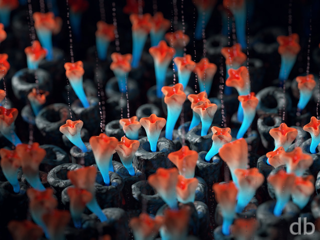
My second render using MandelBulb 3D. This one combines the famous “Menger Sponge” with the “Ruckerbulb” and “Amazing Surf” fractals.
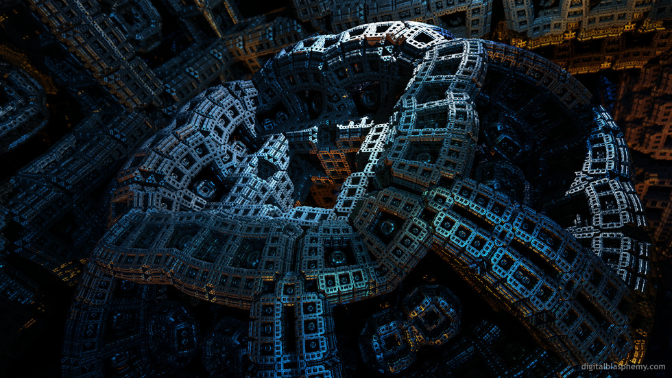
My second render using MandelBulb 3D. This one combines the famous “Menger Sponge” with the “Ruckerbulb” and “Amazing Surf” fractals.
= Add to your a la carte shopping cart.
This feature is disabled temporarily. You can still add a la carte items via the "Downloads" tab on any wallpaper, including this page.
Other Versions:
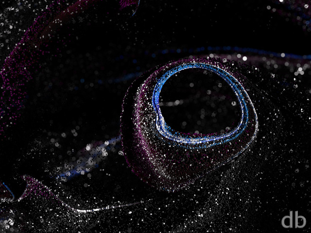
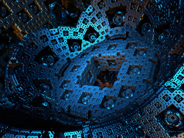 Menger Bulb: mengerbloom1
Phil C. [basicmember]
This looks like something you might see in the Matrix films. 🙂
Phineas [basicmember]
Reminds me of my old Mechano set!
archangel [liferplus]
There is something about the pickle jar version that captivates me; I like it even better than the gallery version. Your abstracts are some of my favorites of all time.
docster [basicmember]
Love this. Definitely a feeling of menace for me….
DaveSp [lifer]
To me, this looks like pieces from an Erector Set (“https://en.wikipedia.org/wiki/Erector_Set”) which has taken on a life of its own. Very intriguing.
Jason
I’ll admit my ignorance right up front — I’ve never heard of a Menger Bulb before. But with a quick Google search, I kind of get the idea… It looks like your first one sticks more closely to what a Menger Bulb is supposed (?) to be (as far as I can tell), but I love what you did with the second one. I’m with BobC — I’m amazed at what you can do with an abstract idea and some color. Impressive work; LOVE it!
BobC
I’m totally with jmk and Jenanne. I don’t know how you do it. You take a fractal, abstract construction, do things with the texture, lighting and point of view and come up with some kind of fantastic “scene.” You certainly have an eye for it. Hats off!
jmk in ct
i really prefer this render. it has a menacing mechanical feel to it.
Jenanne
I like this more than I liked the first version — and I liked the first version a lot. It’s more dynamic and exciting somehow. Love your abstracts, Ryan!
MIB4u
I myself have only used Mandelbulber so far, would you mind giving a Tutorial in MandelBulb 3D one day?
SethR
Definitely better than the previous version; I did not feel the perspective in the old version related to something, and the blurriness bothered me. I agree that this version looks more like a machine, but I don’t see that as a problem.
Ali
Please add png versions for 1440p too.
Eric
I love this background. Will be hard for me to replace this on my dual screen setup!!
Littlemom
Love this!!!
Joe
@Ryan
I prefer the new render to the one you had yesterday. The image feels a lot cleaner, and I have a much higher level of appreciation for Menger Bloom. Richard H. makes some good points about the DOF perhaps changing the perceived scale of the objects, but I definitely prefer the new version.
Psyclone
I seriously said that aloud when I pulled up your site this morning. ‘Whoah.’ This is just fantastic. It’s going on the big screen!
Richard H.
@Ryan: The points that Joe made about DOF were interesting and probably valid (though the problem hadn’t occurred to me), and seeing your new render and comparing it to the previous one is even more interesting. It’s a shame that the old version isn’t still here, so that others can download and compare the two.
I have to say that, notwithstanding Joe’s dislike of the blurriness of the original, I think I actually prefer the original image myself. Certainly, the new render is beautifully crisp and sharp, but the fact that so much more is in sharp focus reduces the sense of scale of the whole thing. Whereas I previously felt as though I was in a spaceship, looking at the entrance to an unimaginably vast Dyson Sphere, now I get more of the impression of a much smaller metal component in a machine; something that might hold in my hand, because I can see every detail of it in sharp clarity.
I like both images, but the more blurry original had a much more impressive sense of scale. Also, perhaps because of the blur, the original render looked less starkly contrasty, and some darker areas were a bit more visible.
Anyway, whatever you decide with regard to the future of this image, I think it’d be nice if you made the different DOF versions available as Pickle Jar variants so that people can decide for themselves which approach they like best.
Ali
Hey Ryan,
Since you’ve gotten your new hardware, when can we expect a final version of Cloud Canyon 2015? You posted it as a WIP but an official gallery version never showed up.
Thanks.
Tyler
Awesome job! I love the repeating square theme throughout!
Phil S.
I like this one a lot, not grainy, and especially how clean the edges are. Great textures too.
P.S. I left a comment on “Recursion” a while back that I am not sure you had time to see or comment on.
Jenanne
Love this one, Ryan. Really, nothing else to say about it. 🙂
Oh BTW, the new 2560×2560 version is actually 2880×1800.
John
What a fantastic image! There are so many in the DB collection that I like, but I think this one has instantly made it to my “select favorite” group! Thanks, Ryan. I can hardly wait for the FB Timeline version to come out.
Ryan
I’ve reconfigured the DOF in the single-screen Joe (still learning that aspect of MandelBulb). Perhaps you could re-download the image and let me know if it has improved.
Joe
I’ve never understood how you select the DOF for your renders. Half the time it’s OK, the other half, like this image here, the DOF effects ruin the image for me, especially at higher resolutions. In this image, which I want so desperately to like, the Menger Sponge that seems to be in the middle of the render and what should be the focal point is half blurred because the DOF doesn’t cover it. The only part of the image that is really clear is the lower half of the screen maybe 1/3 of the way from the left hand side. You’re the artist, and I trust your vision, but sometimes, I just don’t understand it. Maybe I’ll just use the center triscreen render…
Nico
I like this one. Looks like it’s looking back at you. Are you going to place different color ones of this? Thanks
Richard H.
Love it! It looks a bit like an entrance to a Dyson Sphere! 😉