


= Add to your a la carte shopping cart.
= No watermark version, for Plus members only. NOTE: On this page, this icon is a link by itself.

$0.00
= Add to your a la carte shopping cart.
= No watermark version, for Plus members only. NOTE: On this page, this icon is a link by itself.
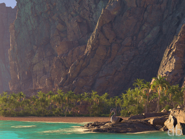
Doc
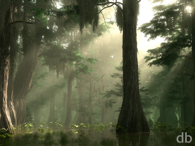
One of my all time favs. Came back to get a mobile version for my new mobile. Crikey, I didn’t realise this was from 2006 !. This image is a regular on my desktop. I love it. (I’d love a version for the HTC One too !)
Miles
I’d love a remake of this one. Or at the least a higher resolution for my Retina MBP!
SergioM
It simply looks like a photo. Amazing job.
Dave
The beauty and realism of this one is unprecidented. The layer of fog in the trees below and the sunlight coming from the clouds is breathtaking; nothing short of pure brilliance.
Mercury
I think this image is far underrated, and it should be in the top 10 overall. In terms of sheer realism and beauty, this is as good as they get as far as I’m concerned.
Cajmoh ( simon )
Showed this to some of my family. We all agreed that it looks like a photo. Never been there, but reminds me of Canada for some reason. Fantastic work
Arkineshu
I have a friend who used this one in a school project. He made no money, and it was a single-print for in-class evaluation.
However, it made his project 300 times better than it would have otherwise been. I think that, for graphic designers, 3D skills like this would generate a vast sum of money.
jfweber
I love this one!! It reminds me of Chinese brush paintings. Parts of this also remind me of Japanese Ukyoe paintings, tho there isn’t quite a Fuji image in the picture, one could imagine it , just under the cloud formations , perhaps?
All it needs is perhaps, a bit more “negative space?”
Konstantin
Hi, everyone!
I’ve got this one discovery for you.
Images of Ryan Bliss are REAL 3D! In case you never seen REAL 3D images i can tell you a technology, so everyone can start right now!
If you place two identical images(width sould be less than 100 for starters, height doesn’t matter) next to each other, separate them with 1-2 pixels and try to make a single image from two using your eyes, you will get a REAL 3D image.
Look, you try to make a SINGLE image from TWO identical images. Guess, what will you see, when it will happen? Right, you will see 3D image, like if your monitor is a portal to parallel world) Try to create a crop from Morning Mist, (right of an image, width is 150, height is 1024), copy it and place them both next to each other and then watch! You will SEE.
Try this trick with everything on your PC, photos, images, windows XP icons even)
Few minutes ago i sent an email to Ryan, describing this.
Konstantin
This was the first new image, i saw since i first visited DB in November. I love this image, it will be on my wall in a few days)
Told everyone of my friends about Digital Blasphemy, everyone impressed!
Michelle
At first I was turned off by the graininess too, but now I’ve actually come to like it, because it really does give the picture an authentic photographic feel. Most other DB work is so polished and slick, that this picture caught me off guard. However, I’ve come to really enjoy how it looks like a real photograph taken perhaps a more old-fashioned camera.
cecileva
Perhaps most people’s comments are a representation of two distinct categories of db lovers: the photographers and the graphic designers?
I love photography, and am impressed by the realism of this image, and how close to a real photo it looks; it’s got the “graininess” of a blown-up pic and the foreground details of the trees. I would love to take a picture like this!
Great job, Ryan.
Happy holidays to everyone!
Patriarch
I really like this picture overall, especially the foreground of trees, but it seems you got a little overzealous with the distortion effects on the sky and hill. I can understand, to a degree, why the clouds would be as such, but, the hill especially, seems to be too blurry/grainy.
Emily
LOVE! LOVE! LOVE! LOVE! LOVE!
doc
My new desktop. Don’t really need to say much else.
(I like the grain, although I’ve got to admit I too would like to see a non-grain version.)
Jordan Mcfurgeson
I don’t think the grain takes anything away from the photo. if anything I think it makes it look more authentic.
Way to go its a breath taking image, the trees, the mist, and the bit of sunshine coming through the clouds
JohnN
I opened this image in photoshop and gave it a blue tint. I used lab color and curves to increase the blue in the lower half of the curve. I think it looks much better.
Roberto
This is a very relaxing background for my business notebook. Perfect with the xp silver theme.
That reminds me some kind of Fangorn forest from Lord of the Rings.
Nicholas
It is a beautiful scenic picture, although without the noise it would look that much better.
Dana
I like this wonderful scenic picture. Nice job!
Boris
I actually like the graininess of the image. It adds a texture that is lost in todays image processing perfection.
Look at some of Ansel Adams winter scenes, there’s a element of the photographic grain there that adds a layer to his photos.
branson
This is probably the best one you’ve done in a long time .. easily my current favorite.. and I am a long time lifetime subscriber 😉 Please make a dual head, hi res version of this.. I love it.
And thanks so much for continuing to do this.
Zebulin
Frankly, I think this image looks more like a real photograph for a couple of reasons. First, it has a lot of noise in it. Next, that dark spot in the center is also a feature I’ve seen in some photographs.
In all, I think it’s perfect as is. The noise helps to disguise the fact that it isn’t “perfect” and therefore digital. In fact, everyone who walks past my desk comments on what a wonderful photograph it is and asks me where I took it. When I tell them it’s digital, they don’t believe me until I point them here.
[=
Adam Mordecai
This is great!! This would be even better as a dual monitor version
Thanks
Adam
Claus Reibenstein
It would be a breathtaking image, if that annoying grain didn’t exist 🙁
I strongly suggest to put this grainy version into the pickle jar and a non-grainy version here.
cmhegg
Such a pretty, lifelike picture!
Zach M.
If I didn’t know better, I would have thought you took a photo from the back porch of my parents place in New Hampshire!… Just cool, this one is going to stay as my background for a long time…
Noah
I’m not sure if I’m digging the grainy look when it’s blown up so large…
Fvr
Congratulations !
Like other peoples said, the grain add a realistic touch to the rendering.
I’ve always been very impressed by photorealistic painting or 3d images.
I only miss a sunset version or a night version with the moon and it will be perfect !! 🙂
Overdrive
… but not perfect (yet). I agree with Mike Barber: Morning Mist looks much better in thumbnail size. Would give it a 9, but the actual image somehow misses the fascinating contrasts visible in the thumbnail.
Therefore: 7
Zach
Excellent. This is perhaps one of the most photoreal images you have ever done. My only quibbles are:
-the grainy bit mentioned over and over. While it adds to the realism of the piece (as if it was taken with my own POS digital camera), it slightly detracts from the clarity, and therefore the aesthetic appeal. Is it really rain? Or is it the result of the “volumentric clouds” you mentioned on the main page? If it’s just a problem with the program, don’t sweat it.
-the hills in the valley. They seem too small and pronounced. Perhaps fewer, gentler hills might work better. Also, I think there might be a few deciduous trees in a valley like that. Greater arboreal diversity (OK, that sounded pretentious) might help the “endless forest” issue that some don’t like.
And as to some other issues mentioned, the color saturation is just perfect for the amount of light. More saturation would make it more “breathtaking”, as James said, but would make the fact that it’s a computer render more obvious. The endless forest is great, especially keeping in mind that this is a background and not a centerpiece. A couple of your works have been rendered less effective by excessive noise. The icons get in the way and the entire screen is a mess, not to mention the fact that I can’t read some of the shortcut names.
I’ve been rambling, and I’m tired. Good night and good job. 🙂
Meyer
Quite impressive. This will definately be my desktop when the dual monitor version comes 🙂
Odders
I love this one. Although personally, I am not that big on the grainy look. I would love to have the triple screen render once it’s finished though, hint hint 😛
Alastair
I love Morning Mist already – I can’t wait for the dual screen version. Jessie is my own personal champion in the Bliss household – I’m delighted that she also likes the scenery images. Thanks Jessie! Oh, and you too Ryan 😉
James
This new program has so much potential! This landscape looks unbelievably real! It’s uncanny! I really think that less grain and way more color would make this absolutely breathtaking!
918 girl
Looks like our place up north when the forest fires were a’blazing. The smoke sat in the tree tops, just like this picture. Since we survived them, I can say this is a great picture.
kremer
I don’t know about everyone else, but I really LIKE the grainy quality to the image. I think it makes it that much more lifelike. Great job on this one!
Nuilok
The subject and the composition are great and that would be one of my all time favorites if it was not for the grain which is a major issue as far as I’m concerned :- Some other details may benefit of a special attention but they were already discussed in the other comments: the rays of sun piercing through the clouds which are not visible enough, the color saturation of the trees (but I’m not so sure for the latter, a cloudy landscape usually lacks its usual color saturation so…), the need to have some other elements appart from an infinite forest: what about a lake, a river, some mountains? All in all, I believe this picture has truly great potential…
Mike Barber
Too grainy and it’s missing that something that makes the image “pop” like most of your others.
It actually looks better in thumbnail size than full size
Maybe give the trees some more color in the foreground and off to the right…
Randy
No need to make adjustments.
Al
Looks cold.. Like winter, not as in a cold shoulder.
Nice job, Ryan!
Terry
As said by others noticed a grain in the image which I’m not sure looks right. Other than that its a good image, I’d prefer to see a warm sunrise but thats just me.
Keep up the good work,
T.
Jamie N.
The grain is very off-putting though.
Also it looks a little *too* monochrome… I think the foreground greens could be accentuated *just a tad*.
Labanimal
Yep… I must agree with some, difficult to see if its a render or not. The grain is a problem, but at the same time it also kinda makes you think it a real picture taken with a cheap camera!.
All in all, Great pic. I don’t really like the trees and all that, but its the realism that swings my vote.
Besides the Grain issue, what really would be nice is the sunlight that seems to try get thru the clouds, needs to be more pronounced – more orangy, more hints of blue in the sky, and where some of those rays of sun hits the trees, let the color of the trees come to life…
Picklejar ???????
Dan
Wow, you are really onto something awesome with this one! I like it, especially the low lying clouds and the sunlight peeking through. Do more of these in the future but with different variants of seasons, etc.
CP
this would be a fave without the grain…
Jon
This picture is simply amazing like all your pictures, but the grain still needs some work.
Tril
I like the idea and the composition of this picture–very atmospheric (literally and figuratively :-). But I would prefer A. less grain in the mist and B. more color!
Chad
Good Job!
Billy
Speechless.. awesome !!
Michael
I agree that the grain is overwhelming and really takes away from the image, but there’s also the issue of the saturation of the trees in the left foreground (as Jamie N. mentioned above).
I’ve noticed that a lot of scenery on Digital Blasphemy seems to lack saturation… I don’t know if this is the software trying to simulate haze or something, but I don’t really like the way it looks. It makes everything look flat.
The trees in the background look fine, so perhaps there’s a setting that adjusts the “haze versus distance” effect?
Mike
One of my Fav’s to come out this year. The Grane yes is a problem but one your prolly plenty aware of and was prolly planned. Anyways Great work!!!!
Xiaoli Wang
Ryan,
This is the first image you’ve posted that I could not tell was computer generated. It really looks like you went somewhere and took this with an SLR!
It’s amazing how far software and your art has come. Keep up the good work!
psklenar
I hate for my first comment to be a simple, single word. But …
WOW!
pat—-
Doug Mason
Really, a fantastic picture, it’s amazing how real it looks. I’m wondering why it appears grainy though, especially in the top half. Anyways, a great picture overall, excited to see what you do in the weeks to come!
Ryan
The grain in the sky is one of the issues I need to work on. Maybe it’s something wrong with the program, because the quality settings were at maximum.
Rich
Ooooh, so luciously photoreal and well composed. I’m super stoked for Vue 6 now! *giggles in anticipation*
Chiops
That’s not grain in the sky, that’s rain in the air.
Great image, Ryan.
Glad you are using Vue again.
Bravo!
Kairyu
Neat, I think the grain/noise effect actually makes it look like a real photo. Even I had to take a second look to make sure! Great wallpaper, that’s for sure!
Matt
I like this background a lot. I agree that it looks like a photo more than a render. The gain in it is nice, however could be more muted. I am also noticing some artifacts in the upper left hand corner with the clouds. The clouds are patchy solid colors surrounded by the grain giving an uneven appearance. I am not sure if it is my setup or the image :)I am using the Wide 1920×1200. Overall a great image thou.
Matt
Chris
From the thumbnails, I couldn’t tell that this was a render – it’s that real. As a few mentioned, it seems to suffer from graininess – almost the same kind of problem I have with my digicam.
If that could be smoothed out, the image could see a point or two gain in my rating. Although I love this image, right now I think the grain would get to me (1900×1200).
I’m really looking forward to more from Vd’E6!
Chris
It’s the amazing renders like this that made me want to join DB. Your artwork is amazing! I can’t wait to see what you can do once you/the devolpers iron out the bugs.
Alucard
Ryan my friend, this piece is a bit premature. It demands refinements which cannot be overlooked, and lacks your midas touch I’m afraid. This new program looks promosing, but I believe you became over-anxious to demonstrate it’s capabilities, and ended up with a image littered with artifacting and pixellation. I also am not fond of the perpetual tree environment; perhaps a mountain or body of water would remedy that. Otherwise, stay up and stay Platinum son.