


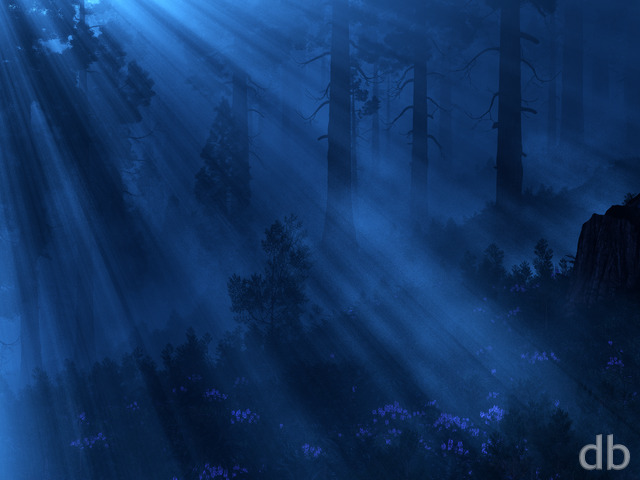
Description
A little something I put together after a discussion with a good
friend on the merits of “sky porn”. This one is still in the
early stages but I thought it looked nice enough to share.

A little something I put together after a discussion with a good
friend on the merits of “sky porn”. This one is still in the
early stages but I thought it looked nice enough to share.
= Add to your a la carte shopping cart.
This feature is disabled temporarily. You can still add a la carte items via the "Downloads" tab on any wallpaper, including this page.


iceisfun [lifer]
I for one welcome our new 3440×1440 overlords
Avi [plusmember]
You don’t have Ultra Wide Screen version of this one. I think that would look really cool.
Chris S
Your pictures make me want to live elsewhere in the galaxy!
mejakun
The landscape looks so familiar — is this a nighttime rendering of an earlier DB island/ocean scene? Very, very nice image.
Xorothian
As the title suggests, this is a personal favourite. It is such a well done image, I could stare at this for hours! “Sky porn” indeed!
Atonnese
Oops, I meant at night of course!
Atonnesen
I think you should make onw with maybe a more blue or colored sky, or whatever real colored sky is, haha. 🙂
SaltNPeppr
The thumbnails really don’t do this one justice.
I wasn’t sure about it until I had it up on my screen, and then…wow. “Sky candy” is the only way to put it. Beautiful.
Download it. Go on. You’ll thank yourself that you did.
Kevin
The coloring is spectacular and the sharpnes of the sky and the shooting star gives it a level of realism that, with this color scheme, would not be difficult to miss. The spacing is also very on point and the dimensions feel accurate and proportional which gives this another layer of realism that really rounds out the perfection in this piece.
I must say it truly is a work of art. Well done.
WillowMoon
Love the combo of colors, but you’re missing the 1440×900 size!
Thunderbol
doesnt look bad overall, but imho the sky is too pixelated (there are too many stars or whatever its meant to be)
Isy
I absolutely love the coloring. It makes your imagination run wild.
*I would love to be able to have a Google+ sizing similar to FB.
Keep up the great work!
Kana
Any chance you can make a new mobile resolution of 720×1280? The Samsung Galaxy s3 has that particular resolution, and it’d be awesome to have wallpapers that fit my phone perfectly. 🙂
Trav
I can almost hear that shooting star tearing its way through the atmosphere.
Amazing work, Ryan. Very good stuff. Looks fantastic on my dual screen.
Lidia
As I re-read my previous comment I realized that the decade milestone was last year… oops. 😛
Celebrate big anyway!
Lidia
Happy Birthday Ryan! I don’t have Facebook either, so I’m posting here as others have. I think decade milestones are worth celebrating in a more significant way than other years, so go celebrate in a big way! Hard to believe I was only about 15 when I found this site, just a few years after it launched.
Chris B
Man, I think I first found the glowing shrumes 12 and a half years ago. Nice work & keep it up! I think my neighbor is currently in the process of having her baby. guess she has 27 more min to go if she’s not out yet 🙂
GrueTSC
I don’t have Facebook, so I (along with all those others before me) will just put it here….
Happy Birthday!
Zach
Though I don’t have a Facebook account so I can’t partake in the chance to win a free renewal, I wanted to wish you a Happy Birthday! Hope you get to spend it with your family, friends, and loved ones.
Thanks for the multiscreen render of Nightfall!
Cheers,
Zach
Ron
Only thing I don’t like is the trees/island halfway down, left hand side is too dark.
In other news, Happy Birthday, and hopefully, many, many more to come, (along with more kids!!!)
Ron
Only thing I don’t like is the trees/island halfway down, left hand side is too dark.
In other news, Happy Birthday, and hopefully, many, many more to come, (along with more kids!!!)
Jenanne
Congratulations on your latest trip around the sun! Wow, 15 years — you’ve had triumphs and challenges during those years, and you’ve earned a ever-growing following of fans. Happy birthday, and here’s to many more successful trips in the future!
@Ryan: “I am celebrating another successful trip around the Sun. Hard to believe it I was only 25 when I first posted this site back in February 1997.”
James
On the dual screen 5:4, there is a strange pixilation problem with a bright orange cloud at the top of a palm tree. Otherwise, pretty awesome.
Kyle
Ryan – why focus so far left on the dual-screen 4:3 render? With how close the comet is to the edge it really looks cut off. Other than that it looks great. 🙂
Romarch
This is by far my favorite piece you’ve done so far this year. It has everything I’ve liked in your works (been visiting DB since 1998): warm tones, cool tones; red-gold, purple, blue, green; rocks, water, palm trees; celestial phenomena, patchy clouds and biolume…all in one piece and one cohesive whole. I just took it all in, clockwise from center-left, and it was a treat for the eye every metaphorical minute… WOW. Just…WOW.
tekrican
Just curious… How do you travel around The Sun??? 😀
Jen
A mutual Happy Birthday to another 9/11 kid. Keep up the excellent work.
drow
many happy returns!
ojonasar
By getting another year older is how you travel around 1 orbit of the sun. Happy birthday Ryan.
Vivian
If only I could live there. Love the colour blends.
Khyren
When this makes it to multi-screen, would it be possible to get a lossless 16:10 tri-screen?
Kelton
When is this coming to a dual screen near me?
Ryan
I’ve posted a minor update to “Nightfall” this morning. This version is sourced from my 4800 x 3000 print render and addresses some of the issues with my original (squared off clouds, noise).This update overwrites the original in my gallery so you might want to give it a new name when you download it (if you want to keep both versions for comparison).The print version can be found here.I’m still working on the multiscreen render and hope to have it up shortly!
James
Amazing, but not as crisp as “The Eye of Aquila” Which is a clear 10. On the subject of “The Eye of Aquila” Why did that not get posted to Zazzle before “Nightfall”?
Thanks for everything Ryan 🙂
Ben
Sky porn indeed. This is amazing.
Doug
Love it! Need a Dual and Triple monitor of it but even on only one screen it look great!
Val
Thank you for your creativity!
Ryan
Awesome. The only thing that would make it a 10 is 3840 x 1080
Toolsmith
Just, Wow!
I don’t visit the site as often as I want (work getting in the way and all), but every time I come back you make me glad that I bought a lifetime membership!
As always, I can’t begin to fathom the depths of your creativity. You are a gift to the rest of us.
StephenH
I could actually just do a sky shot here – I do not think the land or water is needed.
Mike
Okay, wow, this is a real standout piece.
Ryan
The glow-pong table is safe! The room is hurting however.
Chris B
I was hoping when you said it destroyed your basement that it didn’t take out that awesome Pong room…
Bryan N
I love it. The incredible amount of stars you see when you are away from civilization is something most people would not believe possible and this is getting close to reality.
Thank you!!
Brian
Yes, I think you did get carried away. I encourage you to let loose more often. Very nice!
As for the falling star vs. a planet. I would like to see other ideas. A black hole? And I actually like seeing past renders incorporated into new works. It’s like see the same universe from a different perspective, which I think a lot of us wish we could do in some of your works.
Russ
In the 90’s I went to college out on Long Island to study marine biology. While there I had the breath taking experience of seeing and swimming in the bioluminescence in Shinnecock Bay. In the black of night a person could swim and agitate them. They would form a silhouette around the person’s body and it was almost angelic. I wouldn’t mind seeing a pickle jar version with less emphasis on the shooting star in the background. As always great stuff Ryan!!
CE
I love it! I love palm trees under a starry sky, and the glowing waves and sky color are just brilliant. Can’t wait to see what else you may do with it. I think this one may tie Tropic of Thetis (night) for favorite! I love pink puffy sunset clouds and noctilucent clouds post-sunset clouds.
My one comment is that the palm fronds seem just a little too stiff. I’m undecided as to whether I think they should be silhouetted… technically maybe should be but I just love the color, especially against the red sky!
LaurenG
So beautiful, I don’t usually like nightscapes because darkness to me often makes things seem smaller and confined, but this sky makes all the difference, space always feels so vast!
David M
Wow, what an array of colors! Very good job Ryan.
Mark
The sky in this one if fantastic, and the contrast between the sky and water is striking. You might consider picking just a few red highlights here and there in the waves…
Dual Screen, please!
Ryan
Here’s the photo that inspired this project…
Mechie92
This one looks awesome! I love the sky in particular, very dynamic clouds and a great space shot. I’m not sure you emphasized what you were intending to, but it turned out great!
Miguell026
i like this one! its becoming something amazing…
and if you want a tiny hint….
maybe a bit “less cloudy” and/or less “gloomy” on the horizon would make it more… “open” and exotic =)
great job Ryan! i love your night scenarios!
Hoverwolf1
I’d want to relax, kick back and grab a Corona.
JK
I have to say I was disappointed to click on the link only to discover it was YOUR FB page. Then again, for privacy reasons, I guess it wouldn’t be proper to link to the actual page that had the inspiring cover.
Anyway, I’m still curious. I’d like to at least see the picture somehow?
Afterthought:
Did I actually say Facebook and privacy in the same sentence?
mike
awesome. reminds me of the scene from the movie “Contact” with Jodie Foster. I love that movie and i love this image
mike
awesome. reminds me of the scene from the movie “Contact” with Jodie Foster. I love that movie and i love this image
Kana
not David, Nelson, for the cloud… 🙂
Kana
Oh yeah – that cloud @David was referring to does look like it was cut off, not natural at all, which looks funky with the other fluffy ones…
Kana
I love the bioluminescence! I’d like to be focusing more on that, though the meteor (or whatever it is) draws my attention almost too much if your focus was the water. Dim that meteor (or take it out), and maybe just a *tad* on the brightness of the sky, and you got me sold on a 10. Nice work!
Adeann
Beautiful!
Nelson
Somehow, this is not my type of scene, but I had some trouble to grasp what exactly is strange for me here. Maybe it’s the strong green of the trees? With this kind of illumination, the vegetation shouldn’t look so saturated greenish, I think. And there is that big cloud to the right that looks as if its upper front side has been cut off. And I find the glow of the water on the shore a bit too bright.
But nevermind, many people are really happy with it, so I’ll just wait for the next one… 😉
Dave
Fantastic new piece Ryan! Love the sky, love the meteorite. One of my favorites of the year.
Hawk
I love the colors! I love the deep lighting!
Keep up the good work!
Littlemom
This is a beautiful render Ryan. I gave this a rating of 8, because even though I love the render itself I think I’d like to see the sky done in blue tones or maybe even blue with a little purple mixed in. The Red sky makes the render have an angry or agressive feel to it, instead of peaceful as any tropical scene should be. That of course is just my opinion. Other than the sky issue I think this is a great render.
David
It’s a great creation, but the iphone4 selection cuts off the head of the star. I see however that you would have to choose between the shoreline and the open sea section which has the position of the head of the star… but would of course chop off the trees which add nice color to the creation. I’ll wait for the double screen render. Overall I really like it. Nice job again Ryan!
Sabrina
Absolutely love this. The only thing I’d like to see any different at all is the yellowish mass in the center of the sky gone. It’s extremely distracting to me; I keep wanting to look at everything else (it *is* really busy, which I LIKE about it!!) but I keep getting pulled back to the yellow mass. But…. Really…. If it never changes, then frankly, it’s still perfect. I just love your work. And this…. is *excellently* done. Bravo.
Matt
LOVE IT!
Love the Meteorite. Such a nice change from planets.
Eric S.
Color and contrast are amazing. Reminds me of the paintings of Lassen. Don’t listen to the naysayers saying to change the sky, it is perfect just as it is.
Jenanne
WOW! Wonderfully different; I love it, Ryan! Yes, it needs a few minor tweaks, as folks have mentioned, but overall this is my favorite of the year. Not your usual style; I think that’s why it rivets my eye the way it does. 10 all the way — More!
Chris B
that someone was talking about. I think the stars make up the perception that it is rough, more so than the image actually looking more like an oil painting. After I read the comment I could see it too. but only the sky.
The water & plants look awesome.
Chris B
The direct center of the screen there is a bright area that is just begging to be filled. It is brighter so your eyes are drawn there, but there needs to be something, eg a nebula, a second galaxy that is colliding with the one this planet is in, or something.
Also, I love that there are a lot of stars, but maybe have the galactic disc vs just a whole bunch of stars everywhere? or make some cool constellations that really stick out. It’d be cool, though maybe cheesy, but more cool I think to have a mushroom constellation. 😉 lol
Logan
Reminds me a bit of the alien beach scene in the movie “Contact”. I like it!
Lidia
I really dislike the combination of the red sky with too many stars. Could you pick only one (red or stars) for the next version?
Geep
The sky is amazing in this! Even though the sky does feel it a bit disjointed because of the sunset, it still looks totally fantastic. This is for sure going on my desktop!
Mat
I’ll agree Daniel B. It seems like there are too many stars in the sky for the amount of sunlight left. I love it, but it feels way too abstract for the setting.
Olivier
Thanks !
It was a long time… Beach, Space ect…
Finally i can change my wallpaper 🙂
10
Chris
This one is awesome! The attention to the night sky is easily the best part of this picture. If anything needs changed it would be the palm trees, which seem a bit grainy. Great job.
Astatine
Wow, that’s tremendous. There’s something a bit odd about it — maybe the pixel sharpness of both the stars and the foreground shore, maybe because the subdued green looks out of place against the vibrant red and blue (perhaps a simple silhouette of the trees would work better, perhaps adding a fourth colour, I don’t know). Still, my jaw dropped as soon as I spotted the thumbnail.
Daniel B
Maybe its me, but I think the stars are a bit too prominent considering the amount of residual light from the sunset. At that point, I’d expect only some of the brighter objects to be visible.
Although, maybe I’m just too used to being in an area with a fair bit of light pollution?
Also a comet would be preferable to me than a meteor. Perhaps make this a different view on the comet from harbinger?
Nico
I wish I could be on this beach! The comet is a great touch! Maybe make one with a storm on the horizon? otherwise I give this a 9.99999999999!
Josh O.
I really love the mix of colors on this one. The blues and greens make for a great contrast against the reds and oranges. The clouds do a great job capturing the light. It’s definitely one of my top 10 DB favorites.
Ted
Especially if this is considered a “work-in-progress.” Busy sky doesn’t bother me much. The comet is perhaps a bit over the top.
Silver
Can’t wait for Tri screen version of this one .. going to be epic 🙂
cmmnoble
I love the colors in this one! I’m curious about what it would look like without the clouds–the sky behind them looks so interesting, I wish I could see the part that’s hidden. 🙂
Ross H.
I love it! I’ll be switching my background to this today!
celmendo
“Oh my gosh!” popped out when I saw this. Love it as is and I’m sure you’ll only make it better but this is really great for me. thank you
Lucas
Nightfall? Nah, This is more like cosmic trips and cocktail drinks… Awesome Ryan! Beautiful scenery! Amazing colors! One of your best!
Ryuzaki
I like what you did here, though I think the colors of the leaves are a bit too bright or well something is just not right with them. However, everything else is just perfect!
Adam
Spectacular!
Jen
I love the detail in the sky, I love the detail of the water, I love the color balance of the entire piece. What I don’t like are the leaves of the trees, particular the one most in focus on the top left. Too linear, seems like they are lacking the detail found in the rest of the image. Green lines without any differentiation.
Randy
can’t see any of the coast line
Timhogs
You say “sky porn” like it’s a bad thing…
But seriously, folks, I like it – my first reaction was “there you go!” But after admiring it for a little bit, it feels a little busy.
Ryan
Wasn’t sure about the falling star. The sky felt like it needed a little something extra and I feel like I have done planets to death. What do you guys think?
D
Very nice, love the colors and detail. Clean up the grain and change the comet into a glowing moon for a 10!
Mello
Beautiful! Possibly THE BEST wallpaper in 2012 to date! You have managed to blend perfectly you’re 3 best wallpaper features… sky/space, ocean/water, and tropical. I love it!
Angelique
I like the mix of colors and the theme of this particular work. However, I’m not really a fan of how it seems somehow rough textured, as if it were an oil painting or something. I much prefer when the scenes have a smoothness of photograph. I’m not quite sure I described thus right but it just seems like the way a photo looks when the contrast is raised and everything is too sharp. Also the very bright light in the upper right corner is a distracting point and perhaps a touch too much busyness. I do enjoy the sky being very full of stars as you don’t often get to see it like in reality (too much clouds, city light, whatever) an the sunset is beautiful as well.
Ryan
A little something I put together after a discussion with a good friend on the merits of “sky porn”. This one is still in the early stages but I thought it looked nice enough to share.
Josh
I LOVE this.
Jake
I love this. At first the contrast difference catches me off guard, especially between the shore, water, and sky. However, the more I stare at it the more right it feels. I think the water and sky are gorgeous.
Tyler
Having followed your work for years I know well that your best images are ones like this that are virtually perfect out of the gate. Forget the sky criticisms it’s not too busy at all. Isn’t the point to be sky porn? Anyway a light one-over and this baby is top of the charts to me.
Chris B
Just that little tweak really made it look a lot better!
Sorry to hear about the pong room, but at least the table and posters survived!