


= Add to your a la carte shopping cart.
Single Screen
- Lossless Master plus
- 1024x768 (4:3)
- 1152x864 (4:3)
- 1280x800 (16:10)
- 1280x1024 (5:4)
- 1366x768 (16:9)
- 1440x900 (16:10)
- 1600x1200 (4:3)
- 1600x900 (16:9)
- 1680x1050 (16:10)
- 1920x1200 (16:10)
- 1920x1080 (16:9)
- 2160x1440 (3:2)
- 2560x1600 (16:10)
- 2560x1440 (16:9)
- 2880x1800 (16:10)
- 3456x2234 (MBP)
- 3840x1600 (21:9)
- 3840x2160 (16:9)
- 4096x2304 (16:9)
- 5120x2880 (5K)
 Receptor: receptor2
 Receptor: receptor1
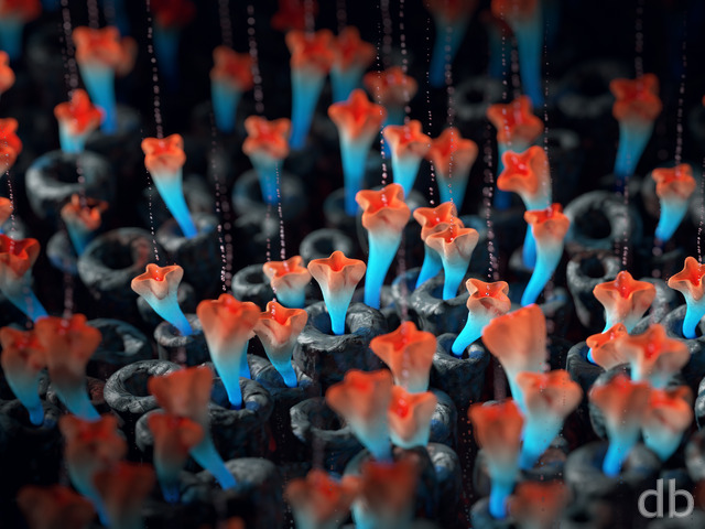

Mike
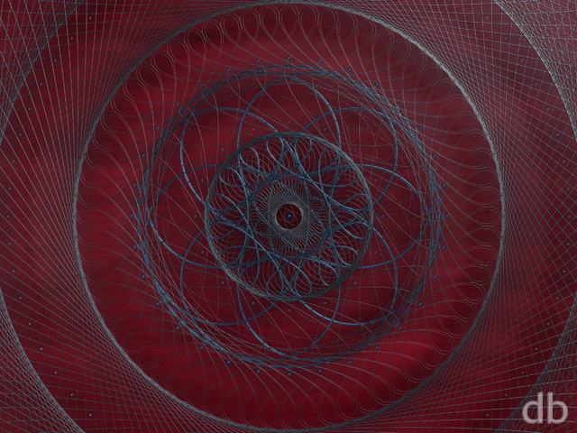
I think I like the contrast of V2 a little better, but the overall “flow” of the latest is the best. As a side note, the 2560×1440 lossless PNG seems to be missing.
Elaine
I’m one who liked the pickle jar 2 better but I understand why you re-rendered. I’m a little disappointed in the dual screen on the final version. When I put this up on two monitors, I’m not fond of the left-hand image because it has such an extreme perspective.
Ken F.
@ Ryan: My daughter loves this render!
Eric
I love V3. It looks amazing on my 2 monitor setup, and I love that the focal point is far right rather than center or left. For some reason I don’t know, I picture all of these pieces spinning into focus/position and then back out again in an animation.
Zach
I also greatly prefer the stark contrast of V2. This version just seems a bit drab by comparison. That being said, still a very cool render.
pendrag
The coloring contrasts really make this pop. Full marks
BobC
I actually prefer V.2 because I find it more evocative. (“What IS that deep red glow? Where is it coming from? What’s going on down there?” Also, the central beam stands out more.) Whether the render is less refined doesn’t bother me.
Andrew
I like both the final rendering and the Pickle Jar versions. It shows a great contrast in colours and textures
Tyler
V.3 is perfect. Perfect combination of color and clarity. The multiscreen is incredible. Love the abstracts and this one is as good as any. Thank you Mr. Bliss.
ZUL
Another amazing wallpaper.
Micro78
Amazing! It almost looks real!
Jenanne
Magnificent!
Ryan
PS: I hope your daughter likes the new version!
Ryan
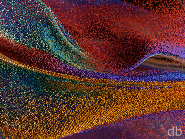
I’ve added my “final” version of “Receptor” this morning. Why did a change what was already a pretty good wallpaper (the second version was quite highly rated)? Well, I sort of cheated with v.2 and posted a Photoshop composite about about 3 different renders. I couldn’t replicate those component pieces because I had saved over my files with every iteration. That means no multiscreen version and no print-res. Also v.2 had too much grain because I used renders that weren’t as refined as they could have been.Anyway, the second version will remain available in the Pickle Jar for folks who prefer it. I personally prefer this final version, but I would love to hear your thoughts!
youngrama
This rendering just keeps on getting better and better every time I see it. Your use of colors is great and just enhances the depth of the piece. Great!
Jenanne
Outstanding! Wow! I’m looking forward to the preview version, too.
BobC
This is stupendous! I never would have thought of handling the color like that. Having the red adds some kind of unidentifiable energy and brings out the blue beam. (I’m still ambivalent about the narrow depth of field, though…)
Kaaletram
Can’t wait for the multi-screen!!
Bevin
Purple instead of red would be perfect.
Stephan
Beautiful shape. Rich details. Wonderful contrast & Color. Spot on 🙂 Original Tron is my favorite movie and this reminds me of it.
Elaine
I like this version much better than the all blue. I’m not usually a fan of abstracts but this variant is subtle and interesting. It’s headed for my desktop!
Ken F.
I love both versions but this version seems to pop a bit more. I can see a multitude of color variant possibilities for this wallpaper in our future. My 6 year old daughter wants to know when youâll be doing one in purple hues.
Matt
Love the red! Great contrast. My main concern is how grainy it looks when you get away from the center; that really detracts from it.
Chris C.
I love the rich contrast on this one – Any chance of a dual screen 3360 x 1050 version for members, pls? :o) Cheers Chris C.
Scott
I like the contrast of V2 a lot – the colors and sharpness make it “pop” for me. Still seems to be a bit of grain int he reds especially, but I think that was how you rendered it?
I’m not a huge fan of abstracts, but I do like this one – it’s headed to my desktop immediately 🙂
Ryan
I thought I would add a bit more color and contrast to this one. The blue version will remain in the Pickle Jar. Let me know what you prefer!
Josh
I think this piece has great potential, and I like the look on the single-screen, but the dual-screen (at least in the 1680×1050) has some crazy blur near the middle of the object; it’s extremely distracting.
Jenanne
Love the color, concept, and detail of this abstract, Ryan. I do agree that less blur would make it even more awesome, but it’s pretty awesome as is. 🙂
JoeB
I think this would be awesome, but I would have preferred it to not blur out on the sides in the triple head version. If it were sharp all the way across, I’d really like it. I like the design, and the color, but the blur keeps me on a previous one of your wallpapers. 🙂
Yamanu
Love this one, I’m not usually a fan of abstract, but I love the shade of blue, and the detail.
D
Another great abstract Ryan.
I’m a huge fan of Dale’s work and would love to see you attempt a render using his style as inspiration.
BobC
I like this one! As a HUGE fan of “Orthohedron,” I had to put it on my desktop immediately. I’m so-so on how the depth-of-field is managed – in the abstracts that I’m so fond of (like Orthohedron) I can see them in whatever scale strikes me at that moment and that adds to the awesomeness and fun. With this one, I feel “locked” into a viewpoint of “really close to a really tiny thing.”
drow
awesome!
my wife and i visited the chihuly garden when we were in seattle last year. it’s quite an installation.
drow
awesome!
my wife and i visited the chihuly garden when we were in seattle last year. it’s quite an installation.
darkuncle
@Adamtrons – that was exactly what came to mind for me as well! 🙂 very TRON-esque. nice work, Ryan.
Rob
3840×1200 appears to be missing.
Ryan
I’m uploading a new render that I let go overnight. It should look a bit smoother. Try redownloading in about 45 minutes and let me know what you think!
Jacob Klei
How about adding a Pickle Jar version that excludes the bump texture? I am not a fan of all that grain.
Zero G
I love it… the symbolism of it is very beautiful… It reminds me of the clockwork of 2011. Just another confirmation of the level of artistry you can create…
pendrag
before it hits the blur points I really like the shadow texture that shows up.
alternate colors?
hurtzDonut
Like it.
Ryan
I added a bump texture to the give everything a bit of a “frosted glass” look. That’s probably what is causing the noise in the out-of-focus areas.
Anup
Is the grain (noise) in the out of focus portions of the image intentional?
Tim
Beautiful
Tyler
Yes
Molly W
I love your abstracts, and this one is cool!
Maria B
Love this one! The mazelike feel is great.
Adamtrons
My immediate reaction was “Oh wow! That’s cool”. I really like the design and color of this one. I can imagine being inside a TRON style environment and this aperture opens to transmit data packets to the outside world or something. Agree that there’s a little too much grain upon close inspection, but that’s a minor issue. 9!