


= Add to your a la carte shopping cart.
= No watermark version, for Plus members only. NOTE: On this page, this icon is a link by itself.

= Add to your a la carte shopping cart.
= No watermark version, for Plus members only. NOTE: On this page, this icon is a link by itself.
This feature is disabled temporarily. You can still add a la carte items via the "Downloads" tab on any wallpaper, including this page.
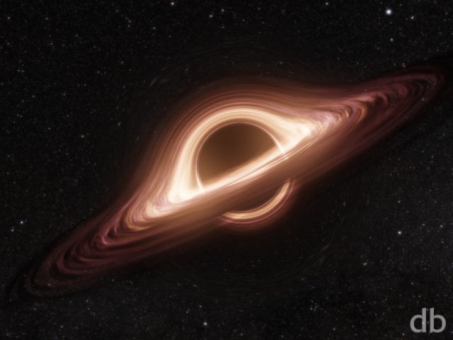
 Singularity
 Singularity: singularity2k132

Reviews
There are no reviews yet.