


Description
Hard to believe it has been 7 years since I posted the original. I was never quite satisfied with how blocky and chaotic everything came out in the first version. I think this one has a bit more pop.
I am not quite satisfied with how Vue d’Esprit’s DOF came out this time. Some areas are great but others have a few artifacts (which are less noticeable at the lower resolutions).
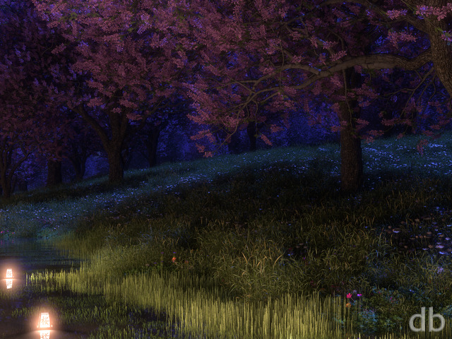
You might recognize my cherry tree model from Sakura (2013).
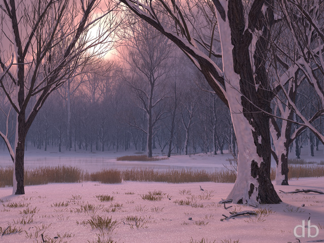
This render is for anyone ready for Winter to be over…
Cori [liferplus]
Sakura at night is one of my all time favorite. I really like this take/variation of the Cherry blossoms.
Susan
A touch bright at the top and would have liked a bit more detail at the sides. It’s a bit hard to see what all the grey is supposed to be. But overall I do like the way the light shows on the tree
Presten
Excellent work Ryan! Glad to finally be a lifetime member after watching your work since 1998!
Nicole
Love this, I really do, but I don’t care for how over-exposed the top of the tree is. That much bright is just too hard on the eyes for such a dark scene. If it matched just a little closer to the rest of the lighting on the tree, I think it would be great. After reading some of the other comments, I do agree the grass under the tree is a little too abrupt. It’s a beautiful image, though. I am also ready for springtime!!! Thank you!!! 🙂
Tyler
I really like this one, but the central portion is not well blended with the rest. The grassy area under the tree is divided from the rest of the image too abruptly, and the outer part of the image itself is drab and poorly developed. I see potential for improvement, but it doesn’t seem finished as it does not fully satisfy the eye.
Rankin
While I enjoy some nostalgia sir, I do feel that your original was the better. Sure the details have become more refined as you upgrade and improve but what I enjoyed most about the original was the simplicity. This one just has to much in it, while the original was more conservative in how much spring came out.
Ryan
I would try the 2560 x 1024 version.
JM
Idiot question: if I have dual monitors at 1280×800, what’s the “correct” dual-screen resolution? o_O
Sharon
I love this. I’ve always liked the Sakura trees. This is a nice combination of subtle and bright. Beautiful!
DaveShaw
Like the idea, and loved the original, can’t believe it as 7 years ago :D.
It does look a little over-exposed at the top, and the ground appears a little unrealistic.
Matt
I agree with other comments that the ground is a little over-the-top. The edges of the ground are very harsh.
Momcat
The new one is too over-the-top for me, not comparing well with the original, especially the area just under the tree.
However, the rest of the tree trunks are the best I’ve seen you do!
CHSpera
I also like the original a bit more because it was a bit more “realistic” than this update. The update “goes up to 11,” where the original had a more realistic “volume level.”
CHSpera
I agree with Doctor D. there needs to be a “softer” line between the snow and the grass around the tree. Sakura was a good tree to pick, but there’s too much contrast between the spring on the tree and the winter of the forest. Maybe if you blurred that line a bit..?
There are also WAY too many flowers on the grass mound. Once you have more snow there, those should be pulled back a bit, I think.
Littlemom
My overall impression of this is I don’t care for it. The tree is fine, but up against the winter picture it looks like some cheap copy and paste item. Just not my favourite render of yours.
Doctor D
While I enjoy how much the tree in the center pops in the new version, the sharp line of the grass to the snow I find to be jarring. The old version the snow and grass were a little more faded–kinda like how snow would normally melt. I do like the snow covered trees in the foreground and background in the new version.
Morrissey
will this be available in 1280×800 resolution?
thanks
Morrissey
will this be available in 1280×800 resolution?
thanks