Description
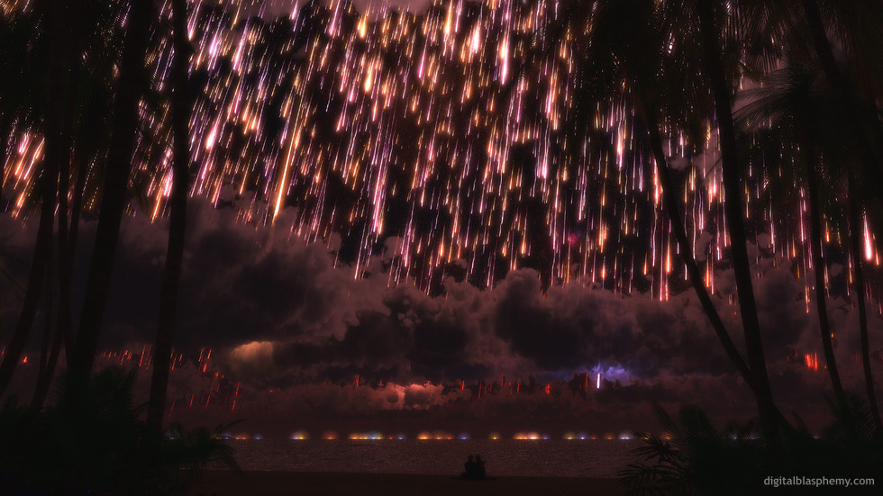
This piece was inspired by an old woodcut engraving that has captured my imagination for a long, long time. I used Lightwave 11s excellent instancing system to render the sky and Vue d’Esprit for the foreground.
I left the title somewhat neutral here so folks can come up with their own conclusions regarding the subject matter…


 Starfall: starfall1
 Starfall: starfallstars1


Michael Schmitt
[Lifetime]
This one popped up on my random screen saver, and I thought maybe it was a depiction of the hard rain from Seveneves. Not enough destruction though.
Scott P [lifer]
This is one I’d LOVE to have on a metal print. Doesn’t look like it’s up on S6 at the moment. I don’t know what you have to do to make that happen, but whoa, man… let me know.
Marc
The sub-title might well be “waiting for annihilation”, which might even tie in with Jamie’s and Rene’s comments. Pride goeth before destruction. Which might tie in with Carysta’s comment. All in all, it makes me think that with that amount of debris in-bound, they won’t have long to admire the beautiful sky before they’re obliterated. Sometimes even complete destruction can be magnificent – you just don’t get a chance to comment on it afterwards.
Carysta
I really like this image. It makes me think of the part of C.S. Lewis’s last Narnia tale, The Last Battle, when the stars are all coming down to earth.
Ryan
Sorry I missed uploading that one. The 5760 x 1080 is available now.
Sylar
Love it but no 5760×1080 yet?
hEADcRASH
Just stunning. Gorgeous flurry of colors. And .. wait .. is that a silhouette of two people embracing in the foreground?? My .. allergies .. dust particle .. eyes .. watering ..
A really beautiful touch.
Rene
I agree with jamie below! Or, how about a Pride-themed wallpaper at some point? 🙂
becky
amazing
jamie
how about in celebration of SCOTUS overturning the Prop 8 decision, a picklejar version with shadows of two guys?
[seriously].
i’d be a fan (and subscriber) for life.
Dan
I love the image and complexity in layers. It seems a blending of Dodenfell, Eldritch Mountain, Thetis Tropic Night and for some reason (probably purple lightning) Eye of Aquilae/Magnetar all backing up Tears on steroids … nicely done.
Jeremy
It’s too complicated with variety of images that are not pleasant to look at.
Meercatnes
Would of rated it a nine if thr couple were drinking wine.
Jenanne
Thanks, Ryan! I gave it a 10 – I like the multicolored explosions (or whatever) on the horizon. Some nice changes to the falling stars, too. But I do wish we could have a Pickle Jar version without the cuddling couple.
Xandra
This reminds me of a dream I had where the world was ending and it was this event everyone was flocking to the park to watch. It was strange and beautiful, but not scary.
Jonathan L
Oh! That’s great!
Thanks a lot, I’ll get right on those! 🙂
Ryan
I added them last week actually, but forgot to upload the 1080 x 1920 for this piece. It should be there now.The zip file is at http://digitalblasphemy.com/downloads.shtml
Jonathan L
Hey Ryan,
Just a suggestion: With so many 1080p android handsets rolling out, and being an owner of one, I notice that there’s a lack of 1080×1920 mobile wallpapers.
Are you able to start adding those with future wallpapers? 🙂
Ruth
I love this piece mostly as it is. When I first looked at it, it seemed that this was an event that was rolling toward them and just about to hit. I don’t feel this is a piece that should have lots of bright, cheery colors, and I think that you have captured that ‘it’s about to hit the fan’ feeling! I would like to see a little less cloud cover, but then again, maybe that helps with the ambiance. @Heather – I love that you mentioned the Pern series; haven’t thought of that in years, and you are right about the Threadfall! 🙂 Thanks Ryan; I love looking forward to what you are going to do next!
cmmnoble
I’m going to second SaltNPepper’s comment below–consider changing nothing. I think this one works really well the way it is. It’s got a story, and drama, and is also nicely balanced artistically, in my opinion.
Greg
I totally agree with D. Definitely add more lights, and rid the clouds so we can see some impacts.. I bet adding a few impacts in the foreground water with some splashup effects would look great.
Also, I’d love to see a picklejar version with the blue-green algae color that Michael spoke of.
Jenanne
Regardless of how you decide to modify this render, Ryan (or not), it’s been an intriguing discussion. Lots of interesting opinions. 😉
Jenanne
In that case, let’s have a toddler and small child there with the cuddling couple, sitting calmly, awaiting their splatterfrying. (Okay, I’m being snarky now, but really.) I liked “Deep Impact,” too, except I thought the newscaster was an idiot for heading for the very beach the wave would hit first. The end of “Knowing” was more realistic that way. [shrug]
SaltNPeppr
…and say leave it just the way it is.
Maybe its the writer in me, but I love this piece. Its very…evocative, end-of-the-world piece. It kind of reminds of the scene of DeepImpact, where instead of leaving, that newscaster lady (Jenny? actor Schell?) spends her final moments on the beach with her estranged father, watching the tsunami come.
I think its like that. For some people, if you *know* the end of the world is coming and there’s nothing you can do…spend it with family.
Make all that you do, count.
For that…10 all the way.
D
Add lots more and not just on the horizon. Also, remove the clouds on the horizon and show trails all the way into the impacts.
Logan
I agree with Gene, the horizon lights need variation. Also the water looks too serene for the catastrophic impacts. Seems like there should be big splashes, waves, ripples, tsunamis and stuff.
Amaryllis
I like the lights on the horizon just as they are (I think of it as fire on the horizon), and I agree with Jenanne about the impact of less or more. As it stands, the picture is very balanced, in my view.
Michael
My new background. I especially like the couple at the bottom, nicely offsets what at first glance appears to be a pretty hostile scene.
Any chance for different colorations of this in the pickle jar? I’d love one in a flourescent-algae-ish blue-green.
Rhys
Looking forward to 3840×1200 version!
Gene
Lights on Horizon? To me, they look too similar and “orderly.” I’d like to see them more chaotic and scattered. Not a major issue, though.
Maryann
I’d love to see this in a different colour palette – moody blues and blacks with starlight/fire perhaps?
Jenanne
Hmm — I like the lights on the horizon as is. Less or none would diminish the impact (so to speak), and more would be overkill, IMHO. As it stands now, the viewer can make up his or her mind about what is happening, one of the (many) things I like about the piece. But see what others say. 😉
Ryan
What do you guys think about the lights on the horizon? Should I get rid of them, keep them, or double-down and add more?
Jenanne
I have to agree with Gene on this one. It’s human nature to try to survive even if survival is unlikely. Might I suggest a PJ version of the cuddling couple on fire? Or perhaps absent because they have run away? 🙂
Momcat
@Logan, good answers! Might I add the last movement of Mahler’s Second?
Logan
It depends on if I had an underground bunker deep enough to save me. Currently that would be a big no. Anyhow my 5 yr and 1 yr old both like this image.
Next question: What music would you listen to while watching the flaming apocalypse? I’m thinking either the 1812 Overture or Barber’s Adagio for Strings.
Gene
Ahhhh Ryan, I can see how folks would say that from behind a computer screen, in secure, air-conditioned comfort, but I stand firm in my belief that if REAL flaming rocks began cascading from the heavens, it would take a stout heart indeed to sit back and just wait to get splatterfried.
But of course, I’m just quibbling here — fun quibbling (for me…) — but quibbling nonetheless. 😉
Cody
Fantastic, though I prefer to think of it as a harmless meteor storm.
I’d also prefer to see a version without the palm trees. Unless I look closely, the dark areas in the upper corners (from the palm silhouettes) look more like large variations in the storm’s intensity.
Gene
It’s a stunning image, very nicely executed. Somewhere a long time ago I had seen that woodcut (or something like it), and marveled at the impression that must have made upon the people of the time.
In my opinion, however, there is one little fly in the ointment: human psychology. Someone else already touched upon it, but if anything remotely like this were happening on MY planet, I would be RUNNING FOR COVER, not sitting on a beach taking it in… Running probably wouldn’t do much good, but still.
Overall, yet another fine work Ryan. Thanks, and keep ’em coming!
KRingg
I really like the scene, but I find the perfectly hemispherical collision-lighting-domes really distracting. I’ll be Photoshopping those out before this one earns it’s place on my desktop.
As always though, great concept and overall… beautiful work!
KRingg
I really like the scene, but I find the perfectly hemispherical collision-lighting-domes really distracting. I’ll be Photoshopping those out before this one earns it’s place on my desktop.
As always though, great concept and overall… beautiful work!
sundogvet
Maybe this world is where the Leonids go home to grow up into big, strong meteors and raise their own families.
Eyal
What about placing the couple (and the shoreline) a little higher in the scene?
Ryan
I asked this question of my Facebook fans and the response seems to veer overwhelmingly towards sitting down and taking it all in.
Dennis
Everything else seems realistic.
The sand however seems a bit too flat and smooth.
Ryan
Here’s some info about the 1833 meteor storm.
Momcat
Does anyone know the backstory on the original woodcut? I thought I saw a reference in the comments but not so.
Beautiful piece, Ryan, although I do agree with many posters: Fewer palm trees, maybe some rocks, just a bit fewer stars. Really grows on you, though. 🙂
Tim H
Really like it but I would like to see less stars. Maybe even just a single shooting star. Well done!
Ryan
If the sky looked like this, where would you run?I’m often asked why I put the people in my images. I’m of the opinion that when you add a character (or two) you turn a picture into a story.
D
Then perhaps add impacts closer to the foreground and have the couple running for their lives? I don’t think my wife and I would sit and cuddle while watching part of the planet being pummeled into fiery dust. 😉
Ryan
I really wanted to leave no doubt that this was not a benign event, the lights on the horizon the the first impacts after all, so I wanted there to be a staggering number of falling stars.Adding a version without the couple on the beach should be pretty easy though.
Dillon
This is a great image, great coloring, really cool idea.
I would love to see one without that couple just chilling on the beach. 🙂
cmmnoble
Wow. This is fantastic as is. I like the colors, the bright/dark contrast, and the level of detail. For me, the density of the falling stars makes the picture. (Thanks for sharing the woodcut that inspired it–that’s very cool.)
Phoenyxx
I love this one, and would have given this a 9… I just feel that there are way too many stars falling. It seems too cluttered to me… perhaps lessen the amount of falling stars?
Littlemom
I absolutely love this render. And although some have said they don’t like the people in this render, I think the couple on the beach is very fitting for this particular render. Great job Ryan. Have been a lifetime member for a couple of years now and love your work.
Jason
Love this picture. I like the couple on the beach sitting peacefully watching all the star fall. Seems a little apocalyptic, but if its inevitable might as well enjoy the show.
I would definately class this as end of the world more than meteor shower though with the angle of the shooting stars and the sheer number. I do like this effect though.
Eyal
Generally – it is wonderful.
Two minor points:
1. Star count is just a little bit too big…
2. The couple sitting on the shoreline, enjoying the show, are a little bit too low in the scene, so they are slightly hidden by my (two-rows wide) taskbar…
Still – overall, it is a NINE.
AlfonsoMX
“It’s the end of the world as we know it and I feel fine…” =)
RC Davison
Really neat image. But, if the lights in the distance are fires that have been set by the meteor shower, I’m not so sure I’d want to be on that beach watching it!
Amaryllis
I love it, it’s a great contemporary response to the woodcut. I’m not going to gripe about the people, really, but hope that you’ll do one for the pickle jar without the figures – for those of us who are unromantic and slightly misanthropic (other people just get in the way of a fantastic view!)
PaulR
Could this have been what the Dinosaurs might have seen 65 million years ago? Maybe Dinos in place of the people. Just a thought. 🙂
D
Very cool and I really like the piece that inspired you. I would suggest reducing the number of shooting stars a bit, dropping the palm trees and some of the clouds to open up the sky. Also perhaps consider adding some rocks intermixed with the foliage on and around the beach.
Ryan
I’ve posted this one to the gallery pretty much without change from the preview version. Decided to develop this one “in the open”.
Ryan
My gallery version will be properly cropped.
Steve
..liking it so far, Ryan. I suppose you’ve alreay tried various other colour (brit spelling, sorry) options, as the effect is quite often a surprising changed (but you already know this)… Thumbs up from this end!
Pat
I was going to comment on a new pickle jar variate, and was greeted by this sweet image after logging in. I cannot wait to see the final product. This is one awesome picture. I love the “fire rain” but I suppose it could be a huge downfall from fireworks. Either way it is an impressive image.
Tyler
8 for now but know the 10 is coming. I love the concept and will trust your judgement on the revision. For me this a more epic version of Nightfall which I also love. Also I enjoy the couple as I imagine any romantic would. Excellent work as usual Mr. Bliss.
Jenanne
I love it. This is much better than Tears From Heaven. I’m not a fan of the little people, but I still gave this a 10. 🙂
drow
“Well, the dragonriders are toast. Egon, what’ve you got?”
Heather H
Reminds of the Dragonriders of Pern series and the Threadfall they faced often. Very cool!
Ali
It’s good but I feel like it’s repetitive compared to your previous works. Don’t be afraid to break out new concepts. I suggested treehouses, such as a secluded village of exotic looking treehouses in the middle of a rainforest, or something.
Littlemom
So far so good it’s so pretty Absolutely Love it can’t wait to see the final product
Maggie
I had a dream like this once, but at the end of it, everybody died. That being said, it looks like these folks are just waiting for it to end, but at least they are together.
Katie
The first word out of my mouth when I saw the work in progress was “COOOOOOOL” 🙂 I love the engraving. Can’t wait to see the finished product!
Ryan
I was inspired by this engraving…
Raquel
Very pretty, might be overdoing it a bit on the meteor shower. But as you said the title will explain, I’ll reserve judgement. 🙂
Shelia
“It full of stars!” It doesn’t need people in it to experience the wonder, I do agree with others on that.
Josh/Sylar
Love it a tad more sliver from the sky would be cool, would make a good mix sliver and gold.
Nick
It looks great. I actually like having the people in this one. I look forward to finding out what is actually falling from the sky. If they were fireworks I would expect their to be more of a pattern/design to them falling. There seem to be quite a few of them for it to be a meteor shower too. Thus, my current conclusion is that it must be the flaming shrapnel remains from an exploding Death Star falling on the nearest planet.
Ryan
I always welcome constructive criticism but reserve the right to ignore it 😉
Jeanne
I love it! I’ll totally love the one you do in purple shades! (purple is always better than red in my opinion!)
Afya
I think Joe should just do the griping, since he seems to agree with the sentiment 😉 But yes, I would be happiest if the humans were replaced with a curious animal of some sort. People aside, I love it. Exciting.
Laura
I didn’t know what to expect after your comment this morning, but I like this a lot.
Ryan
My eventual title will most likely clear up any ambiguity about what is falling from the sky…
Shura
My first reaction was “Shiny!”
Reminds me of Tears From Heaven (2010).
Joe
Although your meteor (or whatever… sparks?… fireworks?) density may be a bit high. I predict someone gripes about the people, though. Someone always does.
Dr Blade
…or the worlds largest “oops” moment happened offscren. Good work so far.
Logan
I actually like the people, but they are so far down in the frame that they are blocked by the windows taskbar if I put it as my wallpaper.
Ryan
I’m thinking maybe Mozart’s Gran Partita Serenade K. 361 (Adagio)…