


= Add to your a la carte shopping cart.
= No watermark version, for Plus members only. NOTE: On this page, this icon is a link by itself.

= Add to your a la carte shopping cart.
= No watermark version, for Plus members only. NOTE: On this page, this icon is a link by itself.
This feature is disabled temporarily. You can still add a la carte items via the "Downloads" tab on any wallpaper, including this page.
Other Versions:
 Untouched: untouched1
jaz [nonmonthly]
Ilike this…i found it somwhere a few years ago, moving to windows ten, i lod 2 usb drives with YEARS of data. This image was one of them.
Mark A. [liferplus]
Ryan, I realize that it’s officially spring (when I’m posting this), but I just had an idea. Have you thought about doing an Untouched Winter?
JWAZ [basicmember]
Very soothing and relaxing on the eyes.
Skyweir
As a botanist, I am sensitive to the portrayal of plants. This is my favorite (even 3 years later) for the use of different trees’ shapes and branching. Like Andrew, I love watching how the trees [in your art] improve over time.
RyiidKyii
Not much more to say. I tend to be drawn to your work with more bluescale color schemes to them, but this, this just sucks me in and makes me sigh with contentment.
Readmore
Any chance of a “red and gold” version of this very beautiful scene?
Ryan
Very possible…
Sly V.
I love the ripple effects and the lighting. Not your best but a great job none the less.
Andrew
i love watching how the trees improve with time 🙂
i never really liked the trees and foliage in your earlier work (like 2000 Glenwood). they were too clearly artificial (which i am inclined to blame on the current state of the art eight years ago). but the greenery here is downright lush.
also, your use of lighting is very tasteful, as usual.
Jonathan
I get lost staring at this wallpaper. So calming and beautiful…
thorin
A Couple of white cranes fishing in the water?
Laura
Being the nature girl I fell in love with this one from the moment I first saw it. “It” meaning the first version. When I saw Ryan’s comment that he was making improvements on it, I thought, “How could he possibly make this any better?” Then I saw the second version and my jaw dropped. From the rays of sun to the added purple flowers to the ripples in the water… WOW! I immediatly set it as the wallpaper for my duel 20-inch widscreens at work. Lots of people have commented on it when they see it on my screen; one woman said it reminded her of The Secret Garden. Well done, Ryan, Bravo!
Laura
I just wanted to add that I am a new member so I apologize to Ryan for doubting his ability to improve on an already beautiful scene. Lesson learned: I will never doubt you again!
Tom
This is one of those images I feel like I’ve just crossed into the inner sanctum! It’s so gorgeous, and if I were to cross it in real life, I would have to just stop and stare in amazement-which is what I did the first rendering of this!
I love the update, and really appreciate the “photorealistic” quality to it- I love how believable your images are, and this one is so realistic I can hardly believe it’s not!
10/10 easy!
Annemieke
Hey
I have been a fan of your artwork for 5 years now and particularly love the ‘day scenery’ piccies. I love all the sceneries but find when I load the darker piccies that they are too dim on my screen to get all the detail. I know you sometimes do it but could you always provide a ‘bright’ version of all your artwork?
Very best wishes to you and thanks
Annemieke
Hunter
Yep, it’s HD. I should have made it clearer…
The xbox 360 has “blades”, so at any one time, you can only see half of the wallpaper. The overlay of the blades over the background are what makes it seem unclear and messy.
I wouldn’t worry about it, its a stunning wallpaper, and there are a heck of a lot more wallpapers to choose from for my xbox!
Good job!
Kody
this is yet another great wallpaper for my 360. it has all the right moods that set it as my top pick of the summer. A night version would be cool, such as having it the nightish blue look with a few firefly’s in the background and close by the trees on the sides. But anyway GREAT JOB!
buckwheat
I never leave a comment, but I always read everybody else’s. This time I had to say something. I downloaded this wallpaper for triple screens and installed it. Breathtaking!! This is among your best, if not, it is your best.
I am thankful that you care enough and take the time to accommodate those of us who have three screens attached to our computers. Not everyone does. Please continue your artistic work.
Hunter
A true masterpiece for sure. Absolutely breath-taking on a computer monitor. Unfortunatly, it looks like a mess of green on the xbox 360.
There are few way’s you could improve the wallpaper.. perhaps some eye-striking lilly flowers? Or another thought, how about a fishing rod coming off the right side of the screen with a floater creating a ripple?
Just an idea!
Ryan
Hunter — What size TV are you using? Is it an HD set?
adam
The water is too calm… I think you should try working on some more realistict water renders.. Go out to the beach, lake, pond, or river, stream, or creek, and just take it all in.
Try to duplicate a calm pond. Don’t just have a calm surface, we all know underneath there is a thriving ecosystem, moving about, which causes shifts within the water.
Also, water is never always one solid colour.
Serena
Ryan, you’re amazing. And your pictures are even better.
Keep up the good work, they rock! A couple have even fooled my friends/teachers/family into thinking they’re real.(Lone tree, Island Time, ones like that)
Brij
Hi Ryan, I agree with heather that a Night version most likely wont be able to capture the picture as well as this day version has. Whats the theme for your next project?
Ryan
Thanks for your comments. I wouldn’t try a night version if I didn’t think it wasn’t worth the time. If it doesn’t look like it’s going to work out I won’t waste the time rendering it.
Tim
Yes! Definitely try a night version. Just be sure to make it with Bright moonlight, otherwise it will be too dark as others have mentioned.
Dennis
What if someone was camped on the far shore… off to the left. A campfire might cast interesting shadows and reflections. And don’t forget moonlight…
Prometheus
Ah, but having someone camped off to the side would kinda defeat the whole “untouched” bit, eh? I’m not sure about the whole night version idea either. Not that I’m against it … or for it really. Well that input was useless. I guess we’ll just have to see what you decide to do …
Pritesh
I’ve always loved the nature ones that are posted. I think this would look great re-rendered as a night time version with the moon shining through and a few fire flies dotted about here and there. This 1 still looks brill!
Christopher
It’s very beautiful. The leaves and flowers in the water and the rays of light look very realistic.
Timothy
This is now the second time I have renewed my account since it expired in October of last year and its nice to be welcomed back with this great wallpaper. I like the revised one better as the rays make it much more interesting in the middle.
I look forward with eagerness to a years worth of hopefully some really great images.:)
Dave
I don’t always agree that your changes are better than the original, but I think you hit it out with this update. Thanks for the great work !!
-Dave
Heather
I think that a night version might not go so well. It might make the overall image too dark. I don’t think it’d be worth the time to try.
Jayce
I like both versions of this one quite a bit…the first one has a bright but cloudy day feel and the second has a sunny mid-day feel. The change in ambient light changes the mood for me. 🙂
Also, one thing I love about Ryan’s work is that it looks real, like a photo, but it’s not. So he can do all kinds of cool stuff and it still looks realistic. I think a little graininess kinda adds to that since when you take a picture with light and shadow you often get a little grainy in the shadows. So for me it adds, actually.
Sean W
The light and other little effects (ripples, etc.) really make this piece stand out from the original. The first was a very calm scene that you might run across in a wildlife preserve, which is to say beautiful, but not extraordinary.
With the added lighting and shadows, contrast is added, and it really does make a world of difference. This is an extraordinary piece. Great update, Ryan! 🙂
Juan
Much better. I think you still capture the haze like in the original, and the many cattails are a nice touch. I think this is much better than the 1st. Plus I’m a fan of the sun rays.
Tim
I wasn’t feeling the original, but after see the revised version I really like it. The ripples, and the added plants with the purple blooms in both the back and foreground. The sunlight pouring in from the top of the scene makes the trees in the foreground look darker, and more sharp. I also like how the reflection on the water in the front has been modified as well. You really have an eye for detail.
Loxmyth
I had to toggle between the two versions several times to decide, but I do prefer the revised version. The light rays make the haziness more understandable, and the ripples in the water are a definite improvement. All in all, untouched is a terrific wallpaper.
My monitor is set for 1600×1200, and I was surprised to see that the revised version is 1.7MB smaller than the original. I expected the revisions to make it a slightly larger file.
Ryan
I was surprised to see that revised file was smaller than the original as well. I think maybe the sun rays even out some of the detail in the background leaves. In the original this where the most noise was and I think it made the image difficult to compress.
Curtis
I can imagine myself sitting here in a summer afternoon, such a nice soothing image.
I actually like the graininess of it, gives the image a certain aura about it. 🙂 one of my favorites.!
Chizo
This is much better than the original, the god rays and ripple really give the picture added life and realism. The only thing missing is a couple of dragonflies buzzing around! 🙂
Adi
The original image looks so much more “Untouched” IMHO.. Graininess not an issue
Mikey
I really like this one. Very Nice. Are you going to post split files on this one.
Hope so.
Mikey
Loretta
Like I said, I have a small monitor, so I didn’t see enough graininess in the first version to complain about.
To me, this just isn’t as nice. Continuing with my analogy to the Great Dismal Swamp, this is later in the day, in the high heat and humidity. The lush greens are all more washed out by the overbearing sunlight. Time to head for the A/C.
I’m happy others like it, but I’ll stick with the original.
Lo’
Ryan
One of the pitfalls of posting revised versions of my images is that the second version rarely has the impact of the first, even if it is technically superior. There’s something about seeing a scene for the first time that cannot be replicated no matter what changes I make. It’s kind of like how George Lucas monkeyed around with the original Star Wars. No amount of technical upgrades will make it any more enjoyable than the first time you saw it. But, for those people (like my son Ian) who have never seen Star Wars, they won’t find the special effects upgrades out of place at all and it may enhance their enjoyment of the film. This leaves out the “Han shoots first” argument of course…I just have to wonder if people, like Loretta below, would have a problem with the version if they had never seen the version posted last week.
Labanimal
Ryan, after the multi-monitor versions, are you considering sunset/night versions of this?
As for someone mentioning lack of green in this version – Just ran Untouched through Photoshop – nothing a little Brightness & Contrast can’t fix!
Nathan V
Do you use antialiasing? I’m curious if that might help? Either way, I like the image. Very cool. I wish it was that ‘spring-like’ here in Seattle.
camorgan
I really liked the 1st and I have to say the new lighting makes this look even more realistic. This is way up there with my top favs; can’t wait for the multi-mon version.
John
In my opinion, this second version is a lot better than the first. It has a hint more color (the purple) and detail (such as the ripples in the water). Good job!
Ian
Hi Ryan – Just wanted to join the group and say what a phenomenal piece of art this is. I try to stay out of the arguments for first vs. revisions – yes, the second is more detailed, less grainy, and generally brighter in color – but the skill it takes you to even create the first image from nothing, critique it yourself, and make changes is incredible. Your constant devotion to making your work superb is definitely why I’ll continue to subscribe for years to come. Keep up the amazing work!
Mark
The first was stunning, the second even tops that. Well done Ryan, this is amazing, and looks great on my desktop.
MythAvatar
Yes I’m going to have to agree with mark on this one, this image is Fantastic, again you’ve outdone yourself, but the grain on a 1900×1200, 24″ LCD sticks out like you wouldn’t believe, I dont think it looks anything like haze, it looks like a high quality image that I’ve converted to a GIF and then displayed on my desktop. As Mark said, Indian Summer was another fantastic image but it seemed to suffer from a similar problem to this one.
Grain aside, 9/10 for the image, nice one Ryan.
Greg
I just interpreted the grain to be the haze/mist that others mentioned. That said, I do like the addition of the sunbeams.
Ali
I think the composition looks better after you “zoomed out”, showing more of the trees on the sides.
Ryan
The “zoomed out” version is the 16:10 widescreen and that is how I composed the image. The 4:3 is cropped at the sides.
muse.ings
Swampy goodness.
Oh, much better. The sunbeams give more light and balance and lessens the ‘grainy’ effect.
muse.ings
I must laugh at the illusion the two versions create. The ‘grainy’ effect in the first was rejected because the brain couldn’t fathom that ‘haze’ without a reason. And now, it’s perfectly acceptable – it’s *supposed* to be there when you’re looking through sunlight. It makes all the difference in the world. I love it.
Labanimal
Ryan – JOB WELL DONE!!!! 10/10
However there is something seriously wrong……..
… you forgot the digitalblasphemy.com bit at the bottom :)))
kajshdasd
ur right, there isn’t a watermark on the larger size woohoo. like the image
Ryan
The watermark is back on the 2560 x 1600 version. Thanks for the heads up!
Patrick
Looks a lot like a few pounds around here in North Central Florida, well done good sir well done.
Tril
While I don’t find this one significantly less grainy, I do like the more dramatic lighting.
Troy
The beams o flight make this image now. I love that effect and see that you added ripples to the water. Nice touch.
Troy
Phillip D
The revision looks really good. The graininess is still there but the rays overlook the graininess….I am aware of Vue and it does have that grainess problem in volume light settings.
An idea I have for you is to take this same file and convert it as a night scene and have a moonlight light or moonlight rays shining from above?
Russell
What’s drawn me to a lot of DB images is the lack of either of these. Photo realism is nice, but I think it’s the ‘infinite view’ characteristic that really draws me in. It’s not photo real, but it is a place I’d like to be, imagine walking outside with a view to the horizon or to the stars with infinite clarity.
For this image, I’d have to say I prefer the original. While the rays of light streaming down look great, they seem to wash out the colour of the trees.
Just my personal preference though, as always keep up the great work Ryan, I’ll be hanging for your next image.
MissBanjo
I was saying to my boyfriend it needed a little bit more color (like the flowers) and as usual you did a great job!
Tuishimi
…but I am finding the graininess a little too distracting. On the other hand it sort of reminds me of a Surat painting. 😀
Nate F
Now that I’ve looked at the piece in full resolution I can agree with Doug and others that there is a grainy look or noise as Ryan pointed out.
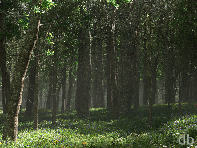
The acclaimed wet asphalt look of the water is another interesting aspect, initially I wondered why this would happen. However after looking over many of Ryan’s former works I noticed that all of the other scenes with water have some sort of rippling or wave effects in the water. Effects like these seem to make the other backgrounds water portions very easy to believe. So since this piece is titled “Untouched” it is going to be much more difficult to give that believable look and feel.
So I’m not sure what can be tweaked to make the lake have a more realistic untouched or ‘glass’ effect, whether it be making it translucent to a degree or altering the reflections or something completely different.
Ben
I like this one decently, although I wish you would make another planetscape, especially an epic one like “Where Silent Waters Whisper” in your user gallery. Even if we have to wait longer for the render, the final image will be well worthwhile.
Thanks Ryan!
Doug
Dude, there’s gotta be something that can be done about this.
Yes, there does need to be haze to make the scene realistic. But your software is using such a strong jittering or something that it’s really detracting from this otherwise top-notch image.
Specifically, as Russ pointed out below, the main set of trees across the lake, which ought to be a main focus of this image, is impossible to see clearly. Also, the lake itself has such a strong grain that it really has more of an appearance of wet asphalt than of water! Especially since the grain is present only in the reflection, and not in the water lilies etc. on the water.
I wonder if this would work: shut off the sunlight-scattering completely, and insert a large, vertical-standing polygon across the middle of the lake. It would be transparent, save for a slight whitish coloring to match the haze color of this image. The top, left, and right edges would extend past the field of view; the bottom edge would need to transition to 100% transparent by the point where it hits the water, so that there isn’t a line there.
Basically, there’s gotta be some way to work around it, without resorting to huge runtimes. This graininess has been detracting from a number of your works lately.
I hope I’m not sounding too negative here; I love your work — I just hate to see a dumb technical issue acting against all your hard work.
mark
This is a good image, but I just can’t avoid the graining issue.
Another image with the problem that stands out like this one is ‘Indian Summer’.
I don’t know anything about rendering, but I just can’t help but feel that if you could fix the problem this image would be absolutely fantastic.
Gary
Where is the wild life??? Birds, butterflies, frogs, dear, rabbits, squirrels, etc?
Don’t get me wrong, I really like this image, but I after looking at this for a while I knew it was missing something.
Ryan
This image is excellent the way it is! The haziness is necessary and I don’t think it’s overdone. It gives the feeling of a really hot, humid day. Well done.
Mirage
As many others have said, in my opinion the grainyness adds to the realism of the piece, it brings to mind a slight haze settling over the water on a summer day. If you do find yourself tweaking, I wouldn’t tweak too much.
Also, count me among those that would like to see other versions of this, I think someone earlier mentioned giving it the Spring/Summer/Autumn/Winterwood treatment. Might be interesting to see this spot at different times of the year. Or at the very least an evening or night time version (as others have said, with fireflies perhaps?)
Doug
Some people seem confused between the two. Images like this absolutely do need haze to be realistic. But the haze in this image is largely ruined by its graininess.
There may also be a difference in how people are perceiving it, due to differences in monitor resolution & quality. The grain won’t be so noticeable at the lower resolutions, or on monitors that are a bit “fuzzy” (say, old CRTs, or perhaps LCDs not displaying at their nominal resolution). It’s the crisp, high-resolution monitors where the grain stands out as a non-natural artifact.
To be clear, this is not Ryan’s fault by any means. Somehow the software is relying overly much on a “jitter” technique to deal with aliasing issues. I think this is the same thing that Ryan mentioned getting in the way of his early animations of Dispersion.
Ryan
This one did turn out way noisier than I would have liked. I think it is a combination of the volumetric rendering quality being set a little too low and all the leaves in the background maybe causing the renderer some confusion.I am in the process of rendering a new version which I hope will be smoother but also retain the hazy, humid quality that people are seeming to enjoy.Thanks for all the great feedback everyone!
T
Beautiful work!! Excited to see the new render!
Although it would take FOREVER… a dreamscene of this would be breathtaking!! The leaves blowing in the wind and the moss n lillys floating lazily.
Though if each render takes 36 hours I think I’m chasing a pipe dream =)
Magnus
This is a beutiful image ryan, its relaxing and vibrant, only thing I might change would be the grainyness of the trees at the far end of the pond, The lilypads are awesome though, GOOD WORK
Agni451
I have to say that this is one of the most realistic images you’ve ever created. It’s absolutely perfect- the trees’ leaves don’t have that common “Vue” look to them (you know what I mean), and the lighting makes it feel warm, even humid.
I use Vue myself, and those two trees on either side of the image in the foreground really are the most realistic Vue trees I’ve seen. Please, please tell me what “species” they are.
finger
This scene looks incredibly like a area in a forest close to where i grew up. I used to do alot of fishing i a lake not unlike this. Brings back alot of fond memories.
Thanks alot for this great piece of art.
Are
This is one of my favourites so far. It feels to duplicate the real word very good. I have only two small comments which stood in the way for a top score. In my experience, the water in such places are much darker close to the observer. Secondly the leaves, at least the ones on the “edges”, would probably float on the water and therefore not cast shadows the the surface. But that’s just my opinion.
Joss
Wow…that’s the only word of it!
I changed this to my background at work and I had the most comments yet!
I cannot wait for the Tri Screen version!
Although, I might say, the graininess up close does look a little strange, from further back it looks like a slight mist there, and looks quite cool.
Just unfortunate that I sit right in front of my computer not on the back wall!
Anyway, keep up the great work mate, if you have any more like this, I don’t mind the wait at all!!!
Gary
Wow, I’m not sure what you are not happy with… this is a fantastic image.
Keep up the great work.
M Burgess
I love it too and would also love to see a night version.
I really prefer dark images since they make better backgrounds, IMHO
Maryann
LOVE how the greenery with the sunlight filtering through comes so very close to that elusive shade created in nature. I spent hours as a kid trying to pinpoint what exactly was the colour of the morning sunlight on grass? You’ve got it!
Mike
My first thought on seeing this one was simply – WOW! I LOVE your nature scenery wallpapers and they just keep getting better and better 🙂
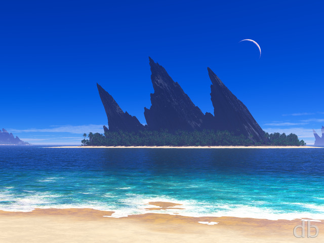
For the next one, would you consider doing one with ocean or beach scenery? I’d love to see one with crashing waves and beautiful medium aqua blue waters like tropical locales have. I don’t think I have yet seen you do a scenery with a crashing wave but just a normal calm shoreline as if it were a lake shore or lagoon area.
Shawn
Great Image…I’d love to see a night/twilight version of this..
one other suggestion…maybe add some sort of ripple effect to the water?
Russ
Ryan,
First let me say thatI love your work especially the nature/ landscape scenes. However this one I am not to happy with.
The foreground and the pond look spectacular. The problem I have is the opposite side of the pond. The bank at the forest line looks distorted. Instead of getting the feeling of depth and items blurrying together naturally it looks more like old grainy 8mm film.
Your work always shows so much detail and it simply amazes me. Yet this particular piece gives me eye strain as the middle of my pc screen focuses on the far bank and some dark and grainy/blurry foilage and trees. I have had this as my background for most of the morning but just recently removed it. I loose the beauty of the rest of the work becasue the blurred trees grab my attention, everytime i look at it, as I try to bring them into focus.
I have never complained about any of your works and hopefully never will again but I just have issues with this one. I am still in aw of the beauty you create for I could never in a million years create a “stick man” have as well as you make a single blade of grass.
Patrick
Easily one of your most beautiful pictures for a while. I love this picture. It makes me want to write and create.
Thank you.
Loretta
Hi Ryan –
<< I >> wouldn’t have noticed the graininess, but then I have a 15″ 1024×768 monitor. ;c}
To me it appears hazy, like parts of the Great Dismal Swamp and Back Bay in Southeastern Virginia, or the bayous of Louisiana in the heat of a summer morning. It’s not quite to where the steam is rising off the water yet, so still pleasant.
I don’t think I’d want ripples on the water, either. This isn’t the Amazon rainforest, but a little shady patch of backwater.
I always love the way you frame your scenes with foreground; a photographic technique my Dad taught me decades ago.
Thanks again for another wonder.
…and for the extended mobile formats too.
Lo’
Tim
Love this one! Only issue I see is that the contrast is too low. The sunlit areas aren’t bright enough.
It looks like an underexposed film picture.
The haze is realistic and reminds me of a hazy summer day. Increase the contrast and this will be a 10/10.
Tim
Tril
After feeling unenthused with recent offerings, here is one I love. Yay! I like the lush foliage
and especially the lily pads, which seem to glow in the sunlight. And the picture has depth to it. I feel like I’m there.
It would be nice if the water looked more watery–more of a limpid quality and less graininess.
9/10.
Jon
I think the deep green in this scene is simply breathtaking!
It’s a beautiful forest scene, the best you’ve ever done I think.
The only thing that keeps me from rating this a 10 is the hazyness/grainyness in the middle. I think it would be best if there was just clear air going strait back to those bright green trees.
Thanks for putting another great wallpaper on the table
Good work!
Adrian
Very calming with all the green…nice to have a wallpaper that isn’t high contrast and shouting at you like the last few have been (not that I don’t enjoy them anyways).
Justin H.
I just love all the greenandhowit produces a calming effect…this is anawesome background and I will definately use this for one a while. Haha, thanks a bunch!
Eddie B
As some have mentioned – a bit on the grainy side but for me up there amongst your best. Looking forward to the triple screen version.
Nate F
I find that this scene really shines above many others to me because it is so incredibly believalbe which makes it a very picturesque shot.
It looks like someplace that I would really enjoy having a nice relaxing afternoon in.
So to rephrase the subject: Untouched is unbelievably believable.
Nate F
Hmm… well after reading some of the other comments I have this to add: I find that the haze or blurr or whatever you want to call it is actually essential to this scene and making it into such a realistic masterpiece. It really reminds me of some places that I have seen in nature early in the morning.
Blizzard
Great job on this one! It went to my number 2 spot as soon as I saw it.
imhihere
ahhh, makes me feel refreshed. I love it!
Edouard
I love it !
Juan
I like these types of images that you do- examples like summerwood, inlet, hiddenfalls, islandtime, etc. However, this one seems rather noisy, not as much of a natural look as the others I’ve mentioned above. It is a beautiful scene, but my eyes are drawn to the noise.
ted
I suspect the fact that your renders can take up to 36 hours even on a very high end machine explains why your work always turns out so well (coupled with prodigous artistic skill, of course). It is worth the wait!
kriz
make you see life a whole different way. simply amazin
Sonaris
Absolutely ravishing!!!
I love this site for its originality and attention to detail.
‘Untouched’ delves into the greens that have never been emphasized to this extent before.
This artwork is so realistic that I can almost smell nature on my desktop and was obliged to comment for the first time on this site.
I think I speak for all when I say that Digital Blasphemy rules.
Ali M. K
It looks a bit grainy, but I think that’s the point. I like it. I don’t think it needs tweaks. The trees look more realistic than before. Good job, Ryan.
Kyle S.
Looks awesome on my 42″ LCD TV. Another good one Ryan. Only thing I can think of changing is making the water be a little more clearer.
Tarkan2467
I agree that this image looks a tad grainy, but otherwise it’s very well done. Nice work.
Mark
Once again Ryan, you have shown that you are the king of computer desktops (but we all knew that already.) This is amazing, looks fabulous on my desktop, Thanks!
MG
The Grainy Look almost makes it look like a faded picture. I like it as is but if you want to tweak it the image should only improve..
Jacob L.
Stunning. I love it! Sections of those trees are looking photorealistic. The ambient lighting is great. I could go either way with the pond color. If the spring rains did come, it might be a bit more clear. I can also understand the lighting and plethora of green might tint the water at this viewing angle. The granular appearance I can live with and, in some cases, almost resembles the dense moisture that could be present in a place like this.
Regards, -Jacob
dujeon
Excellent work mate, I’ve just joined, as ive been checking out your site for about 5 years at least once a week if not more. Finally had the money to sign up. You rock, everything you do is fantastic, great vision, keep it going 🙂
Greg
The last nature scene, “Island Time” didn’t really do anything for me, but this one is awesome, thanks!
Scott
I’ve been waiting for a good spring/summer outdoor scene to use for my desktop. This one is perfect. I’m a big fan of the “woodsy”, kinda dark ones (I loved the Summerwood/Autumnwood/Winterwood/Springwood series from a couple years ago.)
Greg
But an early evening version of this with fireflys, similar to Summerwood, might look really nice…
Phantom
This is amazing, really looks true to life, thanks man!
aurelyn
I’m speechless. This is truly beautiful. One of the ones that makes me really wish I was there, laid out under one of those trees.
Topher
I do love it too, as does my wife. And I too would love an evening one.
Labanimal
This is beautiful! – But i can also see what you mean by wanting to tweak a few things.
The sunlight could be stronger, and the rays coming through almost like there’s a dash of fine mist between the trees – could make it a bit more surreal!
The water seems a little lifeless, I’m kind of looking at the water wondering; “where’s the fish” – slight ripples in the water as fish are feeding off whatever is floating on top could add a tiny bit of life, and add depth to the water.
The bottom right corner you have some blue flowers – MORE! definitely more flowers to add a little more color to all this green
I must also agree with others, giving it that Summerwood/Autumnwood/Winterwood/Springwood touches/versions would be SO awesome!
Thank you for posting this early version – This was well worth the wait!
Mercury
Awesome job. . . as has been pointed out previously, the trees look great and I think the graininess is nice. If you were actually in the shade looking out into a sunlit area, would it not appear slightly grainy or hazy, like in this picture? Maybe I’m wrong. . . In any case, I look forward to whatever alternate versions you have planned.
Dave
This work is simply astonishing. Definitely one of your greater ones as of late in my opinion(not that the last were bad) and I love the flourishing life feel to it. I agree with Labanimal; seasonal touches to a perfected version of this would be amazing!
Dan
… just imagining how many mosquitoes that still pond breeds 😉
great job again!
DaveL
Yet another amazing piece of art from you, my friend !!! I can almost hear the skeeters buzzing and frogs croaking too… Looking forward to the dual screen, but not sure there is anything else you can do to this one to make it better 🙂
Josh
Really cool. It would also look awesome at night with some moonlight and fireflies, maybe a rowboat with or without some people or person or something! 😉
Ben
Fantastic image. I showed it to my girlfriend and she didn’t believe that it was computer generated. That’s so harsh to put it that way, this is just too beautiful.
Kyle C
Wow, you continue to amaze me… this is a fantastic image and a lovely scene.
I’d agree with a few others that the light intensity could to with being a tad stronger (certainly around the nearest tree trunk on the left – just looks too light?), and that a few random ripples (subtle) would fit in well too.
Id also definitely agree that an evening version would be good.
All in all, I really like this piece and would like to say thanks for releasing it earlier rather than later please take the comments as constructive rather than negative.
Keep up to good work, it adds life to my little office 🙂
Phillip D
Overall it is a nice, lovely image, I am very impressed with the placement of those water lilies….(or whatever you call those) only thing I see that I dont like is the volume light is a little grainy. But I am aware in some Vue applications, it is hard to get rid of.
An idea you could make as the next wallpaper scene, how about a night scene with few fireflies around with a dim light shining from above as it appears from the full moon?
Pawan
You continue to amaze me! Keep up the good work!
*hannah*
I just wanted to put one more vote in for an evening version with fireflies. I love this one also. You have perfectly captured that explosion of green that occurs in the northern states around this time of year. Marvelous!
Smithy
One of your best pieces yet.
Every piece you do you raise the bar higher and this is an example we should all follow of dedication, passion and hard work.
Thank you for creating such soothing and awesome wallpapers.
Keep it up ryan :).
Cheers.
Smithy
I also think a night version would be awesome with some moonlight on the water with the fireflys in the trees, that would be really nice. Something like summerwood has..
Cheers.
Devon Shaw
Experimenting with some graininess? From a distance it makes the picture look quite authentic.
alexM
Overall this is a very pretty scene. My only complaint is that it’s kind of grainy. I’m sure that if you do that it can render faster, but now that you have it up here and it seems like you’ve probably got everything where you want it, I think it’d be worth it to do another render at a higher quality where you won’t have that graininess.
mr-juneu
Looks like there might be some nice size bass in that pond
Mark J.
Excellent, Ryan. I can hear the heat bugs and the peepers. 🙂