


Description
The spring installment in my “At World’s Edge” seasonal set. I
experimented with a thunderstorm background, with lightning,
but
in the end I felt the background action only cluttered the
scene.
This is the only piece in the series (thus far) with
volumetric
clouds above the camera.

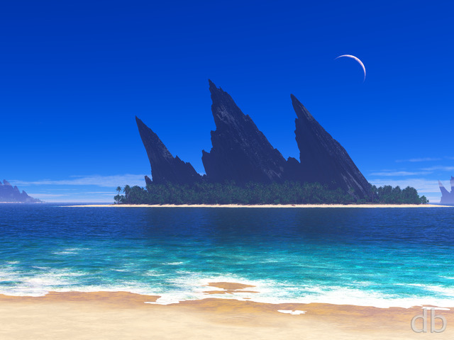
David Driscoll
[Lifetime Plus]
jlpilkin [basicmember]
Still one of my favorites during Spring. Is it possible we can have a 5K render of this? I?ve resorted to using Photoshop to do an upscale with a sharpening filter.
Wade [liferplus]
This has to be one of my all time favorites. I always make sure it’s included in my folder of desktop backgrounds, or I just set it as my permanent background. Keep up the good work!
Jenna
This is a gorgeous piece… but for some reason, it reminds me of the movie “UP”.
CPinTX
Hi again Ryan… this is still my favorite and still my wallpaper. I am one who usually switches wallpapers at least every few weeks if not more often, but here it is edging towards the end of June and this is still my wallpaper. I did switch briefly to your Gotham for a day last week but had to switch back. This so light and cheery…
Thanks again!
psithurism
i dig it… would like to see something like this with a color IR feel to it!
Michael
I’ve been a member for a year or so (and a fan for quite a bit longer!) and have used many of your wallpapers, but this is by far my favorite. What a fine piece of art!
Maureen
So jealous – I want more than one monitor! I used to have a dual-monitor setup at a previous job, and I really liked it.
CPinTX
Ok, I’m a huge fan of all your blue images, but this has become by far my most favorite! Thanks!
Ryan
There must be a bug in my Photoshop Macro. The link is working now. Sorry for the wait!
Link
Hi, Ryan. I’m the link to the 3360×1050 (dual 16:10) render of this image. I’m still broken and sending everyone to the 5040×1050 (triple 16:10) render. Would you be so kind as to fix me, please? Much appreciated! –Link
Spywriter
I tend to give a second look at images that are lighter at the left edge, because of the way my icons are gridded. I’m going to use this one for a while. It’s nice to be able to change the eye candy. I love your flowers, and had the california poppies for a long time. But then I liked the medicine bottle thingies too. . . decisions, decisions!
Reisan
This is just stunning, it is this image that got me and my mother to sign up for life-time subscriptions. I think this version is the best of the “At World’s Edge” images so far
Marc Lerch
Hello! Beautiful job on this one! But please check the size on the 3360×1050… I don’t think that it is correct.
Thanks.
Viper
I like the triple screen version so much, i’m using it on single screen.
Any chance of you doing a zoomed out render of it when you get time? The view point of the triple screen version really looks good on a single screen.
One of your Finest work Ryan and it was just in time for the sun here in the UK.
Thanks for all.
Phillip D
I just imagine a lady there standing by the edge looking into space, be pretty cool …in terms of your multi render on this one, usually your sides are distorted on your past renders, this one came out evenly and great.
Phillip D
nice art, I like the mixture of grass vegetation and very well in details. Your artwork makes renderosity gallery site look boring…in other words you have excel in 3d rendering, great job!
jen
“At World’s Edge” is maybe my favourite series, and this is just a stunning addition to it!
Greg
im simply loving the triple screen version!!
Jason B
I really love this spring version of At Worlds Edge. Any chance you will be doing spring versions of Canopy Creek or Green and Gold?
Sam
The link for 3360×1050 is linking to 5040×1050
Walo
Trunk texture is fixed as well, I think you forgot to say that in the update. hahaha
RRapplean
Quite worth the wait.
LauraS
Great job again Ryan. 🙂 Normally I’d say something about how much I’m looking forward to the dual screen, but sadly I got laid off a couple of weeks ago, so no dual screen for me anymore. 🙁 At least I can still enjoy the single screen versions!
hEADcRASH
For some reason the edge of the grass and the clouds looks really .. blurry .. to me. In more of an optical illusion rather than a “two different pictures blurred together in Photoshop” sort of way. I don’t know if that’s the look you are going for, but I wonder if it’s possible to make this look more “cliff-like” than a “soft-island-floating-thing”. thingy. I dunno, it’s hard to describe. I gues I like the idea of a plummet from Spring into the clouds rather than .. kinda .. smudging from one state to another. 🙂 I really love the idea, however, and think that the distinct parts are quite beautiful.
Andy
Love this version Ryan! Nice Job!
nickaix
The bright foreground and the darkening clouds make me think of the promise and the threat inherent in spring. So often the bright sun comes only one patch at a time, even on nice days. And just yesterday, we had a gorgeous, sunny, breezy day (80 degrees, in fact), and after that a night of storms, and even a tornado watch! Nice job capturing both sides of the season!
Jon H
Ryan,
The trunk texture is way better now. I swapped out the one on my desktop and it now looks 100% awesome. Thanks for the tweak!
Chris
I have always loved these. I admit this isn’t my favorite of the 4 however I love the vibrant colors of the flowers and the tree looks beautiful. Well done 🙂
Jake
1600×900 resolution ever going to happen?
Pat
Thanks everyone for your suggestions..I finally got the full picture by changing the DPI settings (or whatever they’re called) from large fonts to normal…all is ok, and I’m a happy camper…
Ryan
I’m rendering the multiscreen version right now. How to have it up by tomorrow!
Neal
I have triple screen versions of the other two. Will triple screen versions be posted?
Pat
Thanks for the responses you’ve all sent. I do have my screen set at “center.” My screen resolution is set at 1024×768. No orange dot next to offered resolutions. I tried a few other resolution settings on my monitor, but didn’t help. I appreciate all of you trying to help..P
Alex H
I saw the thumbnail and thought “shit, what is he thinking?”, but I read “At World’s Edge” and decided to give it a chance, knowing that it is a variation on previously released awesomeness. The winter and classic versions are definitely better, but this one grows on you. If you do an Autumn version, could you please do something special with the sky? Nothing too “in your face”; that would kill the scene. But something slightly out of the ordinary would be nice, like an interesting colour on the clouds. Doesn’t have to be surreal or anything, just something “different”. But heh, disregard me, you’re the artist, and you’ve produced heaps of awesome art already, I look forward to anything and everything you produce as it is. 😛
Lee
Try the 1152×864 version and set it to “Fit” instead of center.
Zak
Have it on both my PC and phone… 🙂
Ryan
Sorry you are having problems. If I have an exact match for your resolution the dot next to will be orange. If none of the dots are orange then please let me know your screen resolution and I will try to pick a close match for you.
Greg in CA
Do you have your desktop position set to “center”? Also, what resolution is your monitor set at?
Melodie
Great! Needs a bunny or a Robin. 🙂
Pat
I love this…but once again, when I set the picture as my background (no matter what setting), the forground is cut off (prettiest part). I have written to you before about this problem with another picture I love, but got no response. I have a normal 19 inch Dell moniter…please help..thank you
Ryan
I’ve replaced all of my files with a new version with an improved texture on the tree trunk. I hope this one works better for everyone.Thanks for the feedback!
William
I have the winter version as my background at work. I would love to see a duel screen version to switch to/between/etc.
Eric
Full of life Ryan, thank you for this festive piece!
sleeper
And I’d love it more if there were dual screen options. 😉
sigmaman
Nice work Ryan. Beautiful.
Chris B
Just DL a higher rez one and crop it the way you want it in photoshop, or whichever photo editor you like the best.
Greywalker
I really like the image but something feels off about the lighting. The tree appears to be self-luminescent, rather a small issue to me but I thought’d I’d mention it.
Miguell026
Nice! =)
i like it!
and it’s spring time.. so it’s very appropriate indeed!
byteful
Very springy. Are there Multi screen versions in our future? This would look nice in a Multi-screen format.
T3chn0g33k
Do a fall version to complete the series!
Allinuon
This is one of your works that I have been waiting for a third image so I can set up a desktop sequence that transitions to a new season every few minutes. Now that it has three images (summer, winter, spring), I tried it.
The summer and winter ones transition smoothly with only the leaves and grass fading away, but the spring one is not centred the same. The tree and rocks move when transitioning winter-to-spring and spring-to-summer.
Can you recenter this image so it aligns with the other two?
robk64
Looks good, but for the first time I’ve noticed a bit of pattern work in the texture in the moss and the trunk of the tree. Kinda takes away from the natural “randomness” that would otherwise give the image a relaxing, photorealistic feel.
Which program did you use for this one?
Jonathan L
I’d love to see this in a night scene for some reason… I love how the tree looks in full bloom!
This is perfect!
Kobrin
… can’t wait to see it as multiscreen! 🙂
Gary
It really does need work… the tree trunk is way too blurry… and maybe a nice clear sky would have been nicer with the foggy valley (or world’s edge).
Superman
Love it. Want to pull up a chair under the tree, prop my feet up on the rock and just sit for hours enjoying life.
betsey
the detail on the flowers and leaves is fantastic–I really shouldn’t have bashed Greg–he’s entitled to his opinion–and since I like all your styles I shouldn’t tease him about being biased!!!!
betsey
wow!!!! Forget Greg–he doesn’t know the good stuff!!! This goes with a set!!!
Greg in CA
As a dude, sufficiently lacking in self esteem to the degree that I can’t abide by flowery, ‘feminine’ desktop artwork, I feel I must speak out. Where are the abstracts? The outer space/planet scenes? Your pathetically macho audience is suffering… 😉
Chris B
I actually like the haziness. It gives it an ethereal feel to the picture like you would expect to find at the edge of the world. It is amazing how making the seasons change make such a HUGE difference in the feel of the picture. This is a nice vibrant peaceful relaxing version.
I did notice the tree trunk fairly quickly, but hopefully that’s not too hard to fix.
Nice one Ryan, and I suspect that we’ll have to wait ’till Sept-Oct for the Autumn version? lol
Ryan
It does need some work. So many projects, so few workstations!
Jon H
I love the tree (this is the best tree you’ve ever done, thanks for resurrecting it). I love the flowers on the tree. I love the clouds. I love the colorful flowers in the grass.
I have but one suggestion. I can clearly see the repetition in the texture of the tree trunk. This was hidden in the past by the snow in the winter version and the darkness in the summer sunset version.
Ray
Hey Ryan, thanks for doing this one. I know this is not the ‘main event’, just something to pacify us eager members, but its a great variation all the same. My only reservation is that it looks like a scene from the ‘opening video’ of some PS2 fantasy role-playing-game, and it seems the apparent ‘haze-i-ness’ of the whole picture seems to hide the lack of detail in the individual elements. It does have a very charming effect, but I’m not sure which of the two you were going for (or both). But its still a wallpaper that I’d proudly display.
Josh
Is a dual monitor version coming?
Kev
Very bright and different from the usual images; good to mix it up.
May I suggest darkening the font color of “digitalblasphemy.com” in the bottom right corner of the image? In most images, it’s the perfect shade of gray that does not detract from the actual art but is clearly readable if you glance at it. The vibrant grasses in this image make the logo extremely difficult to read – I don’t know how anyone could decipher the letters with the current font color, never mind read the actual website address. And besides, that’s the most important part of the image, right? 😉
And do fix the tree!
Amanda
I really like the colorful flowers, but I have to agree with everyone else about the tree trunk. It was one of the first things I noticed and it’s a bit distracting. The green riding up the trunk from the ground looks odd and the texture is off. I hope you can fix this because it’s a wonderful picture.
Walo
But where did you leave the autumn version? lol. I never thought I was gonna see a new version of this render.
Beverly
This has to be one of my favorite “updates” you have done. It’s breathtaking!!
Mike
I needed something to cheer me up today, and this did the trick. Love it!
lilylavned
It’s awesome, Ryan! Thank you for all your good work!
Mirage
I love this – a wonderful welcome to spring.
I do admit that at first I didn’t notice the tiling on the tree trunk, but after I had some windows open on my desktop that just happened to ‘frame’ the trunk, it became very noticeable. Now I kind of can’t help but notice it – hopefully it’s an easy fix. I look forward to a dual screen version of this as well 🙂
Max
Keep up the great work!
Max
I couldn’t agree more. The horizontal tiling is extremely noticeable. However, things I usually like least are becoming much better. Your grass, tree leaves, and cloudwork has really improved of late. In fact I’m still not sure if the clouds are a picture or CG particles.
Mike
Awesome! Except for the tree trunk, as others have said. That should be a pretty easy fix though…
Other than that, I really like it.
Koolio
One of my favorites especially the winter one, but please make sure you do a very sunny summer version.
dejerdejer
I like it but I have to agree with Hunter here. the tree trunk is not good. it almost looks like it squares off when the branches start. the colors at this point do not give a natural blend. It makes a great background but I would fix the tree trunk. It really is below your quality of work.
Tardis
you seem to be going backwards in your designs. There is just so much likeness to previous stuff. Come on Ryan, lets have some good new stuff
anna_writr
Just what I needed on a dismal day, a breath of spring. Thanks!
Floryj
Very Cool, when do we get the dual screen versions?
Hunter
The main problem I have with this piece is that the textures are “repeated”. Have a look on the tree trunk, and you can clearly see that the textures are just placed side by side, which leave a pretty ugly and predictable pattern.
Fix that, and it would be so much better!
Woodstock
Pretty, a little otherwordly. Not sure that’s a bad thing.
Jeff
I think it’s nice, but it doesn’t scream ‘Digital Blasphemy’ to me. Something about it gives a feeling of fakeness to it that hasn’t been present in other recent works. It might be the sheen of things.
Its still beautiful, it just falls in the deadness of the digital divide, for me.
Jen
It’s the watermark. It totally blends in with the grass, and I barely see it at all.
Other than that – I like. 🙂
matt
…post a sort of “trial version” of the one you’re working on for the community to vote on whether or not they’d like to see it in all resolutions…although, i know that goes against your artistic philosophy a bit, and that’s something i definitely cannot argue against. anyway, i love the wallpapers that get redone for the seasons, and this one is certainly no exception!
Laura
Oh I love it! The other At World’s Edge versions have always been some of my favorites so I am ecstatic to have a new one. Thanks Ryan!
Dmackoy
just something about the haze of this picture that makes it less appealing to me. Although I enjoy the levity it inspires through the bright colors
coffi
Just what I wanted and needed today.
thank you.
Ben
Works for me. Can’t wait to have my lilacs out front of my house in full bloom. This should tide me over until then. 🙂
Maureen
Looks luscious! I can feel the warmth of the sun, as I’m sitting with my back against the tree trunk.
Dale
Very nice! Thanks for a great update to this picture.
Wraith
Title says it all… just in time for spring. 🙂
rafi
I’d love to have this one in quad screen format for my n900 (3200×480)