= Add to your a la carte shopping cart.
Single Screen
- Lossless Master plus
- 1024x768 (4:3)
- 1152x864 (4:3)
- 1280x800 (16:10)
- 1280x1024 (5:4)
- 1366x768 (16:9)
- 1440x900 (16:10)
- 1600x1200 (4:3)
- 1600x900 (16:9)
- 1680x1050 (16:10)
- 1920x1200 (16:10)
- 1920x1080 (16:9)
- 2160x1440 (3:2)
- 2560x1600 (16:10)
- 2560x1440 (16:9)
- 2880x1800 (16:10)
- 3456x2234 (MBP)
- 3840x1600 (21:9)
- 3840x2160 (16:9)
- 4096x2304 (16:9)
- 5120x2880 (5K)

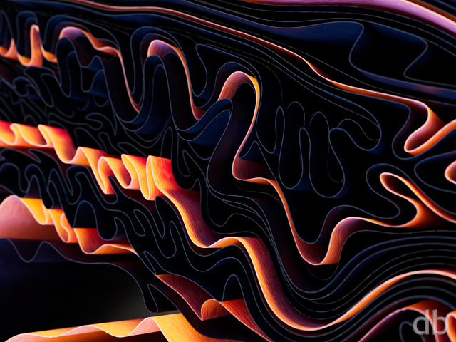
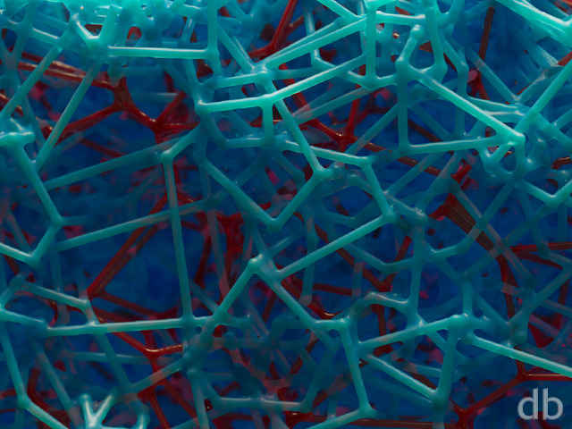
 Waveform: waveformchrome
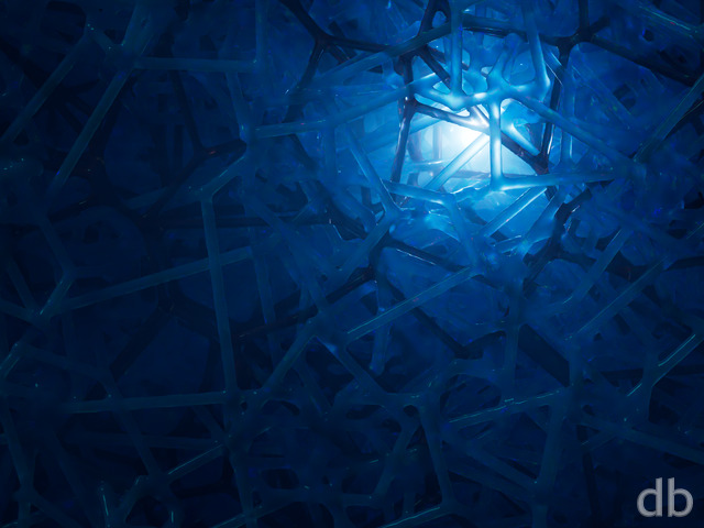
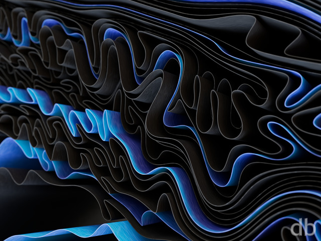
 Waveform: waveform1
Rick (Horseman) [basicmember]
This artwork is colorful, fun, and inspires me to think about ‘the chaos in the absence of balance and harmony’. As well, the evolution of humanity’, hope for the future that humankind will drop their weapons, toys of destruction, and take on affirmative action roles to work collectively to rebuild harmony and balance.
Steve
love the monochrome variation. Its a great alternative and is easier to work with since it’s not so bright as the original colored version.
Mate
I absolutely love this. I use it at work and find it very inspiring for my work.
Ryan
Ah I see. I would recommend you use the 2048 x 2048 Retina iPad version then. It is getting to be very difficult keeping up with all of the different tablet resolutions. On the plus side it is a lot easier to adapt a different sized wallpaper to fit on those devices (pinch/zoom/crop/etc) so I may as well just post one massive file and say it is for all HD tablets…
Taint
Hi Ryan, thanks for the response, I should have said this is the 2013 Nexus 7; which has a much higher resolution. However I’ll give the Droid HD resolution a try.
Ryan
Any image with a vertical resolution of at least 1280 pixels will work fine for the Nexus 7. The screen will only show 720 x 1280 at a time (portrait orientation). Try the 1440 x 1280 “Droid HD” resolution.
Taint
it looks like it needs to be 2400×1920. I think the only thing I could do would be to crop the 4k render :-/
Taint
I think this is an awesome abstract. Is it possible to get this for the Nexus 7? I think the physical screen res is something like 1200×1920 but the wrap around wallpaper makes things interesting.
Ken
So there looks to be an issue with the lower portion of the 4800 x 1200 triple screen render or at least with the version that is on the website for download. The portion doesn’t match up with the rest of the render.
Ryan
That one is available in the Pickle Jar here. I don’t list every resolution available on the Pickle Jar page for the images but you can browse them by clicking the “All Resolutions” link. The iPhone 5 files have a 640×1136 designation.
Steve
Can I get the black and white in the iPhone 5 size?
Chris
ok, love the chrome adaptation. another idea: something involving onyx or carbon (black) …
Tomcat
This is prefect for my phone wallpaper. Thanks Ryan!
Ryan
That was odd. It should show up now. Thanks!
Eric
The Pickle Jar link works, a page comes up, but without images. Something is broken.
PS. Waveform is pretty cool.
Iain
Love this one. Multiscreen looks great on my tri-screen setup. FYI, the cubes in the lower leftmost ‘spiral’ are clipping each other. Still love it!
Cooper
Wow! This is so vibrant and has so much texture and form. It feels like a Frank Gehry-designed solar array. Or brings to mind a writhing, undulating mass of shiny cathode ray tube TV sets, with cheery propaganda for life on the off-World colonies.
And although I really love the color choices you’ve made here, a fuller-spectrum version would be neat. But I also think this is such a powerful image that you could do a lot of things to both the hues and even the saturation that would leave Pickle Jar-dwellers happy for many months to come. A grayscale-and-one-color version (or series!) would be amazing, too, I bet. 😀
tl;dr: 9/10! Top 10.
Ryan
The multiscreen version of this is rendering now and I hope to have it up later today!
Jay
Any word on any multiscreen? I can’t wait for a 5760×1080 of his one to see it roll over all three of my screens!
Cory
Do you plan on rendering dual screen variations? My dual WQHD setup (2560×1440) is craving this one.
Fumigator
Studly abstract, thanks for this one. I haven’t been enthralled by much of the 2013 work (sorry), but this one is instantly top 5.
Deanna
Beautiful colors and design! I feel like I’m looking inside my keyboard’s SOUL, lol. This flew right to my desktop.
Ryan
Thanks! If you download and use the 4k version you can crop it to your liking.
Jonathan
I like it, but would like the iPad version moved to the left to expose the left upper area for the image.
Jay
I love abstract art! This is an awesome piece, the only thing that I would say to improve it would be some sort of focal point, maybe a larger color contrast, but I like to be drawn into works of art.
Joe
Solid. I’m loving the abstracts. You’re making my new lifetime membership well worth the cost.
Since you’re not using one of your ‘main’ machines for the renderings, I’d love to see maybe 4 or 5 different color combinations with this one.
Alex H
Funny how you call things like this “a little less complicated”. Classic example of “less is more” imo. I came here for the abstracts and stay here for the abstracts! 🙂
Ryan
I have another color variation rendering right now which is a bit more blue. There are, of course, a million different ways I could light and color this one…
Mike S
Would you consider doing this in a monochrome with black primary and either a neon green or deep, but bright blue for borders? I usually only use darker wallpapers, so this would be ideal for me instead of so much colorization.
Hoverwolf1
Again, not a big fan of abstract, but well executed. I agree with the others who suggested more color variation. It will probably look cool on chronowall.
Gene
I’m of two minds on this work. On one hand, to me, the technical rendering is superb, the geometry is interesting, and, at least on my screen, the colors really look nice.
On the other hand, there seems to be something not there, but I’m not sure what it is, since it’s not there (very helpful, I know…). If this were a piece of writing, I think I’d be saying, “good so far, AND. . .” Nevertheless, I still like it, but I would choose many of your others, old and new, as “better” or “more satisfying to look at,” or “more complete” in my eyes.
Jenanne
Love it. Deserves at least a 10. Brings to mind M.C. Escher taking a stab at solar panel design. 😉
cmmnoble
I like! Variety is fun, so it would be neat to see different color variations in the pickle jar–like other people have mentioned. But this one is great as is! (I particularly like the reflections, and the sense of movement.)
RDL
It’s a unique game on Steam where you control the amplitude and frequency of a wave to “catch” objects flying by. Anyway, looks good. I have this on my work PC.
fizzrate
This is a great wallpaper but, I agree with Randy. I would love to see both a full color spectrum version and a cooler version as well.
DougB.
Must be a Friday, because I can’t type. 😛
DougB.
11/10 — Talk about an instant favorite….I can’t wait for the dual-monitor rendering of this one.
Randy
too much red, needs more mid-spectrum and end-spectrum, i.e., green and blue.
Adamtrons
Excellent work. I really like the futuristic, abstract look of this. However, I’m not a big fan of red. The blue looks so pretty, it would be interesting to see it as the dominant color in a pickle jar version.
betsey
worth staying up for!!!!
Cougz
Very psychedelic. Love the colours and the geometry in this one. Well done !