= Add to your a la carte shopping cart.
Single Screen
- Lossless Master plus
- 1024x768 (4:3)
- 1152x864 (4:3)
- 1280x800 (16:10)
- 1280x1024 (5:4)
- 1366x768 (16:9)
- 1440x900 (16:10)
- 1600x1200 (4:3)
- 1600x900 (16:9)
- 1680x1050 (16:10)
- 1920x1200 (16:10)
- 1920x1080 (16:9)
- 2160x1440 (3:2)
- 2560x1600 (16:10)
- 2560x1440 (16:9)
- 2880x1800 (16:10)
- 3456x2234 (MBP)
- 3840x2160 (16:9)
- 3840x1600 (21:9)
- 4096x2304 (16:9)
- 5120x2880 (5K)


John S.
Love everything, however your link for the triple split files for accretion on the 4800×1200 is broken or missing.
Scott
Just do what you have been doing. I actually have 4 monitors on the same system but basically my 3 mains have your backgrounds.
Mixed resolutions of 1680×1050 to 2048×1152. I just match best I can and over the years works fine.
Just keep cutting into 3 like you have been
Richard H.
@Ryan: What, in fact, is the difference between the regular render and the Pickle Jar version? I simply can’t see any appreciable difference between them!
Ryan
I need a new solution for Mac users. What size screens are you using?
Scott
You triple screen split files are missing for most of the newer posts.
Are you going to do that for us Apple / mac people??
Richard H.
Regarding the picture, I like it but it’s not one of my favourites. Also, is the pickle jar version actually any different from the main picture? I can’t really see any difference between the two!
My main reason for writing here, though, is to agree with lionpants about the watermark. Personally, I don’t really mind it, and fully understand why it’s there. Its presence certainly doesn’t deter me from using any of the wallpapers. BUT I do agree that it can be quite obtrusive and can rather spoil some scenes. I think lionpants is right that it’s got a bit more obnoxious and intrusive in recent times. Even if you don’t want to make it any smaller, maybe you could in general make it a bit more translucent, please, so that it blends into the picture better and doesn’t look quite so distracting? Just a thought.
lionpants
Looks great Ryan!
Something a bit off topic… I’ve been a member for years (since high school) and love your work. One thing has always bothered me about it though since you added it, and that’s the watermark in the corner. I realize why you feel you need to have the watermark, but I have always felt it takes away from the wallpaper and over the years they seem to have gotten larger and more obnoxious. Maybe it’s just me, but I can’t stand how it throws off the balance of the image and it always makes my bottom right area of the screen look cluttered.
Believe it or not, if the watermark doesn’t blend in with the wallpaper it will actually stop me from using the wallpaper even if I like the scene. It clashes with a lot of the scenes too. 🙁
I always tell everyone about your site anyway, they don’t need to see the URL on my wallpaper (I know that’s not the only reason you put it there). 🙂
Anyway, something to think about hopefully. Hope you’re enjoying your new PC. 🙂
RDL
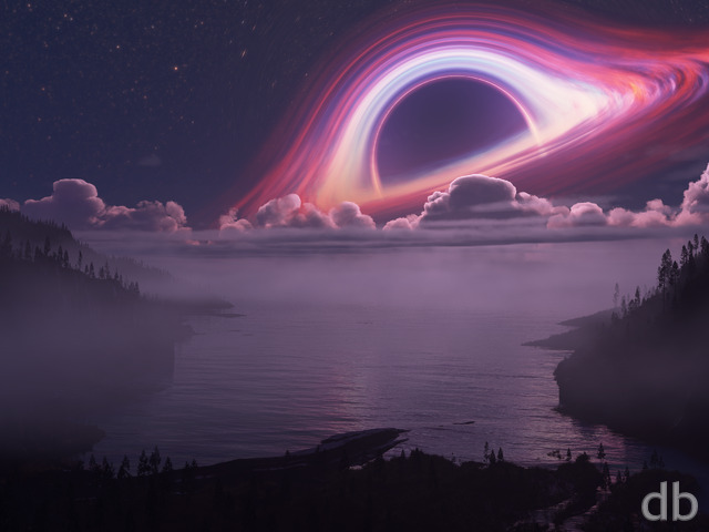
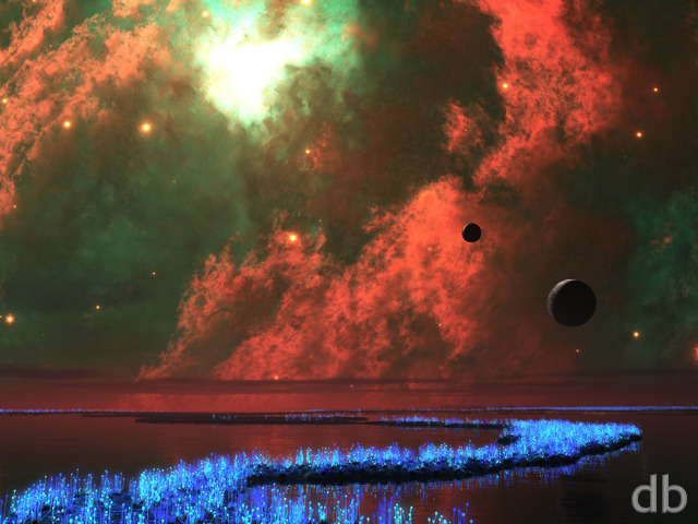
It makes me wonder what your rendition of the destruction of “The Pillars of Creation” would look like (stupid super nova got them).
TheJimz
Lower your field of view for less stretch at edges of screen, or even go orthogonal for scenes like this where perspective at this distance wouldn’t exist.
docsensi
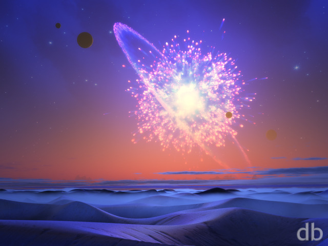
At first glance, explosion. This amazing piece’s name states otherwise, creation!
Romarch
…Or came together; ‘accretion’ can describe the formation of a protoplanetary ring around a star, or the formation of the planet itself as it collects material from the ring until it has enough mass to hold itself together…at least I think that’s how it works… Whatever’s going on here, though, I definitely like this render!
Carysta
First there was nothing, which exploded. 🙂
Ryan
Yes for some reason 3D programs like to stretch the pixels out on the sides of very wide frames. Not exactly sure what is going on there…
0beron
I like the new wide aspect renders, hope they are here to stay.
Comment on this one is that the starfield background (containing the little flare in the lower left) seems to have giant square pixels…
Michelle
I hate you a little. Why? Because now I really want 3 monitors for that tri-screen view. Amazing! Thanks.
John
This is amazing! I love your planetary and sci-fi scenes the best.
Robert
What happened to the iPhone 6 plus resolution? Most of the recent wallpapers don’t provide it.
Ryan
All of the files should be there now. Let me know if I missed any!
Ryan
All of the files should be there now. Let me know if I missed any!
Dane
Will there be a 1920 x 1080?
Caleb
I always love your space scenes and here’s another one to throw on my desktop at work!