Description
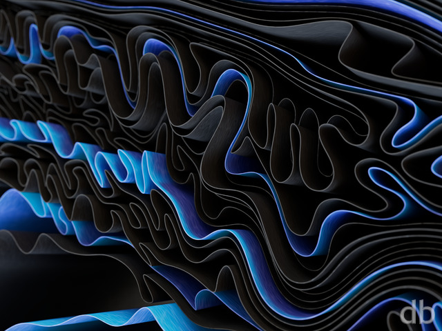
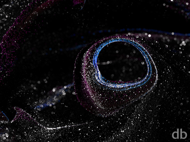
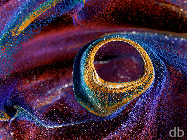
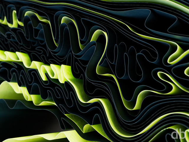
Back when I first posted Minimal Surfaces a lot of you asked to see more such “minimal” renders. Here’s another one that I created using the same “minimal surface” modeling program. I chose a brighter, more lively color palette for this one though. I hope you enjoy it!


 Acumen: acumenblack1
 Acumen: acumenwhite1


Brian [basicmember]
The quality of the higher resolution (5760×1080) really seems to take a hit. There is quite a bit of loss in detail and clarity which renders this render unusable for triple-screen.
Acumen is a fantastic image! The entanglement of smooth curves and vibrant colors is very pleasing to my eyes. Landscapes and distant planets are not my favorite but minimal renders like this really strike a chord with me.
Rick (Horseman) [basicmember]
Do you fit into this spiral of diversity, of colour? If you found your place, would you invite others to find their place? Our world is a spiral of variety, of colour. Imagine if every living human accepted diversity and people of all colours as part of the collage of global richness and diversity, then more time and energy could be diverted to comprehensive health and welfare, basic needs.
mollycule [nonmonthly]
I like your abstracts, and all of the colors in this one will look great on my tablet screen. I really like the black and red version as well.
Ed A [basicmember]
This looks really cool! The colors are very vibrant!
finger [lifer]
Could you render acumenwhite1 in UHD 3840×2160?
Patrick [liferplus]
I agree with StGrimblefig – Ryan could we please have some off centre dual screen images (most definitely the monochrome white)? For those lucky enough to have 3 screens, this is not an issue 🙂
StGrimblefig [basicmember]
Nice. Reminds me of a non-newtonian liquid on a speaker, connected to a signal generator. I especially like the Pickle Jar variations.
The only thing I don’t like about this is the fact that on the dual screen version, the center construct is broken in two by the gap between the monitors. In the past, you have offset the center for the dual screen versions. Was there a reason that you didn’t this time?
Ryan
Thanks for the heads up! I’ve uploaded the correct sizes.
Richard H. [liferplus]
@Ryan,
Thanks for including the 5K resolutions in the list. However, I’m afraid there’s been a mistake: although the 5K white version is fine, the file that’s marked 5K in the black version’s list is actually the 8K render.
8K will be great for the future, so I’d suggest you keep it… but for the time being, 5K is the most that most users are likely to need, so it’d be nice if the dedicated 5K version could be there as well. Thanks.
Steelwheels [basicmember]
Ryan, again I am totally in awe. Again you have created an image that captivates and forces me to loose myself in your imagery. Thank you for sharing your talent.
Richard H. [liferplus]
The 5K resolutions seem to be missing. They appear to be there in terms of filenames, but they’re the wrong sizes.
It’s nice to have these, but personally I prefer the colour versions. I also like the white better than the black. The black one looks kind of spidery and evil to me! It gives me the creeps a bitâ¦
Patrick [lifer]
I loved the colour one, but the monochrome white is just extraordinary in its depth and clarity, and reminds me of a scanning electron micrograph of a diatom. Both of those images are going on my phone too as well as desktop.
Matthew [basicmember]
I love the depth in this one. Initially, I see an iris within a layered vortex and then capture the truth depth upon peering at the dark teals. Very nice piece 😉
Brian [nonmonthly]
Simple & soothing. Well done, sir!
Linda [liferplus]
This is beautiful!
D. C. Sessions [lifer]
This, like ‘minimal’ is a good working background because its regularity is predictable enough to be easy to ignore while paying attention to other things. I’m using them for my system administration desktops.
Mario [basicmember]
Great looking fractal! Has a creamy texture.
Jenanne [liferplus]
Wow, this looks amazing on my phone. Love it! Great abstract, Ryan.
Holly [basicmember]
stunning colors. beautiful!
Joe [lifer]
One of your best abstracts so far. Rich, smooth, bold color. With enough small detail to make my 4Ks sing. Bravo.
MooeyG [liferplus]
The work draws you in. I am a big fan of color, too, and this fulfills that need nicely.
Lisa [basicmember]
I particularly like the fine textural detail on this one. Reminds me of sandstone in slot canyons.
Laura [liferplus]
I like the landscapes best, but these minimal abstracts are awesome! This is my favorite!
Ryan
Not sure how I missed uploading those files but they are available now!
Angelo [basicmember]
Can you please make this in 3840×1080?
Rodewaryer [basicmember]
It is simply pleasing to look at. Not too busy, not too “loud” so to speak, just pleasing, like therapy for the eyes and brain. Brilliant!
Littlemom [liferplus]
Although the colors in this are bold and pretty, Abstacts just don’t really do anything for me. I do however like the center of this render.
Ozaawaagosh [basicmember]
Love the Awesome colours, Makes a Great Wallpaper, AWESOME Job Ryan
Mark [sponsormember]
Always guaranteed to get a comment from me when you post an abstract or planetscape. Love this, nice one Ryan! The preview doesn’t do it justice, I love the depth when you look close. These ‘minimal’ creations are great wallpapers where I won’t lose icons. It’s happened more than once where I’ll change a wallpaper to a new one of yours, and suddenly an icon appears that I forgot about weeks ago. More!
Paul Gibbs [basicmember]
Love all your abstracts Ryan. Colours in this one are stunning.
Ben [basicmemberlifer]
But when I opened my Email to see this in there, I actually said “wow” out loud. Nice. 🙂
Patrick [lifer]
Always loved the abstracts Ryan. There should be a rule for abstracts and planetscapes (my favourites) to be posted every once in a while. This abstract is now sitting on my phone through the DB app. Any chance of some colour variations? Nice work.