= Add to your a la carte shopping cart.
Single Screen
- Lossless Master plus
- 1024x768 (4:3)
- 1152x864 (4:3)
- 1280x800 (16:10)
- 1280x1024 (5:4)
- 1366x768 (16:9)
- 1440x900 (16:10)
- 1600x1200 (4:3)
- 1600x900 (16:9)
- 1680x1050 (16:10)
- 1920x1200 (16:10)
- 1920x1080 (16:9)
- 2160x1440 (3:2)
- 2560x1600 (16:10)
- 2560x1440 (16:9)
- 2880x1800 (16:10)
- 3456x2234 (MBP)
- 3840x1600 (21:9)
- 3840x2160 (16:9)
- 4096x2304 (16:9)
- 5120x2880 (5K)


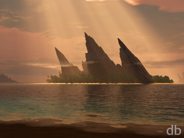
 Archipelago: archipelago2k140
Zach
Hi Ryan, I think that the 3840×1200 is messed up. It seems to be the triple-screen render (with the focus in the centre of the image) even though the resolution is accurate.
Overdrive
I’ve been to one of those islands, so I compared this new version with my own photo’s. Maybe surprising to some, the colour of the shallow water is actually pretty realistic, as is the blinding white sandbeach. Only the plants are way too overexposed, the palmtrees just a little. The deep water is (almost) perfect.
The original Archipelago is still my most used DB-desktop background, but far less realistic than the new version.
Jenanne
I’m sure this isn’t high on your “to do” list, but Shattered Sky and this render (and maybe others I can’t recall) seem to be missing their picklejars, which they ordinarily would have since they had first versions. Just FYI, etc.
Ryan
I’m so sorry I missed your emails. I found them in my spam folder for some reason. Yes I did receive your donation (THANK YOU!) and I’ve added your name to the registry. You should be receiving your thank you card soon (hope I put enough postage on it!).
Isaac
Nice piece beautiful water I do agree with Phil though the trees are too reflective. Also I sent you a donation on the April the 2nd
Transaction Number: 0097338719713024M, do you receive it? Sorry I for using the comments page (Feel free to delete this after you have read it) to raise but I have sent you a couple emails asking you confirm this and never got a response and want to make the payment went through. Cheers 🙂 Awesome site by the way been looking at it for 10 years now.
Phil
This piece looks good, but i think the trees and bushes look a bit too reflective and shiny. Makes them look a bit plastic’y and fake.
Slackweed
Noise level on the water is significantly improved.
RobertM
Please add a small hut, cooler of beer, and lawn chair. Then tell me where it is…
Dave
I can see these two as being the same image – high tide and then low tide. I do like the sand version better. Maybe put a sun-bather (or three) tanning themselves on the beach…
BobC
I actually strongly prefer the earlier draft version- I think because for me it seems to “fit together” more and seems to simply and clearly express what I think is the concept (improbable atolls in the middle of nowhere?). The foreground water here is VERY pretty, but I’m not necessarily concerned about photorealism per se. I did a quick survey of the past 3 years – when I have strong feelings, I prefer the “rough” version slightly more than half the time- usually beacause of additional elements or photorealism that didn’t add anything to the original concept. (I kept a copy of the v. nice draft version of “Panoply”!)
Laura
ok, forget that last comment, I was thinking of Atoll.
Laura
The original Archipelago still is a favorite of mine. This is a nice update, and I like the new angle.
Topher
MUCH better this way. I love seeing the bottom.
Jenanne
It’s great that we can see the ocean plants and animals; the render is much less grainy now. However, the sand looks overexposed and artificial. Less sand would be my vote, particularly if you plan to change the water gradient.
Nithilher
Beautiful. I like both versions. The two version are like high and low tide, although isolated tropical islands of that type usually don’t have strong tides.
Ryan
I see your point about the water. Actually I didn’t change the water settings at all. Rather I added some sand just beneath the surface but agree that the sand should transition to clear sooner.
Harry
Was a 9.5 with the first version. Sadly like quite a few in the last year the colours are rather extreme. It would appear to me that off screen there must be a leaking tanker filled with the entire worlds supply of cyan dye. The deeper water isnt to bad and is prety decently acurate it is however the water around the sand and where it shallows off that is the problem. In your original version (the years ago one) the colour of the water is much lighter BUT is nearly perfectly gradiented based on its depth. With the new one the water is highly dyed which gives the correct collour at depth but is horribly false when shallow. At the moment there is no gradient at all in the water colour only a reduction in brightness with depth.
Ted
Much improved, the water is great now. But the overexposed beach isn’t doing it for me. I hope there’s time for a third render to tone that down and it’ll be perfect.
Amadeus
I like This second version better than the first, it’s coming along great!!
Tyler
I love this one, much better than the last few that have been put out. The colors and tones are pleasing and the picture overall is quite balanced. The image is tropical without being overwhelmingly saturated with color.
Joe
Need to post wallpaper for an IPhone5
Ross H.
I actually have been using the previous version of Archipelago on my laptop for the last couple of days.
The new version just pops out and looks photo-realistic. My one piece of constructive criticism is that the lighting is a bit on the bright side and may benefit from being toned down.
I would love to see a night time render of this!
Thomas
Beautiful.
But I would LOVE a night or sunset render of it.
Ben
Hey Ryan any chance of some cool type of extra for the multi-screens…
Tyler
DB *member I meant to say.
Tyler
Totally disagree with you. Been a DB for 10 years and Ryan’s work is anything but boring. There are highs and lows like everything but personally I feel this year has been amazing. Honestly I’m surprised Ryan allows so much feedback when he could be like most artists and shut critics out.
D
Pretty nice so far. I suggest dropping the viewing angle until the horizon is in frame. Maybe add some sea-life and perhaps a ship in the distance.
Susan
I really love the way the water looks, I guess it looks grainy to some and though I’ve never flown over an ocean, this looks very realistic. There are an awful lot of trees though, it seems to take a little from looking at the water. But to be honest your water images are some of my favorites.
betsey
once I got past my Monday blahs and looked at both the detail and the full render….I love it!!! much omproved from the original!!!
Slackweed
Very nice, but so much grain and noise 🙁 It’s like texture filtering is turned off, or antialiasing is not enabled. I realize its not a realtime render – even more the reason things should be able to be smoothed out when at a distance.
Zach
I’ve been thinking a lot about my recent trip to Thailand, and this just adds to those good memories. I really enjoy the serenity and seclusion of this one, Ryan. My only comment is that it seems a bit grainy. I think that Ted’s suggestion to make the water a bit smoother and maybe lighter in colour rings true with me as well. Thanks again for your outstanding work.
Ted
I live the tropical scenes. It seems to me the water is a little dark and choppy. I’d like to see it smoother and more transparent. And then the sharks and fish Gary wants would be more visible.
Jenanne
Love this one! Not sure about adding sharks; maybe dolphins. But IMHO it’s great just the way it is. I particularly like that the palm fronds seem to be blowing in the wind, but the clarity of the fronds and the trees aren’t affected. Don’t know how you did that, Ryan, but it’s great!
Gary
A few sharks, and some other fish… this is very close to being perfect.
BobC
Checked your site today (as I do every morning)and found THIS! I especially like the colors and reefs in the water and the unusual vantage point and…and…the whole effect! Bravo!
Eyal
Definitely a place I’d like to be in…
Casper
Ryan, This is not intended to be just for the purpose of being negative, but as beautiful as the water is looking in this picture, I’ve been looking at your latest works and they seem to be getting redundant and boring. 🙁 I don’t have the skills and genius you have to create these kinds of scenes, but I do enjoy them.
I’ve just been noticing that I’ve been going to other wallpaper sites for my computer and I don’t enjoy it really. I though maybe you have been extremely busy with Family or overworked or who knows? I understand that stuff.
I just was hoping you would take this as a little constructive criticism and maybe have it help you get a second wind.
I would have done this privately, but I do not know you personally.
I also hope anyone reading this does not get discouraged from gaining membership to this fantastic site and Ryan’s amazing works. This is just the opinion of one person.