Description
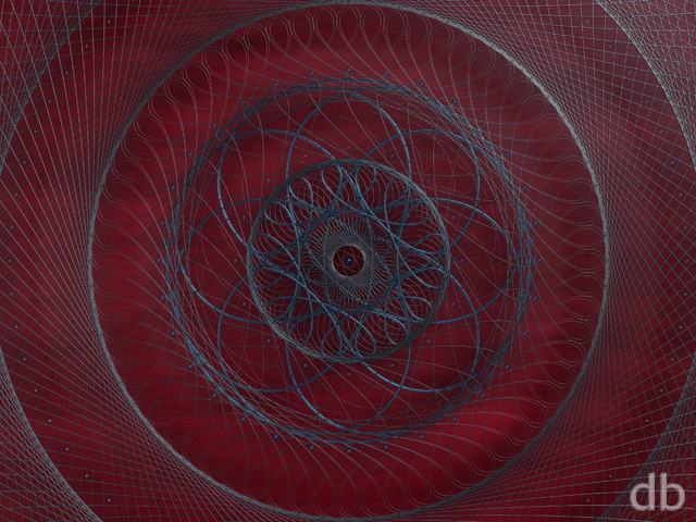
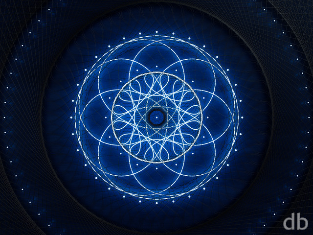
I wanted to create a much simpler version of “Archive” that would take under 8 hours to render. It’s a much simpler scene than it’s companion, but sometimes (as they say) “less is more”. It may end up being in the Pickle Jar, but I thought I would feature it for a while and get your thoughts…


Brian Pugh [lifer]
I paired this with the full Archive render on my Windows computer by setting this one as the login screen background and the other as my desktop wallpaper. It really makes it feel like you opened a door when logging in.
Skeeterhawk [basicmember]
Perfect on my tri-display. Loving it.
Carl Spanoghe [lifer]
One more thing: this wallpaper is dark enough to activate the “Dark” theme for the Android Oreo pull down menus. So not only does the wallpaper look great, but it makes the whole phone look better!
Carl Spanoghe [lifer]
looks fantastic on the Pixel 2 XL
Jess W. [liferplus]
This works wonderfully as the wallpaper on the lock screen on my Galaxy S7
Jason [basicmember]
@Ryan – Just a heads-up; the link to this page from the image on the home page is broken. It goes to archive1 (which is a clone of archive2) instead of archiveminor1. Fortunately, the link for comments points to the right page.
Holly [basicmember]
love the colors and lighting.
Davin [basicmember]
I always enjoy the abstracts. I love the colors in this.
Jason [basicmember]
…and it may be the best lock screen image I’ve put on there yet. It looks great!
Robert [nonmonthly]
I’m picky, and when things bug me I tell you. Don’t change a thing here, this is freaking cool. I can’t describe where this takes me, an AI’s brain or what it’s like to be in a game program or a digital Dyson sphere but it’s bloody good.
Mario Carini [basicmember]
This reminds me of the scene in Lawnmower man where he tires to find a way out of a “diseased mainframe”. I like the gradient look to the piece.
Henry [liferplus]
I love this – so much more than “Archive”, which is a little busy for me. This is clean, elegant, simple and beautiful!
david w [basicmember]
very minimalistic. pretty cool
Richard H. [liferplus]
Really like this one. I also liked the previous Archive, too, but this is like a 2D detail from it, and just as worthy of existing. I really like both in different ways. I’d definitely keep this as a proper composition in its own right, not a Pickle Jar variant of the previous one.
Just a couple of points, though:
1. Where’s the blue hexagons? In the central ‘blue’ area, blue colour is emitted as rays, but there are no blue hexagons as such to match the red and green ones. It just struck me as a little odd, though not terribly important. Is it that the red and green colours are reflected from other sources, whereas we’re seeing the blue source but not its reflection, I wonder?
2. If you want Pickle Jar versions of the other image (i.e. the original Archive), my one criticism of it is that there’s a bit too much red in it. It would be nice to see alternative versions with other dominant colours, or a more varied mix.
Amanda [nonmonthly]
This is great. I am not usually one for abstract designs, but this has lots going for it. Texture and detail, and interesting but not dominating colour! I really like it. Another one to look at often and not get tired of.
Paul [nonmonthly]
This is seriously one of the best backgrounds my computer has ever had. I need, like, another monitor, just to free up more space for wallpaper to show through.
Mark [sponsormember]
I love it. Eagerly awaiting the multi-screen renders! Always liked this type of wallpaper, I’m a big fan of your abstract creations, like Oculus, The Grid (both original and recent), The Comb, Synapse, and so on. More!
Zack [lifer]
Less is more. A simple concept and execution, but because it’s less busy, it is much more please to look at for longer period of time. This is giving Portals a run for it’s money for top spot in my all time favourite list.
Ben P [basicmemberlifer]
… and just wanted to say that I really dig this and the main one. Glad you shared them both.
Keith-E [nonmonthly]
I too shared your reservation with the colors of the ‘parent’, but we lurve this one..
Thanks again, Ryan, for all you do for us.
Chris Z [lifer]
This one is awesome. Definitely a keeper……when the dual screen comes out. 🙂 Thanks again for you time and efforts.
Kevin McDaniel [nonmonthly]
Love the art, where is the multi-screen version?
cmmnoble [nonmonthly]
This looks great on the desktop! It may be a variation on the more complex image, but IMO the two are so different that they each are deserving of their own entry.
The stained glass effect is really neat. I love your abstracts. If you’re ever in the mood to do more easy-to-render “experiments” like this one, I would certainly look forward to seeing the results. 🙂
David E. Smith [basicmember]
This looks like part of a really cool board game, and I’d probably buy it.
Greg [liferplus]
This would look great as a triscreen. 🙂
Ryan
I wanted to create a much simpler version of “Archive that would take under 8 hours to render. It’s a much simpler scene than it’s companion, but sometimes (as they say) “less is more”. It may end up being in the Pickle Jar, but I thought I would feature it for a while and get your thoughts…