= Add to your a la carte shopping cart.
Single Screen
- Lossless Master plus
- 1024x768 (4:3)
- 1152x864 (4:3)
- 1280x800 (16:10)
- 1280x1024 (5:4)
- 1366x768 (16:9)
- 1440x900 (16:10)
- 1600x1200 (4:3)
- 1600x900 (16:9)
- 1680x1050 (16:10)
- 1920x1200 (16:10)
- 1920x1080 (16:9)
- 2160x1440 (3:2)
- 2560x1600 (16:10)
- 2560x1440 (16:9)
- 2880x1800 (16:10)
- 3456x2234 (MBP)
- 3840x1600 (21:9)
- 3840x2160 (16:9)
- 4096x2304 (16:9)
- 5120x2880 (5K)


 Automata: automaton1a


oldtowneast [basicmember]
It’s strange you would have known what the Cyberpunk 2077 main loading screen would have looked like, this far back in the future. 😉
docster [basicmember]
My dear niece: “Cool! A Borg trout farm!”
SethR
I rotate wallpapers, but this is my most frequent
Ryan
I should show up now.
Brian
Can you make a Retna iPad resolution please.
dujeon
I can’t explain it but I just think of Blade Runner when I see this, I really like it
Greg
While I love almost every piece of art here, this one spoke to me at a deeper level and has now become my all-time favorite. It now graces not only my desktop but I also made a compressed version that Windows 7 will load as a logon screen.
@Jenanne… “But certainly everyone can benefit from a lifetime of Bliss!” I couldn’t agree more. I figured that out when I decided to become a lifetime member 3 years ago. Worth every penny! I don’t even remember how I found out about DB, but I’m so grateful I did!
Jenanne
I know it’s been a crazy week, but it looks like we’re still missing a few resolutions for Automata. Personally, I only use the iPad HD but doubtless people are waiting for the others:
1600 x 1280 (Nexus 7)
2048 x 2048 (iPad HD)
1252 x 626 (Twitter Header)
Thanks!
Jenanne
Well, not a full lifetime yet, I hope. But certainly everyone can benefit from a lifetime of Bliss!
SethR
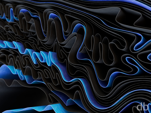
For my eyes, this has an endless fascination; as much as I like many other of your wallpapers, this one I thought about when I wasn’t at my computer.
Ryan
I’ve already lived a lifetime of Bliss and I highly recommend it. 😉
@jamie
@Jenanne : Oh GROAN ….. lol!
Jenanne
And then I misspelled my name. Sheesh!
Jenane
No biggie, Tyler. 🙂 And I agree with you about the 11/10 on this render. It became my current favorite very quickly.
Tyler
Sorry I blew your name. I call every girl Jenna. J/k!
Tyler
Love it on every level. The technicality, the colors, it just works. Even if your company doesn’t go with it who cares this piece is brilliant and instantly went on my desktop.
Also @Jenna that was very clever with the Bliss pun.
Andrew Rev
The detail at higher resolutions is really spectacular I would encourage anyone who is initially turned off by the preview to view it at full resolution. I almost passed this one up because of that
Michael R
Still waiting for this to become available in the DB Android app.
Jenanne
Wow, if I wasn’t already a lifetime member, I’d sure jump on that special $49 price! That’s a steal for a lifetime of Bliss. 😉
Ryan
I do prefer the title “Automata”. Thanks for suggesting it Michiel!
William
I was sure you would be smitten with “Substratum”! Anywho, this is another brilliant work of art. I’ve been a fan since I ran into your art back in 2000. Keep it up!
Frank
That’s the title that popped in my head when I saw this wallpaper. Quite beautiful, by the way… 🙂
Ryan
I have my own reasons for the name change, but it wasn’t because people didn’t understand the original. Maybe “Automata” is better name though…
B0bb1ns
I really like this and the original title was great. Any reason why there’s no Nexus 7 sized download for this and the last few other images in the members’ mobile list
Michiel
was meant to say: Aw, what happened to “Moore’s Law”?
Michiel
Let me guess: people didn’t understand it. 🙂
It’s a real shame. I can totally see Moore’s Law in this piece, albeit in an abstract way: the idea that circuit-design gets more complex / dense over time.
The title “automaton”, however, seems out of place. There are automata without circuitry. And there is circuitry that’s not part of any automaton.
Just my two cents. I like the render, by the way, though it’s not really my style (I’m more a fan of your landscapes).
Ryan
Let me know if there any any other missing ones. It has been unbelievably crazy around my house the past week or so so I apologize!
Jenanne
2048×2048 and 2560×1080 are MIA.
I hope we can get a peek at any others you create for the semi-conductor series. I love this render.
Ryan B
…I can also confirm that the split triple zip file (http://digitalblasphemy.com/content/jpgs/3x/automaton13x_split.zip) is missing.
Looking forward to displaying it once it’s available!
RDL
I liked that other version too. The one that was just a low res preview.
Request: glow
If you make it black and white, you will notice that nothing really feels illuminated. Some subtle lighting effects could really give a nice feel to this. I think that would be the finishing touch.
betsey
woke up this morning…..and went “huh”????? no “mooreslaw”???? please put the original in the Pickle Jar!!!!
scottg
SPLIT TRI-SCREEN FILES MISSING
Nice one!
Joe
Renders like this are WHY I bought a 3-year membership. This is one of my few 10/10 ratings, and the contrast between this and “Arrakeen” (which I didn’t like) is huge. The diversity of your renders are astounding, and at this rate, a 50% amazing (this, Roche, Jelly) to mediocre (Starfall, Sakura, Arrakeen) ratio is making my investment extremely worthwhile.
A+
Pat
Your 5120 x 1600 (dual 16:10) version is corrupted, it doesn’t load past the first few pixels.
Ryan
I’ve uploaded a new version this afternoon which includes dual and triple-screen versions. The new single-screen versions are crops of the multi-screen. I’ve changed a few textures and added a bit of geometry but nothing too major.The initial word from my friend in the industry has been very positive 😉
sidheyuna
I’ve always liked your tech themed abstracts, and I’m eagerly awaiting a dual screen version so I can throw this into rotation with all my other DB favorites. 🙂
Patrick
Oddly enough, this reminds me of the Iron Maiden album cover “Somewhere in Time”. Sort of futuristic architecture vibe going on.
Best not go on too much more, as I guess most people won’t make the same link.
Michael R
I love the detail and the depth of this. It’s going on my phone today and on my PC as soon as the multiscreens are up.
The older version I saw, which was from a sort of higher and leftward angle, was also very cool. Any chance of that showing up in the Pickle Jar?
John B
This is the perfect wallpaper to have while listening to Vangelis’ Blade Runner Soundtrack. Perfect visual and audio experience.
Rating it just on a wallpaper level. I would say this is one of your best abstract pieces ever.
JoeB
Love it. I saw Blade Runner as soon as the page loaded. That’s a compliment, not a shot saying you borrowed or anything.
Blade Runner, was one of the movies I saw when I was young that cemented the fact that I’d be a tech person some day. Now I am a sysadmin, using thousands of “a large semi-conductor company’s” processors.
This immediately brought back excellent memories.
Thank you.
fandeboris
I really really really like your abstracts. The “space images” come in a first, though. I love my images of ringed planets and everything else you throw in them. I still see a multicolor Blade Runner in this image, Complete with ‘wet’ streets. going to give a 10
Ben K
I’m all about abstract wallpapers, this has nice color composition and beautiful depth. I’ll be sporting this one for a while@
Brandi U.
You made a computer geek girl squeal. Love the title and think the results capture it. Great piece.
Jenanne
This looks terrific on my monitor, better than I expected. The colors and level of complexity are perfect. Good luck on the corporate partnership. They’d be crazy to pass up your talent. Here’s hoping they pay you the big bucks! 🙂
Michael
Very nice and techy. Will look great on my home computer.
Michael N
I like how busy this image is. It seems like there’s something new to look at every time you look. The only potential problem is that my icons seem to blend into it until I search for them
Jonathan
Interesting work. Makes me think of TRON.
Tor
My first thought was, this looks like something Intel would commission.
Jared
Personally, this is not my style, but I think the name suits it well! I work for a large semiconductor company and I can imagine having this hanging around the office! 🙂 (I’m pretty sure I was lectured for a few hours on Moore’s Law when I first started here too. lol)
Ali
Where are the PNG versions for 1440p and 1600?
Hoverwolf1
I’m not a big fan of abstract, but this good. I like the water at the bottom in particular. It reminds me of some of the maps from Quake 3.
FYI, the 2880 x 1800 link isn’t working.
Ruth
I love this piece because it isn’t really an abstract but it kinda feels that way. Thanks for the explanation; I would have had no idea! I like that I can look at this for a while and still see something new. I hope that the company has the good taste to use the best art being created right now! <3
Randy
I’ve always liked your landscapes and space scenes the best. I do like the reference in the title.
Jenanne
Ah, yes, that’s the right wording of the law. Thanks, Ryan!
Jenanne
Love it, Ryan! I don’t think you’ve done anything quite like this. I like the title you’ve chosen. Isn’t Moore’s Law something like “computer processors double in complexity every two years”? Very appropriate. Great job!