Description
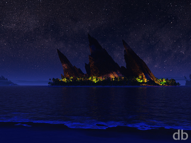
Going back to my theme this year of re-working some of my older classics. The original goal with this piece was simply to re-imagine “Space Vista II” from way way back in 1997 with some better texturing for the planets. I wanted something in the foreground this time so I used Gaea to create some interesting landforms that looked alien but wouldn’t take the focus from the sky. Lastly I added some cumulus in the distance to give the scene a little more scale.
Had to give it a new title though because I wasn’t really thinking about good names back when I first created this piece in 1996 (a year before I posted my site). They were simply files on my hard drive back then 🙂 Hope you enjoy it!


RDC
[Basic]
Wouldn’t mind seeing just the planets, by themselves, without a foreground.
Mike Wiles
[Plus]
This one ranks up in my top five of all your art. I truly love it!
Michael North
[Lifetime]
Your clouds on this look amazing! It’s been a while since I swapped desktops but this one is a winner!
Reiner Bertlein
[Donor]
very good work!!
Nathan Fazakerly
You are just killing it lately. The planetscapes are amazing.
svenge
very good but would love a version with no clouds and less atmospheric fog (more like the original)
Gian Luigi
[Basic]
very good work!
Thomas Patten
[Lifetime Supporter, Lifetime]
I think you hit this one out of the park, I know it will soon become a favorite.
Jen Helgren
[Lifetime Supporter, Lifetime]
Wow! Your planetscapes are the BEST! Thanks for your wonderful work, Ryan.
Kym Prasser
[Lifetime Supporter, Lifetime]
Great rejig of the original
Todd Rubel
[Lifetime]
Beautiful work Ryan!
ADAM MILLER
[Basic]
Wow. Beautiful work. Love this one!! 😍🌌✨
Cathy Warren
[Lifetime]
Beautiful!!! Great Re-render.
Jeff Ogren
[Lifetime]
BOOM! That is what I’m talking about!
James Hulsmann
[Lifetime]
Fantastic, as nearly all of you backgrounds are – but it is very apparent you using oLED and HDR when making these – I have noticed that I now (and for a while, now that I think about it) have to open them in Paint.NET and play with contract, shadow brightness, and color intensity to make them look great on my lowly SDR led-backlit but not HDR display. That’s fine, I kind of like playing around with images, but perhaps others may find your portal and think some of them look a little washed out?
Tim Porter
[Plus]
Love this, the clouds are stunning.
Jennifer Jonsson
[Basic]
I love the planet ones, day and night!! The problem is only that I like so many of them and I can only have one at a time on my screen! Unless there’s a way to rotate them. Must look into this.
Mark South
[Basic]
I love this one so much!
Mason
[Basic]
This one is amazing. It has a lot of my favorite features: alien landscapes, surreal planetscapes, night scenes, towering voluminous clouds . . .
Nathan Zachary
[Plus, Lifetime]
Talk about an upgrade from the original! WOW, how things have changed since 1997. The clouds are outstanding, and I love the single point of vibrant colours to pull in my attention. Nice work, Ryan!