Description
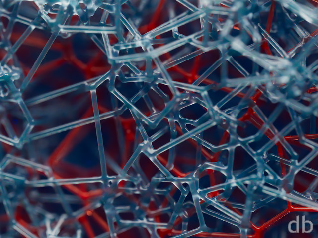
I’ve always been fascinated with the workings of our brains and this is the latest in my series of “abstracts” to attempt to represent the pathways found there (see “Neuronet“,”Pathways“, “Tendrils“, “The Spark” and “Conglomerator“).
I’ve posted a screen shot of the wireframe of this scene here if anyone is interested.


 Axonal: axonal1b
 Axonal: axonal1c
 Axonal: axonal1a


Holly [basicmember]
Beautiful! I love the color palette.
isaac
this render is a winner.
and LOL @ chris s comment re electron microscope view of the firefox logo rofl
Chris S
Its like if you took an electron microscope and pointed it at the Firefox logo you’d see this 🙂 I love the mixture of warm and cool colors! nice work!!
Chris
Its like if you took an electron microscope and pointed it at the Firefox logo you’d see this 🙂 I love the mixture of warm and cool colors! nice work!!
DanG
I rarely hand out the 10’s, but this was an easy winner – I’ve even stopped the usual DB library backdrop rotation so this one has had exclusivity all over the Christmas break (and deep into January I suspect)
Good job!
0beron
Really really like this one, more abstracts like this please 🙂
Techna
Incredible as they all are, this one is top on my chart.
Simon
Absolutely your best abstract ever! I really love the colors on this one too, those warm colors is really needed around this time of the year!
Also, this is only the second wallpaper ever (First being Highland), which have ever made me turn off the icons on my desktop, so that I can fully enjoy this wallpaper.
Of all your work, this is my absolute favorite! 10/10
Keep up your fantastic work, and Merry Christmas! 🙂
Deb
This one appeals to me in the way alot of fractal art does — really wonderful color combination and interesting textures. The depth to draws your eyes into the image and the warm colors are inviting. I love that about it.
Ozaawaagos
Like I said many times before your art work ROKS, hands down better then any one out there, just want to say thank you for sharing and have really good holidays my friend
Tavavilla
Your gift and your work are impressive, extraordinary!
Tavavilla
Your gift and your work are impressive, extraordinary!
Chris
So I’m not sure if anybody else got this, but this sort of has that “anemone” feel to it for me … which is awesome 🙂 Thanks for your art!
nickaix
This is some real funky stuff, Ryan. I like it!
And I think the colors really work on this one; a little out of the ordinary, but definitely a good call.
Brian
I’ve chimed in before on the abstract debate: I like ’em, but love the landscapes. What sells this abstract in my opnion is the 3D. It’s good to see the pickle jar evolution. I say the hard work paid off.
jcvr
Hi! I always loved the abstracts and this one is no exception.
I dont want to be a nitpicker, but there is a part of the pic that bugs me because it looks like a jpg artifact (Dual screen versions, left screen on the big orange think in the front) http://jump.fm/IBMXL
Nice!!
Wow I am really impressed with this image! You have always been very good at abstracts, and this one takes it to another level of talent for you! Reminds of science, or a cut scene from House, M.D. or CSI.
Andy
Damn, you just blew my mind. Absolutely love it! 🙂
Nelson
Generally I’m a fan of your abstracts, but this one is different. I just don’t like it that much, and I can’t tell why exactly… Maybe it’s that orange/cyan combination or the strong blurring.
But still, please keep on making abstracts now and then!
Alex
I was watching Avatar yesterday and this reminded me of that movie, with all the vibrant colors. Excellent! One of my all time faves!
Dave T
… I really like the out-of-focus bit, too. Adds a cool dimension.
Dave T
I always like your abstracts, and this is no exception.
Also, I know it’s never wise to feed trolls, but I feel compelled to point out that if you’re going to reject the civilized conception of politeness and stoop to rudely insulting someone on his own website, at least get your homonyms right: it’s ‘roots,’ not ‘routes.’
SteveSw
I love your abstracts, particularly these that have an organic feel to them. Your inner spaces, as it were.
This works particularly well in the multi-screen versions.
Thanks
Bryan
Another great one.
Labanimal
5760×1080 version is measuring only 4985×1080. i’m correcting it in photoshop…
Hunter
I really like this one Ryan, I’m not usually a fan for the abstract types, but this one stands out.
Though currently my desktop wallpaper is reserved for Christmas themed wallpapers. This will be on my desktop on the 1st day of the new year!
Brandi
I love how original your abstracts are. Love the colors in this one.
Corbey
But I think it must be your brain on New Year’s Eve!
Iardis
poor. You need to get back to your routes and do planet scapes. You also need to spend more time updating your website. I pay a subscription to you, not to facebook.
Chris B
I have to agree with the left bottom corner. I do like the blurriness to give the depth, I think it’s just a little too much in the lower left corner. maybe spread it out a little bit to make it more like the right hand side. so it’s not so big & intense.
Regardless I really like it! I just might like it more 😉
ATG
this is great, but the watermark for the 3840×1080 is in the middle of the right screen. is that intentional? is there an option for members to disable the watermark?
robk64
That’s the DB I remember! Very cool!
Jeff
When Christmas is done, this is my next desktop.
John N.
Now that all the sizes are available, I can comment on this rendering. I usually don’t care for the abstracts (especially the one done for Halloween!), but I have to say…this one Rocks! Great job Ryan! The Winter Solstice was great as well! Two masterpieces in a row!
Jim Wilson
I’M in Effingham, where R U ?? 🙂
Jim Wilson
I’M in Effingham, where R U ?? 🙂
Ryan
The multiscreen sizes should be all correct now. Let me know if anything looks strange!
Timmo
I love this, totally draws me in.
Ryan
Photoshop action gone horribly awry… Looks like I need to reupload most of these. Please hold off on downloading until I post that they are corrected.
Ryan
Photoshop action gone horribly awry… Looks like I need to reupload most of these. Hold off on downloading until I post that they are corrected.
Wrong link
link for above size image is incorrect and points to
4,796px à 1,200px
Seth
Love it.
Thomas
People are always asking me if I know Tyler Durden.
Dan
This is just fantastic. I’ve been waiting for another one of your ‘Abstract’ photos, and here it is.
Dan
This is just fantastic. I’ve been waiting for another one of your ‘Abstract’ photos, and here it is.
b0bb1ns
An excellent image – the ‘brain’ set mentioned in your post are all among my favourite images. I do agree with the comments about the blurry clump in the bottom left though. It’s a very big area of the image to have so far out of focus, and it makes my eyes go all scribbly when I’m using it as a desktop wall paper 😉 Maybe push that clump further into the scene to make it smaller and nearer to the focal point?
Steve
And that’s awesome that you posted the wireframe. It would be awesome some time to see screenshots of a wallpaper you do as you go through the process. Kind of a “making of”.
Ryan
I think I have all the files sorted out now. Let me know if you find any missing!
Brian
I like the picture, but why did you leave out the 1920×1080 version?
dmackoy
Very fun design and mezmorizing. makes me feel like im exploring a new place. thanks.
rubbercake
love this one, but the 1024×600 netbook size has cyan bars on the sides :-
Eric
@tubes and all the proponents – I concur
@Ryan – The perspective and feeling of 3 dimensional imagery is IMHO “Perfect”. Bravo!!!
Can’t wait for the duals so I can liven up my office screens.
Cheers!
Walo
That’s a lot of pathways there. This person must be pretty intelligent lol.
mango
niiiiiiiiiiiiiiice
please render some dual screens for the home and office me love you long time
tubes
For the people complaining about the blurry bottom left hand corner. It’s called Focus. When you look at something not everything is in perfect sharpness. If you focus on something close the details further away will be out of focus. I really love this picture don’t change a thing plus I’m sure it would take a lot of time re-rendering anyways.
sigmaman
That is wicked!
Bruno
It’s a great picture, but I’m too missing the 1920×1080 resolution.
Chris
This reminds me of a ink blot test where a doctor holds a picture (like this in front of you and than asks what you see, or what do you think the image is. It looks really cool seeing all the individual strands all out there. Great job Ryan
Fabio
Great work, but…
There isn’t “my” resolution 16:9 1920×1080!
TL
The wire frame is sick!
Will
makes me think of the inside of an electric pumpkin
Mike Barbe
Absolutely amazing. I can’t wait for the dual screen renders
Greg in CA
And another thing, AWESOME!!!
Max
Absolutely a stunning piece of work, but, personally, I do not care for the bottom left corner. just a little to much fuzziness there. The right hand corners (both top and bottom) look fine, it is just too much in the bottom left and takes my eye away from the rest of the piece.
Keep up the great work.
Max
Daniel
Awesome!
John N.
Where’s the 1920×1080 (1080p) version? Are we not doing 16:9 anymore?
Dave T
What happened to it?
Chris B
really like the colors & how all the axons are all over… but what happened to the 1080?
madtyger
I have to admit that I haven’t been the biggest fan of some of the abstract pieces like Neuronet, but this one is by far the best and probably my second favorite this year!
Patrick
A stunning piece of work Ryan. I have always loved the abstracts, and this is a cracker. I think it is great to occasionally get a glimpse into your creative process, be it inspiration, or in this case the early stages as wireframes.
Like the others say, can’t wait for the double monitor version for my work machine.
Torrey
Not sure if you’ve considered rendering any of your work for a 3d monitor – but this would look stellar in an extra dimension.
Lidia
Awesome! I hope your fascination with brain inner workings continues; these types of abstracts are some of my favorites. This one is just plain awesome.
McKab
I have to say, Ryan, you out did yourself this time around. I think this is my favorite abstract!
Tim H
I love it. I also really like the colors you’ve used. Great job as always, looking forward to your new holiday piece !
Jeremy
That is just plain AWESOME!
Jen
Awesome. Thank you, Ryan. 🙂
Peter
Man this is some sweet wallpaper Ryan.
You need to update 5120×1600 render of this one and past 3 others you have recently completed.
Your work is simply AWESOME!!!
Happy Holidays.
Loyal Lifetime Member
Ryan
The 1366 x 768, 1280 x 800, and 2560 x 1440 files should be working properly now. Thanks!I’ve posted a screen shot of the wireframe of this scene here if anyone is interested.
James
I hate to carp, but there’s not a 1920×1080 there.
Bart
Lovely! Looking forward to the multiscreen renders.
Will
The 1366×768 is a square, 1366×1366 I believe.
Otherwise, nice wallpaper!
Eric
I really like your abstract images like this. There’s no need to worry about being photo-realistic and you can use any colors you want.
Molly W
What happened to the 1280 x 800 size? 🙁
Looks pretty awesome though 🙂
Jen
Ryan, would it be possible to get this in 2560 x 1440 (16:9)? It looks great!
Jeff K
Love the colors on this one. Sort of look like fungal spores.
Jonathan
Very impressive image. My ignorance in digital artwork design may be showing, but I am awestruck just imagining the amount of work involved to sketch out each individual ‘pathway’ in this image.
Jonathan L
I’m a bit sad, I haven’t used any of the last five backgrounds as my main images.
Not nit picking, I’m just sad that none of the images have completely struck my fancy.
Great image though! 🙂
Magnus
This is a great image but the fuzziness on the orange blob on the bottom left really takes away from the picture imo, especially b/c of how blurry it is. I’d love to see a picture without the orange in the bottom left hand corner, then id give it a 10/10