Description
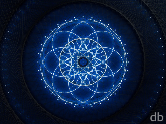
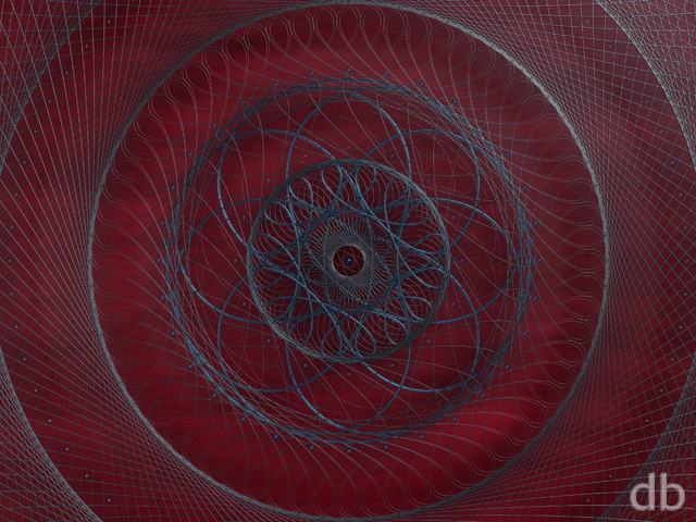
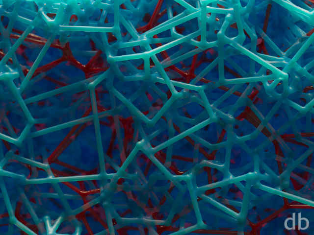
I’ve created similar “microscapes” before using Lightwave, but this is the first time I’ve attempted one using Vue d’Esprit 2015. All of the geometry was modeled using The Plant Factory. I used the same techniques to create an alien landscape which is still rendering on Shadowfax.


Organics / Fractals [liferplus]
Love your work, your have greate creativity. I do a morning staff meeting and your art is the highlight of the morning meetings
Ben K [nonmonthly]
Elegant, detailed, beautiful, but simple. Definitely a top abstract in the collection, in my opinion, makes for a great background. I love this style.
Ryan
In cases where I haven’t been able to render a multiscreen version, the 21×9 is usually a cropped version of the single-screen.
Mike [nonmonthly]
but I don’t understand why the 21:9 widescreen images appear to be horribly cropped. Maybe it’s something I don’t understand about widescreen
Joshua Pocock [liferplus]
Absolutely beautiful. Love it!
Rand al’Thor [lifer]
Must remove the taint from saidin…
Are you really there, Lews Therin?!
sigmaman [lifer]
Sweeeeet!!
shaldannon [lifer]
I like it. I like it a lot.
Rick Mozi [basicmember]
Howdy _ a creative and colorful piece that took me to the far end of our galaxy _ imaginative, blending is excellent and so is the accentuation of primary colors _ good work Ryan LR
Rick Mozi [basicmember]
Howdy _ a creative and colorful piece that took me to the far end of our galaxy _ imaginative, blending is excellent and so is the accentuation of primary colors _ good work Ryan LR
Rick Mozil [basicmember]
Howdy _ your creation, a collage of color, depth, and creativity stimulates my inner imagination _ another piece well done Ryan _ a reason why this cowboy stays with this group
TheNemesis [basicmember]
I also really like the lighting on this one. Not only is it visually cool, but it makes a great wallpaper, as the icons are easier to see on the dark edges.
Ryan
I’ve updated the Lossless Master to match the other files. I thought the original post a was a bit too dark so I played with the levels in Photoshop and reuploaded but somehow neglected to update the Master. I certainly prefer the lighter version.
Ozaawaagosh [basicmember]
This Abstract is really Cool, Like its a living entity, that is evolving Awesome Render
NikB [liferplus]
The lossless master file is amazing. So much depth to it. Is it meant to be darker than the standard files? My 1920 x 1200 version is much lighter – not quite sure which I prefer!
Susan [nonmonthly]
At first I thought “no I don’t like it”, but then I found that the more I looked at it, the more I liked it. I especially like the lighter colour in the centre of the picture. Though I must admit that some of the straggly lines look unfinished to me.
Rodewaryer [basicmember]
Boy does this ever pique the curiosity, you can’t just look at it without any number of instinctive questions being formulated. Cool!
Gnarlyrabit [basicmember]
Is this available at any dual-screen resolutions (5120×1600)?
MIB4u [lifer]
Looks great, but I miss it on the site …?
Randy [lifer]
So much detail, blurred by the long view.
Lews Therin [basicmember]
Excellent piece here! You’ve done it again. 🙂 10/10