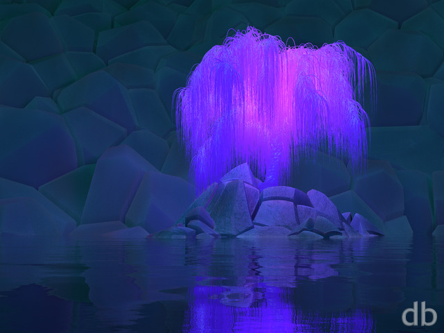
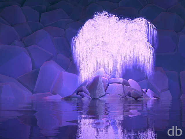
Description
It’s been a while since I’ve attempted a cave render and one of my fans recently shared some photos which inspired me to try my hand at it again.
The geometry was started in Lightwave and sculpted using Zbrush before importing into Vue.
I have future plans for this scene…


 Bones of the Earth: bones1
 Bones of the Earth: bones3


Ryan
I actually just added that one to the PJ about a month or so. I think I prefer the orange rocks to 🙂
Jenanne [liferplus]
Wow Ryan, I just stumbled across “Bones of the Earth 3” in the PJ; somehow I managed to miss this variant when you posted it. IMHO, this one should be the gallery version. It rocks!
Richard Haselwood [nonmonthly]
Nice lighting etc, but for me, the stalagmites don’t look all that accurate. They tend to be a lot smoother
Josh [nonmonthly]
It’s probably me, but the picture has a unique art style that makes it look drawn. Pretty good, nonetheless.
Susan [nonmonthly]
The ripples from the water drops are very effective
Jason [basicmember]
This reminds me a lot of some of your older stuff; glad to see some of the “old school” style come back!
Sharkgirl [lifer]
PJ version IS more dreamlike/less grainy but I prefer to see the ripples as they continue the theme out of the frame. Only a thought-tiny elements of light would soften the water drops – the solid black is a little distracting. Love the magical aspect to the stalagmites – makes me think of Gandalf and suchlike; perhaps the sacred place where powers choose their wizard. Super!
Jeff Myers [basicmember]
No 1680 X 1050?? It is an older monitor, but has that size become obsolete??
Ozaawaagos [nonmonthly]
This one is also so beautiful, it feels as if your standing there taking it all in Great Job
Ozaawaagosh [nonmonthly]
So sureal in Beauty, the detail is simply awesome on of my fav’s
Rift [basicmember]
I can almost here the water droplets on this one. This one gives me a sense of cool calm, like I’m exploring a cave near a beach, wondering what’s around the next bend but happy to see what I’ve found already. It could use a few improvements, the stalagmites could be blunter to add realism, but I like it overall.
Glynne [basicmember]
I showed this to my husband who is a long time deep caver as there was something not quite right to my eye in your stalagmites compared with all the photos he’s taken deep underground. He said, your stalagmites should be symmetrical rather than corkscrew-like because although at any given point the diameter can vary depending on drip flow the drip down that forms, the drip is always dripping from exactly the same point above – the tip of a stalactite that has formed above it, meaning they have axial symmetry or close to it (unless artificially damaged). Hope that makes sense.
Penny [nonmonthly]
Reminds me of a cave I found near Mount Lassen. I wonder what this one would look like with the golden glow of Noontime? Or a Dragon coming home from the entrance. So many possibilities 🙂
Mario Carini [basicmember]
Perhaps Jules Verne might have envisioned such a place when he wrote Journey to the Center of the Earth. It has that underground feel!
Zach [lifer]
I really like the water droplets in the current gallery version, but it seems like the PJ version has more contrast, and is less grainy. I also like the mood of the PJ version. This is yet another wallpaper that makes me wish I had three displays. I guess I’m going to have to do that one of these days. 🙂
Neil [basicmember]
The longer I have it on the more I appreciate the quality and depth of this creation, I really enjoy it.
Neil [basicmember]
The longer I have it on the more I appreciate the quality and depth of this creation, I really enjoy it.
-sùlfúr- [nonmonthly]
Definitely has the feel of a couple of my favorite science fiction films for sure! “The Cave” in “2005” and some select scenes from “Pitch Black” in “2000” just to name a couple. As Tyler stated earlier, a moonlight version is very interesting but the light from the moon itself could be challenging since your so limited with the space the light actually comes through unless you do some kind of bioluminescence from the rocks and water (glow worms or other ancient cave dwelling lifeforms?) Just an idea… Good work Ryan, I look forward to more of your work in the future!
Amanda [nonmonthly]
Love the colours of this, they give it a real feeling of ‘underground’ but lightness and not gloom! I like the water drops, prefer it to the pickle jar version because it seems more underground and cave-like.
JP [lifer]
Is this inspired from an image of Son Doong in Vietnam?
Eric [liferplus]
Beautiful stalagmites and cave. Great overall image except for the falling water which is slightly cartoon-ish. Perhaps a bit less and it will be great!
Jenanne [liferplus]
Love version two, too. Really nice use of light, color, and reflection in both renders.
Timhogs [liferplus]
Surprised there’s no 3840×1080
Jeremy F. [nonmonthly]
Looks beautiful with the lighting, great work!
Jenanne [liferplus]
I love this one, Ryan; it’s my hands-down favorite this year. It looks terrific on my screen. Thank you! I hope you and your family have a great Fourth of July.
Nick [lifer]
I really like this one – I love the blue/grey color scheme! Dual screen 3840×1080 is missing though…
Tyler [lifer]
Great concept. I think a night version with moonbeams versus sun would be compelling. Personally I wouldn’t mind seeing dolphins leaping throughout. The fantasy element is always what drove me to DB and I think ever piece beckons it. Enchant it more Ryan and you will have a finer piece IMHO.
Shannon [liferplus]
I came for the mushrooms and now this is my second favorite.
PhilC [lifer]
Is the face at the top of the main spire intentional?! It looks like he’s looking down toward the lower left of the room. I love it!