Description
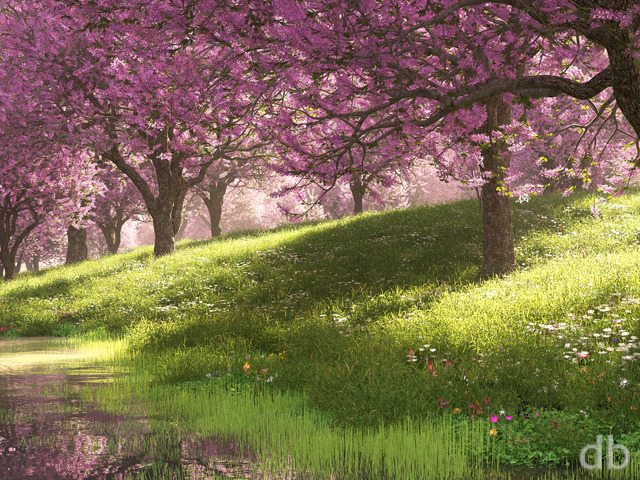
For the record, I created this scene back in September 2018. I held onto it thinking I would come back and make some revisions. Fast-forword to January 2019 and this past week I’ve been working on something dark that pretty much reflects my mood atm with regard to Illinois in the wintertime. I looked at that image, which I was planning on posting today, and decided to hold off. It might accurately reflect my mood, but with a new Polar Vortex bearing down on us I felt the need to post something warmer.
This scene was an experiment with learning Plant Factory’s new “Flower Node”. If I had to do this one over I would probably cut back on the depth-of-field a bit 🙂 I hope you enjoy it and stay warm (or cool) wherever you are!


Richard H. [liferplus]
This is really unusual, in that I like the multi-screen renders MUCH more than the main single-screen render. The main render has a great deal of foreground blurring which I don’t like, and which makes the scene look somehow like a tilt-shift photo.
However, the multi-screen renders don’t suffer from this problem; they’re much sharper throughout, and e.g. you can see the plants growing up out of the water in the foreground. These more in-focus renders are MUCH more to my taste. I think they look really beautiful. It’s just a shame that, to me, the main gallery image slightly spoils the set overall. But apart from that, 10/10.
Afya [lifer]
The 2560 dualscreen render seems to be a broken link.
Beautiful scene. I LOVE the softer / less exposed light at the focal point in the multiscreen.
Cara [basicmember]
Sometimes the beautiful detail you put into your work gets lost until I see it full screen. I didn’t even realize the tree’s leaves were feathers until I had it up as my background, and it just made it even more beautiful. You have such incredible talent!
Russ [donormember]
Ryan, Thank you for getting the multi-screen renders up, of this awesome piece of work!!
Ryan
Thanks for writing! I’ve offered 3840 x 1080 for quite a while as part of my multi-monitor selection. Not every image has a multiscreen render though as they are VERY time consuming.
Christian Gravgaard [lifer]
It is a beautiful render!
Have you thought of making a 32:9 format (3840 x 1080) for monitors like this: https://www.samsung.com/dk/monitors/c49hg90/
Bob [basicmember]
Still would really love a widescreen…
Susan [basicmember]
I like the flowers, but the purple does tend to take over everything and makes it hard to see all the detail
ChrisW [basicmember]
Really digging this one. The depth of field, the abundance of color; just the kind of wake-up call we all need to remind us that spring is coming.
Ryan
Just FYI http://digitalblasphemy.com/rss/images.rss is updated automatically when I add images to the gallery. I need to advertise this better.
Ryan
Yes I need to update the RSS feed!!
Michael Schmitt [lifer]
Not everyone uses social media for tracking updates. That’s what RSS is for.
Jenanne [liferplus]
I vote for notifications to the list in general, but see what others think. It’s a good idea. I often forget to check later on and, yes, I rarely check social media for updates.
Ozaawaagosh [basicmember]
The colours and the light, makes this a magical and serene landscape, I would never leave this place, Great render Ryan.
Ryan
I hear you guys. I really do. I have always had to balance creating new scenes with “finishing” my old ones. All too often I want to jump into something else new rather than tie up a machine for over a week rendering a multiscreen. It was suggested that I create a special mailing list for folks who want to know when I post multiscreens. I think that would probably be best (either that or sending out an email to the main list when I add a new multiscreen). Social media updates seem to go nowhere however. Whenever I post about a new multiscreen I get crickets on social media…
Nathan Zachary [lifer]
I, too, have been down about the lack of multiscreen renders. Many beautiful images have never been ported to multiscreen versions. For those, I’ve downloaded the 5K renders and made my own multiscreens, but they don’t look nearly as good as if you (Ryan) used your amazing artistic vision to make the right choice for framing, zooming, et cetera.
eyal [lifer]
Hey Ryan,
This is another great piece. Somewhat reminds me of water-lilies by Monet.
Sadly for me, however, I cannot really enjoy it as it does not have a multi-screen version, which is what I’m using.
I know you said they are coming, but actually, the list of wallpapers you issued that do not have multi-screen versions is getting longer with each new one you produce. Currently, the list contains: Greenmire, Dapplewood (Winter), Stasis, Biome, Cyber Blossom, Mauka and this new Breath of Spring…
Do you think you will ever get around to issue these wallpaers in multi-screen versions, or am I waiting in vain…?
Rodewaryer [lifer]
Ryan, you stepped out of your comfort zone on this and that’s being open minded. I love this, the focal length view here (I have a fair bit of photography experience) is perfect and being the picky person I am, I got nothing here. I feel like a frog on a lily pad taking in the wonders around ‘me’. Wonderful.
Bobc [lifer]
I love the scene and the colors. I agree with some of my fellow DB members that the way the depth-of-field is handled does make it look like a macro photo of a miniature diorama. It also makes places (left quarter or so of the frame) where the near and middle ground are hard for the eye to interpret and makes the tree trunk look odd.
Shannon [liferplus]
I like the colors and depth of field. Noticed a couple of other comments about tilt shift and the blurring effect and not sure if I agree or not, I’m a show me kind of person.
Xetal [liferplus]
….the foreground bough and the water fading are out of sync, jarring my eye. Challenging, but not my favourite.
Littlemom [liferplus]
This one is pretty, a very nice spring render. But isn’t it a bit early for Spring? Lol. Can’t wait to see the one you were originally going to show us.
Richard H. [liferplus]
I’m afraid I don’t like this one. I ought to; the content is very pretty. But it’s another instance (there was a similar image last year) where the blurring creates a weird tiltâshift effect, and the scene looks as though it’s a picture of a miniature model. I’d like it a GREAT deal more if it didn’t have that effect, and greatly reducing the blurring would, I think, fix it.
Andrew [lifer]
I like the depth of field, it makes the piece more interesting. It’s more of a story than the usual “admire the number of objects and textures!” It’s refreshing and different. Reminds me of classic DB.
Liz [basicmember]
I love the colors and feeling… just the blur is way too much of the field of vision. and im a little confused as to why the left side is blurred. i guess i don’t know where to look?
might work better if the crop went in tighter so the blur was more of a fuzzy cloud around it.
i do love this concept though and want to encourage you!!
Mark A. [liferplus]
the vibrant colors make you feel warm and happy
Kevin [lifer]
First thought I had when I saw this one… “Ooohh”
Cat Scratch [nonmonthly]
Must agree with Laura. Pretty flowers though.
Laura [liferplus]
A little too much blur, but still beautilful. Even though I’m not in the polar vortex I’m looking forward to spring.