Description
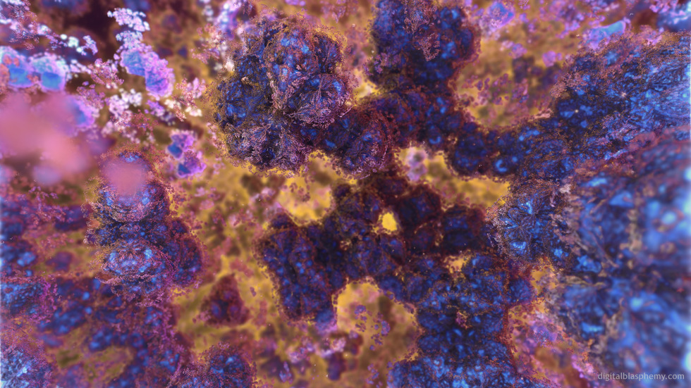
For the past 6 months or so the only program that wouldn’t crash
my MacBook Pro has been Mandelbulber. This is a render I put
together while waiting for “Gotham” to finish processing on Bucephalus.
The goal here was to explore “hybrid” fractals which combine up
to 6 of the different 3D fractal types.
 Building Blocks: buildingblocks1b
 Building Blocks: buildingblocks1c
 Building Blocks: buildingblocks1a
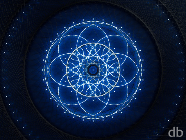
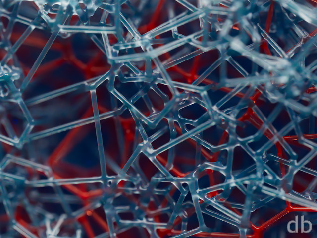
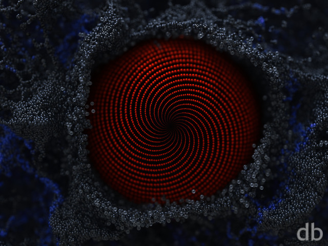
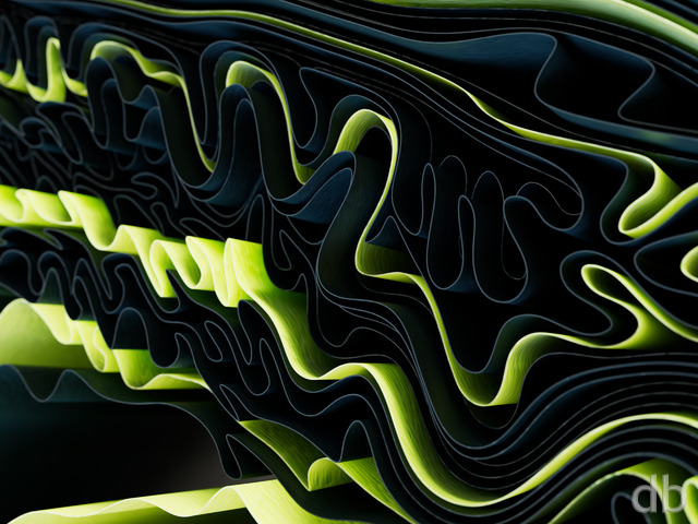
CPinTX
Looking at this makes me think of two things. From a smaller (thumbnail) version, it looks like a close up of those lava cave monsters that Spock communed with in Star Trek. From the larger version, it reminds me of scabs on skin.
While an interesting experiment, not my favorite by far. Still one never knows when you start these things how they turn out.
And of course, the blue version in the pickle jar is my favorite of these. ;o)
Chris B
but I like the orange on green and the deep DoF. Makes it look more 3D. Otherwise the gallery version is cool, the multi colors go together well and break the image into layers.
Doug
Are dual/triple screen versions in the works for any of these?
Scott Wray
Hey ryan – wanted to drop a quick note about coupons and the website.
I’m a life time member and I’m still seeing ads to renew on the side bars. Anyway to remove all that for life members and just see a nice clean version?
Thanks for the thought~
Scott
Dewey
Been a while since I commented, but this deserves it. I’m an old f**t, but I like to use the offerings as really striking backrounds. Many of the prettiest ones don’t work though, the icons on top really wreck it.
That said (sorry :), these three all are great and work well while being very pleasant to look at.
I’ve never been sorry for the Life Member thing.
Ryan
Interesting idea. I am open to suggestions!
Jeff
Ever thought of offering something specific for Lifetime Members? It’s hard to renew something that doesn’t expire for another 90 or so years. 🙂
Intangible
I actually really liked pickle jar 1b… it reminds me of what blue marble stone might look like if you could see into it, and the choice of colors gives it an aquatic look.
I enjoy abstracts which provide just enough “visual data” for one’s imagination to freely interpret, and I think this one is a good example of that.
Hoverwolf1
I’m always pleased when you come up with another new image. That being said, I’m not a fan of the abstracts. I realize that you use these as exercises to test what you can do, and I appreciate them as such. For this set, I would note that DoF only seems to be an issue on the versions with wide color variation (blue and red or green and yellow). It’s also only those versions which would not work well as a background, simply because of the visual focus. However, those aren’t as visually pleasing as the ones with a wide color variation. I like version 1a because of the stark contrast (and colors) involved.
On a side note, I think the four versions taken together look reminiscent of the scene from 2001 where Bowman entered the monolith and he saw all the crazy colors flying past. Cool!
Lidia
I like pickle jar version 1c; though it seems like a new image entirely. Version 1b seems like its own image also, but I’m not particularly fascinated by it. Version 1a I don’t like; it’s not a great color variation for this particular image.
docsensi
The blue/pickle jar version grants this piece a higher rating. The simpler color scheme of blues and reds give it more depth, and allows for better visualization of the details within.
Skrit
While I think that the utilization of DoF in this case is pretty well achieved, I agree with John to some extent. The structure in the very center of the picture should be included in the focus. The bit that really throws it off for me is the small bit very ‘close’ to the camera on the left side. My eye ends up drawn to it constantly and it becomes very distracting from the remainder. I wish you luck with this one, your abstracts are some of my favorites and end up being long time residents on my desktop.
Joe
I like this one a lot, but at first glance on the new wallpaper page, I thought it was Gotham 2012 with brighter clouds.
I still like it, though.
D
For me the DoF makes the shapes appear as if they are under a microscope slide, with the portions in focus being pressed up against the glass, very cool effect.
Ryan
I see your point. Generally, I tend to use depth of field in these busier abstracts to make sure there are areas where your icons will stand out. It really looks like a different image without it!
John
I’m usually a fan of using depth of field but this time it makes the entire image look blurry. I’d tone it down a little. The only sharp looking area is the top middle.
Jenanne
Great fractal; it reminds me of those colorful lichens that grow on rocks. The more I look at this render, the more I’m drawn to it, and the more detail I see. It’s hypnotic.
My favorite of your abstracts is H20 Weave 1997 — that render was one of the many that convinced me to become a member. I’d love to see an update of H20 Weave or even just some larger sizes. Please?
Littlemom
Pretty colors but I prefer you landscapes or planet scapes better
Lidia
Very nice abstract, I really like it! And it’s purple, which is a color you don’t frequently use, so it adds good variety to the gallery.
Chris
This one look so great! Judging by the title I guess its supposed to be some macro-molecules or something of the like, which I also like. I enjoy the abstracts you have that are meant to be like microscopic or sub-microscopic objects. Always very interesting.
DCarver
Cool and weird looking at the same time….
Lucas
Now this is another marvelous abstract! I love these stuff!