Description
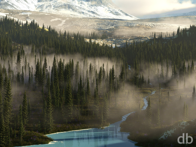
The last in my Canopy Creek seasonal series. I was going for an early spring look here (since the summer version is pretty lush) and this is the first time I attempted leaf buds. Basically in Vue this means erasing the leaf alpha down so only a little nub shows. I think the effect is pretty convincing.
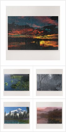


 Canopy Creek (Spring): canopycreekspring1
Metheon
Precomment it wasnt there (checked like 5 times in various places), post comment it was there.
Weird. 🙂
Metheon
The 1920×1200 version is missing? I feel tricked!
Please up it! 🙂
psithurism
… i feel like i’ve seen this image at least 20 different times over the past few years with little variation… shake it up a bit! 🙂
Beth
I LOVE THIS! I couldn’t stop looking at it.
nickaix
Perhaps like the Fable II title screen?
It scrolls slowly from left to right: winter to spring to summer to autumn to winter. Here’s a few screencaps I found:
http://media.giantbomb.com/uploads/1/15428/758006-fb2_01_super.jpg
http://www.supercheats.com/guides/files/guid/Fable-2/fable2s1.jpg
http://www.elder-geek.com/reviews/xbox360/f2_title.jpg
Tried to find a video of it, but no luck. Use your imagination for summer and autumn 🙂
Dave T
Ah, right. I’m not really explaining myself too well, here 😛 What I meant was an entirely new render by Ryan, with spring elements/lighting on the left, then summer, then fall, then winter. But all by Ryan, not just an edit of the existing jpegs.
Ian
I really like the “Night” version of the “Canopy Creek Winter”. Any thoughts on making a “night” version for the rest of the seasons?
Walo
I tried to do that, but the images don’t align very good so I scraped it.
Ryan
@Cadmann: The 1920 x 1200 seemed to work for me. What sort of problem were you having?
Cadmann
Could you please fix the 1920×1200 version, it doesn’t work
Tuishimi
Ouch! I have an ATI 5850 and am looking at the next set of Nvidia’s coming out soon… but they don’t cost anywhere near what you are forking over.
Tuishimi
Ouch! I have an ATI 5850 and am looking at the next set of Nvidia’s coming out soon… but they don’t cost anywhere near what you are forking over.
Dale
Now those are some fantastic pics. Saved a bunch of them for my desktop slideshow – the little one in my Vista toolbar. I’ve got DB only on my dualscreens 🙂
Dave T
Actually, that’s not what I meant. I don’t want all four pictures in the frame together; I was thinking more of one picture that has four sections — the tree on the left in spring, the next tree over in summer, etc.
KGH
Wicked series.
D
Here’s a few more amazing pictures, horribly beautiful.
http://www.msnbc.msn.com/id/36645958/displaymode/1247/
Chris B
That is an amazing pic… I didn’t think it was real at first… I think I need that camera!
Don’t worry though, Ryan’s works were done Years before this volcano decided to erupt, we know who had it first lol
Jon H
If you want the 4 seasons desktop, you could easily make it in Photoshop. Just resize all 4 of them to 25% and paste them in the frame together.
Dale
The current “Astronomy Picture of the Day” looks a little familiar. Hmmmm…. I think Mother Nature is copying off of you 🙂
http://antwrp.gsfc.nasa.gov/apod/image/1004/icevolcano_fulle_big.jpg
http://digitalblasphemy.com/preview.shtml?i=springrite
http://digitalblasphemy.com/preview.shtml?i=jove3
DiaMair
Hey Ryan, I am enjoying both of the spring versions you posted. I like how you softend the lighting on this one. Thanks for doing the extra work to complete the set! BTW, what’s the pickle jar versions?
Gerry
Swap spring and summer. Spring looks too yellow and tired to be spring.
Ryan
This render was supposed to be a quick tide-over while I work on new projects, but the buggy software made it take much much longer than I had intended.
Chad
Tired of re-renders. Time for something new?
Dave T
… but I think it would be REALLY cool to have a version of this (and other four-seasons pictures) with all four seasons in one scene. Like, spring on the left, then summer, then fall, then winter, all blending together.
Just my opinion.
Brandi
I’m not sure that it’s your video card. I had the 8.4 version (also Espirit) and promptly reverted back to 8.1. It was very buggy and ate one of my source files, too. I found it slowed my computer way down, and had redraw issues. Plus, my world browser would disappear.
My video card has Shader 4, so I know that’s not the problem.
Chris B
especially the one on the Left 🙂 Or maybe I’m the only one who sees it lol.
I like both versions a lot, this one seems to be more dawn-ish with the more gold light… which is perfect for spring.
Chris B
especially the one on the Left 🙂 Or maybe I’m the only one who sees it lol.
I like both versions a lot, this one seems to be more dawn-ish with the more gold light… which is perfect for spring.
Missy
This is beautiful! I love the birds
Reuben
This was a really good idea, I’m glad you did it. I just want to know if you will be doing this in the future for other season orientated wallpapers, or even with day/night wallpapers. eg: world’s edge, green and gold, summerwood (complete set)and so many more.
Thanks
Reuben
Ray
Very nice work Ryan! I do have one comment, that some of the branches seem abit too sharp -angled. Its the case with your other seasons as well. But its minor, so it doesn’t affect it too much.
Khariel
One of my favourite images so far. Keep these alternate-season images coming!
Ryan
The 5800 is only $3050 at newegg right now… and it’s a business expense, so it’s tax deductible!
Lidia
I’m not sure I like this one better. I do like that the light is not as strong, but I don’t like that it’s less colorful. It’s too yellowish/orangeish.
Wraith
While I like how this one isn’t so bright that it washes out the background, it seems too yellow-ish to me so I’m not quite sure if that works better or not. I THINK I like this one better but I’m not sure. :p
Ryan
Ah, there it is.Thanks littlemom!
littlemom
Ryan you always amaze me in your work, this revised version of spring canopy creek is so much better than the first one. I love the lighting. Thanks for all your work. Always amazing.
Ryan
I actually posted a revision a couple of days ago, but it had a big fat error that I only caught by looking at all 4 seasonal renders together. I left it up but I wanted to wait until I had my preferred version up before I posted.Now to figure out why the Pickle Jar image isn’t showing…
RC
I don’t see a pickle jar version either.
Walo
Did I miss something or the image updated itself? lol. Good update, I like both versions.
Geep
This newest version is really nice, but I actually like the older one better. The lighting was softer in it and a bit more relaxing. Great job on the update though, but I think I’ll stick with the previous version. 🙂
Chris
I am not sure I like the tree closest in the foreground on the right side of the creek being cut out. All you see it it’s root now. That aside I do love the color. The sun isn’t quite as intense also. I love those subtle changes 🙂
Chris
I am not sure I like the tree closest in the foreground on the right side of the creek being cut out. All you see it it’s root now. That aside I do love the color. The sun isn’t quite as intense also. I love those subtle changes 🙂
nickaix
Would love to see if you could works a flowering tree in there someplace. Maybe not real prominent, but somewhere. The flowers on the trees are really what say “spring” to me.
Spike
Like it’s predecessor, I love this version too.
Ali
>>only thing are the roots are just a little too much off the ground
I agree. It has happened before, so many floating roots do not help with the realism, assuming the pic was meant to be realistic.
betsey
oh yeah!!!! happy dance!!!!
Joel
When you posted the first version, I couldn’t believe that you said it wasn’t done, because I thought it was so good already. Well, you showed me!! I will still be keeping both though, because they are both awesome in their own right.
Walo
The above image is just a preview of the real images, just go below the image and select your screen resolution and there you will see the real image with a small almost transparent logo.
Brian
I’m backing up Max and Dan. The watermark on the production edition is fine.
Dan
Looks great, stands right up there with the rest of the series! And if I may say… I think your DB.com watermark is fine in text size. I’m not sure what another member is seeing but the text to me is proportioned just right. I’m viewing all of the images at 1680×1050.
Max
You obviously aren’t a member of DB. The above image is an example of what the image looks like. When you click on one of the image sizes and it brings up the actual image for your chosen background size. The watermark on those is MUCH smaller and even more transparent than on the example image.
macmage
I love it and see no need to change it. you do great work and I sometimes think that people are too picky. I am not an artist and there for i can only tell you what I like, and I like it – another wonderful art project –
THANK YOU
Geep
I really like the spring version of this the best. Spring is my favorite season and this perfectly fits it.
Tianuchka
Dear Ryan, first of all let me say, what You are the greatest digital artist i ever knew! You are making very beautiful pictures, what i can name a masterpieces of our time. Please, don’t never stop )))
But can i ask You one thing? Is it possible for You to post the “Digitalblasphemy.com” comment in the lower right corner of Your works with a little bit smaller letters, as it done, for example, on the works of the artists of the gamewallpapers.com or cgwallpapers.com sites?
These BIG “Digitalblasphemy.com” letters just killing all the great sence of perfection of Your works, in my opinion. This is the one and only negative nuance of Your astonishing work.
GeneralB
There is quite a bit of light. Whether you want that or not, it does seem to wash out the rest of the scenery a bit.
Also, as others have said, implementing some animals of some kind (other than the birds) would really bring across the Spring feeling of new growth and life.
Hunter
I can’t see anything that needs to be changed here Ryan, I like it just the way it is!
Foz
A Unicorn having a drink while being bathed in sunlight ^_^
celmendo
I’d like to see that third tree on the right gone (there’s still plenty of canopy to justify the name). Just leave that space more open to sun and flowers. Maybe put a momma bear and some new cubs getting some water. Never seen that from you.
It’ll be great no matter what.
Tril
I find this one kind of washed out…I think I’d enjoy it a lot more if the sun were gentler and the colors deeper.
Jenanne
No, actually, I like the flowers the way they are now. But I don’t see them as Disney-like or cartoon-like. This IS the spring version, after all, and there won’t be much difference between spring and summer other than the shade of green if Ryan removes them. I like the birds, too. The water is, perhaps, a bit calm for a spring stream, but perhaps it’s a backwater stream. I’m not one who thinks every detail has to be realistic. Anyway, I gave it an 8. Perhaps it can be improved a bit but it’s very good as is.
@littlemom
Dear Ryan,
Highland is still my favorite of the spring series. I wish the water was more blue on this one. Not realistic but still my preference. I’m getting anxious for a planetscape or abstract! Those are why I joined sir.
littlemom
I have thoroughly loved all the canopy creek series and am glad you have now finished and added this one as well. And I do think it’s pretty, the more I look at it the more I feel like I could be sitting on the bank watching the water flow by. And unlike some of the comments I happen to like the flowers a lot. I do however look forward to your new renders, and hope to more of them soon.
NovaGuard
As always, the Canopy Creek images are awesome, but as was mentioned earlier the moss and flowers seems too plentiful. Maybe “dirtying” up the foreground with more mud patches or even clumping up the moss would alleviate the “kinkade” feeling. Best of luck with the tech issues, keep up the fantastic work.
Alberich
I’d say you ought to devote your energies to your other project or something new, but if you really want to redo it, something that bugged me is the third trunk on the tree on the left, the one that bends off the left and out of the frame. It’s not in the other seasons as far as I can see, and I’d rather that element matched the others in the series.
Greg
I honestly think it’s brilliant as it is, and if you think you can improve it, go ahead!!
Nate F
I really like this one, I liked worlds edge spring; but not as much as the other two worlds edge images. This one I think is the best in its series
anna_writr
I love the early spring look. A little mud at the edge of the water would solve the slightly cartoony look of the flowers, but eh. It’s still great!
Brian
I agree, the Disney flowers have to go. What? No Unicorn? Even so, this is the first edition of the Canopy Creek series to make it to my monitor. Love the lighting and the birds. The knarly trees work for me. Overall, well done. Sorry about tech fail.
rdeforest
Do you use a version control system? If not, I highly recommend it. Subversion is completely free (FOSS), cross platform implementations are available and it’s easy to get started with. The learning curve is more like a one-step ramp. 🙂 I’d be happy to provide you with free tech support if you decide you’re interested in setting something up. You’ve got my email.
DiaMair
Beautiful job with the lighting! This really brightens up my day here at the office. I love your work, keep it up!
rdeforest
Do you use a version control system? If not, I highly recommend it. Subversion is completely free (FOSS), cross platform implementations are available and it’s easy to get started with. The learning curve is more like a one-step ramp. 🙂 I’d be happy to provide you with free tech support if you decide you’re interested in setting something up. You’ve got my email.
Kaz
Alas, Ryan, I cringe at your description. I’ve lost more than one source file to corruption, and the loss is irrevokable. I’ve all but given up on using their software now. It just keeps getting slower and harder to work with on every update =( So much potential, but they’ve taken a few wrong turns at e-on imho.
That said, I love the spring version. It’s quite lovely, even as WIP, and I hope youcan recreate the scene successfully.
Thanks!
Kaz
rdeforest
I don’t know exactly why, but this one looks a little cartoonish, especially along the bottom. It reminds me of Disney and Thomas Kinkade. Maybe the flowers are too plentiful and the moss too thick? I don’t know. Also, it could be me, but the rays in the foreground over the water look a little grainy. I don’t know if that’s something you can adjust. It doesn’t look like a feature of the scene, but rather like a rendering artifact. (I’m looking at the 2560×1600 render.)
What I really like about this one is the same thing I like about all your non-abstract works: it draws me in and implies a story waiting to unfold. I want to go to this place and find out what’s behind the things I can see. I already love this one in its draft form. I can’t wait to see what you do with it the second time around.
Ryan
Nothing seems to be working and I cannot open the source file for this project. It “loads” for around 90 minutes and then crashes every time.So it looks like I will be doing this one. The re-adding the birds will be a pain but everything else should be pretty straightforward. If there are any changes you guys would really like to see feel free to post them here.
betsey
were there birds in the other ones–or does the SECOND cup of coffee make the difference???? BEAUTIFUL Ryan!!!!
Walo
Now the set is complete, nice one as always.
Chris B
You were going through a dark & blue phase there for a little while lol It’s nice to see the cheerful colors in all of your recent images (I love the dark ones too) but it’s a nice change. Looks like this set complete unless you want to do a night version with fire flies ala summer wood. 😉
The only real branch that looks kinda unnatural is the tree on the left with the branch going down. it has bark all around it rather than what looks like a broken branch. It doesn’t bother me though, it goes with the somewhat mystical scene.
Phillip D
Nice smooth rays, no grainess like your previous versions, lovely plants and wildflowers…only thing are the roots are just a little too much off the ground, but overall excellent lighting and rays
Andy
Nice addition to the series.
Kody
Hey Ryan, theres really no need for a remoddled version of this 🙂 it looks amazing! and it completely follows your definition of an amazing picture, it looks good up close and from across the room. it works really well with my by season theme on windows 7 so it flows smoothly. keep up the good work 🙂
Mark
Yet another great piece that is now the background of my laptop…at least until your next piece comes out. 🙂 Keep up the amazing work!!!
rocy
I’ve been a big fan of this series since you released the first of the four. I have, however, noticed that there are a few branches off of trees on the left side of the creek that seem to just cut off without organically tapering off like most do. I haven’t noticed this in any of the other seasonal settings, but they are probably in the others too. You said that this is probably not a final render, however, so I am certainly not concerned. The bright colors found in this one and in “At World’s Edge (Spring)” have been a refreshing change coming from the darker streak we saw at the end of 2009.
Chris
I am a early poster! This series I have loved since you released last year. Thanks for completing it Ryan!! I am really loving these spring pieces.
Wraith
Yay! The final addition to canopy creek. Looks lovely. =)
Cadmann
Hm, weird, it now works. I tried it several times after you posted it and it just didn’t load. Any other version worked fine, just not 1920×1200.
Well, works now so I’m happy to finally put it on my desktop. Thanks 🙂