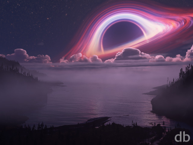
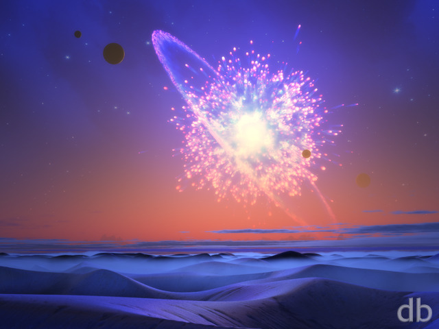
Description
I’ve been meaning to update my “Trinity” scene using Vue for a long time now but the trick was the figure out how to get two light sources to affect the coloring of the sky (Vue only allows for 1). I think I’ve figured a good workaround using a volumetric light.
I chose to use alien plants (modeled by myself using The Plant Factory) in the foreground this time and I’ve left out the little person. Since the viewer was one piece of the eponymous “Trinity” I’ve chosen a new name for this piece. “Circumbinary” is an astronomical term for a planet orbiting a binary star.
Members might recognize white-dwarf as the same that has been my “work-in-progress” for the past month or so. I’ve finally found a use for it 😉


 Circumbinary: circumbinary0


Ryan
Thanks for supporting my work! You would grab the 3840 x 1200 image.
Michael Ticehurst [basicmember]
Hey, just joined, but which one do I choose for dual 1900 x 1200 Dell U2415 monitors?
Mario Carini [basicmember]
Excellent and spooky looking! Gotta love that sun. Maybe it’s becoming a white dwarf star without much power to burn this planet with its het.
edgie [lifer]
No 3440×1440?
Rodewaryer [nonmonthly]
I do like this, you made a place we would like to go to again. I love the bioluminescence as that is part of the dream place, not sure the stars are quite as I would have pictured them but a bloody great rendering!
Susan [nonmonthly]
The lights you have at the bottom set it off. Without them it doesn’t have much to offer. The orangey effect is nice, but is a bit hard to see some of the darker detail
PentecostalGeek [nonmonthly]
I really love this piece. Maybe I’m just a major Doctor Who fan, but the White Dwarf light actually to me is how I’d picture the Tardis coming through time to a new place. Nerdom aside, the only criticism is the lower left-hand piece of bush closest to the camera. It’s completely unlit. It almost needs a light or two to match the rest.
Nate R. [nonmonthly]
Its beautiful pic not only does it shows creative forces but destructive forces as well. Their is a sun but behind that is it a Blackhole in the background that has already sucked up something?
CBRRider1 [lifer]
I’d like to see a dual screen as well. Of course, that’s with every background. 🙂
Peter Hall [basicmember]
This is great. Have you ever thought of producing this as a screen saver with twinkling and pulsating light effects?
Joel [nonmonthly]
I really like the concept here. It’s really pretty. The high contrast between the fiery mass in the sky and the dark luminescent foreground is gorgeous. I might think that there would be a bit more shading/reflection of the massive ball of fire in the sky on the surrounding landscape. The water reflects orange, but it seems kind of like the land is a bit too pitch black for that lighting. Also not sure what it is, but the sun object in the center seems a bit…. grainy? Not really sure what the word I’m looking for is. Something about the level of detail on it seems a bit odd to me. Other than those minor details I think this picture is really fantastic and I like the complementary colors and contrast. 😀
bemused1 [liferplus]
Check out M106 from hubblesite.org. The dust lanes give a three D effect.
bemused1 [liferplus]
This is more my speed. Thetis Moon and the like. Was San Diego too boring? Or too expensive? My sister says she prefers four seasons in Ohio to Florida panhandle’s wet/dry variance.
WiDoW [plusmember]
Love the piece. Has someone been keeping up with Pluto and Charon’s binary system? Love the concept. The horizon features need just a shade more light or reflection of light. Almost not noticable on the smaller screens. I sense that you don’t want to detract from your alien trees but just a subtle lighter hint of the mist or reflection of the star off of the mountain peaks would add to the depth to small screen viewers. Bet it’s stunning on the triple monitor set-up! I’m sensing you have several pieces going and are having way too much fun! lol, way to go Ryan! I love planetary wallpapers. Would love to see something with a multi-sun scene as a concept in some future creation. It would add sense to the writhing trunks of your alien trees, as they would be confused as to which sun’s light to steer towards. Wishing I had your tools to dabble with. (Envious lol) As a side note: Your WIP deserves more justice than this piece offers =p
Rae [nonmonthly]
The colors are breathtaking!
cmmnoble [nonmonthly]
I love the mood of this one. The colors are fantastic!
aslan [nonmonthly]
Inspiring…any chance of a dual monitor version pleeese….
Littlemom [liferplus]
Love this render. I only have one little complaint, and that is the galaxy by the sun to me it detracts from the render, but otherwise the render is beautiful.
Ixias [lifer]
Another fine alienscape for the collection.
Jonathan [lifer]
You always seem to find ways to one-up yourself.
betsey [lifer]
fantastic as usual Ryan!!!
Brandi U. [liferplus]
Love it!
Yanna [basicmember]
This wallpaper embodies what you are best at, Ryan: Your planet/space related landscapes with the gorgeous alien skies are just so wonderful to look at!