Description
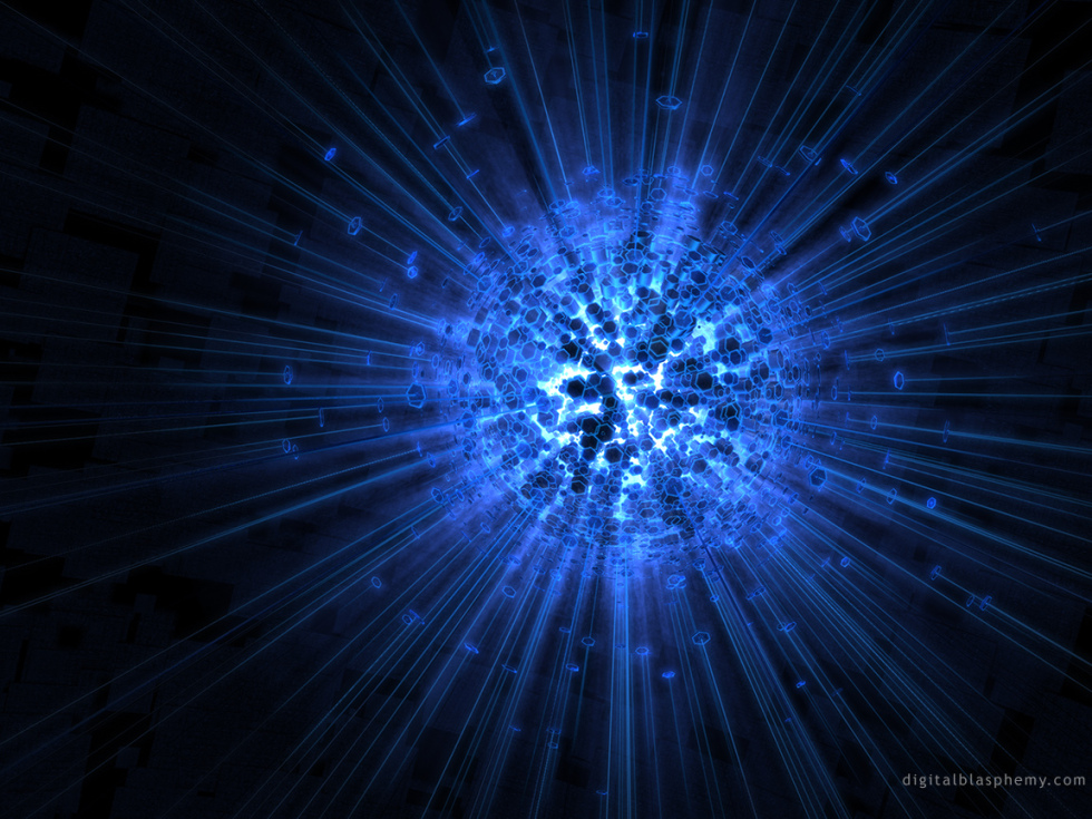
It’s no secret that I have always loved creating deep blue abstracts. The hue combines with the monitor’s backlight to produce an otherworldly, futuristic effect that simply cannot be duplicated with pigment and paper.
The geometry here was created in 2006 using a very early procedural modeler called “Xfrog” and then the mesh was textured and rendered using Lightwave 3D. Containment has long been a favorite in my abstract gallery.
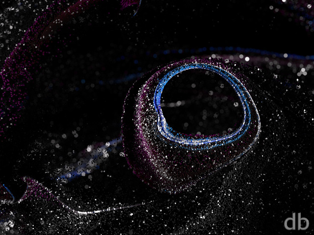
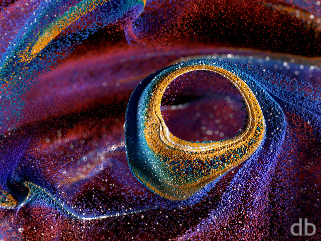
 Containment: containmentred
 Containment: containmentgreen
Micah Beasley [lifer]
I have had a blue themed desktop for forever, and this wallpaper has lived on it for a very long time… I am currently working toward an upgrade and can’t help but think this would be great looking in purple (Dark/ dark electric?)
Keep up the great work! Much love! Micah
Michael T
http://www.nastol.com.ua/download/929/1366×768/
Thought you might not have known
Aviance
This is my second favorite wallpaper of all time next to Flourescence[6]
Joe Welch
For some odd reason, I was only able to download one pic to my droid, now everything I try just comes up with unsuccessful download. Any ideas for a lifetime member?
Balthazar
I don’t know how much work it would take, or if it would even be possible, but I fond myself thinking that this would make a really cool animated wallpaper, if it was rotating or pulsing or something.
Kempeth
This is one of my all time favorites.
I wish there was a poster version…
Keith
Love the concept and the blue. It has similarities to Protus. This is one of my favorites.
Frankenroc
Since you have blue, red, and green renders of this, how about one where you have blue, red, and green parts of this image (well dispersed of course) combining together in the center to form the white light (which is present in all three). I know I could change the colors myself if I put my mind to it, but if you get the urge to update another past image, I’m sure a lot of us would love to see your take on this idea.
Barblane
Beautiful, like a hologram, 3D light and all. You’re a master!
Adam Werner
Once again, you have created a masterpiece.
On another note. I would kinda like to see more space images. And I think the user gallery could get an update. I’m sure there are people who have submitted their work.
I would also like to see a family pic of you. I have seen pics of your children and they a are adorable, but more of what makes up your life would be great.
Jules Kain
I Love This One Because Its Blue I Don’t Know Why People Say Blue Is A Sad Color Its A Happy Color To Me
Anyways I Love It Keep The Blue Coming 🙂
Dragonmaw
…are my absolute favorites of your renders, and have been for years. You are right — the contrast is perfect.
Images like this are more breathtaking to me than a traditional landscape. PLEASE, please continue with them as well!
Zach
Excellent image. I love how the appearance of the hexagons makes it look completely unreal.
As for the colors, blue, green, and red are all very well, but I would love to see some others once in a while. I think yellow would work exceptionally well for this one.
Baldeagle
Can you add picklejar versions of the dual screens? I would love to have one in Red that spans my desktop.
Thank You,
Baldeagle.
Greg
I like this abstract quite a bit, but the dual monitor version seems very weak.
general125
I love your abstracts, and this is one of your best to date.
TobyTDK
This is an interesting image and I can really agree with you about prefering blues. A different thought was since you’ve done a red and green pickle jar image have you done a version of it outside of the std RGB set (ie maybe a deep violet). Just a thought
Frank
it reminds me of another abstract type a while back with the sea life and the green version of containment is amazing. Kind of reminds me of the Omega Molecule from Star Trek: Voyager /end geek
Johan
I would really just say that i have allways loved space scenery/abstracts, and i really really like this piece right here.
When i look close there so many nice details, this is awsome Ryan. Thanks alot.
As to the thing you said on the frontpage, regarding your need to be forming with free hands once in a while. Well im one of those who enjoy it alot.
–> 10!!
Jon
Hey man,
Don’t sweat that your abstracts aren’t as popular. I won’t lie, I don’t necessarily like all of them, but some of them I truely appreciate. That being said yes, my wife asked the other day when “a fall one” would turn up.
anyway, i think this latest one is pretty cool. Keep em coming, man.
-J
Alucard
Listen up yo, this abstract is totally tight. In fact, I am loving every square inch of it! Here is the deal, if you have a picture editing program (God forbid paint shop) feel free to tweak the colors to your liking. Using my own amateur program, I was able to achieve a staggering ultra violet hue that was breathtaking! It reminded me of the Bane Elemental from a certain PC game (hint hint Blizzard). Personally I like it when the core appears to be almost nuclear in nature. Like a star that is about to super nova! You’re definitely a baller Ryan, I look forward to your upcoming releases. Stay platinum son!
Rick Mozil
My comment applies to all your artwork. A common variable you seemingly thread through your work is creativity and imagination. As well, by combining creativity, imagination, color and dimension to create an image, the end result encourages me to let go of reality for a moment, and be wisked away to another plain of existence. This cognitive adventure is what appeals to me. Your scapes draw me in, and as if travelling through a worm hole from one dimension to another, wisking me from a physical reality, example, my office, be it be for only a minute to another plain of existence beyond my office whether it be in fluid or parellel realities, or micro plains of imaginary existence. In other words, the product opens the door to another plain of existence, another iimaginary dimension beyond the reality of the physical plain I live and work in. This for me while in a moment of reflection, helps to relax my mind especially during a heavy day in academia. I often change my backgrounds on my campus office and home study computers so I can experience all there is to experience in the different plains of imaginative existence you present in your work. Interestingly, your work often catches my students and colleagues attention when they see a background. This often leads them to inquire about the the nature of the background, why do I have it up, what is it’s purpose and the list goes on. I simply re-direct them to your site, and tell them they can decide for themself after they review your work.
Chris
I love this image but judging from what I’ve read,(and my personal opinion) I think you need to redo this one several times in a full spectrum of colors and I think others would agree.
Zapalandrox
I love this image there is so much happening in it, i think if you could, a white color for this with the same dark background would be very cool
Ethan
While this is easily one of my favorite abstracts, I think the use of blue has hurt the overall emotion of the piece. I think a brighter color would give us a better sense here. This thing (in my mind) is actually losing containment, and bright color would really give that impression. Maybe white, but perhaps a light yellow or gold seeping through the center would make a huge difference.
Jay5gen
You put so much effort into creating these wonderful peices of art. Why do the dual screen users just get some offcenter leftovers. With such a creative mind, I wish you would apply your self to framing an eyecatching scene in dual screen, these one screen attempts just are not pleasing to the eye… in fact, they are blasphemy.
Marvin S.
Very nice creation. I normally prefer the more “landscape”-style wallpapers above the abstract ones, but I like this one very much. Beautiful lightning effect, starting as an “explosion” in the center and becoming darker in the direction of the border. I also like the blue “needles” surrounded by the little hexagons.
Elijah
I like when you use darker colours… Many lightly coloured desktop images are availible, so the variety of dark images on your site is well-appreciated.
Kairyu
I really like the hexagons radiating out like that! And its not as bad on the eyes as I thought, it looks great on my laptop.
The only whine I could think of the lack of pickle jar versions of it =p. Maybe one with a red or green hue.
deus mechs
i really like this one so keep up the good work.
Jo
I love both this and the color variations you just posted. Any chance of a purple one though? 🙂
Keep up the excellent work!
Zach
I actually really like blue for backgrounds. One of my favorite colors, and I think you make very good use of it. Keep it up!
OS2Mac
Ryan,
It would also be very nice to have a nice Radiation hazard yellow version…. That’s what this reminds me of…a graphic I saw once of the first moments of a nuclear explosion.
Good Work.
Scott
Blue is my favourite colour too. Also, with this wallpaper I notice that if I let my eyes go slightly out of focus, it looks like the fragments are sliding up and down the vectors. Neat. Or maybe I’m just insane.
Elliott Cable
I do see what the first or second commenter mentioned; it certainly does seem to move around if you unfocus your eyes…
I do have to say this, although an awesome idea and one that excited me greatly when I noticed it; on my 30″ the render looks rather badly done compared to most of your work; the edges of the hexagons look very bad. I love the image, hate the rendition. Not sure what went wrong while you were rendering this particular one ^^/
http://i3.photobucket.com/albums/y85/SilverSide1895/Picture1-1.png
—————-
Elliott Cable
http://e.avxw.com/
[[email protected]]
Eric
I am very glad for your continued Abstracts. This image is one my all-time favorites. Every time I look at this beautiful image, I see it in a new way. Are the hexagons exploding outward? Are they swarming inward? So many great possibilties for interpretation! And, of course, the dazzling detail on the higher resolutions.
The only issue I have with this image (actually, wth many of your abstracts) is that often in the dual-screen versions half of the image is practically empty.
Other than that, I love this one!
Simon P
I normally don’t like abstracts and only use the scenary images for my wallpapers. I really like this one though, so it was a nice surprise for me. Keep up the good work.
Dave
The abstracts are terrific!
I would say they were an acquired taste because it took awhile before I started displaying them regularly. However, I get many more “WOW!”s and “COOL!”s from coworkers and my wife when I’ve got abstracts up than any other type.
U. B.
Each abstract seems to change and grow and get better, however they are all still unique. For some reason I get this immense feeling of de ja vu when I look at this piece, am I the only one who thinks this looks really familiar?
It could have something to do with the mathmatical undertones, man there is some really vivid imagery in this one! Great job!
[email protected]
thejester
i agree with other members commenting on this blue phase… phase blue out and use other colors. ty 🙂
Jeff
Agreeing with some other people here, I also like the abstracts, especially this one. Keep them coming, even if they’re not always as popular as the sceneries! 🙂
Bolly
Abstract wallpapers are my favourite.
There are better ones.
I’ll give this 8/10.
Mark Smith
I know she likes the nature scenes and I do too, but I really love the abstract. Especially this one. It just looks really cool. Not to mention it is all blue.
Jimmy
it looks like its shifted to the right….
Matt
i love anything blue. i must be addicted to the color or something. i like the abstracts better than the real life stuff anyway.
Matt
duh its shifted to the right a little bit so u can have your desktop icons on the left hand side like i do! 🙂
Ben Young
Would this one be possible in a silver scheme. A lot of the wallpapers tend to lean towards the blue and I have the silver appearence on my Windows XP. I was just wondering if that would be possible.
Amy
I like abstract–so don’t worry. My fave though, are night scenes and planets. I really like this pic cause I think it looks like an exploding planet. It’s a blue and awesome. Keep up the good work!
Cemil K
Got to love your abstracts Ryan. They are getting more complex with each one. Infinite complexity in simple images…
Thank you
eugien
so far as abstracts go I like this one better than all the rest. the color is perfect IMHO and then add to it the geometry involved in the rendered hexes in the middle and radiating out.
I would prefer that it fit my dual screen setup a little better, and it had an alternate purple or bright red version. but hey 🙂 I m just one guy .. keep up the great work I have been a fan of yours for years now.
— eug
Michelle
I love the color blue, and my work computer has a blue theme, so I can’t say I really mind the blue too much. However, a little more variety with the colors would be appreciated by many I’m sure. Some of your older pictures have pickle jar options with different colors (the cobalt daisy and mushroom come to mine). I’d love to see more of that.
This is one of my favorite abstracts of yours. It’s very well done and one of these pictures that I look at for a long time and not easily get bored with it.
Morgan
As “Pamela” already stated, there are lot of dark images nowadays. Personally I prefer images that aren’t that dark and lights up my desktop.
Francesco
As some other said, I would really prefer it, so see some more brighters scenerys. I mean, when I sit in front of my PC at night, I just enjoy, the day scenery images more.
Lecarde
Every picture you’ve done for the last month has been blue. Do other colors too please.
Tril
Well, you can count me in with the anti-abstracts, pro-landscape contingent 🙂 There are some pictures you’ve filed under “Abstracts” that I like very much (Cobalt Daisy, Flora), but they generally bear a resemblance to something of real life. The pure abstracts like this one don’t do much for me, although I do feel that Containment is the best of the 2006 Abstracts so far (except for Flora).
Kevin D
This one is beautiful! It’s like Something Blue but even more intricate and impressive. Keep making abstracts, some of us like them just as much as the landscapes!
Masada
Some of your best works are abstracts. Computer generated pictures can look sort of “canned” when the “real life” objects aren’t just right. But this is never an issue in you abstracts. I think they show your real artist.
What I long for in your abstracts is more color. They are often designed to be monochrome where you post several versions. That’s okay, but some my favorite pictures from you have been the images with many colors at once (like Confluence). These have been your best work (IMO).
This piece is good with form, focus and energy. I’d like to see it multi-colored.
john
too much blue lately….
Richard
Abstracts may not be your most popular, but they are continually creative, beautiful and impressively created; and “Containment” is no exception. I say keep them comin’.
Richard
I like the blue streak, too.
JoeB
Hi there,
I very rarely use scenery as a wallpaper unless it’s space related. I have personal photos from Italy and other parts of the world that I will use before I use a CG scenery wallpaper.
But your abstracts and space themes are great!
Thanks for the great work!
David
It looks similar to another one of your wallpapers. Its nice but hopefully the next wallpaper you make wont be blue
Tyson
i think this one is just OK….i can tell u really like blue alot…(i do too)…this is still a cool image dont get me wrong, but not one of my favs..
~Tyson~
Overdrive
Although I prefer your great scenery pictures i’d like to see this nice abstract one in green (and maybe red).
Someone suggested you are depressed because of the recent ‘dark’ pictures and asked for more brighter ones. It’s not of my concern in what mood you are (I hope you’re feeling well), but… I like these ‘darker’ pictures. So stay ‘depressed’ for a while.. . 😉
Zero
I really like your artwork on this one. Despite everyone’s rave about your sceneries, I really enjoy your abstracts most of all.
Pauly
I’m a scenery kind of guy, but I do like some of your abstracts. This one makes me think V’ger from Star Trek: The Motion Picture. Not sure why…
John Ricci
I’ve enjoyed your work for years. I happen to work at a place with cheaper LCD displays….is it possible to make your images brighter somehow so more details come out?
Many Thanks,
John from New Haven CT
Kevin
Hey man just droppin a line to let you know that i’ve enjoyed your work for years. No complaints i read you had a another kid congrats, otherwise take care
Bonnie
As someone who has to have a neutral gray background on her screen at work so as not to interfere with image color correction, it’s always a treat to be able to come home and have something as colorful and dramatic as your designs on my screen. Thank you! I also find they’re great for a little psychological climate control – I put the icy ones up in summer and the warm beaches in winter, and it makes it easier to deal with the (often uncomfortable) temperatures in the room where I work. Abstracts and seasonal images make for a nice change in spring and fall, so I’m open to anything you care to design. :o)
I do have one request, though: With all the posters here asking for brighter, daytime shots as a change from the blue, I’d ask that you not go *too* bright. I really enjoy looking at images like “November Snow” and “Ice,” but they’re SO bright and white that there’s just too much glare to have them in the background all the time. Images like “Snowtop” or “Seeress Dome” seem to strike a better balance, or ones like “Karesansui,” which are bright but balanced with darker areas.
Thanks for listening, and keep up the good work!
Bob
Another blue background… everything is blue these days. Don’t get me wrong–I love your blue backgrounds. However, variety is nice… maybe a few pickle jar non-blue varients?
Scott
I agree, abstracts are great exercise, just like doodles there are no rules, there is no meaning… just wide open abuse of the tools at hand!!! Like your other abstracts I hope you release other color options of this one, this one came out real nice… not sure if its coming together or blowing apart despite the name.
Michiel
I must admit, I prefer the landscapes, but not by much. Containment is a great image! Too bad it doesn’t really lend itself for a dual-screen wallpaper. I came here primarily for the great 3200×1200 wallpapers.
Anyway, keep up the good work!
Jennifer
I know I said this in an email to you before, but I’m one of the weird ones who tend to prefer the abstracts and rank them higher than most of your landscapes.
This one is a perfect example of why… the sense of barely contained energy is amazing.
sweetcorrosion
I also love the abstracts. 🙂
Demented Wizard
I was going to jump on and mention that I like having a variety of wallpapers (abstract, landscapes, wherever your mind takes you) but it looks like quite a few people beat me to the punch. This is yet another awesome wallpaper, keep up the great work.
Brother None
This is why i love the website Ryan. I love to change my backgrounds often… when mixed with Changable skins of Windowblinds my desktop is always an area to be explored. Keep up the awesome work.
Jamie N.
I like the abstracts, but I couldn’t help thinking I’d seen this particular image before.
So I went looking and found Psychlococcus to be pretty much identical, except Containment is just pure blue.
After waiting 3 weeks for a new image, I was very disappointed with this to be honest. Was it worth the wait? No.
Andrew
I absolutely love your abstracts, this one especially. This one is right up there with “Circular Logic” as my favorite abstracts from you. As much as I love your sceneries, I feel a few abstracts thrown in there are important.
Michael James
I personally love the abstract work, this one in particular gives me the sense of an awesome power breaking free and being uncontainable, keep up the good work
macmage
I love the variety of your artwork. Sometimes it seems you do a sting of landscapes or scenery pictures. It is fun to see the abstracts, some are great and some are good but all are fun.
I also love the space picture too 🙂
Brad
I am glad you like blue as much as I do!!!!!
This one is very cool, I find myself staring at it when I get bored at work.
Joseph Dempsey
Ok, I love this image. Its a wonderful abstract but it took me a minute to figure out what it was that was bothering me about it. The image is off-center by about 120 pixels. This is even more exagerated on my widescreen. Anyone else notice this?
Chipp
I think a rerender in a different colour would add variety and give us a choice of what to use. I personally would enjoy a green or something. Although, no complaints, since this is my background right now as it looks awesome.
drow
it pains me to be at odds with your wife, who is otherwise clearly a woman of good character, but i must side with the abstracts. they are uniformly excellent, particularly as of late.
regards re-rendering in a different color; open gimp. load image, alter hue, save image. easy, and pick your colour.
Blaine
What if you made the center of the ball or “core” look gel-like and gooey
Mike
I have to side with a couple of other posters here and say that I absolutely love your abstracts. There are certain wallpapers that I like immediately and Containment was one of them. Your other wallpapers are excellent too, but abstracts have a certain appeal to me. Keep up the great work!
James
Your landscapes and scenery artwork. While I enjoy the abstracts such as this one (“Containment”), I must say that your landscapes — perhaps because they have a “familiar” feel given that they are constrained, in some sense, by reality — are absolutely incredible. While I don’t mind letting my mind wander free every now and again, I marvel at the way your landscapes can portray a particular scene in the environment while also making transcend realism and become something even more beautiful. Bottom line, I like the abstracts, but I love your landscapes. Thanks!
bcollins
This is what happens when a gaming world blows up!
(gamers uses hexagons for maps fairly frequently…)
Jimar
I am a big fan of your abstract images! This one is very powerful and awe-inspiring. If you decide to continue with your abstracts, I for one will be very happy!
Juan
Ryan,
This image reminds me of a mix between Protist, Orthohedron, and Divisor, all rolled into one. Blue is my favorite color, so this image really strikes a chord with me. This is an amazing image, 10 out of 10. The lighting effects and the small hexagons all pieced together is awesome. Great work!
Holobits
I like the abstract, but I am more for the space and sceneries with figures in them. Out of your abstrcts though I think this is one of your better ones. It offers simplicity in color with complexity in dynamics and action
Shaz
I probably like your Planetscapes and Abstracts the most, though I have favorites among all the other categories, too. I really like this one (and it’s my wallpaper now), but I’d probably like it more in another colour (but my favorites are ones you don’t use often for abstracts). Definitely though, keep doing the abstracts!
Daniel H.
I like them, and they do spend a lot of time as my backgrounds. I find them to be wonderful sources of inspiration as I write, as if somehow seeing the abstract jogs my mind out of its usual cycles and send it looking for something new.
Pamela
When I look over your work on the members page, you have been doing dark colors and evening/night images since July! And the volcano was day and night versions. I’m beginning to be concerned that you are feeling a little down, with all the deep, gloomy images. Sharks, spiney blue sea urchins like “containment”, red planet, smoking volcano,etc.
Hope your mood starts to lift, with more upbeat, natural, exuberant imagery! Looking forward to that…
Joneric
I love your abstracts! I’m glad to hear your going to continue doing them! =]
In my opinion, it’s always great to see the product of creativity from an artist’s mind!
Keep it up. Awesome wallpaper!
Erick
I read your blog posting that your abstract images are not the most popular on the site here. Myself, I think they are absolutely amazing. Your planetscapes and other abstracts are among my favorite work that you do. This one in particular is excellent. Keep the awesome stuff coming!
Duncan
Usually i don’t have abstracts as backgrounds because i love landscapes and space wallpapers (which probably applies to what you said earlier) but this caught my eye and it looks amazing on my desktop. Fantastic job!
The Computer Guy
Keep the abstracts coming, they are definately tops in my books. This one will stay on my desktop for a while to come.
A. Pacheco
I personally like the abstracts more than the landscapes, don’t get me wrong, i love the landscapes, but the the abstracts are much cooler. keep up the good work!
VisualdreamZ
Of course, I pretty much love ALL your stuff, but I don’t think abstracts are even close to a waste of time (sorry Jess). All these images have a place in the gallery, and all of them are inspiring to someone. They certainly were to me.
Thanks to your advise to me years ago, Ryan, I’m now getting all kinds of wonderful feedback on my own work. I deeply appreciate the work you do, and the time you took to answer my email as I tried to decide where best to start learning 3D.
Love the comments section, too. It’s something I’ve thought much about adding to my own site when next I update.
Warm Regards,
Karen
http://www.visualdreamz.us
Nithilher
I like your abstracts. Sure, the landscapes are great, but as you write, they have to follow certain rules to look real. But for me, as a science fiction fan, many of your abstracts also have this quality to somehow feel real, or feel as if they could show real things in a very different world or part of the universe.
I like most such wallpapers which somehow manage to show something clearly not from this world, and yet let it appear as something real, or which could be real. What I mean is that they look glimpses from alien but not artificial worlds. Very often, your abstract have that effect for me.
Eugenio Barreto
i can honestly say that i love it, but the background .. it too overwhelming.. the attention on the ball is too small
if the ball was bigger i think it would look better
other than that.. i think it looks great.
Wayno
Please keep these comming I love your modern art…!
John
Everything is so dark and blue lately.. its getting really depressing, even though you do amazing work.
Ambrose Coddington
I personally love the abstracts. I like the freedom that is shown in the images.
Keep them coming.
bohb
I really like the abstract images on here, and this one is no exception. However, as was said before theres a lot of dark and/or blue pictures recently, perhaps this image would look good in a green? maybe a yellow? Something…brighter. Otherwise, great imagae.
Grant
Glad to see a new image, although can’t say its one of my favorites. My only complaint is that its very similar to many you’ve done in the past. I do, however, like the colors.
Kyle G. Horst
WOW! This is a awesome abstract. I wish It rotated or something, that would be a cool background.
Jeremy
I really do like abstracts and was hoping he’d add one sooner or later, I was getting kind of tired of the landscapes. I do agree with the others, there are a lot of blue scenery lately. I like blue, but there are different colors out there ;-). As a graphic designer myself, sometimes it takes some critism to get better, as long as it is constructive!
Good job!
Jeremy
Billy
art in silence mode.
Bryan
I /love/ the abstracts!! =D Keep up the great work!!
Omega
This is the level of cool that EVERY artist should strive for when they make something with visibly radiant energy.
I personally love the blue tint, as blue is my favorite color; however a green-tinted version would not go unappreciated.
Simply exquisite.
Regards,
Omega
Dave
Landscapes are great, but keep the abstracts coming! Great piece!
Psyclone
What a perfect time to add a comment system… I was just about to email you.
I’m going to have to disagree with Jessie on this one. While your landscapes are a nice demonstration of your talent, I’ve often wondered why graphic designers bother with landscape images. Granted, you can create some spectacular effects otherwise impossible using 3D modeling (Tropical Moon of Thetis being one of your more notable examples), but when you’re creating pictures of trees and grass using 3D modeling that could be just as spectacular in, say, a 2D photoshop painting, it just strikes me as… a little off.
Abstracts, on the other hand, give your mind freedom, as you said, and I really think they lend themselves better to 3D art. I love your abstracts and I think some of your best work has been abstract art. (Flourescence put you on the map.)
The only other thing I would say is that I kind-of agree with the community on this one… More colours. 😉 You’ve mentioned before why you prefer glowing blue things on computer monitors, but you do *so much* blue that I’m beginning to wonder if you’re a modern-day Picasso or something. It’s time for a Rose Period, Ryan. 🙂
Matt
You’re abstracts are amazing and what drew me to your site in the first place.
The only thing I would say about your scenes is that they are visually stunning because they are so realistic. I’ve had people who’ve seen my desktop ask where that jungle/forest/island is.
Sonny
I display your latest abstract on my desktops as soon as you create it. I don’t like the scenery images much at all. You do a great job with them, but they aren’t my thing. The entire reason for my continued subscription is the abstracts. Please don’t stop creating them.
Jamus
This makes a good addition to your other Abstracts.
I lean more towards the abstract/space scenes myself. The Starbirth and Singularity scenes are my all time favorites.
Containment is definitely going up on the widescreen for work tomorrow!
Rob
Keep the abstracts coming! Dont think for a second that your wasting your time on them; I believe their what drew most of your members to the site, including myself, in the first place.
Dave
Ok, I like your landscapes; I like your abstracts. If it’s a cool image, I dig it. This is definetely one of your baddest abstracts in a while.
Greg
I actually prefer your abstract images to your scenery ones, and this one is great!
Keller
I think that they are both really cool, but I would like to see maybe something of a hybrid of the two. maybe a some sort of fantasy world with abstract ideas and themes, but in the relm of a recgonizable landscape.
this is a veery good work. =)
-Keller
Marcus Ada
should make a dual or tri screen with the three of these, like the mushrooms