Description
Created this piece during a very tough time in my life. My son
Jason fell mysteriously ill in early 2010 and eventually had to
spend 4 days in the Children’s Hospital. Oncologists were
involved so it was pretty scare for all of us. Fortunately it
turned out to be a particularly nasty viral/bacterial infection
and he was fine.
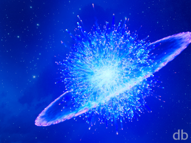
I fashioned this one out of the Muspelheim sun during a 48 hour stretch while
Jessie stayed at the hospital and I stayed with Ian. It was a
great stress release I must admit.
I’m very excited about the cool space effects possible from
melding Apophysis fractals with 3D geometry.


 Corona: corona1
 Corona: corona3

Mario Carini [basicmember]
Gorgeous! This sun is about to go nova. That spells doom for all life forms on the planet.
Matt
This was in 2010? I remember this release like it was yesterday :S
Hugo
Ryan, this image is great, but the pickle jar is better (binary), and many of your viewers have rated it more than this version. If it were to be the actual image, it would be bumped up to No.2 on the top rated list. Please make the binary corona the main one.
Thanks!
Jacob
I absolutely love this one, though there’s something not quite right about the coronal loops. The ones in the rendering are parabolic – the ends point away from each other where they go back into the star. Real coronal loops are ellipsoidal (since they follow magnetic field lines) and the ends point towards each other where the reenter the star. All sorts of (real) pictures on Google images for “Coronal loop” ~JSD
Mike
Speechless magnificence, 11/10.
genj
Ryan, I can’t get the download to start while using my bberry browser. Know if there is a setting I need to change? The drop down selection works without issue.
S. Scavere
This is one of your best, but i have to say that making the star take up a larger portion of the screen for the dual screen takes away from the depth that the single screen has.
Eddie
I have to say I definitely find the Binary Version much more unique. Especially since lately I have been playing Mass Effect 2 and this wallpaper coming out amidst the launch of the game definitely bumped to the top spot on my desktop. Is it possible to get the Binary version in the mobile formats also at some point?
Jenanne
I like both versions very much, but I prefer the binary. It’s visually provocative and I don’t think you’ve created anything quite like it. I’m glad you gave it a try, and I’m doubly glad (binarily glad?) that it’s still available in the Picklejar. Thank you, Ryan, for all your terrific work!
John R
I think the binary is a good idea, but the smaller star seems too bright. What do you think? Maybe a different color, or have them interacting with each other?
John N.
This is more like it! A more faded aurora surrounding the sun and the rocks in the foreground are more detailed! (It’s almost like someone is listening to me! LOL! Just kidding Ryan!) Great job! I think you are now beginning to to master your new rendering software. Kudos!
Nelson
Though I liked this small blue star in the multi screen versions, I don’t like it in the Binary version. For me, the two stars are too close, and their different colour hues don’t fit together. A bit more distance would have been nicer imo.
Ryan
The multi-screen version is already “binary”. Let me know if you have any other questions!
cjsdelray
The pickeljar version is amazing with the second star… any chance to get multi-screen version of the pickejar??????
Good work
Alicia
This one is fierce on dual monitors… I like having something on each side.
Tom
I have to say that I like the two stars… at first when I was reading everyone’s comments I thought it was two big stars. I think the one large star with the one little blue star works well! I have it as my wallpaper now!
asterismW
I’d say, single star for single screens, and binary for duals. It just looks better that way. The binary system on one screen just feels too crowded for some reason.
Greg in CA
But I like it much better now. Why should the dual monitor people have all the fun? 😉
Natalie
I love the binary version. Whichever you decide to keep in the gallery, the two star version is already on my desktop!
Reuben
I like the two star version but I would like to have that on my iPhone as I’ve got dual screen and can have the two stars anyway, I just love the way the blue one looks
celmendo
No, the stars on one screen don’t work the way you have it.
MG
I like the binary star in the dual/triple screens but on the single screen they seem too close together… Now if one was feeding off of the other it would make a little more interest and might make the scene work as a binary star scene… But the two just sitting there doesn’t fit IMO…
Great Image as always though
Mark
Ryan, I like the 2 stars for the dual-screen version, but multiple stars on the single screen version seems like too many.
Ray
Maybe make the blue star bigger and move it to the left. Would also like to see the blue star on its own.
DT
Interesting concept design. The difference in sizes between both stars was distracting. Perhaps if they were closer in size? Defitenily will look forward to the next version!
Stijn
Much prefer the single star, 2nd version up in the gallery for the single screen; then again it’s nitpicking anyway as they’re both still very good 🙂 I’d leave it up to your own preference Ryan, nothing wrong with that!
Andrew
The smaller star was at more of a distance from the larger one. Say for instance, moving it more towards the lower left corner. Just my opinion here.
travis
I like the idea, too. but the star alone is just so amazing, the blue one kinda takes away from it. Plus, just the way the “clouds” are around the star just wouldn’t logically interact in a binary fashion. No disk, no swirl, ya know?
However, still a great idea! LOVE the dual! LOVE the original! Bravo and keep up the great work.
dnbFiend
Absolutely gorgeous.
Michelle
I like the idea of working in the second star on the single screen, but the way it’s currently done in the pickle jar just looks like it’s too copy and pasted there. I know you didn’t just copy and paste it, Ryan, but for some reason it just doesn’t feel like a natural part of the picture to me. I LOVE the current version though and will happily continue to use it. I think it’s fine if the second star remains a bonus for those who use the multiple screens.
Chris B
But I agree they are too close together. The Big one is the star (haha so punny I know) of the wallpaper & the blue one should be further away, maybe down and to the left outside of the corona. It would make the smaller one stand out better.
Also the little blue one sucking in the corona from the bigger one would be amazing & the honor of being it’s own separate wallpaper! Binary ’10 🙂
Mark
I like the second star, I really do. But I think it looks a bit odd over the top of the main star. I’ll be keeping the single start for a while yet.
Jonathan
While I do agree with the others that you should update the 2003 binary, i personally think that both corona single versions are well perceived by the eye in their own way.
Walo
I think that a binary system should be in a new wallpaper.
Sanalith
While I definitely enjoy the original, I prefer this version! I was jealous that the single screen version didn’t have the second star, so this is a real treat! Thank you! 😀
Micha
+1 on moving the blue star away from the orange one, so they don’t obstruct each other.
Also, I would think about making the blue one a bit larger and the other one a bit smaller. They don’t need to be equal size, but a bit more “balanced”.
And I still would totally love a version with only the blue star, as I like how it looks like there are “sparks” coming out of it. But I don’t wand to be too demanding 🙂
Jon H
Both are quite beautiful, and indeed the contrast of that blue star is very striking. However, I feel that it is a bit of a distraction from the glory of the large star’s corona. Ultimately, I will be happy with either as the are both sweet.
Will
I love the binary star image. But I agree with some of the others, the pickle jar version does seem a little too close.
May I suggest leaving Corona as it is, and directing your effort on a updated version of 2003’s Binary. Something with a little more interaction between the stars…
Keep up the excellent work!
Mike
The binary is too busy. I agree with Ryan, the original is the stronger of the two.
Chris W
I definitely prefer the binary version, and count me as:
+1 on that the blue star should be further away
+1 on that it should be an extremely high density one that is pulling some matter away from the first.
I think these two changes would make this a very cool render indeed!
Viper
Thanks for the 480×800 Version of the original.. Now Im Craving the binary version 😛
In terms of PC versions, try putting the blue star a bit further away. There is a nice amount of space on the bottom left.
Matt’s idea of exchange of matter should work really well.
Maybe the blue star can be a really high density one, where it is lifting off the matter from the red giant. Some kind of red matter ring around the blue star could work…
Tom
…BUT, I was made very jealous of people running a dual screen setup. My school is throwing away a couple of old CRT monitors, and I was sorely tempted to go rescue one from the trash! (I just wish they weren’t so darn big and heavy!)
Thomas
The binary version just doesn’t seems as “real” as the original. It seems like the blue star has been thrown into the image (sorry to say).
Matt
…if they’re that close together, i’d rather see their coronas “eating” each other…gravity effects and all.
D
I really like this concept but I don’t like that the blue star is front of the Corona star. I think it would look much better if you move the blue star to the far left and maybe move the Corona star a bit to the right so they both occupy their own space.
Steve
Too cluttered with the new star in there. My 2 cents. This is one awesome image by the way.
Ryan
Thanks for the feedback. I prefer the original myself, which is why I put the “binary” version in the Pickle Jar.
Jay
I have this wallpaper on both my triple screen at work and my home laptop. While i must say on the triple the blue star looks great, I believe that putting the smaller star right in front of the larger one takes away from the original magnificence of the picture.
Micha
Yes, I’m using 1920×1200, so 120px more. That can make some difference…
Having both stars on one wallpaper/one screen also looks great.
Maybe Ryan makes some more modified versions of this 🙂
Jonathan L
I love both versions of this background, though I prefer the binary arrangement. I’m very excited to see how much effort you’ve put into Corona — it has turned out to be such a fascinating project to see develop.
However, Will brought up the suggestion of updating 2003’s Binary. I would love to see an update to that amazing background! Please update it. 🙂
(If you’re in the mood to work on a binary arrangement.)
Brandi U.
as others have said, it’s too close in the single-screen version.
If the blue star was further away, maybe barely on the screen, I might prefer it to the single star version.
I do love the way you’ve played with Corona, though. I like having the different versions.
John Munro
I think the blue star looks out of place
Chris B
You must be running a higher Res than I do, 1080p. It is smaller, but still looks alright.
White Dwarf/Blue Star:
http://s83.photobucket.com/albums/j308/iamchrisbrown/DB%20Screen%20Shots/?action=view¤t=Blue1.jpg&newest=1
And 2 Attempts to get my monitor to look as cool as the Dual & Tri screens.
http://i83.photobucket.com/albums/j308/iamchrisbrown/DB%20Screen%20Shots/Both2.jpg?t=1264723797
http://i83.photobucket.com/albums/j308/iamchrisbrown/DB%20Screen%20Shots/Both1.jpg?t=1264724301
Micha
Thank you, I already tried that.
But the blue star then is still too small for my liking and there is too much debris around 🙁
Ryan
I’ve posted a 480 x 800 version. Thanks for the heads up!
Hunter
Best.
Dual screen.
Ever.
A work mate just came up behind me and said “Woah dude, is that from that *ing hubble telescope, man? Or what?!” – always a good sign.
Ray
Would love to see the blue star from the tri screen on its own.
Viper
Can you pleaseeeeee do a 480 x 800 version of this… Wants to use it with my Sony Satio…
Thankssssss
Viper
WOW, I want a triple screen setup just so i can use this wallpaper forever!
Chris B
I’ve actually done that already. Just save the largest Tri-Screen in Photoshop, create a new image with the resolution of your monitor & drag the large corona image into the new image. move it around until you like it, re-size it if you want to, & save as coronablue or whatever. I also cropped it so I have the blue star & half of the Corona. Looks cool. 🙂
PS Ryan, any chance on a computer monitor bailout? Come on, everyone else is doing it!
Ryan
Just doing my part to help stimulate the economy 😉
Caleb Hall
Ryan, I think you’ve out done yourself this time! The triple widescreen, while unusable on my single screen, makes me want to go get a loan to get the monitors to use it in all its glory. Well done!
Michael
The dual widescreen version is incredible and, IMO, better than the single screen. I rarely rate things as 9 or 10 (don’t want to dilute the meaning of those), but this gets a 10. Some of your finest work, IMO. Thank you.
celmendo
Those are perfect tens!
celmendo
Those are perfect tens!
asterismW
I liked Corona before, but the dual screen takes the cake!
Micha
Maybe you can make a new wallpaper with just the blue star? For all the single screen people out there 😀
Jon H
That star is GORGEOUS on the triple screen view! Also I love that little blue planet off to the left, with the star’s radiation reflecting off of it’s atmosphere.
Joel
Wow this is very great, the polar caps and forces are a nice touch. I have always liked your space themes the most and this one is no exception.
Chris B
Why do you keep tempting me like this?!
I actually took the 7680 tri screen & photo-shopped the white dwarf? star into it’s own wallpaper. Not quite as cool, but still an interesting wallpaper.
Since you’ve already done most of the work… Binary is one of my favorites!
http://digitalblasphemy.com/2003/p1.shtml
Mark
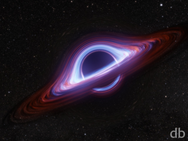
Hey hey, there’s the black hole you mentioned! Looks awesome, wish I had more monitors 🙁
John
In fact, experimenting with any of the dual/tri screens on a single monitor produces some pretty spectacular effects. It’s awesome that every single little part of the piece stands on it’s own.
John
To all you single monitor people like me out there, even though you’re obviously behind the times by several centuries, you can get a taste of the glory by setting the 7680 version to “tile.” It actually makes for a pretty cool wallpaper of it’s own.
Mike
I’m glad to hear your little boy is doing better! I was sorry to learn your family was going through more trying times 🙁
Mike
I’m glad to hear your little boy is doing better! I was sorry to learn your family was going through more trying times 🙁
Simon
This is without doubt my favorite wallpaper of all times!! 😀
Chris B
And show off some closer up, updated scorched pitted rocks rather than just the silhouettes far in the background. Like having the little man next to part of an arched pillar.
Miguell026
nice… i like it!
=)
D
That will be an excellent improvement. I suggest removing the cave framing as well so as not to obstruct the new star.
Ryan
This actually is the star from “Muspelheim”, with some added work. I intend to add it back into that scene shortly.
Walo
Man I, wish this was the star of the muspelheim wallpaper, This one looks way more badass.
Michelle
I’ve been an astronomy buff most of my life, and have often daydreamed about what it would be like to actually be able to visit other stars and planets. This is so detailed and realistic, that it puts me right there. Thank you. 8)
Littlemom
The first render of Corna was amazing and this is just as amazing, the fractal ribbons in the sun give a 3d affect and are pretty cool. Awesome job as always Ryan.
Micha
ist one of the best wallpapers you ever made.
Kirtai
Looks great at 1920×1080. Very multidimensional, I feel like i can see a different angle if I just tilt my head 🙂
Loren
This is one of my new favs! Good job!
Chris B
Nice quick Submissions! I do like the Star 2.0, looks more fluid & on fire than the original. Very cool! Dethroned Poseidon’s Playground… at least for a little while. Going SCUBA diving in Bonaire in early March & it’s perfect for that.
I wouldn’t give up on Muspelheim, It has the potential to be as good as Niflheim after you step back from it for a while… and now you have an upgraded star to put in the background 😉
Alex
Man, this is awesome! Love it! The colors are fantastic and it looks amazing! I’m a believer again!
Gandalf
I love Ryans Planetary work. This is one of the best. A total 10.
Tyler
Dear Ryan,
This is it! I knew you were discontented with Muspelheim… admit it. As a musician I can understand when your “baby” doesn’t quite turn out. I’m glad you didn’t give up and move along. As others have stated, this is far superior to your previous work. Albeit Muspel still had mad potential, it cannot compete with this concept which centers the viewer to the majesty of the star. Definitely top notch stuff here. The colors combos are simply ridiculuous, in the best of ways.
Jenanne
As you can see, I’m speechless. I love this image — it’s one of the few 10s I’ve given — and I think I’d still love it even if your space images weren’t my favorites. This goes straight to my desktop. Wonderful job, Ryan!
As for the “it’s not realistic enough” comments, realistic representation is important to a point, but if realism was all we cared about, we’d cancel our DB memberships and just download the NatGeo Picture of the Day and the Astronomy POD. Your artistic interpretation is what makes your work so compelling. Keep up the great work!
John
Like it a lot, the center of the sun is much better looking then before.
Michael
…for the dual widescreen. This is great! Thanks for the bevy of great images of late!
Ryan
Like I told a poster on my Facebook page: I know just enough astronomy to be dangerous 😉
Jon H
Some people have said that this doesn’t exactly look realistic, but that is only partly true. This photo on wikipedia looks a lot more like your artwork than I would have expected. http://en.wikipedia.org/wiki/File:Traceimage.jpg
Original Article: http://en.wikipedia.org/wiki/Corona
Jon H
I loved the first version and gave it a 10, but with the new star texture it is even better. I would give this version an 11 if I could 🙂
Max
I love how Ian’s comment is almost a copy and paste of my original lol. Anyway, the updated image adds a lot of depth to the star. Thanks so much for the speedy fix!
P.S. I’m building a new rig with a dual monitor set-up and can’t wait to add the finishing touch to it by slapping on one of your amazing dual screen wallpapers!
Greg in CA
Perhaps even awesome-er…
drow
double awesome
Randall
Once again, an incredible work! Thanks, Ryan, and I’m glad to know your son is doing better.
Littlemom
I love the fractal look and the rocks that seem to float in space. Beautiful wallpaper. Thanks Ryan keep up the good work.
celmendo
Love this very much! Glad the kid is doing better.
Lidia
I had not seen the last posts from 1/20 and 1/21. My RSS reader did not pick them up for some reason. I’m very glad to hear Jason’s ok, though. I hope he is fully recovered soon.
Nelson
That’s a very cool render! It combines realistic space elements with abstracts, and I think I like this type of pictures most.
Phil
Really looking forward to the dual screen…
Joe
Really cool, definitely my new background! 🙂
The Guru
Very nearly perfect. You’ll probably tweak it a little here and there. Some others voiced some nitpicks about the star’s resolution, and I would agree. It seems a litle grainy while the Corona seems a lot more organic. I also thought the large pieces of debris were a little grainy as well. These are only observations and suggestions, I’m sure you realize. It is still fantastic enough to earn a ‘nine’ from me and it sits proudly on my desktop. I’m thrilled to hear your son is doing better. Any word on when we can expect you to start producing artwork made in Terragen?
Andy
Nice addition Ryan. Still looking foward to an epic planetscape. Preferabbly in the green & yellow hues. Anyways. Nice Job!
Thom
It is very pretty, although like another user stated the sun’s surface’s resolution is kinda cruddy.
Also, like I’ve mentioned many times before your new watermarks bother me incredibly and they stick out like a sore thumb. I cannot believe I am the only one who complains about them. 🙁 Maybe it’s just my OCD? If you are definitely NOT ever going to change the watermarks back – you can just tell me to shut it. 🙂
Dave
What a sweet blend of the representative and the abstract. Love it!
RichT
Although I found Muspelheim disappointing I thought the background star image had a lot of promise, and I was hoping you’d do something like this as a result. This is much more to my taste. I look forward to the multi-display version.
Cougar
Nice Work mate. It looks like something organic. Like an artery or something. Even a heart…hmmm
Maryann
I like. It has this otherness, this stringy/spidery quality that I noticed in abstracts of yours from the past, which I personally find very interesting and aesthetically pleasing. Where are those strands going? What are they reaching out to, or why? It reminds me of a web,and I find that something to both think about and simply enjoy the beauty of….
M.
Tim
I would’nt change a thing on this one, perfect.
timmo
Its not often I get the chance to use that word but…it really is. My eyes are so fixed on the “crisp fractal flames” as Ian said below.
If you could sharpen up the stars surface to a glittering pin sharpness then I wont be going to work…i’ll be staring at my monitor all day drinking it in!!!
Well done Ryan, all the best to you and your family
Wraith
I love space wallpapers. 😀
Bradley
Firstly I agree with what Ian said about the low-res looking surface on the sun. Other then that it looks awesome!
As for Jason I wish again for a speedy recovery and endless joy with his Lego (I’m 18 and still love making models)!
Nicola
Wow. I absolutely adore the use of colour here, and the way the outer layers seem so fragile. I’m usually into scenery rather than the space scenes, but this is just something special. Thanks!
Ian
…the texture on the surface of the star looks very flat and low-res. It stands out against crisp fractal flames, but if not for that one issue, it would most definitely be my new desktop.
Mark
Wow, this is truly impressive. I can see this becoming a bit of an icon for DB. I like the way you have combined a space scene with a fractal, very inspiring.
charles
file does not exist for 1152×864
charles
file does not exist for 1152×864
Jon H.
Wow! This one is way better! 10 out of 10!
Greg in CA
I love all the detail in this. Maybe you could do a pickle jar version of Muspelheim with this star?
Max
I love this one. However, I have one thing that bothers me. The texture of the star appears stretched in the center. It also seems a bit low res or flat. I love the plasma you’ve created, it just seems to make the sun’s texture stand out is all. That’s just me being to critical though.
I love this wallpaper and it looks great on my desktop! Good to hear Jason is back home, hope you get some good news soon.
DoubleJ
I like this one much more than Muspelheim 🙂
Nessie
To be honest I loved the little blue man and was using that one as my wallpaper but I DO prefer this one.
So glad that your little man is doing so much better. Enjoy your time with your family x
dejerdejer
I think this s a great re-work. art is never done. this is much improved. I love it!
Matt
Holy Smokes! This one’s gorgeous!
tmnico
I see blue!!! Not bad I like this one. Thanks!
John
I love the stuff surrounding the sun, it just looks flat out cool. The sun itself is however lacking in detail at high resolutions, and I think the large rock in the lower left looks a little out of place.
John
I love the stuff surrounding the sun, it just looks flat out cool. The sun itself is however lacking in detail at high resolutions, and I think the large rock in the lower left looks a little out of place.
Mike
I commented on the last picture that I thought the coronal halo wasn’t quite right, and in my head I was picturing something exactly like this. I really like this one, it looks amazing.
Jonathan L
Terrific idea, I love the star!!!
Thank goodness it’s in a wallpaper of its own.
Great job! 🙂
Ryan
Thanks for the feedback! People ask me all the time what “Digital Blasphemy” means. It boils down to another way of saying “artistic license”, and that is what I employed here. This one is a hybrid space/abstract as such I don’t expect it to have universal appeal. I like it though and that’s all it needs to make it into my gallery…
ray
hey Ryan, thanks for coming out with another one so soon after your family issue. i like this one, but have one reservation in that i’d be hard pressed to believe that a star’s corona actually looks like that. not completely realistic, but then again, its your imagination! i do really like how the rocks/debris seem to be swirling and circulating the star though. good work!
Labanimal
Simply amazing! Makes me think of Avatar! Would love to a world like that illustrated by you!
Looking forward to the triple screen!
Labanimal
Simply amazing! Makes me think of Avatar! Would love to a world like that illustrated by you!
Looking forward to the triple screen!
Chris
Another reason it won’t make it to my desktop is because Poseidon’s Playground is just that beautiful of a wallpaper, I can’t bear to take it off. I think that’s your most amazing work thus far, even overtaking my other favorite, Song of the Sky.
phil
how down load?
Chris
Muspelheim was OK, but I like this one better. Probably still won’t use it on my desktop, as it’s too bright, but I do like it. The fractals on the star look awesome, almost like it’s from a really cool sci-fi video game, like Half-Life.
xyverz
Is this the sun from Muspelheim without a planetary landscape in the foreground? This looks pretty nice.
Dan M
The added detail only makes it better! I really like this one!
The Guru
Yup, the title says it all. The texture update blends in so much better with the corona. It’s gone from really good to amazing. Changing the vote to a ten.
Jonathan L
Can you please remove the Canyon so that we can see more of the sky?
I loved the sky of the first, but overall, minus the cave, the second is much better. I just found the cave took up way too much space for a good desktop background. 🙁
Still, it was a great image don’t get me wrong!
And, on topic, I love this image right here!!! 🙂