= Add to your a la carte shopping cart.
= No watermark version, for Plus members only. NOTE: On this page, this icon is a link by itself.

= Add to your a la carte shopping cart.
= No watermark version, for Plus members only. NOTE: On this page, this icon is a link by itself.
This feature is disabled temporarily. You can still add a la carte items via the "Downloads" tab on any wallpaper, including this page.
Other Versions:
Kelton
Would love to see this one in dual screen mode…
Braden
Any chance we’ll get this in dual-screen formats? I’m specifically looking for Dual WUXGA (1920×1200 x2)…
Mike
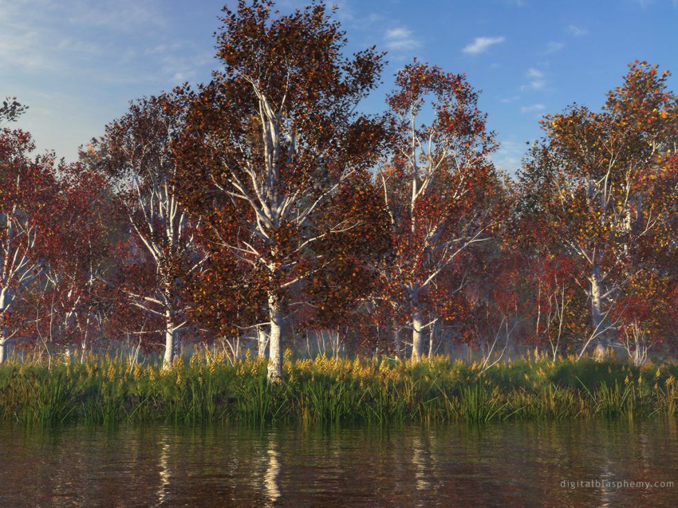
I was just looking at this one again. It is such a beautiful scene but I can’t help wishing there was maybe some little ducks or something floating along in the water.
No matter how beautiful a scene is it always just seems kind of desolate without any sign of life like that.
Nina
I love this new version. It feels just like fall to me.
Overdrive
Although the composition of Crimson Season 2 is better, I prefer the brighter colors of the first version.
I always look for something special in every single picture you make. This one looks technically pretty good, but in my opinion a little too ordinary.
First version: 7. Second version: 6.
Pauly
I’m with Steve! You’ve got to make a dual monitor version of this one! My two 19″ Samsung SyncMasters are begging for it!
Adam Werner
Now normally I’m not a huge critic, but I have to on this one.
I was browsing the sites of the software programs you use to create these images, and came across a program called Xfrog Tune. Now I understand that this program reduces the number of poly’s so that the image can render faster. The method it uses also removes secondary, and tertiary branches.
I understand you didn’t use Xfrog Tune on this image, but the same effects of it are here.
Even though this image is wonderful, at high resolutions, you REALLY notice the leaves floating with no branches 😛
Thanks for a wonderful pic.
Adam Werner
http://www.xfrogdownloads.com/greenwebNew/products/tuneCompare.htm
Steve
This is a fantastic work of art. Any chance it can be expanded for dual monitors? I have 2 beautiful LCD’s at work that are dying for it 🙂
Simon
Overall I like this one. But I just think it could do with a bit more horizontal variety. By this I mean that if you look at almost any point on the picture and then to the left and right of that point, then it all looks very similar. It almost looks like a tall but thin image that has been horizontally tiled.
This is really a minor constructive criticism though to an overall beautiful piece of work 🙂
Sean W
This version looks much more natural! Everything looks softer, like it was taken with a camera out in the woods, and less crisp like CG. Very nice!
Arne Vedø-Hansen
Great image with lovely colours. Any chance of seeing a dual-monitor version? I’d love to have this on my desktop.
Kingdeb8r
Now this is a lot better! The leaves look more realistic and the trees look less plastic.
The reeds at the bottom also have a better look to them!
Well done! Now, churn out some more 😉
Mike Barber
I bet this would look great at dusk with a orange hue from the sun setting
Also looking forward to a dual monitor version
Keep up the good work!
Ben
Is there any way to retain comments from a previous version of an image for reference? The old version was up and down so quickly I never got a chance to see all of what people were saying that provoked the changes.
Ryan
Comments on the previous version can be found here.
Jamie N.
I agree with the other posters… this one looks much more natural and realistic.
I wouldn’t have used the old one as a wallpaper, but I am using this one now 🙂
Good job mate!
Ian
I love the changes you made – the trees are more autumnal, and the entire scene looks so serene. Don’t get me wrong – the other one was great, but I enjoy this one especially much. I look forward to hopefully seeing a Halloween creation of yours, as well! Thanks!
Wayne
Will you have Dual & Triple Screens?
Fernando
I like the image it’s pretty realistic, Im not a big fan of bright screensavers so I would love to see like to see a dusk version (like a previous poster said)Love your work.
Cheers from Mexico.
Francesco
I absolutley agree with Fernando. A dusk version would be great. So If you have the time, please do it Ryan. Thanks!
Francesco
What should I say… the wallpaper looks really good and gives a good impression of the autumn season, although it has not the same great atmosphere as the last autumn wallpaper.
Brian
I really like the adjustments you made. The color variations in the leaves help a lot!
Zach
I think you did a good job on the original myself…but I guess thats what the pickle jar is for 🙂 Very nice
KathumpaG
I love this image.
Sean
I think it looks a lot like a painting for some reason. An autumn scene, but to some extent made fresher or more of an ideal than autumn usually is. Of course some of it may be where I live.
Timo Virkkala
Wow.
Sometimes I think you’re Finnish. This is straight out of Finland’s autumn. The original version looked unreal – the red was too bright – but this one hits the spot.
Dan Hudson
Another great wallpaper, made twice as better by a few tweaks. The trees needed more colour to the leaves definetly, and the trees themselves look nicer a bit brighter!
Keep churning them out Ryan!