Description
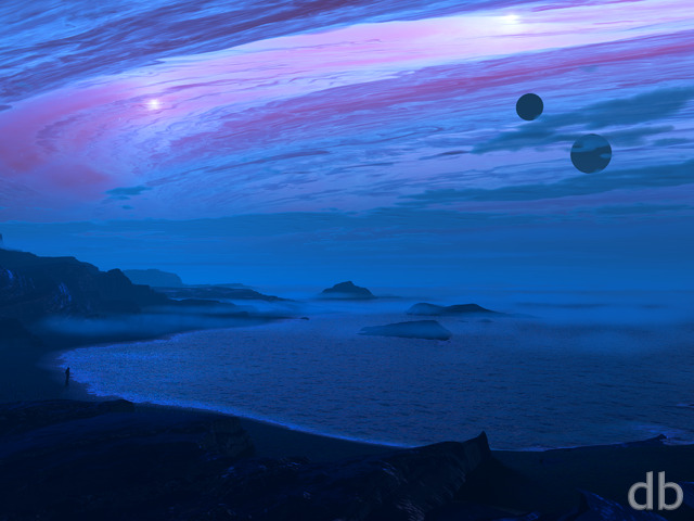
After all that tinkering with Vue’s planetary rendering mode, I thought I should bring it all together was a nice planetscape.
The planets are a combination of two different Vue renders (it only lets you render one planet at a time) and the foreground was also rendered using Vue 2014.
You might detect the influence of my recent trip to Washington state.
Here’s the original from 1998 if you are curious as to how they match up! I hope you like the update!!


Rick (Horseman) [basicmember]
The detail and color in this creation takes one’s eye as if looking through a powerful telescope to the heavenly bodies above.
Jenanne [liferplus]
I agree with Bryan. This is one of my favorite planetscapes; a dawn or twilight version would rock!
Keenan [basicmember]
This has always been one of my favs – reminds me of a scene from the Hyperion Franchise and I like to imagine I am the person standing on the shore. Any chance we could get a 3440×1440 for my new Ultra Widescreen?
Jeff [lifer]
I like this one!
Mario Carini [basicmember]
Who wouldn’t want to live here just for the spectacular view? Those clouds could be signalling a future storm, so I’d best get indoors!
Mason
Very nicely done. It’s a great improvement from the first peek; the inclusion of the fog really brings the scene together, and makes the cloud cover waaaay more realistic than in the first version. Great job!
Lynne
..and I have a new desktop background. I love how well framed the planet is – by the clouds and hills.
Is there any chance of getting a female figure, or a version without a figure so I can add one in?
Alton
I really like the colors and the lone figure standing at the waters edge, as if in awe, while drinking in the surreal* moment of life.
Alton
I really like the colors and the lone figure standing at the waters edge, as if in awe, while drinking in the serial moment of life.
Josh
Really like this one a lot– wallpapers like this make me want to find a way to make a third monitor work on my desk.
Joe
This is an instant favourite. I’m a sucker for these moody planetscapes.
D
I love everything about this render aside from the humanoid standing on the shore. Any chance of getting a version without it?
Elaine
I love this in the dual screen. The colors are delicious and I like the reflection of the planet in the water.
Ryan
Thanks Brian! I have a lot of planetscapes in me but I don’t want to be pigeonholed 😉
Rankin
Keep up the good work sir. I”m glad to see that you still have planetscape design in you. Its refreshing and what first drew me to DB
Jonathan
Stunning! Fabulous! The one I have been waiting for! More like this please with the moon as in the super moons this year. A blood moon perhaps?
Eric
Multiscreens!!
Zach
This one is definitely a winner, Ryan! I again feel like I need a triple-monitor setup just so I can take in more of the scene. Thanks again for your awesome work.
Adamtrons
This is my new favorite. Perfect balance of epic and peaceful. I like the sunset colors reflecting in the clouds. The slight glow is beautiful. Itâs seems large scale and comforting all at the same time. Great job!!
Deanna
Beautiful. A treat for my eyes.
Ben
Incredible. Love the foreground detail! I really like how the overall piece really feels like it is a part of a world and not some cliff on the edge of the universe. Water falls and clouds and crazy amounts of detail on Cronus. Really really super work! 😀
Josh
You’ve really come a long way recently with your shading and ecosystems! The planetary textures are great and the the cloud scatter adds a real pop. Very nice work!
labidoloco
So glad to be a member again and this is exactly why!!! 🙂 absolutely love this art!
Chris
I love this. The colors are beautiful, and it takes me to a peaceful, restful place. Such great details in the waterfall, the mist on the water, the clouds. I love feeling like I’m present with the beauty inside this little valley.
I only wish I was there alone, not really a fan of the awkward guy standing there. Will there be a version sans-guy?
Mike R
This is certainly an A+ planetscape but I prefer not to be restricted on either side, a little bit of claustrophobia sets in, which is why I prefer Atoll Nightfall etc. Also I think the figure is a little awkward on this one, whereas the figure in Reverie (2006) for example is so beautifully done and fits in so well.
Eric
I concur with everyone in the comments. Bravo!!!
Please oh PLEASE make multi screens of this one.
Anthony C.
Seriously one of my favorites. I has such an amazing amount of depth and color. Awesome job!
Apollonia
Wonderful. Just viewing it is an ultimate pleasure…Thanks Ryan.
0beron
This one knocks it out of the park – can’t wait for the multi screens.
Tyler
You can always tell when Ryan nails it because you literally want to dive into the image at first sight. This has achieved that at a colossal level.
Brandi U.
One of your best ever. Beautifully composed and rendered.
Aeronaho
The colors are just perfect.
Greg in KC
Personal preference, but I wasn’t a huge fan of the planet-only version, but this version is amazing! The variation in scene from the foreground to the moon to the clouds… just, wow. Another job well done.
CHSpera
can’t wait for the multi-monitor versions!
Mangoman
Although I’ve yet to visit the Pacific Northwest, It must be the forests on the mountainous left and right, and there are samples of the planet Jupiter, but much more vibrant and full of color. You nailed it yet again, Mr. Man. Another Ten. Damb, I dislike you sew much. 😉 This one’ll stay on my monitor in all it’s 27 inch glory for at least a month! Bless!
Timmo
Love it, amazing.
Brian
Every time you link to an old render, I go back and check it out. Perhaps it is that I’ve been an member since 2000 and am a bit nostalgic, but I always like seeing the old renders along side the new. Keep it up!
Duke
Love it! The planet looks absolutely awesome in this setting.
Duke
Love it! The planet looks absolutely awesome in this setting.
Tiberius
It’s funny but I’m 61 and this kind of reminds me of the covers of some of the old science fiction books I read as a boy. Slightly retro. I love it! Thanks Ryan!
dujeon
I love this Ryan, Thanks you
cmmnoble
Wow. Everything about this is great. I particularly like the way the canyon and clouds draw my eyes into the distance, right out to the planet in the sky. I also like the reflections in the water, the waterfalls, the plants. Just wow.
BobC
Yes! I agree with Jenanne and I think this is the kind of scene at the crossover of fantasy and astronomy art that is representative of your work at its best.
Jenanne
Oh man, that’s just beautiful. Particularly like the clouds billowing off the mountains, the waterfalls coming down the cliffs, and the rising mist. I think you’ve nailed the planet’s reflection in the water. It’s so fantastic I don’t mind the little dude this time. 😉
Bryan [basicmember]
I love the way you create a world and have several renditions or themes around it. What it would be like to see this in the morning.