= Add to your a la carte shopping cart.
Single Screen
- Lossless Master plus
- 1024x768 (4:3)
- 1152x864 (4:3)
- 1280x800 (16:10)
- 1280x1024 (5:4)
- 1366x768 (16:9)
- 1440x900 (16:10)
- 1600x1200 (4:3)
- 1600x900 (16:9)
- 1680x1050 (16:10)
- 1920x1080 (16:9)
- 1920x1200 (16:10)
- 2160x1440 (3:2)
- 2560x1440 (16:9)
- 2560x1600 (16:10)
- 2880x1800 (16:10)
- 3456x2234 (MBP)
- 3840x1600 (21:9)
- 3840x2160 (16:9)
- 4096x2304 (16:9)
- 5120x2880 (5K)


 Crucible: crucible2


Isaac [nonmonthly]
When I went through my phase of using mostly space/planet wallpapers this one was my absolute favorite. It still may be my favorite in that category.
KJA [liferplus]
This one never gets old. Always and ever one of the best.
Josh [liferplus]
This is one of my all-time favorites. Have you considered coming back to some of these older ones and producing higher-resolution tri-screens? I’m running 3x 1920×1200 and would love to be able to use this one and some of the others from this time period!
Romarch
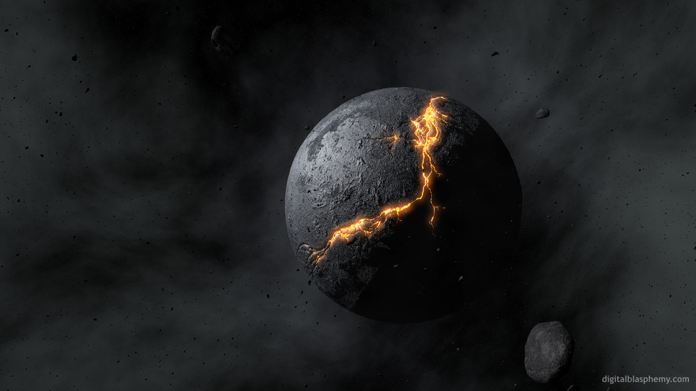
I downloaded the “lava” version all those years ago. For me, that version *is* “Crucible”. In contrast to the view of this as a world being destroyed, to me it shows new planets forming from the matter circling their sun, their crusts so thin that the lava of their mantles still peeks through. That’s more in tune with the title too, I think. Earth in the “Hadean” epoch was like this; give this one a few billion years and it could be as lush as our own world.
NiteWhisp
I have a free version of this at work and love it, so Idecided to join and get this in the wide version. If something like an asteroid smacked the earth, it might very well look like this for a long time. Great rendering, thanks for sharing your talent.
MrToad
I’ve just upgraded my monitor to a Dell 2407WFP-HC, and this image has suddenly come to life.
More over, is the perfect match for my modified Zune theme…
Sometimes I find myself minimizing all windows and just watching it.
mjordan
Easily my favorite out of your entire collection… thanks Ryan.
wynand
when i looked at this i immediately thought of 5’th element – the movie. in the scene where that dark planet thingy starts speeding up towards earth for it’s destruction.
this is a great picture though.
Xircuits
I don’t know why, but when I saw this wallpaper, I just thought of Transformers and Cybertron. I remember in the original Transformers Movie, there was a shot of the planet and it zoomed in. I think I remember seeing a crack similar to this one. I’m not sure, but this is what I think of when I see this wallpaper.
Cajmoh ( simon )
I look at this, and immediately think of the animated film ” Final fantasy, the spirits within “. There is a scene towards the end where an alien homeworld is about to go ” Crucible “. Love your work Ryan
Prime
Love this image as well.
I know its probably all not that common, but I have a tri-monitor setup, running widescreen which gives me a tolal of 5040 x 1050 resolution.
Since only up to 4800 x 1200 images are being offered in the “tri monitor screens” section, Ive had to strech it out myself. Its only 240 pixels, but if its at all possible, Id love to see somee more wallpapers at 5040 x 1050 or lager resolution.
Chris
Just “WOW” been a member since the very beginning yo started, and every new pic i wonder how you come up with these great ideas…
Keep it up Mr Bliss..
Cheers,
Chris
Andar
Reminds me of the evil dark planet in The Fifth Element << Good Movie Thanks!
Paul
Ryan,
I’ve been waiting for a planetscape in this style for a while, Roche is my favorite of your planetscape work so far but this one could take the mantle (the jury’s still out on that one at the moment).
I’ll reiterate what others have said in this thread – planetscapes are my favorites !
I believe you guys in the northern hemisphere just witnessed a fantastic ‘blood moon’ lunar eclipse. That should get your creative juices flowing for the next planetscape 🙂
Love ‘yer work, always look forward to the next installment.
Stephen
Just letting you know the link for the three monitor version does not work.
I really appreciate the three monitor versions, they always look amazing.
Michelle
I really like this. It’s almost an opposite version of “Cosmogony” which I also love!
pinion
Ryan you continue to amaze me.
Beautiful.
Anne
I didn’t take much notice of Crucible until i saw this updated version without the lava. I must say, it’s very beautiful and dramatic- one of your best! The rocks and the lava made it a little cheesy and this version absolutely rocks without the rocks. I like your more volatile and emotional wallpapers. The past few were pretty but too calm and earthy for my taste, this one’s a real departure and a real treat!
Labanimal
Love the updated planetscape!. Just Brilliant!
Ryan – It would be really kewl if you could choose a design you’re working on, and post pictures of your progress IE the Wireframe of what you’re doing, or a rough sketch of your idea going into the design, what it looks like each step of the way (not all but some!) and eventually the result after your hard work.
Elijah
I would love to see this offered as one of the posters…
Nathan V
I love planetscapes like this. Awesome.
My ONLY pick on this would be that there’s no secondary light source so the dark half of the planet shows at least slightly. It might be more realistic that it doesn’t show, but I think the overall effect would be better if there was at least a small or even slight hint at the planet’s surface because as it is I feel like there’s a void there, not the rest of a planet.
Like I said…my only problem with it, and I’m really nitpicking about my personal taste.
I still absolutely love the piece, Ryan. Keep it up!
Nicola
I’m not normally such a fan of planetscapes, but the improved ash clouds make this one really moody and atmospheric.
NikB
Thanks very much, Ryan, for listening to us and posting this. It’s one of the best!
Shawn
Love it man keep up the good work! More planet scenes please!! 🙂
Travis
I have the original lava field one as the background on my phone and now I am thinking that I need to change.
chiops
As I said in the other thread I slightly prefer this image to the lave version, which is interesting because I don’t usually like planetscapes.
Ryan, I feel for you about what happened in that other thread.
Jef Gibbons
That’s why I pay you the big bucks,keep up the good work Ryan!
Konstantin
This image is something outstanding, really, i give it 10! This is the best planetscape 2006-2007) I really like it! Thanks a lot you rendered it once more!
omar;
Personally, I like the planet version better for my desktop because of the clarity and definition of the whole image. The smoke in the lava version looks good for the setting, but I just like clearer wallpaper better. It’s just a matter of tastes there.
However, in terms of graphic achievements, the lava version is better. The improved lava version looks great, and the setting is imaginative. And again, the smoke looks great for the setting, although it isn’t my favorite effect. Also, maybe having the planet in the background a little smaller, like in the planet version, would be even better.
Melissa
Fabulous work Ryan!! You Rock!!!!
Ryan
Enjoy!
Mark
I couldn’t decide which one I liked more, I like them both equally. This one has such a charred and barren feel to it, it’s incredible.
Excellent work, as always!
Jackson
Phenomenal
Bryan
I didn’t think this image could get any better and here you go and do it. I like the minor tweak(s) you did. It definitely helps define the smoke and ash floating in space. Before, it just looked like a solid gray cloud, now there are well-defined swirls.
Can’t wait for the next one…
Marco
I’ve always been a fan of the Planetscapes and this image is just more affirmation of my enjoyment of them. I realize that there are only a limited number of possibilities with Planetscapes, but I can’t wait to see more.
Chris
I LOVE planetscapes those are my favorite ones. And I disagree with Marco(with all due respect); not in that this isn’t an excellent piece of artwork but that planetscapes are limited. planetscapes provide limitless bounds for creativity and Ryan uses them superbly. Keep up the great work!
THANKS
Kain
this look so awesome !!!
im so happy you moved it to the primary image, i love this wallpapr, i can’t wait for your next one !!!
the more planetscapes the better =)