Description
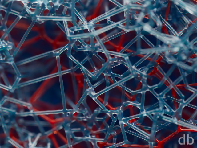
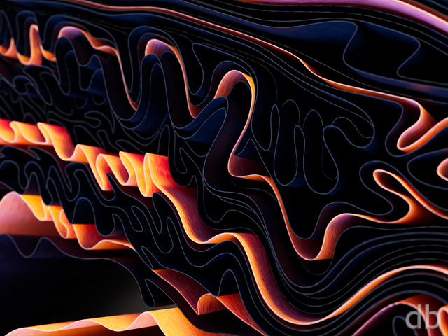
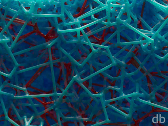
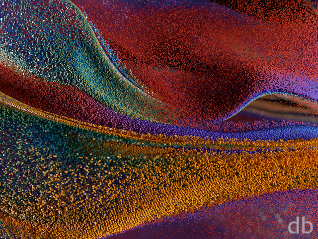
The original idea here was to create a “metallic flower” using Plant Factory. Tried rendering it using Vue but decided that Lightwave allowed me a bit more freedom to get the look I wanted. Of course I decided certain parts needed to glow 🙂


Exit [liferplus]
Love the vivid color! My favorite this far. ðð¼
Michael E [nonmonthly]
I can’t be the only one who sees Final Fantasy 7 in this one. Organic, Mechanical, Detailed, and quite futuristic, this is a nice work with great detail.
Jim Bonner [lifer]
This looks exactly like something an A.I. machine might create to beautify it’s own world. Clever work. Don’t change anything.
Rodewaryer [lifer]
Not really very fond of this one, as the tendrils of color look too much like something man made, or like a computer would create. They are too consistent and without the variation one finds in nature. The leaves and center work just fine though…
Tyler [lifer]
Would not change a thing. However I must say after following you Ryan for over a decade that I notice you do less PJ versions. You used to revel with those but now you seem to arrive on a final version without the variations that you would often allow your followers to choose on. Some of your best work has come from PJ versions so I’d encourage you to please not abandon that practice.
Ozaawaagosh [basicmember]
Love the colours and the how it gives a florescent feel or pulse out to the leaves, I have to say I agree, with Archangel, it is very pleasing to the eye. Awesome render Ryan, thank you.
Richard H. [liferplus]
Not bad overall, but I do wish these plants didn’t have black leaves so often. I really don’t like black leaves; they don’t seem realistic to me (not many real plants have such dead-looking black leaves), and they look sort of a bit evil. Not sure why, but I just don’t like them. Also, I’d prefer it in general if the stems didn’t look so much like tentacles. Overall I like the idea, but the implementation looks a bit creepy to me! Sorry.
Heather [lifer]
Canât wait for iPhone X version!
BobC [lifer]
I agree with Archangel. I’ve always especially liked your glowing plants. The red/blue colors of this plant’s weird vascular system are nicely done. Consider adding a category under “wallpapers” which groups the glowing plants (and fungi) and maybe the ones where the flower is the whole composition…
~Archangel~ [plusmemberlifer]
I really like how this is somewhere between abstract and realistic…very interesting and pleasing to look at!
Michael [lifer]
Interesting idea. I wonder what it would look like in green/gold instead of black/red