Description
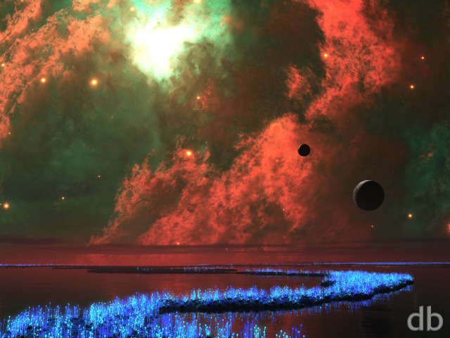
Once again I found myself trying to use Vue d’Esprit to create a gas giant type planet. It still looks a bit “chunkier” than I would prefer but I think I am making progress. Of course it’s all just an excuse to have fun creating alien vegetation for the foreground 🙂


 Cygni: cygni1


Tim Tomecko [nonmonthly]
I really like how the water looks in this one, the blue is almost metallic. Very good…
Susan [nonmonthly]
It’s okay, but I actually find the foliage colours to be rather insipid in this version. The night version is far more spectacular. But I do like the colour of the water in the foreground
Lews Therin [basicmember]
Love this one and the counterpart. Beautiful. The triple screen is amazing.
knights_inarms [lifer]
I like this alien moon landscape concept creation; it truly transports you to another environment. Excellent work!
Mac [basicmember]
Makes me think of the Wetlands in WOW
Brandi U. [liferplus]
I like the plant color of the original one best. The way it coordinated with the planet really pulled the image together.
Xetal [liferplus]
…makes for a more glowing mark from me 🙂
Love this new version, Ryan
Jenanne [liferplus]
Love this! It looks fantastic on my phone. IMHO, the colors work as is, but I’d enjoy pickle jar variations if you’re of a mind, Ryan.
Afya [lifer]
Honestly, a lot of the time with your vegetation, I get turned off because it looks too lush, too thick, too many colours of flowers. This is PERFECT. It’s understated and weird and yet still serene. I love how the colours of the water and the plants echo the colours of the planet.
The only thing bothering me is that the plants stop abruptly at a very close horizon. I would expect to see more beyond that, fading further into the distance.
Mike [nonmonthly]
⦠Because I swear it’s straight from that game if you got to design an entire planet instead of the algorithm. I have to say I must be a bit biased because I love almost all of your space/sci-fi backgrounds; so I’m adding another one to the list. Oddly enough, despite me seeing comments talking about how monochromatic the alien plants are, it really makes the whole scene pop. The colours seem to flow and blend together perfectly as a result I think, and is as much a pleasure to look at as the image is as a whole. Great work man, I just had to write a comment. 🙂
Rodewaryer [basicmember]
Ok, apart from a little 2D and monochromatic (just one more color would have made it pop I think) look to the gas giant, I have to say the creativity in the foreground is noteworthy. That water is bloody perfect and the plants…are just so different it fits the scenario. Don’t doubt that imagination, it’s working.
Hoverwolf1 [lifer]
Not a fan of this one. The foreground looks like Planitia’s remake with a tidal pool in place of a desert, and it suffers from Planitia’s fault: too busy.
Also, something was bothering me about the alien flowers, and I think I’ve figured it out. The color pattern, white body with a red tip, makes them look like the tube worms found by undersea volcanic vents rather than an actual plant. If that’s what you were trying to suggest, then I must apologize for taking this long to see it.
As for the background, I think it’s okay. Yes, the planet looks a little rough hewn or “chunky”, but finer appearance will come with time. I certainly know you won’t stop improving.
I love your planetscapes, but the foreground on this one needs work.
Ozaawaagosh [basicmember]
I really love this, Your Planet-scape Renders are so realistic and life like, simply stunning!!!
Telaria [nonmonthly]
I really like this one – I like the ‘cool’ color palette, very different but it suits my eyes. The ‘ruby’ flowers are neat, great concept!
Darren [basicmember]
The foreground landscape is simply superb. I see what you mean about the gas giant. However I like to think it all works really well if you think of it as a terrestrial plant
RamonR [lifer]
Knocked it out of the park…
John [lifer]
Me likey: and this one seems like it might be a prelude to something for the upcoming solar eclipse. I wonder what you have cooking for that!!
Ryan
Lol! Interesting that some people love the foreground but not the planet, and some love the planet but not the foreground 🙂
Xetal [liferplus]
..whether WalMart Christmas decorations grew or were manufactured. Your best gas giant yet, and I love the overall atmosphere, but the foreground ‘baubles’ jar on me.
Mike [lifer]
This is about the 2nd or 3rd 10 I have given one of your wallpapers and I want to explain why I chose to give this one.
Unlike the previous version of this, I really did not enjoy it (sorry). The vegetation improvement in this shot is over the top better and much sharper and I enjoy looking at it very much.
Some parts of the water I can’t tell if I am looking at stillness, ripples, or whats underneath and it really has me immersed.
Now, as for the planet, I can’t make out what you mean by chunky, (yay?) but the biggest thing I appreciate about the planet is the brown/orange terrain. There’s depth to it and as a viewer standing there watching, I feel I am able to reach out and touch the planet.
Kudos 🙂
BobC [lifer]
I, of course, love it. The completely weird, alien landscape is fantastic and wonderful.
I agree that the planet didn’t work out quite as well as the foreground did..
James [nonmonthly]
Very nice job! Reminded me of something from the game “No Mans Land”. Very cool.
Matt [basicmember]
I like the plants. They’re like sci-fi Dr. Seuss.
Littlemom [liferplus]
The colors on this are nice but again abstacts aren’t really my thing. Although I do like the concept behind this one, a combination of a planetscape and and abstract. The first thing I thought of when I saw this was a planet you’d see on the Orignal Star Trek, not that, that is a bad thing but it sent me back to the original Trek days when I was a kid. 🙂
lionpants [liferplus]
Looks great. The colours are fantastic. There is something off about the tree thing in the foreground. Not sure if it’s the “leaves” or the texture on the trunk though.
SethEden [liferplus]
Hey Ryan, I’m still waiting to see a gas giant cloud canyon scape, maybe with a little cloud-city floating in the distance against a back-drop of lightning! 😀 You know, thunder-heads all around and below.
MIB4u [lifer]
… do I need to say more …?