Description
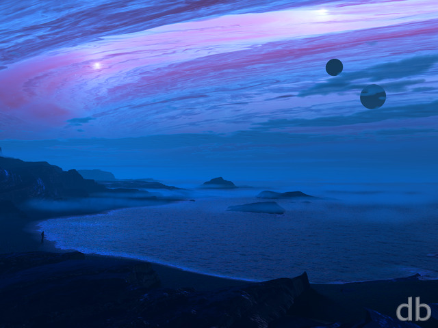
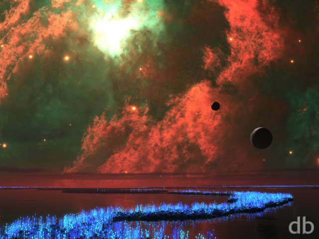
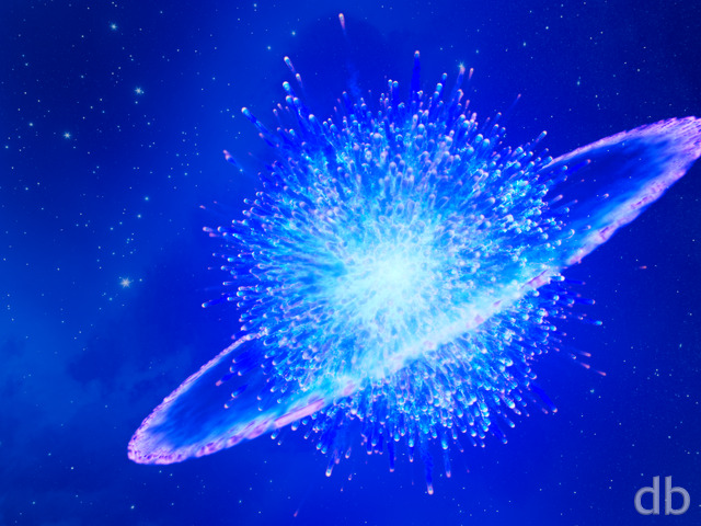
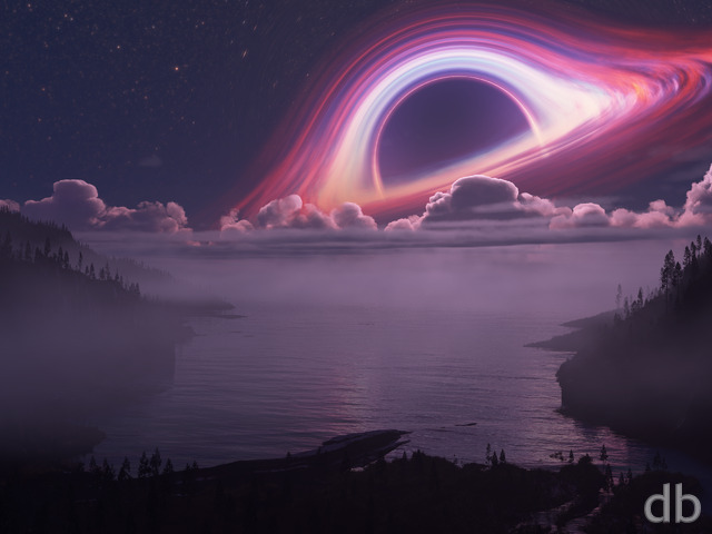
After posting The Floating Garden last time one of my fans wrote and asked if I could make some more “solid” backgrounds. I’m going to assume he meant something a bit more minimal. This one is for him. Created using Gaea (for the foreground) and Lightwave 2019 (the planet). Rendered using Vue Enterprise.


Jimbo [basicmember]
… But I was impressed when I saw it displayed again on my screen background. Thanks Ryan!
Am looking forward to your next works.
—
J
PHAX [nonmonthly]
This reminds me a lot of your 1990’s renders. The Colour gamut is used very wisely, the composition on the planet [Dione] and the mountain is well executed.
While the Red is a little ‘loud’ to be considered realistic; it Wins in the Coolness factor. 10/10
vsync [lifer]
I like this one quite a bit.
The graininess of the sand is good and even geometrical formations (check out the debate over the “Bimini road”) are interesting but the aliasing could be eliminated unless we could at least get a backstory for it.
As far as “solid” I can’t speak to the original requester but while I like this image it wouldn’t be at all suitable for what I would ask for something “solid” for. Personally I’d want something low-contrast and roughly similar across the image, perhaps with areas of interest. This helps not lose windows across it and reduces distraction. When using translucent terminals it also greatly helps legibility.
Gene [lifer]
I love the overall image, the content and the colors especially. The only fly in the ointment, for me, is the obvious pixelation in the foreground areas. Nostalgia has its place, but this is a 2019 image, not one from 1999…
ChrisW [basicmember]
I agree with Rick Raborn; this looks like something out of “A Princess of Mars.” Even though Earth is WAY too close for that to be an option, I still like it.
Shannon [liferplus]
Don’t see a lossless version.
Ryan
Dual and triple-screen versions now available!
Byron [liferplus]
Will this image be available for multiple monitors?
Rick Raborn [liferplus]
Ryan, as usual, top notch spectacular work! Ignoring the fact that the planet would be too close if Earth, this really makes me imaging standing on Mars in the very distant past when there was still water, and looking toward home. Well done!
Jenanne [liferplus]
Very nice! I’m using a slide show of your planetscapes right now, and this is a great addition.
Seadragonlady [liferplus]
A change form your recent work and a return to much earlier work subjects. I like it and it makes a nice contrast when includes in a slide show.
Todd [basicmember]
I’ve always absolutely LOVED your plantscapes, and universe interpretations in general, the most. Your creativity and imagination go to such wonderfully creative lengths that never cease to amaze!
Deb Porter [liferplus]
Wow! That is really amazing! I LOVE the contrast and the intense colors!! It’s now one of my favorites!!!
Ozaawaagosh [plusmember]
I love all your planetscapes renders there beautiful as well awesomely realistic, great render my friend.
Seth R [liferplus]
I have always favored your planetscapes, which is why I am a member for a number of years. I love this as it is, but if you chose to do a variation, I would certainly be interested. Now my current wallpaper.
Oscar [basicmember]
Very beautiful and amazing. Maybe a dual screen is in the works?
karzist [liferplus]
Really love the water effect and the saturated colours and rugged landscape! It does seem a bit heavy on the right hand side, and I find the rock textures a bit too busy (maybe add some sand to smooth it out?). Something seems slightly odd about the bright blue world in the sky and the red landscape with no blue in it; wouldn’t the blue planet cast blue light on the red world and make it look a little purplish or violet?
Sylvia ONeal [plusmember]
I just have to say that you are so blessed. God really gave you an amazing gift. You are amazing! Your work is breathtaking and nothing less. You leave me speechless and in awe, my eyes are so fascinated with such beauty before me. My thoughts took me 1/2hour to find these words.I’m trying, but I can’t find any words to describe what my eyes see. Just that you Rock!
Dan E [basicmember]
I really love the significant contrast between the harsh topography, the deceptively calm liquid and the blue marble planet in the background. Nicely done!
Littlemom [liferplus]
I love the colors in this render but it’s almost too simplistic. Reminds me of your earlier work. I can’t put my finger on it but this just needs something.
Mark A. [liferplus]
Honestly, I think the bottom “half” of it is fine. The only change I might suggest is maybe moving the blue planet a little to the left (making it more visible).
Eric [lifer]
Mirror the land to create a pool, and add Nova or Starbirth(2008) as the celestial object…please
Rodewaryer [lifer]
â¦.but do love the view. I must say I love the way the water is rendered….
Mark A. [liferplus]
I like it. Looking at it makes me wonder if this was what it looked like on Mars when there was more water.
Ryan
I was on the fence about the bump texture on the terrain. I thought it looked too “featureless” without it but it does add some busyness. I may tweak it in a future revision.
Phil C. [basicmember]
The colors on this one are fantastic and that giant planet looming on the horizon is magnificent. I’m not sure I care for the texture of the land, though. Full of little ridges. It looks like someone was dragging a Zen garden rake through sand…..over the whole landscape. Could we maybe get a Pickle Jar variation with some of the terrain smoothed out a bit?
Aslan [liferplus]
I just adore the deeply contrasting colours.
Brilliant.
Jason Pond [liferplus]
Your last render (Floating Garden) will remain #1 likely for a long time. This planetary render takes a close 2nd. though. I like how looking at many of your renders seems to have a calming affect… Nice work dude!!
BDPC@Sea [plusmember]
This is one of my newest favorites. Thank you.