Description
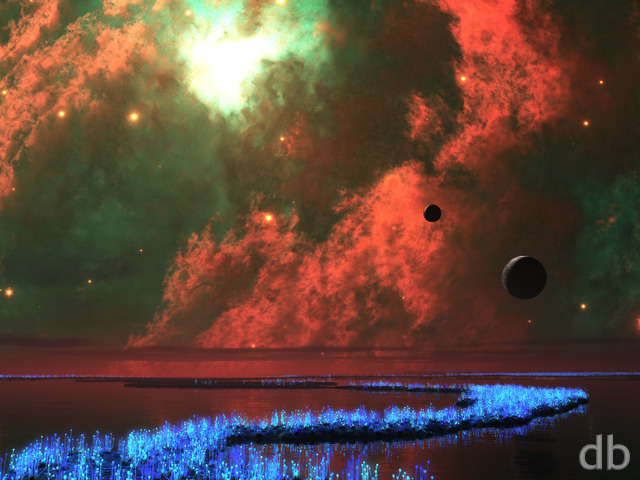
I’ve created a lot of very different plants using Plant Factory and I’ve used it to create some interesting “non-plant” objects (tornadoes, aurora, and snow for example). This time I wanted to see if I could use Plant Factory to model a spiral galaxy.
The galaxy object was rendered in Vue (I also experimented using Lightwave) and then that was used as a background for the scene you see here. I hope you enjoy it!


Richard H. [liferplus]
Well, that certainly explains it! 😉 To me, though, what the 1° cant adds is a bit of subconscious seasickness to the scene! 8-D It’s not too bad in the single-screen version, but in the dual and particularly triple screens, I personally find it just a bit much. I understand your reasoning, but I think the problem is that it’s only *just* off level; it’s close enough to level to look like a mistake rather than something deliberate, if you see what I mean. Besides, I think the very effectively undulating water is enough on its own to destroy any feeling of artificial flatness.
Ryan
I gave the camera slight 1 degree cant because I thought it would add a bit of subconscious realism to the scene. What are the odds that someone with a camera on a rolling ocean would be able to capture a completely level horizon? I guess the effect is magnified on the triple screen though…
Richard H. [liferplus]
I really like this image in terms of its contents, colour, lighting etc⦠but one aspect of it is driving me mad. It isn’t level! It’s like one of those annoying photos where the composition’s just right, yet it’s spoilt because you’ve failed to hold the camera straight and the horizon’s at a slight angle. The single-image view isn’t too bad, but in the dual- and triple-screen versions it’s really obvious that the horizon is lower at the left than at the right. It’d be lovely if this could be fixedâ¦
Tez [lifer]
I was so absorbed in the undulating ocean, really got lost in it.. Then I noticed the galaxy.. Simply Stunning.. Tez
Greg [nonmonthly]
Night-time alienscapes are the greatest.
Well done!
Thank you for the multi-screen versions.
Will definitely put the triple screen to use.
Ryan
Yes unfortunately a rogue BSoD took down my first render attempt and added a couple of days to the wait. It should be ready soon!!
Greg [lifer]
Do you have a Dual/Tri-screen version of this in the works?
Gene [lifer]
…I didn’t see “Horton” at first, but now that others have pointed him out, I too am hopelessly unable to “unsee” him… Good thing he isn’t pink! Sorry, I just had to say that. 😉 Seriously though, if you’re still working this one Ryan, maybe scramble him up a bit?
And as I emphasized below, again, thanks for all the great work!
Ninhalem [basicmember]
I really liked this at first glance, especially the explosion of colors in the galaxy, but when I look closer I think I see roots of plants in the middle of the galaxy. If the overall galaxy can be worked on but still maintain the explosion of colors, this will definitely make the rotation on my work computer.
Adam [lifer]
Clouds in the middle look like Horton the Elephant 🙂 . #CannotUnsee
Richie Knight [lifer]
First off, I gave this a 9. However, the more I look at it the less I like it. I love Ryans planet scapes like this and I generally rate them as his best work. With this scene, it feels rushed. There are gaps between one of the moons and the space around it, the landscape to the left feels low detailed, the clouds feel misplaced (I have felt this in a few renders) and there is a graininess to the whole scene. On the plus side, the colours used are great and the reflective nature of the water is good, (although grainy).
Aslan [liferplus]
As ever a wonderful scene, adore the concept and effects.
I have one observation, to my eye, it is ‘over mooned’
Gene [lifer]
…yet to my eye, something about the whole of the sky seems to be unfinished or somehow, that the parts don’t quite seem to “fit.” I’m sorry, I know that this is horribly vague feedback, but that’s the best verbal “translation” I can offer for my subjective impression. In short, good concept, but something’s still not quite “there” with the sky details.
Still, as always Ryan, I thank you for awesome body of work. Our plain, old, as-yet unexploded, uncracked earth is a brighter place because of it! 😉
Littlemom [liferplus]
Love the sky on this one, and the water is very realistic looking. Beautiful colors
Rodewaryer [lifer]
Excellent render, and I would say the tool to model the galaxy with was successful, and it might be good at doing a super nova as well. I love these kinds of creations, more would be good….
Timhogs [liferplus]
Now that is sweet!
Ozaawaagosh [basicmember]
Simply Beautiful evening planet-scape, would love to be there.
Boom Boom [basicmember]
Love the water!
Not sure about the orange dust cloud coming out of the galaxy.
Galaxy didn’t really hit the mark on this one.
Jason [plusmember]
All I can see is an elephant… 😉
Alex M [lifer]
One of your Best Ever
Ana [basicmember]
Oh my gosh I love this so much! I want it for my wall
NicoleW [basicmember]
This is wonderful. Night scenes are my favorite, and this one is just lovely. Thank you!
Mark A. [liferplus]
It’s very peaceful & serene.
Corwin [nonmonthly]
Beautiful image. I always love the ones set at night.